Become a MacRumors Supporter for $50/year with no ads, ability to filter front page stories, and private forums.

Paco II

macrumors 68020
Sep 13, 2009
2,288
706
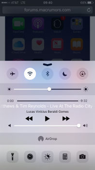
Agreed. At first I was like wtf they removed the player controls? Especially since the little dots completely 'disapper' with some backgrounds. I already dislike the additional swiping required to get to things, but Apple should at least make it 'smarter' to try to minimize it.

Well I haven't personally seen the music come up first when using it because I only use Spotify. If what your saying is correct though it is kind of silly considering that using the music part of the swipe up function is probably the most used reason people use CC
 

KALLT

macrumors 603
Sep 23, 2008
5,380
3,415
I believe that it was a missed opportunity to bring a little customisation into it. A dedicated button to turn off mobile data or roaming, or turn on VPN would be highly appreciated. Instead they shuffle things around, make everything huge and hide stuff that was compact in one single panel behind additional swipes. In particular with the lock screen and the notification centre (while within an app) having a horizontal swipe too, I think they are really going crazy. watchOS crazy, where a swipe has a different result in each direction.
 
  • Like
Reactions: Paco II

jonnyb098

macrumors 601
Nov 16, 2010
4,248
6,492
Michigan
Instead of bitching, how about using your brains. This is beta 1 and a lot is going go change. You all think a GIANT night shift button will stay like that????? NO. That will be split between night shift and dark mode.

I'll see you all back here in 3 months eating your words.
 

Iphone5preorder

macrumors 6502a
Sep 20, 2012
873
466
Because tech companies run by multi-billionaires think about the near future based on things they've been using for a while. "Pretty soon everyone will have automatic blinds and thermostats, because I've had it for 2 years now". What they are failing to realize is that the average person is going to look at Nest for I think $200 then see cheap-o-stat for $60, that's a no brainer. Honestly, how often does a person change the thermostat? Maybe 12 times a year? Is the 12 "get up and go to the thermostat" worth $200? To a billionaire yes, to Joe and Jane down the street, it's an obvious no. The initial cost to be able to set up a scene, is at least $1000 and people just aren't going to pay that much for automation.

Geo-fencing the garage door is a whole-nother task with buying a new garage door opener, easily 500+.

Lighting $100 a bulb vs ~$5 for a pack of 4 regular bulbs, even the LED bulbs.

I haven't done any research, these are just ballpark figures based on what I have seen and guestimates of what I'd expect I'd have to pay for network connectivity.

Everyone is just waiting 10 years for these $500 dvd players to come down to $20.


As for Apple Music, Steve Jobs would be rolling in his grave for the person who used an Arial-like font for the header.

I'm lost. The guy mentioned he doesn't understand why Apple makes some buttons huge. Why are you talking about consumers willingness to spend a lot of money on unnecessary/unaffordable gadgets?
 
I'm lost. The guy mentioned he doesn't understand why Apple makes some buttons huge. Why are you talking about consumers willingness to spend a lot of money on unnecessary/unaffordable gadgets?

I went off on a tangent, I need to correct the post, the night shift enable button was the large one, for some reason I have it in my mind that it's the home app probably because they have a section for it.
 

Iphone5preorder

macrumors 6502a
Sep 20, 2012
873
466
Instead of bitching, how about using your brains. This is beta 1 and a lot is going go change. You all think a GIANT night shift button will stay like that????? NO. That will be split between night shift and dark mode.

I'll see you all back here in 3 months eating your words.

Ah, someone complaining about bitching when his post history is full of it (Apple Music bitching, hint).
 

Frankied22

macrumors 68000
Nov 24, 2010
1,787
594
what if it was smart enough to know if you're playing music to present the music screen first ? I think that would be cool
From what I've read, it does do that. It also remembers which card you last had up. If you used the music controls, the next time you bring up CC the music controls will pop up.
 
  • Like
Reactions: warden

Iphone5preorder

macrumors 6502a
Sep 20, 2012
873
466
Yes and rightfully so as its a current released product. When iOS 10 is released and none of the complaints have changed.....then fine....bitch away.

But you're bitching about an application that is in the process of changing and being released soon. Why not "use your Brain" and wait for the release and see if it's still a problem?
 

Abazigal

Contributor
Jul 18, 2011
20,392
23,887
Singapore
But you're bitching about an application that is in the process of changing and being released soon. Why not "use your Brain" and wait for the release and see if it's still a problem?
Because if you want the change to be made, now is the best time to make noise so it can be rectified before the release.

My observation with iOS betas is that this is more or less a bug hunt, as well as a means of letting developers have early access so they have time to update their own apps accordingly. Apple very rarely makes changes to the user interface at this juncture.
 
  • Like
Reactions: canesalato

shanson27

macrumors 68020
Nov 27, 2011
2,225
21,117
What about this one

ios-10-better-2.png
 
  • Like
Reactions: idrisinan

Creek0512

macrumors 6502
Jun 15, 2012
497
450
I think Apple believes having 2 cards to swipe between is preferable because it is easier to use one handed, compared to having controls at the top of the screen that would be unreachable on the new larger phones.
 

mattoligy

macrumors 6502
Original poster
May 15, 2010
396
191
Cloud 9
Siri App Suggestions in the lower half maybe, or other useful quick settings... Opinions on what you would like to see?
a0SevM2nOHaCxWdSr5jSFCN7TDc5UOkT02JuY7fqxco


(Added to first post)
 
Last edited:

BeeGood

macrumors 68000
Sep 15, 2013
1,859
6,120
Lot 23E. Somewhere in Georgia.
Instead of bitching, how about using your brains. This is beta 1 and a lot is going go change. You all think a GIANT night shift button will stay like that????? NO. That will be split between night shift and dark mode.

I'll see you all back here in 3 months eating your words.

Since you're so good at using your brain, why don't you tell us why you think it's so large in the first place?

You don't "accidentally" resize a UI element, and then "accidentally position it perfectly in the UI.

This isn't a bug or some other type of coding error. This was intentional. So what would compel Apple to change it in a future beta if developers don't let them know how ridiculous it looks?
 

jonnyb098

macrumors 601
Nov 16, 2010
4,248
6,492
Michigan
What about this one

ios-10-better-2.png
taking up 90% of the screen isn't the answer for control center....sorry.
[doublepost=1466094167][/doublepost]
Since you're so good at using your brain, why don't you tell us why you think it's so large in the first place?

You don't "accidentally" resize a UI element, and then "accidentally position it perfectly in the UI.

This isn't a bug or some other type of coding error. This was intentional. So what would compel Apple to change it in a future beta if developers don't let them know how ridiculous it looks?
Because its probably a placeholder to split it up between night shift and some sort of dark mode. Also night shift more or less is an automatic function that doesn't need that large of a button. They always save a couple extra iOS tidbits for the September announcements.
 

Iphone5preorder

macrumors 6502a
Sep 20, 2012
873
466
Because if you want the change to be made, now is the best time to make noise so it can be rectified before the release.

My observation with iOS betas is that this is more or less a bug hunt, as well as a means of letting developers have early access so they have time to update their own apps accordingly. Apple very rarely makes changes to the user interface at this juncture.

I'm the one who started the thread lol. I support bitching about this. It's this other guy who came in here to tell us to stop bitching meanwhile his post history is full of bitching. I was replying back to him using his own silly logic
[doublepost=1466094996][/doublepost]
taking up 90% of the screen isn't the answer for control center....sorry.
[doublepost=1466094167][/doublepost]
Because its probably a placeholder to split it up between night shift and some sort of dark mode. Also night shift more or less is an automatic function that doesn't need that large of a button. They always save a couple extra iOS tidbits for the September announcements.

If that's the case, why don't they give night and dark mode its own seperate card/tab/pane/etc instead of the music player. That's the mind blowing part.

I can guarantee that the buttons pause/play/skip/volume are used 400X more than people will ever be clicking on night/dark mode.
[doublepost=1466095396][/doublepost]
What about this one

ios-10-better-2.png

Why do I need a giant square with a music note?

Here is the simple solution. Replace "timer" with dark mode or whatever. Or get rid of the calculator. Or just let us customize our control center. Easy, done, everyone is happy.

But no, Apple is hell bent on telling it's consumers what they should like. Album art- no, we don't care about that. We don't want it in our control center.

[/QUOTE]
 

Attachments

  • image.png
    image.png
    449.7 KB · Views: 123

jonnyb098

macrumors 601
Nov 16, 2010
4,248
6,492
Michigan
I'm the one who started the thread lol. I support bitching about this. It's this other guy who came in here to tell us to stop bitching meanwhile his post history is full of bitching. I was replying back to him using his own silly logic
[doublepost=1466094996][/doublepost]

If that's the case, why don't they give night and dark mode its own seperate card/tab/pane/etc instead of the music player. That's the mind blowing part.

I can guarantee that the buttons pause/play/skip/volume are used 400X more than people will ever be clicking on night/dark mode.
[doublepost=1466095396][/doublepost]

Why do I need a giant square with a music note?

Here is the simple solution. Replace "timer" with dark mode or whatever. Or get rid of the calculator. Or just let us customize our control center. Easy, done, everyone is happy.

But no, Apple is hell bent on telling it's consumers what they should like. Album art- no, we don't care about that. We don't want it in our control center.

[/QUOTE]
Have you not seen the multiple posts already confirming that if you last were on the music controls, it defaults there?
 

Iphone5preorder

macrumors 6502a
Sep 20, 2012
873
466
Have you not seen the multiple posts already confirming that if you last were on the music controls, it defaults there?[/QUOTE]

Yes, solves nothing. As it is today, I can control brightness, volume, music, DNd, everything from one swipe.

Why would I want to move any of that somewhere else and add nothing else? Forcing myself to swipe more and providing nothing new is not simplicity or functionality. Been over this 20 times in this thread.
 

shk718

macrumors 65816
Jun 26, 2007
1,120
1,098
From what I've read, it does do that. It also remembers which card you last had up. If you used the music controls, the next time you bring up CC the music controls will pop up.
then i'm on board. this allows more functionality and multiple screens like home control...
[doublepost=1466096097][/doublepost]
Have you not seen the multiple posts already confirming that if you last were on the music controls, it defaults there?

Yes, solves nothing. As it is today, I can control brightness, volume, music, DNd, everything from one swipe.

Why would I want to move any of that somewhere else and add nothing else? Forcing myself to swipe more and providing nothing new is not simplicity or functionality. Been over this 20 times in this thread.[/QUOTE said:
The idea is to allow additional quick actions w/o the need of going full screen. basically you can do everything one handed (if it was full screen you couldn't get to the top of the screen) albeit needing to use a swipe sometimes. i think their approach is correct - but i'd like them to make it customizable like the watch face. I bet $ that comes next year. Apple likes to do something - see how people use it - then adjust.
 
Last edited:

BeeGood

macrumors 68000
Sep 15, 2013
1,859
6,120
Lot 23E. Somewhere in Georgia.
Because its probably a placeholder to split it up between night shift and some sort of dark mode. Also night shift more or less is an automatic function that doesn't need that large of a button. They always save a couple extra iOS tidbits for the September announcements.

That's plausible and I honestly hope you're right, but there's really no need for a placeholder. The normal-sized night shift button simply could have been centered horizontally.

Or, like @Iphone5preorder said, why not move that to a new tab instead of music. They could have put the brightness slider there as well to keep all the "visual effects" stuff on one page (since for some reason, the control center now has to be paginated :/ ).

But again, I hope you're right. We'll see.
 
  • Like
Reactions: canesalato

stooovie

macrumors 6502a
Nov 21, 2010
836
314
It really has to change. The way it is now in beta 1 is like going back to pre-7 clutter, with vital functions hidden from view.
 

XeroAllusion

macrumors member
Oct 18, 2013
45
10
As for the design choices that Apple has made, I have criticism.

Notifications and widgets need to be smaller and need to have an edge to edge design rather than this Apple Watch rounded corner look.

Control center needs to be customizable, and it's look should stay the same, the new one wastes space at the edges and ruins the beauty of the previous one. I don't like how the new one isn't edge to edge, I think that what makes most of iOS 9 beautiful.

The 3D Touch animations for notifications need to be more like the ones we've had for peek and pop.
 
Register on MacRumors! This sidebar will go away, and you'll see fewer ads.