I do hope they change that System Preferences icon to make it a little more like iOS's. Right now it's too contrasty and doesn't seem flat enough to fit in with the rest of the gang.
Got a tip for us?
Let us know
Become a MacRumors Supporter for $50/year with no ads, ability to filter front page stories, and private forums.
OS X 10.10 Yosemite: All The Little Things
- Thread starter WhackyNinja
- WikiPost WikiPost
- Start date
- Sort by reaction score
You are using an out of date browser. It may not display this or other websites correctly.
You should upgrade or use an alternative browser.
You should upgrade or use an alternative browser.
- Status
- The first post of this thread is a WikiPost and can be edited by anyone with the appropiate permissions. Your edits will be public.
i'm not really happy with all the transparency in yosemite. it takes, as of now, some performance away. i'm glad that u can reduce it to a minimum
Good to know. Thanks.
Can the Menu Bar transparency be controlled separated from the global transparency reduction? I'm pretty used to transparency in iOS 7, but couldn't live with it on the Menu Bar.
It needs to be consistent - some apps used to override the transparency and make it opaque, so it was jarring when switching apps. Also (and perhaps more importantly), image editing apps really need a neutral colored Menu Bar.
Seems to be two options. You can disable translucent menu bar in the Desktop & Screen Saver settings and can globally reduce transparency in Accessibility.
Seems to be two options. You can disable translucent menu bar in the Desktop & Screen Saver settings and can globally reduce transparency in Accessibility.
Perfect! Thanks. Hope it remains that way by GM.
some Mac programs don't run, like Final cut, compressor etc
But I like the new OSX, very clean
Image
How does Aperture work on Yosemite?
some Mac programs don't run, like Final cut, compressor etc
But I like the new OSX, very clean
Image
I got iMovie to work by clicking 'Show package contents' > Contents > MacOS > double click the icon there...
")
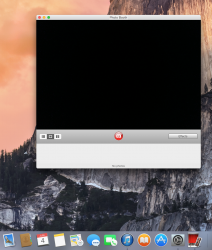
How have you got it to even show up?Well heres what Photobooth would look like in Yosemite, not that bad if you don't look at the full screen mode
Last edited:
In Safari, when you click in the addressbar, you'll get an overview of your recent pages, and your favorites. I used to have the favorites toolbar visible, and on it I have several folders, and some bookmarks. Now when I click in the URL area, it'll show the bookmarks, but not the folders...
Anyone else notice this? it makes it pretty unusable for me
I hate having the bookmarks visible. Even on Mavericks I had them hidden. To add and view bookmark folders I would just use the "Bookmarks" drop down menu in the menu bar. Much quicker than bringing up the bookmarks sidebar.
----------
In full screen mode, when you bring up the menubar, the traffic light buttons appear, and you can close the window or exit full screen mode.
Ooh, nice.
----------
Can anyone post a picture of the ⌘+tab UI? Does it have a blurred background?
Yes. All black for dock folders, launchpad folders, command tab are all blurred instead of black. Looks better to me.
----------
Yep, it has a blurred background depending on the wallpaper. Kind of similar to the dock. Icons seem a bit over the top in terms of size though! (Can't remember whether it was like this in Mavericks)
Yes, they were always large.
----------
I do hope they change that System Preferences icon to make it a little more like iOS's. Right now it's too contrasty and doesn't seem flat enough to fit in with the rest of the gang.
Preview isn't flat either. The new icons are kind of "semi-flat" which I think looks great.
How have you got it to even show up?
It's a Photoshopped image.
It's just me or you got that feeling like Tiger is back to the future? Just take a look at that Dock...
Thank God you can change icons and get rid of all this flatness and pastel/neon.
Weirdly, I tried changing an icon, and it just changes it to the .png symbol WTF?
It's just me or you got that feeling like Tiger is back to the future? Just take a look at that Dock...
Not really. A lot of people say 10.10 looks like Tiger because of the flat dock, but literally almost every other UI element is different. Tiger still had brushed metal..
Weirdly, I tried changing an icon, and it just changes it to the .png symbol WTF?
They have to be .icns - always have.
----------
You can no longer press ctrl+alt+cmd+b to go through different colour/blur options or turn off blur in Launchpad. Sad to see that go :/
The QuickTime framework got marked as deprecated in 10.9 - does Yosemite (DP1) still has QT in it or is it AVFoundation only?
I absolutely love the way you scroll through the tabs now. It's even better that the drop down menu before when you had a lot of tabs. And both are much superior to other browsers like chrome which just scrunch everything up the more tabs you have until everything is unreadable.
Also have this bug, since rebooting my battery indicator says 0 percent despite it being fully charged.
Also have this bug, since rebooting my battery indicator says 0 percent despite it being fully charged.
Yeah, this obviously needs a lot of work - I'll be interested to see what state the developer preview gets released in.
My thoughts at the moment:
I currently prefer the old design in many parts, but I the new design will grow on me if made more refined.
The main thing that bugs me is that the active windows frames are way too bright - they look just like the non-active windows in Mavericks. The transparent sidebars in Finder are also weird to me, as are the UI icon buttons colour (share, tabs etc) - especially the shape of the back/forward icons. The whole OS looks smarter with Reduce Transparency turned on imo.
Apps like Notes, Reminders, Messages etc are really nice
And I don't like the icons - but those won't change, so no point complaining
I hope this improves a vast amount (I know it will) over the next couple of months in terms of UI refinement. This is the first time I won't be using the new OSX's DP on day to day use, but I will come back and check to see how its improving with every update.
Developing...
Seems like everyone is forgetting this is only the first beta, one of many to come. People are so impatient lol.

Seems like everyone is forgetting this is only the first beta, one of many to come. People are so impatient lol.
Weirdly, I tried changing an icon, and it just changes it to the .png symbol WTF?
Open up the .png is Preview. Go to the edit menu, click copy, then go to the get info section of the app and highlight the current icon and then go into the edit menu and paste it in. You don't need .icns.
They have to be .icns - always have.
Tried that. Same result, no image, just a placeholder with '.icns.'
Not surprising. It was probably the worst offender of skeuomorphism and it's not exactly the first thing they rush to change. Would've looked too out of place if they kept it for now.
Never thought Apple would get rid of it either, it's one of the things everyone loves and one of the things that makes a Mac a Mac.
I am 99% sure it will be back by GM. Like you say, it wasn't a priority to get in the preview and the UI will take quite a bit of tweaking. BUT it's one of the most popular things to do at the Apple Store, so I'm sure it's here to stay in one form or another.
Can anyone confirm if Skype works in this current beta?
working great for me. I even have a quick reply thing in notification center like iMessages
Register on MacRumors! This sidebar will go away, and you'll see fewer ads.