Become a MacRumors Supporter for $50/year with no ads, ability to filter front page stories, and private forums.
Status
The first post of this thread is a WikiPost and can be edited by anyone with the appropiate permissions. Your edits will be public.
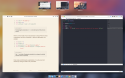
I'm noticing some crazy glitch with Safari, where I see this weird pop-up of the desktop image in the corner whenever doing something in Safari (scrolling, clicking, typing).

I've attached the image of the issue. I'll see if restarting the browser helps this.
 

Attachments

  • Screen Shot 2014-06-03 at 8.40.22 PM.png
    Screen Shot 2014-06-03 at 8.40.22 PM.png
    52.1 KB · Views: 2,239
safari downloads

Have they added an option to "ask where to save each file before downloading" to Safari preferences rather than having to select a default location?
 
Activity Monitor changes:

  • There is now a Compressed Memory column you can add to Activity Monitor.

  • Instead of unclear "Safari Web Content" processes, Activity Monitor now shows the full webpage url of the Safari Web Content so it's easier to see which webpage is taking the most amount of memory.
 
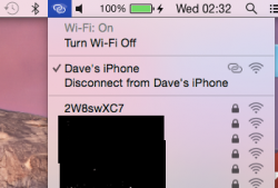
I can't recall seeing this in Mavericks, but the disconnect from the Hotspot Device?
 

Attachments

  • test.png
    test.png
    57.5 KB · Views: 2,960
quick question....

Does anyone know if an iphone 5 can bluetooth pair with an iMac 21.5-inch, Mid 2010 I can't get it to pair and do the "continuity"
 
Control Center coming soon?

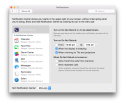
In noticing that Notification Center now lacks a toggle to turn on/off Do Not Disturb, I looked for the setting in System Preferences.

It states: "Turn on Do Not Disturb in <to be determined>."

As in... Notification Center? or maybe Control Center.

Perhaps this adds some more weight to the leaked images from March showing Control Center on the Mac.

Here's how I see it, either they removed Control Center as it wasn't ready for release, or they are still deciding whether or not it is suitable for the Mac. E.G. its one step to open the wifi menu without CC or two steps with CC (open CC, then click wifi).


What do you guys think?
 

Attachments

  • Screen Shot 2014-06-04 at 2.24.30 pm.png
    Screen Shot 2014-06-04 at 2.24.30 pm.png
    352.8 KB · Views: 313
  • IMG_2444.JPG
    IMG_2444.JPG
    547.6 KB · Views: 280
In noticing that Notification Center now lacks a toggle to turn on/off Do Not Disturb, I looked for the setting in System Preferences.

It states: "Turn on Do Not Disturb in <to be determined>."

As in... Notification Center? or maybe Control Center.

Perhaps this adds some more weight to the leaked images from March showing Control Center on the Mac.

Here's how I see it, either they removed Control Center as it wasn't ready for release, or they are still deciding whether or not it is suitable for the Mac. E.G. its one step to open the wifi menu without CC or two steps with CC (open CC, then click wifi).


What do you guys think?
The control centre depicted duplicates a lot of existing functionality. It also adds curious additions like Airplane Mode when no Macs (yet?) have LTE.

It’s unclear if Apple would replace existing methods or make it an additional way of accessing those features (more likely).
 
The control centre depicted duplicates a lot of existing functionality. It also adds curious additions like Airplane Mode when no Macs (yet?) have LTE.

It’s unclear if Apple would replace existing methods or make it an additional way of accessing those features (more likely).

I'd love to see the Apple Menu turn into a Mac version of control center. Ideally a (moderately) customizable one. If nothing else it would offer a nice symmetry with the new notification center. Given the apparently validity of the other screenshots it seems Apple is certainly toying with the idea anyway.

Notification center could become a home for many of dashboards former occupants, and control center could store more functional versions of menu bar items.
 
The "thinking" progress bar reminds me of the one in windows. I don't know if you can tell in the picture, but the progress bar sort of has a shimmer in it. OS X has completely lost its aqua feel.
 

Attachments

  • Screen Shot 2014-06-03 at 7.59.47 PM.png
    Screen Shot 2014-06-03 at 7.59.47 PM.png
    7.3 KB · Views: 2,046
The control centre depicted duplicates a lot of existing functionality. It also adds curious additions like Airplane Mode when no Macs (yet?) have LTE.

It’s unclear if Apple would replace existing methods or make it an additional way of accessing those features (more likely).

That is true.

Duplicating the existing functions would not be the case as the original functions would be removed. E.G. music player in control centre instead of the iTunes mini player, move Wifi/Bluetooth settings from top menu. Brightness in Control Center instead of having to go to system prefs (good if you're using a non-apple keyboard which doesn't have brightness buttons), AirDrop constantly on instead of having to open a Finder > AirDrop window to receive, and AirPlay Settings moved from top bar.

Also, you'll notice how the "About this Mac" and "System Preferences" buttons are located at the top. This implies that the Apple button (top left) will be the button to open Control Center. Also note the shut down/log off/sleep/restart buttons down below.

This makes perfect sense.

You have Notification Center on the right. You swipe from the right to open it/click the top right button.

And Control Center on the left. Swipe from the left/click top left button


Finally, Airplane mode. Unnecessary? What about wifi-only iPads? Airplane mode turns off wifi and bluetooth. It turns off cellular too on such devices, but still has a purpose on those that aren't cellular-enabled
 
Also, you'll notice how the "About this Mac" and "System Preferences" buttons are located at the top. This implies that the Apple button (top left) will be the button to open Control Center. Also note the shut down/log off/sleep/restart buttons down below.

Yes, I was pondering the very same in the thread that accompanied the original images. I also noted that the Apple Menu icon didn’t appear to be “active”. But now that I think about it, neither is the notification menu icon when the panel slides out.

This might have been scrapped out of Mac conservatism (remember the uproar when the Apple Menu was scrapped altogether in Mac OS X beta and when you couldn’t just put all your junk in it once it was reinstated in OS X 1.0? The Apple menu has a certain untouchable status among long time Apple users. The same happened with changing the start menu for Windows 8).

I actually hope this comes to fruition, this is a much more useful version of the menu, and one that can be swiped in from the other side with trackpads.

Totally understand where you're coming from with the Windows 8 start menu.

Great thing about this idea is that all of the Apple menu functionality can be retained while being enhanced.

It also means that users will have to know about control centre. This means that they will actually use it, whereas some iOS users don't even know where it is.

It would become essential for turning your computer off/logging out, and is much quicker than going into system prefs for wifi etc
 
Yeah. They're going to announce it when the new iTunes comes out in the fall.

That is true.

Duplicating the existing functions would not be the case as the original functions would be removed. E.G. music player in control centre instead of the iTunes mini player, move Wifi/Bluetooth settings from top menu. Brightness in Control Center instead of having to go to system prefs (good if you're using a non-apple keyboard which doesn't have brightness buttons), AirDrop constantly on instead of having to open a Finder > AirDrop window to receive, and AirPlay Settings moved from top bar.

Also, you'll notice how the "About this Mac" and "System Preferences" buttons are located at the top. This implies that the Apple button (top left) will be the button to open Control Center. Also note the shut down/log off/sleep/restart buttons down below.

This makes perfect sense.

You have Notification Center on the right. You swipe from the right to open it/click the top right button.

And Control Center on the left. Swipe from the left/click top left button


Finally, Airplane mode. Unnecessary? What about wifi-only iPads? Airplane mode turns off wifi and bluetooth. It turns off cellular too on such devices, but still has a purpose on those that aren't cellular-enabled
 
Does anyone know if there is an API for Spotlight yet?

Also I think the main UI problem is how saturated elements are, especially the blue elements like buttons, folders, and other icons. The shade of blue when you click an icon in the menu bar is much better.
 
I think I'm gonna keep a password now just because of how clean the login screen is. I thought I liked the flat gray one in Mavericks but this is much better.

----------

They have to be .icns - always have.

Tried that. Same result, no image, just a placeholder with '.icns.' :eek:


Open up the .png is Preview. Go to the edit menu, click copy, then go to the get info section of the app and highlight the current icon and then go into the edit menu and paste it in. You don't need .icns.

Do this. I first converted my png to icns but it looked like crap so I did this and it worked.

----------

Instead of unclear "Safari Web Content" processes, Activity Monitor now shows the full webpage url of the Safari Web Content so it's easier to see which webpage is taking the most amount of memory.
[/LIST]

This is a great addition. Having ten huge chunks "Safari Web Content" was so annoying. If you had a resource spike you just had to close tabs until you hit the right one.

----------

In noticing that Notification Center now lacks a toggle to turn on/off Do Not Disturb, I looked for the setting in System Preferences.

It states: "Turn on Do Not Disturb in <to be determined>."

As in... Notification Center? or maybe Control Center.

Perhaps this adds some more weight to the leaked images from March showing Control Center on the Mac.

Here's how I see it, either they removed Control Center as it wasn't ready for release, or they are still deciding whether or not it is suitable for the Mac. E.G. its one step to open the wifi menu without CC or two steps with CC (open CC, then click wifi).


What do you guys think?

I think they had control center early on and then scrapped it once they found out it's pretty pointless on the Mac. The only useful part would be the itunes part, but even then I usually have the miniplayer open anyways. I hope they add the itunes thing in notification center.

----------

That is true.

Duplicating the existing functions would not be the case as the original functions would be removed. E.G. music player in control centre instead of the iTunes mini player, move Wifi/Bluetooth settings from top menu. Brightness in Control Center instead of having to go to system prefs (good if you're using a non-apple keyboard which doesn't have brightness buttons), AirDrop constantly on instead of having to open a Finder > AirDrop window to receive, and AirPlay Settings moved from top bar.

This would be really disappointing. It just seems pointless. The menu bar would then just be empty wasted space and getting rid of the miniplayer as an option would be annoying. And me, like most Mac owners i'm guessing, have brightness on their keyboard.

I mean I'd be fine if this were an option, but I see no functionality gain from it and would hate if it was forced on me.
 
Option clicking the Wifi menu bar icon now shows MUCH more information than in Mavericks, like your IP address, router's address, etc.
 
Register on MacRumors! This sidebar will go away, and you'll see fewer ads.