Become a MacRumors Supporter for $50/year with no ads, ability to filter front page stories, and private forums.
Status
The first post of this thread is a WikiPost and can be edited by anyone with the appropiate permissions. Your edits will be public.
Those with non-retina screens and crappy fonts, try going to general settings and re-enabling the font smoothing.

Seems like it doesn't like the custom settings from older versions like "defaults -currentHost write -g AppleFontSmoothing -int x" and it all just screws up then disabling smoothing altogether.

It's a shame though we can't get even lighter fonts without losing smoothing, cause I gotta admit I really do like win8 high dpi crisp retina like font rendering when I boot it with virtual box. But hey at least most of the time it's somewhat better than it was with Mavericks, cause it's not everywhere bold now.
 
Last edited:
iMessage

Will iMessage sync across OS X Y and iOS devices? What I mean is when I delete a chat in iMessage on one device, will automatically delete on other devices. I hope so.
 
In the Platform State of the Union WWDC video, Apple states that they "hand treat" Helvetica Neue so that the "matrix" of Helvetica Neue closely matches Lucida grande. :D

If anyone wants to see it, it starts at 1:18:00
 
Last edited:
apple are showing off beta 2, 3 or higher in the keynote and website.

I wouldn't be so sure that the screenshot on their website represent the final look up to fine details. Look at the battery icon f.e., for me it clearly looks like old Mavericks design of it on Apple's website, while DP1 has new, wider and bigger battery icon.

Heck, even WiFi icon is old (yet not broken :D) on official preview screens:

https://www.apple.com/osx/preview/developer/images/developer_outside.jpg

Same goes for volume icon probably, can't say that for sure tho cause I'am too lazy to bring it back to status bar ;p
 
Last edited:
I don't like how they're making things thinner and bolder at the same time.
The in-between would be the best looking solution IMO.

I know this is iOS, but they're starting the same thing with OS X right now... Let's put it simply : ugly and inconsistent.
 

Attachments

  • Weight.png
    Weight.png
    42.7 KB · Views: 123
I don't like how they're making things thinner and bolder at the same time.
The in-between would be the best looking solution IMO.

I know this is iOS, but they're starting the same thing with OS X right now... Let's put it simply : ugly and inconsistent.

I like the icons from iOS 7 :)
 
Last edited:
I don't like how they're making things thinner and bolder at the same time.
The in-between would be the best looking solution IMO.

I know this is iOS, but they're starting the same thing with OS X right now... Let's put it simply : ugly and inconsistent.

Wtf. I haven't looked at iOS 8 that closely, but it looks like they're undoing their own work. Looks very gross.
 
I don't like how they're making things thinner and bolder at the same time.
The in-between would be the best looking solution IMO.

I know this is iOS, but they're starting the same thing with OS X right now... Let's put it simply : ugly and inconsistent.

Looks quite similiar to what HTC did when jumping to Sense 4.5 from Sense 4 on their android devices. The iOS 8 icons definitely look more modern, I don't particularly like the changed font though, interesting how it will look on iPhone.
 
Preview app?

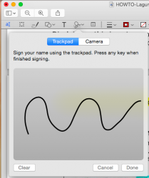
Can anyone comment on changes in the preview app? Specifically with regards to annotating pdfs. This is a very important function for me but very rarely covered by people talking about the new OS and almost impossible to search for (Developer Preview is all I ever get when searching for the preview.app). Apple changes something about the preview app with every OS X release (sometimes for the better, sometimes for the worse).

Specifically since OS X Lion (I think) the highlighting has been restricted to these absolutely god awful mud colors with no way to pick custom colors and the highlighting also has this terrible skeumorphic texture (imagine the uneven irregular look of an actual highlighter on rough paper). Even in mavericks I don't think they changed this and I'm hoping that it is changed now because it was a terrible decision. Anyone care to try opening a pdf in 10.10 and trying the highlighting function?

Thanks!
 
Well DUH!
I've been playing with betas for long enough to know not to complain. I was simply looking for any ideas since it seems to be working for some and not for others.

I was joking :p I don't know solution to fix sorry
 
Can anyone comment on changes in the preview app? Specifically with regards to annotating pdfs. This is a very important function for me but very rarely covered by people talking about the new OS and almost impossible to search for (Developer Preview is all I ever get when searching for the preview.app). Apple changes something about the preview app with every OS X release (sometimes for the better, sometimes for the worse).

Specifically since OS X Lion (I think) the highlighting has been restricted to these absolutely god awful mud colors with no way to pick custom colors and the highlighting also has this terrible skeumorphic texture (imagine the uneven irregular look of an actual highlighter on rough paper). Even in mavericks I don't think they changed this and I'm hoping that it is changed now because it was a terrible decision. Anyone care to try opening a pdf in 10.10 and trying the highlighting function?

Thanks!

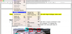
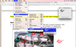
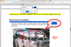
Seems to be working as it should.

PS. these rectangulars were there before editing.
 

Attachments

  • Screen Shot 2014-06-10 at 23.39.52 .png
    Screen Shot 2014-06-10 at 23.39.52 .png
    229.2 KB · Views: 215
  • Screen Shot 2014-06-10 at 23.42.58 .png
    Screen Shot 2014-06-10 at 23.42.58 .png
    389.2 KB · Views: 235
  • Screen Shot 2014-06-10 at 23.44.35 .png
    Screen Shot 2014-06-10 at 23.44.35 .png
    358.6 KB · Views: 179
  • Screen Shot 2014-06-10 at 23.50.16 .png
    Screen Shot 2014-06-10 at 23.50.16 .png
    61 KB · Views: 154
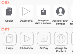
Am I the only one who prefers the iOS 8 icons? They look more substantial and easier to understand than the barebones iOS 7 versions.

I don't like how they're making things thinner and bolder at the same time.
The in-between would be the best looking solution IMO.

I know this is iOS, but they're starting the same thing with OS X right now... Let's put it simply : ugly and inconsistent.
 
In the Platform State of the Union WWDC video, Apple states that they "hand treat" Helvetica Neue so that the "matrix" of Helvetica Neue closely matches Lucida grande. :D

If anyone wants to see it, it starts at 1:18:00

What does this mean? I like the new font on my Retina MBP, but on my iMac I prefer the old font..
 
Does anyone know of any new animations with Yosemite? I really love all the animations in Apples Ecosystem.

There’s some really nice subtle animations to indicate form field and controls focus.

----------

You can now close tabs on other devices using iCloud tabs. I only tested Mac to iOS (no other Mac) but id expect it to work.

attachment.php

Yet another example of Apple going to extreme lengths to save marriages. :D

----------

OS X is the brand; Yosemite is the product name; 10.10 is the version number.

Fixed that for you.
 
What does this mean? I like the new font on my Retina MBP, but on my iMac I prefer the old font..

I will just requote the good old post :cool:

It goes for Mac OS X fonts in general, doesn't matter which font they choose, it's the rendering which makes the difference and that's what they meant during WWDC presentation.

<...>
Important non-disputable fact #1:

Apple and Microsoft have always disagreed in how to display fonts on computer displays. Today, both companies are using sub-pixel rendering to coax sharper-looking fonts out of typical low resolution screens. Where they differ is in philosophy.

  • Apple generally believes that the goal of the algorithm should be to preserve the design of the typeface as much as possible, even at the cost of a little bit of blurriness.

  • Microsoft generally believes that the shape of each letter should be hammered into pixel boundaries to prevent blur and improve readability, even at the cost of not being true to the typeface.

<...>
 
Why don't you click on the "Use as defaults" button?
Image

There is no default for window size, and "Use as defaults" only works on folders that have never had their view options changed. There is no way to change your icon size for ALL Finder windows. You'll always have random Finder windows that still have the icon size from before you changed it. It's just a mess.
 
I've experimented a bit, check the results :D
Apple original Yosemite folder:

Mine :D

I really think they need to change the entire color palette of folders. They're way too bright. I think a darker folder and lighter icon burnt into the folder would look better. Basically, the reverse color scheme of what you just posted.
 
How about fullscreen in OS X 10.10?
At the keynote of WWDC I didn't see the fullscreen button at the upper right corner of a windowof a program. We've seen this option since 10.7 but is it still in 10.10? And how works it?
 
Register on MacRumors! This sidebar will go away, and you'll see fewer ads.