As stated, Finder had no sidebar until v10.3 Panther. I'm running v10.4 Tiger on my PowerBook and that option is not present there.
Eh, it at least feels like it's been around a while. Either way, heres the proof:

As stated, Finder had no sidebar until v10.3 Panther. I'm running v10.4 Tiger on my PowerBook and that option is not present there.
You can... just option key boot to the TM disk and you will be in recovery. From there you can use Disk Util to erase the disk then just click restore.
I found two things:
1. Safari supports RSS again!
Image
2. Window zoom by double clicking on titlebar or toolbar

There is a new exclamation mark icon in the installer, I guess it's also system wide but I haven't checked
Image
It's kind of insignificant but whatever.
That's because you can't install it on a .dmg with no space.
Youtube now defaults to HTML5 and you can't change it back to flash player. Unfortunately, the youtube HTML5 player (like the netflix HTML5 player) feels incomplete. I really hope apple at least gives us an option to switch players, and for netflix too.
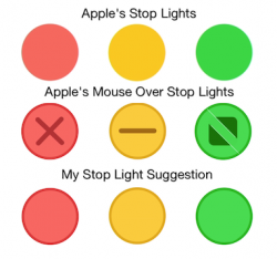
") Well, maybe not that bad. But Apple provides an edge to the stop lights when you mouse over them. Why not use that edge color in regular view? They will look more like buttons which you can click. See my pic below.
Well, maybe not that bad. But Apple provides an edge to the stop lights when you mouse over them. Why not use that edge color in regular view? They will look more like buttons which you can click. See my pic below.Ok, so I'm looking at a close up of the new translucent trash can in Yosemite and I see crumpled colored papers. Hmm! What do you suppose they are pictures of? I can't tell but knowing Apple engineers, they mean something, lol.
Generally speaking, I like the new Yosemite look. Menus are easier to read for me. The flat look will grow on me. I really like the translucency. But those stop lights at the top left of each window. They don't look like and it isn't intuitive that they are buttons. They almost look like accidental stains.
Generally speaking, I like the new Yosemite look. Menus are easier to read for me. The flat look will grow on me. I really like the translucency. But those stop lights at the top left of each window. They don't look like and it isn't intuitive that they are buttons. They almost look like accidental stains.
Has anyone else noticed they finally fixed bookmarks? I can now sort them in the root and subfolders, instead of that wacky bookmarks menu (now favorites) and it syncs and looks the same on the iPhone/iPad (iOS 8). Am I just noticing this or is it new? Because I used to hate how they were under root/menu/favorites/bar ...etc...
TL;DR: Safari bookmarks behave as expected now and sync/look the same across all devices.
Don't know if anyone else has mentioned it, but Yosemite seems to have vastly improved Wake From Sleep on my 13in rMBP. Even the latest updates to Mavericks had the occasional black-screen for 10-20 seconds when waking from sleep; so far on Yosemite it works flawlessly.
So I took the plunge and installed Yosemite on my MacBook Air and it's worked perfectly. Thanks for all the advice.
My question now is, if I get a new laptop can I install Yosemite on it as well? Will it simply appear in the 'Purchases' tab of the App Store app on that computer once I sign in to the App Store? Or will I have to find a way to redeem another Public Beta code or something...