But Apple provides an edge to the stop lights when you mouse over them. Why not use that edge color in regular view? They will look more like buttons which you can click. See my pic below.
They already have an edge like what you suggest if you look carefully.
----------
All The Little Things, or All The Little Bugs
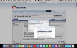
Some graphics elements feel not very clean on a non retina display, like this contact element with letters
All that non-retina screen stuff, you have to report it, it's your duty. The more reports Apple is gonna get, the more chances we have they revert back the fonts on those screens.
 in the top left corner. I tried taking a screenshot but couldn't since it thought I was entering my password