I had the same issue - Restarting Finder using killall Finder in Terminal seemed to fix it.
Cool. That worked. Thanks.
I had the same issue - Restarting Finder using killall Finder in Terminal seemed to fix it.
You can now have an option to show the full title bar in safari. Thank Apple for that eh, the first look was horrible imo?
Now compatible with Safari 8.0 (10538.46):
FullPath
Extending Safari, to include functionality that was removed by Apple, is far from ideal. An extension can not show the address in the expected place and so, there's an additional bar – below tabs, below the bookmarks bar.
Still, no title. I hope for Apple to come to its senses before Yosemite is released.
Postscript: a second screenshot. Since the so-called address bar of Safari has lost functionality, I'd like to lose it altogether (and favour the FullPath extension). Unfortunately: if it's removed from the toolbar, there's no visible response to Command-L; and it's not as easy to search.
So in the second shot I have demoted Apple's effort to the far right, reduced the number of buttons and shifted those, too, to the right. Also, the bookmarks bar is hidden.
With all of those changes, I can more easily see the address in the third party bar.
… Are you still complaining about this post-DP 5?
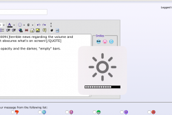
terrible news regarding the volume and brightness overlays. now it obscures what's on screen!
Yeah, I do not like the full opacity and the darker, "empty" bars.
No. To clear up any confusion: what you quoted was posted on the Friday the 1st of August.
The first I heard of Developer Preview 5 was today, Monday the 4th.
this is probably a bug, I think it will be translucent again on beta 6
this is probably a bug, I think it will be translucent again on beta 6
I hope it's a bug because this looks bad...
You can now have an option to show the full title bar in safari. Thank Apple for that eh, the first look was horrible imo?
Yeah, I do not like the full opacity and the darker, "empty" bars.
Has anyone else noticed that double clicking the grey area either side of the URL box in Safari now expands or shrinks the window size? The behaviour is similar to Windows (or at least it was in XP!), whereas double clicking this area in OS X used to minimise the window into the dock.
This behaviour also seems to happen in the Finder.
DP5! Maybe we can now return to little things as in features rather than people posting bug reports on the wrong thread! Yay!
- Whoa, the volume feedback sound has been changed, and for the better, it's not as annoying
- The look of Brightness/Volume controls have been tweaked.
- System Preferences now has integrated title bar.
- Slightly tweaked Calculator widget.
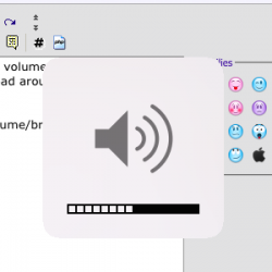
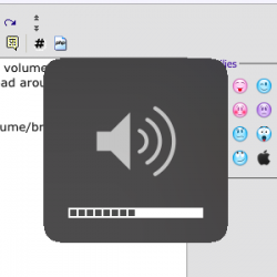
Question. Is this the volume controls shown with the volume all the way up? I'n trying to wrap my head around why the white and dark versions look different.
There's no special "all the way up" version of volume/brightness/keyboard illumination overlay like there is with a zero volume/zero keyboard illumination overlay.
Here's both light and dark mode overlays in DP5, same crops:
Is that was you were looking for?
Thanks.
I actually really like the new ones now, looks clean and makes sense to not have a dark one on "light mode" like previously.
The old overlays in Mavericks were quite transparent. I’m sure that it’s just a beta thing (not done cooking yet).

I like them too, it's just that the full opacity overlay seems intrusive especially when other UI elements in Yosemite are now featuring translucency.
I wonder if it could be tied to (or have a similar checkbox to) the Translucent Menu Bar option.
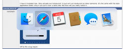
I have it installed now. They actually are translucent. It just isn't as translucent as other elements. It's the same with the dock application folder. Only if you put it over a solid color like blue will you really notice it.