Become a MacRumors Supporter for $50/year with no ads, ability to filter front page stories, and private forums.
Status
The first post of this thread is a WikiPost and can be edited by anyone with the appropiate permissions. Your edits will be public.
Hey all, think I may have found a couple new features, though I'd love to learn that I was wrong as well:

Notification badges are now slightly transparent.

Safari > File > Export as PDF is now a handy option instead of printing and saving as a PDF. (or, I've been subjecting myself to the print preview screen for no good reason for many years lol)

----

Also, is Yosemite Beta 5 only available to Developers? (I ask because I'd be quite jealous, since I'm sitting with the less-cool public preview crowd ;D)

1) Export as PDF has been an option for a while, that is not new with Yosemite.

2) Yes, Developer Preview 5 is only available for Developers. Public beta is for the public (names come in handy!), and there has been only one release of that. Public Beta releases will be less frequent than Developer Preview releases.
 
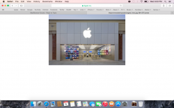
In Safari, I really like when you click an image link and it opens in the middle of the screen, love this little details.
 

Attachments

  • Screen Shot 2014-08-06 at 6.00.21 PM.png
    Screen Shot 2014-08-06 at 6.00.21 PM.png
    398.3 KB · Views: 401
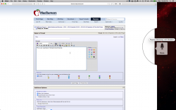
Because of live dictation, you can tell it to replace words, end dictation, delete words or letters, etc.

Sorry if this has already been discovered, or in mavericks, but I did check the OP and a mavericks computer and I found nothing.
 

Attachments

  • Screen Shot 2014-08-06 at 7.28.55 PM.png
    Screen Shot 2014-08-06 at 7.28.55 PM.png
    676.2 KB · Views: 271

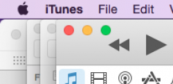
I prefer the application switcher in Mavericks.

In the screenshot above, Yosemite has too much brightness. Harsh on the eye.

When the switcher appears in Mavericks: the transparency is not a problem, and the darkness is welcome. Good contrast. It's a relatively massive interface; I could not possibly confuse that array of huge icons with anything in the background.

Also better for me, in Mavericks: the application switcher (singular); not multiple switchers.

The multiplicity in Yosemite is distracting, disorienting. Whenever the switchers appeared, I wondered whether I was looking at the wrong display.
 
Hi everyone. It's the first time I post in MacRumors' Forum even if I watched it before as a Holy Bible for my Mac's problems. Now I need a help.
I installed the public beta (with its uncountable problems. But it's a beta, I knew it before) and everything worked ok, but I found a problem that could be terrible: Yosemite doesn't backup anything.

It stuck in "preparing backup" and stay there for a looooooooong time without making the backup. My last backup is the one before I installed Yosemite (with Mavericks) but I worked a lot since this date.

Please, tell me it's not just my problem D:

Thank you very much!

p.s. sorry for my english mistakes. I'm not english native speaker, but I'm studying to improve it.:rolleyes:

Welcome. You'll generally get more assistance if you make a new thread instead of posting about a problem in the middle of a long thread. How long is it in "preparing backup?" It may be in this for hours as it calculates all of the changes of Yosemite before actually backing up.
 
Silly me. By "full title bar" I assumed that you meant "full title bar" rather than "full URL/web address." I was actually somewhat happy, because I disapprove of the way that Jony Ive has destroyed Safari's title bar and shoved the back/forward buttons up there to the right of the close, minimize, full screen buttons. Indeed, it is almost laughable the way those back/forward buttons now have to jump around the screen when switching into full screen mode (and when showing and hiding the menu bar while in full screen mode). You'd think that such a ridiculous workaround would have been enough to make Ive realize that he had made a design mistake, but no. He's apparently too stupid to realize how stupid he is.

Ive is a horrible UI designer. He has no idea what he's doing. He's a menace. That there isn't more outrage over the mess he's making of things only goes to show that the majority of today's Mac users are ex-Windows users who never had a good UI to begin with.

If you refer to the menu bar as a "task bar" I'm talking about you.

I think the switch of current FullScreen is lest efficient too! It needs a dedicated gesture~~
 
I really like the new Safari UI specially the way it makes the bookmarks-bar unnecessary.

It's overall so compact, unobtrusive and sleek that it's a pleasure to have the window floating in the middle of the screen not maximised, albeit Safari is a consumption-only application.

In Mavericks it's impossible not to go full-screen.


I think the title-bar and toolbar blending is a good thing for not document-based applications, too.
 
Last edited:
I really like the new Safari UI specially the way it makes the bookmarks-bar unnecessary.

It's overall so compact, unobtrusive and sleek that it's a pleasure to have the window floating in the middle of the screen not maximised, albeit Safari is a consumption-only application.

In Mavericks it's impossible not to go full-screen.


I think the title-bar and toolbar blending is a damn good thing for not document-based applications, too.

Titlebar is a useless thing, so good apps like Chrome, give it up.
Another point of view, Mac os keeps menu bar, which has app name (equal to Titlebar) as the first item at most of time.
I think it is looks very clean to remove Titlebar when FullScreen.
 
window corners

i've only just realized that safari has a different rounded corner. or is it just a visual trick? it's slightly bigger than the other apps'. and also the bottom right corner in finder was always like that?
 

Attachments

  • Screen Shot 2014-08-07 at 16.11.06.png
    Screen Shot 2014-08-07 at 16.11.06.png
    30.7 KB · Views: 154
  • Screen Shot 2014-08-07 at 16.28.31.png
    Screen Shot 2014-08-07 at 16.28.31.png
    76.2 KB · Views: 203
I've read back a few pages, but there are sooooo many :D

I think both of my issues are iCloud related. Anyone have the same issue?

- can no longer use Back to my Mac screen sharing from MBA running 10.9.4 and iMac running 10.10 PB
- Aperture has decided to stop updating my photo stream on iMac, although still working fine on MBA and other iOS devices

Otherwise, I think it's pretty good and I'm sure they fix Safari so when it opens you can just type straight into the address bar and not have to click it first :p
 
Safari > File > Export as PDF is now a handy option instead of printing and saving as a PDF. (or, I've been subjecting myself to the print preview screen for no good reason for many years lol)

It's definitely there in Mavericks too! But I never noticed either and went to Print to do it all this time... Oh well :D

Screen Shot 2014-08-07 at 05.11.50 pm.png
 
Does OS X still have the spiny rainbow wheel when loading something?

Yes, it does and it looks exactly the same.

----------

i've only just realized that safari has a different rounded corner. or is it just a visual trick? it's slightly bigger than the other apps'. and also the bottom right corner in finder was always like that?

Safari's corner may be related to the fact it has the traffic lights centered vertically, but that doesn't make much sense. I'd say submit a bug report and see what they say. Finder does not look like that to me; report it.
 
Yes, but you seldom see it when you're running on an SSD...

I only see it when iTunes 12 is quitting...

It depends on what apps you use. I've only seen it once or twice on my iMac with a HDD and I do a lot of rendering (both 3D and HD video), and photo editing as well as gaming.
 
Silly me. By "full title bar" I assumed that you meant "full title bar" rather than "full URL/web address." I was actually somewhat happy, because I disapprove of the way that Jony Ive has destroyed Safari's title bar and shoved the back/forward buttons up there to the right of the close, minimize, full screen buttons. Indeed, it is almost laughable the way those back/forward buttons now have to jump around the screen when switching into full screen mode (and when showing and hiding the menu bar while in full screen mode). You'd think that such a ridiculous workaround would have been enough to make Ive realize that he had made a design mistake, but no. He's apparently too stupid to realize how stupid he is.

Ive is a horrible UI designer. He has no idea what he's doing. He's a menace. That there isn't more outrage over the mess he's making of things only goes to show that the majority of today's Mac users are ex-Windows users who never had a good UI to begin with.

If you refer to the menu bar as a "task bar" I'm talking about you.

I hope you realize Apple has dozens of designers working on OS X. Also, the things you are complaining about are laughable... not because they are stupid, but because you are making such a big deal out of things that don't actually effect anything. So what if they are hidden and then reappear when in fullscreen mode? Doesn't slow anything down and the functionality wasn't removed...
 
Anyone else notice the tweaked iBooks icon?

Old on left, New on Right
 

Attachments

  • ibooks.jpg
    ibooks.jpg
    67.8 KB · Views: 125
I noticed but I think its so slightly tweaked that it no one bothered to post about it.

Because it's already mentioned in the first post in this thread under DP5 section :)

To be honest though, I don't think I can see a difference, I think the shadows are a bit darker on the bottom of the new icon, yeah?
 
Because it's already mentioned in the first post in this thread under DP5 section :)

To be honest though, I don't think I can see a difference, I think the shadows are a bit darker on the bottom of the new icon, yeah?

The radius of the curve is less in the newer icon.
 
This was just a bug. …

The opposite: I'm certain that it was, not for the first time, an intended feature of a pre-release. A feature, present by design. But not (yet) the best design for what was intended.

… a perfect solution for you. … don't complain. This is the new interface, so accept it …

That's dreadful advice. EDIT: an apology – it's not so dreadful.

We're here to appreciate the progress and submit constructive feedback directly to Apple …

+1 to appreciation of progress.

Some aspects of the current interface are regressive. Some people have a deep dislike for the worst of the interface problems. Should all of these people simply accept the worst from Apple?

Remember the title of this thread? …

See below.

… I think the title-bar and toolbar blending is a good thing for not document-based applications, too.

Hiding the title in Safari is a critical mistake.

At least: consider the many use cases where windows or tabs of Safari are document-based.

Titlebar is a useless thing, so good apps like Chrome, give it up.

What's good about abandoning titles?

Will hiding the title of this thread help people to remember the title? See above.

I think it is looks very clean to remove Titlebar when FullScreen.

Agreed.

A big problem: for the many use cases that do not involve fullscreen, abandonment of the title bar concept is proving to be messy. If you were to attempt to rewrite the current human interface guidelines – to reflect Yosemite in its current state – you would be alarmed at what is being discarded or ignored by Apple.

… In the world of technology you have to keep an open mind, otherwise you're in for a very short run. ¬

True.

A big problem: parts of Yosemite are exemplary of a closed-minded attitude from Apple.
 
Last edited:
Register on MacRumors! This sidebar will go away, and you'll see fewer ads.