grahamperrin: I agree and I disagree. In the case of apps like Finder and Safari, apps that now rely heavily on the use of tabs, the tabs themselves does the same job as the title-bars. Therefore, I think a dedicated title-bar would be superfluous. (I would actually like to see Finder look more like Safari by removing the title-bar)
Got a tip for us?
Let us know
Become a MacRumors Supporter for $50/year with no ads, ability to filter front page stories, and private forums.
OS X 10.10 Yosemite: All The Little Things
- Thread starter WhackyNinja
- WikiPost WikiPost
- Start date
- Sort by reaction score
You are using an out of date browser. It may not display this or other websites correctly.
You should upgrade or use an alternative browser.
You should upgrade or use an alternative browser.
- Status
- The first post of this thread is a WikiPost and can be edited by anyone with the appropiate permissions. Your edits will be public.

Does anyone else want Now Playing to be in the widget bar instead of one other click over in Notifications? I can't seem to change that either, whether in System Preferences or the edit button in the widget bar.
Tabs are no substitute for a title bar
Unfortunately not.
Mavericks
The title – in its entirety, unless it's extraordinarily long.
Command-click to reveal the proxy icon menu.
Yosemite
Is there a proxy icon menu and if so, from where does the menu drop?
Mavericks
Title bars:

Yosemite
Title bars?
… the tabs themselves does the same job as the title-bars. …
Unfortunately not.
Mavericks
- The title.
The title – in its entirety, unless it's extraordinarily long.
Command-click to reveal the proxy icon menu.
Yosemite
- A bar of tools that might be not needed, with a domain (or description of a domain or a URL) in the midst of the tools
- a bar of bookmarks that almost certainly do not relate to the body of the page
- only part of a title – in the midst of other parts of other titles that may be unrelated to the required title.
Is there a proxy icon menu and if so, from where does the menu drop?
Mavericks
Title bars:
Yosemite
Title bars?
Last edited:
A Finder without title bars?
Here, for fun:
https://forums.macrumors.com/posts/19431755/
– at the foot of the post.
… (I would actually like to see Finder look more like Safari by removing the title-bar)
Here, for fun:
https://forums.macrumors.com/posts/19431755/
– at the foot of the post.
Wouldn't the Window Menu be far more helpful in that case if you were interested in finding an open window by its title. Not sure how realistic it is to end up with your windows being laid out in any way close to that, unless you never return to any of the previously opened windows.
Command + Space and type 'terminal' or whatever is how I'm using to launching things. Now I get a recommendation for "The Terminal" on itunes...
Interesting, in DP5, when I type command + space then terminal, the top hit is Terminal.app, and when I hit return before getting those results, it launches Terminal.app..
Interesting, in DP5, when I type command + space then terminal, the top hit is Terminal.app, and when I hit return before getting those results, it launches Terminal.app..
Well I'm hoping it is just taking a long time to index everything. Especially since the mds process is showing 395% CPU at the moment in top... you'd think they'd throttle indexing to only a certain percentage of available CPU time instead of hitting all cores at max. My little macbook air is getting super hot.
Edit: turns out the 2X RDP client entry in /Applications was causing an infinite mirror effect (../Applications/Applications/Applications etc) during indexing. I think OS X quarantined the app and caused the problem but since this is my first mac I'm not familiar with OS X enough to say. I used 'fs_usage' to locate the culprit (example: sudo fs_usage -w -f filesys mdworker)
Last edited:
Wouldn't the Window Menu be far more helpful in that case if you were interested in finding an open window by its title.
I do often use, and enjoy using:
- the Window menu
- the Dock menu of windows of Safari (Control-Click)
- Mission Control application windows
However: no combination of those things can be a substitute for titles that are already present present without additional key strokes, additional clicks, additional mouse movements or additional gestures.
Unfortunately not.
Mavericks
- The title.
The title – in its entirety, unless it's extraordinarily long.
Command-click to reveal the proxy icon menu.
Yosemite
- A bar of tools that might be not needed, with a domain (or description of a domain or a URL) in the midst of the tools
- a bar of bookmarks that almost certainly do not relate to the body of the page
- only part of a title – in the midst of other parts of other titles that may be unrelated to the required title.
Is there a proxy icon menu and if so, from where does the menu drop?
Tbh, I rarely have any problems displaying the entire title of a tab (unless I'm missing something here. Pretty new to the Mac). I got the tabs bar always showing, so even with a single page open, I can see the title of the page. Now, ofc, you get into trouble when you got multiple tabs open (+ max width of your screen...), but in worst case, you can always hover over to reveal the full title. Practical? Not for the power-user.
As far as the proxy icon menu goes, you do get to the icon by clicking the address bar - but without any functionality. I guess they could (and should) move this over to the tabs? Shouldn't be hard to replicate. I don't know. The context menu of a tab as it is right now is pretty useless to me (new tab, close tab etc.). They got dedicated buttons (+ shortcuts), so I'm not sure why the options are even there. Don't know of anyone that uses them. In any case... I got no idea. I get your point. Removing something always comes at a cost.
That's dreadful advice.
That's very true; when chopped up like that, my advice is pretty bad. The context in which I presented it, however, paints a different picture.
i've only just realized that safari has a different rounded corner. or is it just a visual trick? it's slightly bigger than the other apps'. and also the bottom right corner in finder was always like that?
Look at that hot mess. Zero consistency. I love how none of the close, minimize, zoom buttons are in the same position from window to window. What happened to consistency in the Mac OS? It used to be the poster child for good UIs, and now its this schizophrenic clown barf.
----------
I hope you realize Apple has dozens of designers working on OS X. Also, the things you are complaining about are laughable... not because they are stupid, but because you are making such a big deal out of things that don't actually effect anything. So what if they are hidden and then reappear when in fullscreen mode? Doesn't slow anything down and the functionality wasn't removed...
It bothers me because its amateurish in a half-assed Windows kind of way, rather than classy, consistent, and polished like it should be. The arguments youre making are the kind of things PC users used to say when Mac users futilely attempted to explain to them why the Mac UI was superior.
Hi MarsV, my namne is Albert. I'm turning 74 this winter and I've been using Apple computers since 1978. I later on joined said company in 1981. I have endured pretty much every change in both hardware and software imaginable, including the disaster known as NeXT (but let's not dwell on that).
I don't know what your problem is in regards to Ive. Maybe one of his creations touched you or a family member inappropiately. What do i know.
I do however know that the man that you are critisizing has designed every damn Apple product that you have used since the early nineties. I have had the pleasure of working with Sir. Ive on numerous projects and I can guarantee that he is everything but a "moron without any sense of design".
That is just inconsiderate and immature.
If you truly call yourself one of the people who championed OS X during the development cycle, why would you stop now? Because you don't like where the style trends are going in regards to interface design? In the world of technology you have to keep an open mind, otherwise you're in for a very short run. What if we never tried to keep up with the competition in regards interface developments and only stuck with OS 9 because people felt "more comfortable" with it?
At Apple we always tried to be at the forefront of engineering and design, and there would be little to no chance of changing that initiative.
So yeah, you are oldschool. You want to keep the past going in hopes of never having it catch up with you. But if you want to be using the latest and best, you will just have to embrace change or send feedback.
So as the only inofficial representation of Apple in regards to this subject, i truly hope that you understand how little your opinion matters when you suggest never exploring new territory. The rainbow logo will never make a comeback.
Trust me. I never listened to anyone outside.")
Im not old school. Ive been waiting for years for Apple to do something truly new and great, and all weve gotten is silly, tacky, childish, and clumsy ad nauseum. I guess Im just fed up with all these tired, unoriginal detours Apple has been making down PlaySkool lane transparency? Really? and disappointed that, rather than doing something revolutionary, Ive is following the flatness trend and doing a poor job of it.
Yeah, I know Jony Ive designed all those pretty Macs Ive used. Hes the genius who put the G4 Cubes expansion ports on the bottom of the Cube where they couldnt be reached without flipping the thing on its top.
Anyway, I never liked the rainbow logo, and Yosemites neon blue folder icons are hardly what Id describe as exploring new territory. Its the same old stuff, twice as ugly.
Meanwhile, Sir Ive cant even get the window buttons to align.
Sigh.
Look at that hot mess. Zero consistency. I love how none of the close, minimize, zoom buttons are in the same position from window to window. What happened to consistency in the Mac OS? It used to be the poster child for good UIs, and now it’s this schizophrenic clown barf.
----------
It bothers me because it’s amateurish in a half-assed Windows kind of way, rather than classy, consistent, and polished like it should be. The arguments you’re making are the kind of things PC users used to say when Mac users futilely attempted to explain to them why the Mac UI was superior.
It...is...a...BETA. Why does nobody think about that obvious fact before complaining about something which could change drastically in the months left before the OS comes out?
Sorry, not trying to single you out here, but probably a third of this thread is full of whining and complaining and arguing, none of which is part of "all the little things," and I'm not planning on quoting a hundred posts.
Fair enough. I also wasn't necessarily attacking you as much as pointing out that in the history of OS X, there have been much more severe technical bugs, and that a visual glitch is just that. I personally think that the OS is better than ever.
By User Interfaces, are you referring to the way that we interact with the computer or just the coat of paint applied to the UI? Yosemite compared to Mountain Lion & Mavericks does feel a little cartoonish, much like the initial impression of iOS 7 did. But it's far from the "lickable" interface of early OS X.
Its mostly the coat of paint Im referring to, but also inconsistencies such as the placement of the close, minimize, and zoom buttons, the way that the back and forward buttons are sometimes below the title bar and sometimes shoved up into the title bar (and sometimes actually move from one position to the other as a workaround), the poor system font choice which cant be changed, and the fact that more than a decade after OS Xs debut, the Finder, due to contradictions in its design goals, still forgets window view settings. And so much more.
I dont like to see the Mac crumble into the kind of inconsistent, tacky disarray which in the past always characterized Windows. I want OS X to be better than Windows, not translucent and flat just like Windows, not less consistent in its placement of UI elements. I want OS X to be so much better than Windows that it amazes me.
But nothing about Yosemite amazes me. It puzzles and disappoints me.
The context in which I presented it, however, paints a different picture.
It's easy to overlook the contexts in long topics such as this, but that's no excuse. DaJoNel, my apologies.
probably a third of this thread is full of whining and complaining and arguing, none of which is part of "all the little things,"
Good point. I'll take some of the responses to Yosemite looks terrible!
Has anyone noticed any changes or new features to Mail aside from the ones that were presented in the keynote? Federighi mentioned they focussed on the basics or something like that. So far, I dont see any differences.
I was hoping for an option to hide certain folders from the sidebar, or some advanced gestured or quick-toggles like on iOS 7/8.
I was hoping for an option to hide certain folders from the sidebar, or some advanced gestured or quick-toggles like on iOS 7/8.
Has anyone noticed any changes or new features to Mail aside from the ones that were presented in the keynote? Federighi mentioned they focussed on the basics or something like that. So far, I dont see any differences.
I was hoping for an option to hide certain folders from the sidebar, or some advanced gestured or quick-toggles like on iOS 7/8.
I haven't noticed any Mail changes really. I just wish there was a way to search within conversations better. If I search for a key word, Mail will return the conversation(s) that its found in, but I still have to scroll through the conversation to find it. Sometimes, these conversations are quite long and I have no idea where in the thread the word is that I'm looking for.
It would be nice if Mail would pop out or jump to and/or highlight the specific email in the conversation where my keyword is located.
Sigh, they reverted the behavior of Automatic Termination. In previous DPs apps would only disappear from the Dock after a while. Now it's instantaneous. So I disabled it again.
Yosemite is beautiful. I didn't like it on the pictures but I love it now that it is on my MacBook.
Anyone else notice the tweaked iBooks icon?
Old on left, New on Right
Good. I much prefer the shallower curve.
grahamperrin: I agree and I disagree. In the case of apps like Finder and Safari, apps that now rely heavily on the use of tabs, the tabs themselves does the same job as the title-bars. Therefore, I think a dedicated title-bar would be superfluous. (I would actually like to see Finder look more like Safari by removing the title-bar)
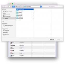
The title bar should definitely stay in Finder. The proxy icon is handy for drag-and-drop operations, and can provide important information about the directory tree of the current folder.
Register on MacRumors! This sidebar will go away, and you'll see fewer ads.