Become a MacRumors Supporter for $50/year with no ads, ability to filter front page stories, and private forums.
Status
The first post of this thread is a WikiPost and can be edited by anyone with the appropiate permissions. Your edits will be public.
The title bar should definitely stay in Finder. The proxy icon is handy for drag-and-drop operations, and can provide important information about the directory tree of the current folder.

Indeed they are, but as I think more and more about it (and I did elaborate on this in another post), I think one simple solution could be to move the proxy icon to the tab itself. They could further display the proxy icons in grey, similar to the sidebar, for a more neutral look.

You could also go all the way "Safari-style" and just have a huge adress-bar, which would display the current folder name (and a proxy icon) when inactive and give you a bunch of options when clicked (including search).

Many ways to keep all the functionality but still get rid off the dedicated 18-20px at the top!

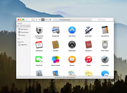
I did a humble mockup.. It turns out being a nice design, isn't it? :cool:
 

Attachments

  • Yosemite-FinderWin-mockup.png
    Yosemite-FinderWin-mockup.png
    508 KB · Views: 677
One thing I noticed this morning, when using Activity Monitor is that every tab in Safari, which has a unique process, is named after the website it's connected to...
If that’s true, that’s great news. Often, when I find a process is unresponsive I wonder which website is causing it. :)
 
I appreciate the effort and the execution of the mockup itself is great, but in practice that would be inconvenient... I couldn't fit half of my toolbar items in there :p

If the search field was just a button that slide in a field when pressed, there should be more space.
 
If the search field was just a button that slide in a field when pressed, there should be more space.

Mhm... what I was talking about was combining the title and search bar, like in Safari. That way you free up all the space you need. Not sure your mockup sold the idea completely! A+ for effort, though. But in any case - getting slightly off-topic here with all of this... We'll have to wait and see if they make any changes. I doubt they will spend any effort on making every single window consistent.

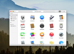
EDIT: Another thing comes to mind viewing the mockup. The status-bar is also something they could (and should?) change. They could easily show folder info at the bottom of the sidebar instead and remove the bar entirely. Most of us never fill up the sidebar vertically, so why not? Another 20px saved.
 
Last edited:
Mhm... what I was talking about was combining the title and search bar, like in Safari. That way you free up all the space you need. Not sure your mockup sold the idea completely! A+ for effort, though. But in any case - getting slightly off-topic here with all of this... We'll have to wait and see if they make any changes. I doubt they will spend any effort on making every single window consistent.

EDIT: Another thing comes to mind viewing the mockup. The status-bar is also something they could (and should?) change. They could easily show folder info at the bottom of the sidebar instead and remove the bar entirely. Most of us never fill up the sidebar vertically, so why not? Another 20px saved.

mmm... I can figure out..
 

Attachments

  • Yosemite-FinderWin-mockup2.png
    Yosemite-FinderWin-mockup2.png
    506.7 KB · Views: 388
:eek::eek::eek::eek:
Ok but.. *just for this time*.. It's not good to see own work modified by others.


It needs to fix few very subtle details for MartinAppleGuy's changes to be perfect.;)

I know. Sorry, I too am a Graphic Designer amongst other things. I just wanted to see what it would look like and your image was the first to hand to try out. I would never normally do this.

----------

:eek::eek::eek::eek:
Ok but.. *just for this time*.. It's not good to see own work modified by others.


It needs to fix few very subtle details for MartinAppleGuy's changes to be perfect.;)

It was a bit of a rush job. I had other things to be doing (don't we all :p).
 
Lots of annoyances, the icon designer has lots to do. This bluetooth icon is niggling me at the moment.

attachment.php


Also think there should be more integration between the menubar and the menu popups, they seem displaced from one another.

Can't seem to pick a good wallpaper to go with the blurred theme.
 

Attachments

  • Screen Shot 2014-08-12 at 19.46.12.png
    Screen Shot 2014-08-12 at 19.46.12.png
    12.5 KB · Views: 2,285
Safari Bookmarks Editor

Has anyone used the bookmarks editor in Safari 8? I find the one in Safari 7 a bit lacking. Screenshot perhaps?

Thanks,
 
Yosemite feels very unresponsive, especially Safari, compared to Mavericks. Betas will be Betas, and I expect the GM to finally bring Mavericks-level fluidity back to the OS and core apps, but the farther we get into the development period, the less likely it seems that the current performance is unintentional.
 
Yosemite feels very unresponsive, especially Safari, compared to Mavericks. Betas will be Betas, and I expect the GM to finally bring Mavericks-level fluidity back to the OS and core apps, but the farther we get into the development period, the less likely it seems that the current performance is unintentional.

Because smoothing out an entire OS is so easy, and takes only 2 months.
 
Has anyone used the bookmarks editor in Safari 8? I find the one in Safari 7 a bit lacking. Screenshot perhaps?

Thanks,

From what I'm seeing, theres no changes. You get the same list view with a single button in the bottom-left corner ("new folder") and a search-bar on the opposite side. Slightly more space between each item in the list, but thats about it.
 
Register on MacRumors! This sidebar will go away, and you'll see fewer ads.