Got a tip for us?
Let us know
Become a MacRumors Supporter for $50/year with no ads, ability to filter front page stories, and private forums.
OS X 10.10 Yosemite: All The Little Things
- Thread starter WhackyNinja
- WikiPost WikiPost
- Start date
- Sort by reaction score
You are using an out of date browser. It may not display this or other websites correctly.
You should upgrade or use an alternative browser.
You should upgrade or use an alternative browser.
- Status
- The first post of this thread is a WikiPost and can be edited by anyone with the appropiate permissions. Your edits will be public.
Then you know when to upgrade.You're right. It takes them until 10.10.3
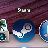
Oooo Steam is now ready for Yosemite... (I don't have Yosemite tho)
Has anything else changes aside from the icon?
")
Has anything else changes aside from the icon?
No, nothing new within Steam it self.
I think that icon is going to be added on both Mac and Windows since that icon is the same icon they use for Steam OS. It's their new icon in general.
Mavericks users wouldn't gotten that new icon if it was preparing for Yosemite. At least thats how other 3rd party apps works when new OS X updates releases.
I really want to see a Yosemite redesign tho
Steam needs waaaaay more than a redesign. Its such a crappy app in general, not well-designed, bloated, slow.
Steam needs waaaaay more than a redesign. Its such a crappy app in general, not well-designed, bloated, slow.
So true. It's literally just a crappy port from Windows to be honest. Even with a powerful MacBook Pro 15" with 16GB of RAM Steam has a slow UI.
I just hope developers will take Yosemite's design to good use and not just put in minor new UI elements. Like when iOS 7 released, every app developer needed to redesign their App. It was a pain when Spotify took 4 months after iOS 7's release to redesign their app tho.
I'm hoping to see huge changes in many mainstream applications like Steam, Spotify, AirMail and so on.
You should report that terrible design choice of splitting the back and forward buttons in OS X Yosemite. I sure did.
I like buttcracks though.
It keeps things consistent though, since nothing else in the system ditches the round corners to keep thing connected.
Has anything else changes aside from the icon?
The UI has been updated across all platforms to better fit in with SteamOS. Not really a Yosemite thing though.
Has anything else changes aside from the icon?
Yes, theres a darker interface.
The UI has been updated across all platforms to better fit in with SteamOS. Not really a Yosemite thing though.
The new icon and new interface are also present in Windows, so this has nothing to do with Yosemite at all. It's purely a choice of Valve for how they wanted Steam to look now.
I think that icon is going to be added on both Mac and Windows since that icon is the same icon they use for Steam OS. It's their new icon in general.
Mavericks users wouldn't gotten that new icon if it was preparing for Yosemite. At least thats how other 3rd party apps works when new OS X updates releases.
Okay, it's their new icon. I haven't logged on to my Windows since the update.
But why did you say Mavericks wouldn't get the new icon? Does Yosemite use a different version of Steam? I thought it had something to do with Yosemite because I see some 3rd party app icons are turning flat since Yosemite announcement.
When is the next update for the beta?
I installed this last week, and this week, there were no real updates. It's buggy as hell. I installed it on a separate drive.
Some of the new stuff is pretty cool, but really hope to see a newer less buggy version soon.
I installed this last week, and this week, there were no real updates. It's buggy as hell. I installed it on a separate drive.
Some of the new stuff is pretty cool, but really hope to see a newer less buggy version soon.
I installed this last week, and this week, there were no real updates. It's buggy as hell. I installed it on a separate drive.
Some of the new stuff is pretty cool, but really hope to see a newer less buggy version soon.
You could download the DP5 update, usually only available to developers, but someone else posted this link to it.
http://swcdn.apple.com/content/downloads/04/01/031-05887/mogez4r4pycbopdo2bj5ll2aemp4lg1phf/OSXUpd10.10.pkg
You're a splendid person. Thank you.
My pleasure, Razeus. I learn from all you guys...
So true. It's literally just a crappy port from Windows to be honest. Even with a powerful MacBook Pro 15" with 16GB of RAM Steam has a slow UI.
I just hope developers will take Yosemite's design to good use and not just put in minor new UI elements. Like when iOS 7 released, every app developer needed to redesign their App. It was a pain when Spotify took 4 months after iOS 7's release to redesign their app tho.
I'm hoping to see huge changes in many mainstream applications like Steam, Spotify, AirMail and so on.
It STILL doesn't have Retina support.
AAARRRGGGHHH.
(Yes, I counted that out.)
It's everything but consistent. The view options toolbar button, which are a combined set, are still attached to each other.I like buttcracks though.
It keeps things consistent though, since nothing else in the system ditches the round corners to keep thing connected.
Oooo Steam is now ready for Yosemite... (I don't have Yosemite tho)
Where did you find this picture?
Where did you find this picture?
It's my own screenshot. Why?
I did a humble mockup.. It turns out being a nice design, isn't it?
Looks good, but I like having a full width title bar so that I can just grab a window and move it without having to hunt for a spot free of buttons and other UI clutter in which to click. I'm happy to sacrifice 20 pixels for that convenience.
Apple needs to stop reinventing the wheel. They got a lot of this stuff right the first time, way back in 1984. There are more important things in OS X to fix without putting all this wasted effort into fixing what's not broken.

WIFI Issues
In DP5 when enabling the automatic login I get connection over WIFI but no Internet connection.
When I re-enable the password login - everything works fine.
Does anyone have the same issue?
In DP5 when enabling the automatic login I get connection over WIFI but no Internet connection.
When I re-enable the password login - everything works fine.
Does anyone have the same issue?
DP 6 is out everyone!
I was hoping they would also release a new iTunes 12 build along with it, but no dice.
* New Preferences icons
* New battery icon
* Help menu bar items are now readable in dark mode.
I was hoping they would also release a new iTunes 12 build along with it, but no dice.
* New Preferences icons
* New battery icon
* Help menu bar items are now readable in dark mode.
Last edited:

DP 6 is out everyone!
I was hoping they would also release a new iTunes 12 build along with it, but no dice.
* New Preferences icons
* New battery icon
Wow! That was wishful thinking!
Thanks Apple. Maybe it works better this time.
Register on MacRumors! This sidebar will go away, and you'll see fewer ads.