Become a MacRumors Supporter for $50/year with no ads, ability to filter front page stories, and private forums.
Status
The first post of this thread is a WikiPost and can be edited by anyone with the appropiate permissions. Your edits will be public.
i still think apple shot themselves in the foot with the loading bar indicator on start up. it makes it seem like the mac takes longer to load than it actually does kinda like time goes by slower when you keep looking at the bar of a download back in the day

Yep. They should remove it. Then, it's also consistent with iOS. As a very last option they could re-add the spinning wheel, but the loading bar ist horrendous.
 
… The original design was brilliant and then almost every change they made to it was a downgrade from the original.

I wouldn't say almost everything. Many of the small changes in Yosemite do truly represent an upgrade from Mavericks.

;-) :confused:
 
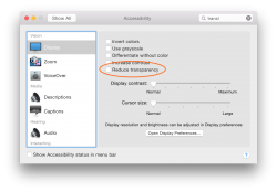
Wait a minute. What happened to the 'transculent menu bar' option that was there in Leopard 10.5.2 to Yosemite DP5? Here's how it looks in DP5. Note the red rectangle. Has that option vanished in DP6, or was it moved somewhere else?

It wasn't entirely removed; it was instead bundled into Accessibility's reduce transparency option.
 

Attachments

  • Screen Shot 2014-08-18 at 2.27.40 PM.png
    Screen Shot 2014-08-18 at 2.27.40 PM.png
    210.4 KB · Views: 274
I wouldn't say almost everything. Many of the small changes in Yosemite do truly represent an upgrade from Mavericks.

;-) :confused:

I didn't say that. I mean usually the stuff looks better the first go rather when they go back and refine it.

Other than stuff like the volume indicator though... it was obvious it wasn't finished from the getgo.

I must say though.. if there's one thing i absolutely prefer about mavericks, it's how much more transparent the menu bar was. it just looked much better how it would react with contrasting colors.
 
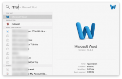
In Mavericks you can search in Spotlight using the first letters, but in Yosemite you can't, for example in mavericks(and previous OS X), you can type mw for microsoft word
 
…I mean usually the stuff looks better the first go rather when they go back and refine it. …

I understand … the wink was intended to show that it was a light-hearted interpretation.

Years ago, I enjoyed an early feature that disappeared long before release. A feature that might have appealed to power users. That was a one-off, I couldn't guess the reason for its disappearance.

From my relatively limited point of view (spending far less time testing than in the past), the little things in Yosemite have become progressively better. YMMV.
 
In Mavericks you can search in Spotlight using the first letters, but in Yosemite you can't, for example in mavericks(and previous OS X), you can type mw for microsoft word

So, what you are saying is that I can’t do this? Obviously, it works for me.
 

Attachments

  • Screen-Shot-2014-08-18-at-3.56.27-PM.png
    Screen-Shot-2014-08-18-at-3.56.27-PM.png
    65.4 KB · Views: 221
It wasn't entirely removed; it was instead bundled into Accessibility's reduce transparency option.

Right, but I don't want the options to be bundled. I much prefer an opaque menubar, but I like translucency elsewhere in the OS. In DP5 and beneath, I was able to enjoy an opaque menubar, while seeing translucency in the rest of the OS. Removal of this option reminds me of a more locked-down iOS feel.

To add insult to injury, when updating to DP6 from DP5, the opaque menubar went away in favor of the translucent menubar. I hope this is a temporary oversight/experiment on Apple's end, and that it'll be fixed. I definitely will be submitting feedback about this.
 
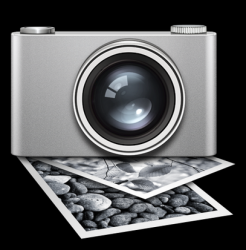
Is this Image Capture icon new?
 

Attachments

  • Schermata 2014-08-19 alle 04.09.00.png
    Schermata 2014-08-19 alle 04.09.00.png
    207.7 KB · Views: 139
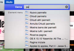
The search in Help menu is instantaneous now ( actually after the first search ).

The menu item indicator must get some 'flat' love.
 

Attachments

  • Schermata 2014-08-19 alle 04.19.21.png
    Schermata 2014-08-19 alle 04.19.21.png
    90.9 KB · Views: 130
  • Schermata 2014-08-19 alle 04.25.12.png
    Schermata 2014-08-19 alle 04.25.12.png
    14.2 KB · Views: 2,110
New you are not connected to the internet page in safari
 

Attachments

  • Screen Shot 2014-08-18 at 11.22.41 PM.jpg
    Screen Shot 2014-08-18 at 11.22.41 PM.jpg
    69.4 KB · Views: 220
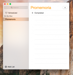
There is a new transparent selection strip in sidebar but it is just in Mail, Contacts and Reminders.

It needs to be system-wide, looks very nice :cool:
 

Attachments

  • Schermata 2014-08-19 alle 05.24.22.png
    Schermata 2014-08-19 alle 05.24.22.png
    179.2 KB · Views: 262
I'm not sure it is new in DP6, but when you change the selected file of a Finder window, there is a subtle smooth fade in/out transition of the icon image in the info panel.
 
There is a new transparent selection strip in sidebar but it is just in Mail, Contacts and Reminders.

It needs to be system-wide, looks very nice :cool:

Whoa, that does look good! That HAS TO BE system wide at some point, otherwise there will be even MORE inconsistency.
 
New 'Funk' Alert noise in DP 6

I have also noticed a very, very slightly adjusted 'Funk' alert noise in OS X Yosemite DP 6. Don't know if its just me, but It certainly sounds different. Go and have a try for yourself.
 
Last edited:
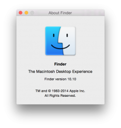
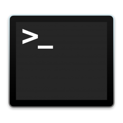
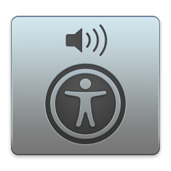
There is a new Finder icon in the "About Finder" menu! This is the same Finder icon shown on Apple's US website. In addition, the Terminal icon now has a MacBook Pro screen like bezel and backlight and the Voiceover Utility icon has a blue-grey tint. Some alert noises have also been adjusted, including 'Funk' and 'Submarine'. There is probably more in this beta I haven't noticed, but I haven't seen anyone else noticing any of these changes yet :)
 

Attachments

  • Screen Shot 2014-08-19 at 3.47.47 pm.png
    Screen Shot 2014-08-19 at 3.47.47 pm.png
    140.2 KB · Views: 138
  • Untitled.png
    Untitled.png
    199.3 KB · Views: 131
  • Untitledasd.png
    Untitledasd.png
    812.3 KB · Views: 123
Two questions

1) Does Speakable Items look and work the same? In Mavericks it still seems identical in appearance to the first version of OS X and isn't as accurate as OS X's Dictation feature. Doesn't seem to have added any features since OS 9 either.

2) Is networking between local Macs better? I have always a lot of trouble with file sharing on Macs--just very unreliable. Does it seem better?
 
I'm not sure it is new in DP6, but when you change the selected file of a Finder window, there is a subtle smooth fade in/out transition of the icon image in the info panel.

i dont see this, can you advise where exactly?
 
There is a new transparent selection strip in sidebar but it is just in Mail, Contacts and Reminders.

It needs to be system-wide, looks very nice :cool:

When you select it, it's blue. When you click somewhere else it would be inactive and normally be gray but now it's translucent. So it's basically the inactive state for the selection.
 
i dont see this, can you advise where exactly?

In the column view of Finder windows, in the preview panel on the right.

However in Yosemite Finder there is a command in the View menu to show the preview panel whatever is the current view of the icons not just for the column view.

----------

When you select it, it's blue. When you click somewhere else it would be inactive and normally be gray but now it's translucent. So it's basically the inactive state for the selection.

Yes, I see.. then it is actually the inactive state for the selection that has to be a system-wide behavior.

In the sidebar of Finder and every other application there is not a inactive state for selection when you select some item in the main panel (/view).

It looks inconsistent.

P.S.
I noted that Mail has always the transparent selection in sidebar, even if there's not selection in the other panels. So it is definitely inconsistent.
 
Last edited:
Register on MacRumors! This sidebar will go away, and you'll see fewer ads.