I don't think Finder or messages has it. I'm sure there are others too.
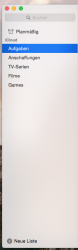
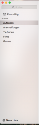
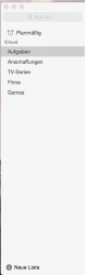
To clearify all this: When you select a sidebar item it turns blue. If you click somewhere else in the app the sidebar item goes to inactive state and is translucent. If the window is inactive all blur effects are disabled an it gets gray.
Screenshot 1-3 show this with the Reminders app. The Mail app has a bug since Lion that it always displays its sidebar items in inactive mode. The selected sidebar item is always translucent there.


")