Got a tip for us?
Let us know
Become a MacRumors Supporter for $50/year with no ads, ability to filter front page stories, and private forums.
OS X 10.10 Yosemite: All The Little Things
- Thread starter WhackyNinja
- WikiPost WikiPost
- Start date
- Sort by reaction score
You are using an out of date browser. It may not display this or other websites correctly.
You should upgrade or use an alternative browser.
You should upgrade or use an alternative browser.
- Status
- The first post of this thread is a WikiPost and can be edited by anyone with the appropiate permissions. Your edits will be public.
Makes sense. That's where you find it in iOS 7 too. Shame though you can't have a transparent Dock with a solid menu bar anymore though. Or does the Dock remain transparent now?Probably already mentioned, but the translucent menu bar is no longer a separate option in PB2. This is now controlled by the global reduce transparency option under Accessibility.
Would anyone be kind enough to post a shot of cover flow in the latest build? Thank you")
Sure.
Attachments
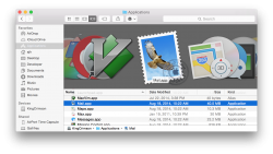
I think the Downloads icon in Safari is new in DP6/PB2.
Yes it is. Also, once you press clear downloads, the icon disappears.
I don't think Finder or messages has it. I'm sure there are others too.
Finder and Messages both have it. Perhaps apps without side bars like App store or settings.
They really need to address this inconsistency between apps!
Contacts:
-Blue selection darker than others
-Search word smaller than others
-Buttons on bottom instead of top
Notes:
-terrible yellow selection
-texture
-no trasparency on sidebar or selection and withe search field
-new note button on the wrong side
Messages
- No transparent selection
Reminders
-new reminder button on the right side
-light grey loupe (darker on others) when the windows is not selected
All
- Search field not aligned
Attachments
They really need to address this inconsistency between apps!
Contacts:
-Blue selection darker than others
-Search word smaller than others
-Buttons on bottom instead of top
Notes:
-terrible yellow selection
-texture
-no trasparency on sidebar or selection and withe search field
-new note button on the wrong side
Messages
- No transparent selection
Reminders
-new reminder button on the right side
-light grey loupe (darker on others) when the windows is not selected
All
- Search field not aligned
The notes has the texture as a tiny remnant of skeuomorphism left. Not nearly as annoying as a fully yellow lined notepad so I don't have much problem with it. I don't like the yellow though. But it's from iOS so I guess that's the reasoning.
The dark blue in contacts should be what all the others are though. I much prefer the darker shade, the lighter ones look washed out.
Also, I don't see why they needed to squeeze down the itunes top bar. Looked better before.
Last edited:
Public Beta 2 bug:
When you are trying to format your iphone through itunes, itunes will crash and leave your phone in DFU mode. When you retry the process, itunes crashes every time.
Be careful. Do NOT try to format your phone unless you have a backup computer to do it.
When you are trying to format your iphone through itunes, itunes will crash and leave your phone in DFU mode. When you retry the process, itunes crashes every time.
Be careful. Do NOT try to format your phone unless you have a backup computer to do it.

This may be new in recent DPs, or maybe not, but I took out my old white apple remote so I could control my iTunes from across the room, and the batteries were low. I hit the play button, and the entire screen got blurred, like the mission control background, and in the middle of the screen was a diagram showing how to replace batteries in the remote.
I am at least sure that the full screen blur thing is new in Yosemite. I would post screenshots but I think I need to restart the computer to make it show the message again, and I don't really feel like doing that at the moment.
I am at least sure that the full screen blur thing is new in Yosemite. I would post screenshots but I think I need to restart the computer to make it show the message again, and I don't really feel like doing that at the moment.
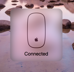
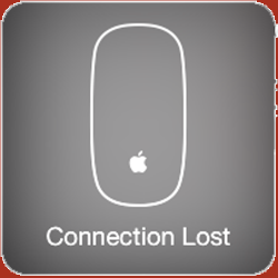
Pretty sure the Apple Mouse BT connection thingy (see below) is new in DP6.
The translucent box around it is new.
Attachments
The translucent box around it is new.
and the Apple logo on the mouse
Thoughts on the removal of the sound when adjusting volume? I kinda like it.
You can reenable it in the preferences. The new sound is also better.
IDK if this has been mentioned but there's a new charging bar. It's no longer like on iOS. The lightning bolt is INSIDE the battery now...
It bothers me that the lightning bolt no longer changes into a plug symbol when the battery is charged like in previous versions of Mac OS X. A quick glance at the icon always makes me think the battery is charging, even when it's not.

It bothers me that the lightning bolt no longer changes into a plug symbol when the battery is charged like in previous versions of Mac OS X. A quick glance at the icon always makes me think the battery is charging, even when it's not.
Maybe they want to make it ore like iOS; which also doesn't show a plug...
Register on MacRumors! This sidebar will go away, and you'll see fewer ads.