Got a tip for us?
Let us know
Become a MacRumors Supporter for $50/year with no ads, ability to filter front page stories, and private forums.
OS X 10.10 Yosemite: All The Little Things
- Thread starter WhackyNinja
- WikiPost WikiPost
- Start date
- Sort by reaction score
You are using an out of date browser. It may not display this or other websites correctly.
You should upgrade or use an alternative browser.
You should upgrade or use an alternative browser.
- Status
- The first post of this thread is a WikiPost and can be edited by anyone with the appropiate permissions. Your edits will be public.

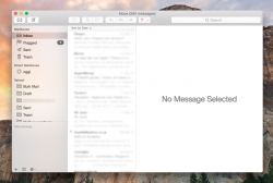
That is stunning, could you post mail?
Here it is Mail.
The transparent selection looks a bit changed in screenshoots, though.. a bit darker, a bit less fluorescent..
It is even better on live.
Attachments
Last edited:
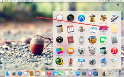
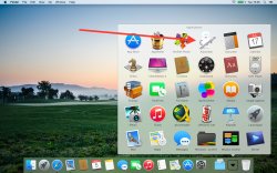
new chess icon ... sh-ts getting real now
Mine looks no different.

There is a new transparent selection strip in sidebar but it is just in Mail, Contacts and Reminders.
It needs to be system-wide, looks very nice
Just looked at this for the first time dragging it across wallpapers.
Holy crap, it's so sexy.
And there are people who don't like 10.10....
new chess icon ... sh-ts getting real now
That seems like an over-exposed picture of the normal icon? I didn't get any changes, though I haven't yet downloaded the newer DP6..
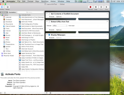
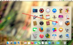
Also, Automator now has a translucent background:
Attachments
Last edited:
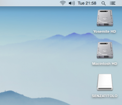
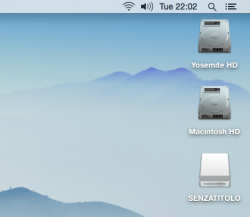
A comparison between old and new volumes icons.
Anyone thinks the new icons are ugly?
Whoa, those are ugly.
A comparison between old and new volume icons.
Someone thinks the new icons are ugly?
I think they look good, refreshing at the very least...unfortunately my computer doesn't have the new icons somehow, so I can't enjoy them.
There is a new transparent selection strip in sidebar but it is just in Mail, Contacts and Reminders.
It needs to be system-wide, looks very nice
I'm confused. This is system-wide for me.
I'm confused. This is system-wide for me.
What about in the messages app? Or, finder?
What about in the messages app? Or, finder?
Yep. And Calendar etc. I tried to upload a picture but the filesize is too big.
A comparison between old and new volume icons.
Someone thinks the new icons are ugly?
I can't change the Hard-drive icons... I'm on DP6 and tried Killall Finder, quitting finder (i have the shortcut on), resetting the thing in Finder > Preferences.
Any other ways?
Yep. And Calendar etc. I tried to upload a picture but the filesize is too big.
I'd love it was in the Finder too, but in my Yosemite it's not this way.
I want to be sure we are talking about the transparency of just the selection strip, not of the whole sidebar.
----------
I think they look good, refreshing at the very least...unfortunately my computer doesn't have the new icons somehow, so I can't enjoy them.
I can't change the Hard-drive icons... I'm on DP6 and tried Killall Finder, quitting finder (i have the shortcut on), resetting the thing in Finder > Preferences.
Any other ways?
This worked for me.
sudo find /private/var/folders/ -name com.apple.dock.iconcache -exec rm {} \;
sudo find /private/var/folders/ -name com.apple.iconservices -exec rm -rf {} \;
sudo mv /Library/Caches/com.apple.iconservices.store com.apple.ic
This worked for me.
sudo find /private/var/folders/ -name com.apple.dock.iconcache -exec rm {} \;
sudo find /private/var/folders/ -name com.apple.iconservices -exec rm -rf {} \;
sudo mv /Library/Caches/com.apple.iconservices.store com.apple.ic
YES!! This worked perfectly
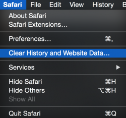
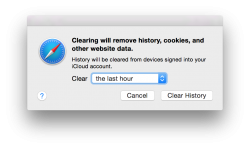
New Safari menu bar item with "Clear History and Website data".
So we pretty much have "Reset Safari" back, except this only clears history, cookies and cache.
I think this error page is new too:

So we pretty much have "Reset Safari" back, except this only clears history, cookies and cache.
I think this error page is new too:
Attachments
Last edited:
new chess icon ... sh-ts getting real now
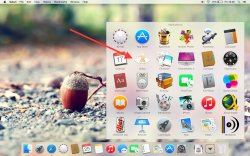
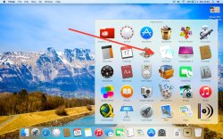
This is a bug from DP1 which has been reported several times. Basically once you scroll up and down app folder from dock, some icons become washed out.
Attachments
-
 Screen Shot 2014-07-25 at 16.28.29_1.jpg1.2 MB · Views: 266
 -
 Screen Shot 2014-07-26 at 01.21.19_1.jpg1.2 MB · Views: 243
 -
 Screen Shot 2014-07-26 at 12.03.49_1.jpg1.7 MB · Views: 237
 -
 Screen Shot 2014-08-05 at 01.46.41_1.jpg1 MB · Views: 267
 -
 Screen Shot 2014-08-05 at 16.05.29_1.jpg1.3 MB · Views: 225
A comparison between old and new volume icons.
Someone thinks the new icons are ugly?
They're fugly. I wanted to see new drive icons for a while, especially since magnetic disks are largely being phased out in Apple's product line in favor of SSDs. Instead of taking the opportunity to recreate them from the ground up, these are weird, washed-out, blue-tinged versions of the old set. Pretty disappointing.
I don't mind the shift to simpler icons, but it looks like they're dropping the ball when it comes to trying to incorporate a slightly flatter design while trying to retain some of the original design. They should be a little more ambitious, IMO.
Oh ok, my mistake. Yes the selection strip only appears like that in some apps. However it doesn't stay like that in any app. As soon as I click on a selection, it turns blue.I'd love it was in the Finder too, but in my Yosemite it's not this way.
I want to be sure we are talking about the transparency of just the selection strip, not of the whole sidebar.
This is a bug from DP1 which has been reported several times. Basically once you scroll up and down app folder from dock, some icons become washed out.
yes, its very annoying
This worked for me.
sudo find /private/var/folders/ -name com.apple.dock.iconcache -exec rm {} \;
sudo find /private/var/folders/ -name com.apple.iconservices -exec rm -rf {} \;
sudo mv /Library/Caches/com.apple.iconservices.store com.apple.ic[/QUOTE]
Thanks This worked for me as well. Just had to do it twice, and execute killall Finder command.
sudo find /private/var/folders/ -name com.apple.dock.iconcache -exec rm {} \;
sudo find /private/var/folders/ -name com.apple.iconservices -exec rm -rf {} \;
sudo mv /Library/Caches/com.apple.iconservices.store com.apple.ic[/QUOTE]
Thanks
This worked for me as well. Just had to do it twice, and execute killall Finder command.A comparison between old and new volume icons.
Someone thinks the new icons are ugly?
I don't think they are. Just Yosemite-ish.
There is a new transparent selection strip in sidebar but it is just in Mail, Contacts and Reminders.
It needs to be system-wide, looks very nice
It is system-wide.. where do you not see it?
It is system-wide.. where do you not see it?
I don't think Finder or messages has it. I'm sure there are others too.
Register on MacRumors! This sidebar will go away, and you'll see fewer ads.