did they revert the wifi icon? It looks terribly bulky on a Macbook Air. I haven't updated my rMBP yet.
On non-retina screens, yes. I have my rMBP hooked up to an external, and it's bulky on there, but still thin on the retina display.
did they revert the wifi icon? It looks terribly bulky on a Macbook Air. I haven't updated my rMBP yet.
I and many others prefered the original thin fonts from the first iOS 7 betas. You act as if iOS and OS X are private projects Apple is developing just for you and the group who think just like you. That's not the case, no offense.Since the iOS 7 betas, it seems as if Apple had so much pride that they're willing to do exactly the opposite of what we're asking for.
Help shape OS X Yosemite, my ass.
I and many others prefered the original thin fonts from the first iOS 7 betas. You act as if iOS and OS X are private projects Apple is developing just for you and the group who think just like you. That's not the case, no offense.
Do you guys still have this? I've updated to DP7... hopping this to be fix... but then...it's still the same
Image
Natgeo site loads perfectly fine here... is it clipping every website you use?
You were being forced to buy an iMac huh? I can only imagine what a terrible nightmare that must have been for you.I would have bought a Retina iMac in 2013, but its non-existence forced me to buy a regular one. We still have problems with thin fonts on these screens.
Anyone have direct link to the update? App Store is not an option.
did they revert the wifi icon? It looks terribly bulky on a Macbook Air. I haven't updated my rMBP yet.

Do you guys still have this? I've updated to DP7... hopping this to be fix... but then...
Image
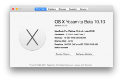
Hm, mine doesn't say beta on DP7.
EDIT: Yes it does, it just doesn't show up right away.
Hm, mine doesn't say beta on DP7.
EDIT: Yes it does, it just doesn't show up right away.
Mine still doesn't. 14A343f
Mine doesn’t show Beta or DP either.
Well when I first checked it wasn't there so I minimed it to write a reply. But when I came back to it couple of mins later it was already showing "beta".
Funny....same happened here. Just checked again and suddenly it says Beta!
Kinda interesting they've waited till DP 7 to implement this text.hahahah It's beta, indeed!... It seems you have to check it twice before it confirms you that it is a BETA!