Become a MacRumors Supporter for $50/year with no ads, ability to filter front page stories, and private forums.
Status
The first post of this thread is a WikiPost and can be edited by anyone with the appropiate permissions. Your edits will be public.
Ok so my post with link to apple.com open mirror was deleted. No idea why is it considered warez since anyone can access it directly from Apple, but whatever...


No, seems like they actually finally fixed it.
It now shows the actual signal strength or at least the "connecting to network" animation is right and you can tell the difference between full and empty bars.


DARK mode / theme and it's font rendering slightly improved, but it still looks odd if you ask me :p
It's kinda like these classic "high contrast" themes on windows. Well I'am exaggerating, but there is definitely too much contrast to keep it in "general" rather than in "accesibility" settings.. It just doesn't look clean the way it is.

EDIT: Image
Sorry for the crappy quality but on-screen recorder just couldn't catch it properly.

Next to the battery icon and the wifi is in full signal, it looks strange. Before it was maybe too thin and now it's too thick in my opinion.
 
And to be honest I liked it more the old way. Now when watching the movie you can't see ***** behind the volume popout.

Gotta agree, this has annoyed me as well. This is even more applicable to iOS because the popup takes more screen estate.

Design over functionality again.
 
Actually…

Kinda interesting they've waited till DP 7 to implement this text. :p

I don't know when it was added, but I'm on DP6/PP2, and if I minimise the About This Mac window, and open it again, the beta tag is showing. Had never seen it before, but following the "double-check" method, it appears. God knows when it was introduced.
 
That dark version of spotlight looks terrible, what the hell. :(

----------

They finally fixed Calendar's off-center date text issue. It's properly aligned again:

Image

Now they just have to fix all these other UI issues. Barf...

Image Image Image

I know. Not sure why it takes so long to fix this stuff. It's just UI.

Also not a fan of the white highlight color in dark mode. Can anyone tell me if the highlight color is still blue when dealing with the regular light colored right click menu?
 
I don't know when it was added, but I'm on DP6/PP2, and if I minimise the About This Mac window, and open it again, the beta tag is showing. Had never seen it before, but following the "double-check" method, it appears. God knows when it was introduced.
LOL it's showing up for me immediately now on DP2. Maybe they activated it remotely! :p
 
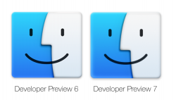
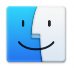
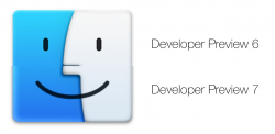
Finder has had a nose job.

The blue is also a different gradient, with a lighter left edge.

Finder DP7.png

Overlay.png

Comparison.png
 
Fonts have definitely been thinned out + sharpened.

Menu bar is also a bit more translucent and 'vibrant', better matching the dock.

Same background.

Menu 1.png

Menu 2.png
 
Probably old news, but a lot of the Spotlight search features were limited to US only. I'm in Australia and seem to be getting most of them now (finally).
 
Probably old news, but a lot of the Spotlight search features were limited to US only. I'm in Australia and seem to be getting most of them now (finally).

Which ones are you getting ? I have been waiting for nearly by theatres to come up if you search for a movie but I don't see that yet.
 
Which ones are you getting ? I have been waiting for nearly by theatres to come up if you search for a movie but I don't see that yet.

Nope, that's the one thing I don't have yet. I get movie results in the iTunes Store but not actual playing times. But I'm getting the Wiki pages, App/iTunes Store results, music results, various web results. Wasn't getting any of those before, it was only doing a local HD search. I guess they just need to find local area-specific providers for things like movie times.
 
Why would they do that? Shadows are necessary or else the OS will all blend together. And I much prefer the bigger subtler shadow than the old shorter dark one.

The drop-down shadow is far too large though (some wallpapers look crap on Yosemite because of it). You don't need shadows this large to determine layers (I'm a Graphic Designer).
 
Can anyone confirm this? It looks like Apple changed the default for Play User Sound Effects from OFF to ON.

I just upgraded another of my Macs to Yosemite DP7, and it plays a sound when I adjust volume and brightness. I did not change the setting myself until just now when I turned it off.
 
Can anyone confirm this? It looks like Apple changed the default for Play User Sound Effects from OFF to ON.

I just upgraded another of my Macs to Yosemite DP7, and it plays a sound when I adjust volume and brightness. I did not change the setting myself until just now when I turned it off.


The sounds are off by default now
 
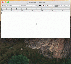
I didn't discover this, and don't know who did, but I read it on iDownloadBlog...quicktype is actually built into yosemite! It is definitely not complete as you can tell by the lack of blur effects, but in certain apps like text edit, if you hit the space bar (such as after typing a word), and hit the escape key, it brings up a drop down menu with a bunch of suggestions for words.

Below is a GIF, which I guess won't actually play when I attach it to my post, so click on it and it should work.
 

Attachments

  • QuickType-demo.gif
    QuickType-demo.gif
    1.4 MB · Views: 636
Unless I noticed it too late, there seems to be a new icon for Calendar alerts:
Screen Shot 2014-09-04 at 10.37.21 AM.png

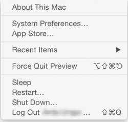
Also, was there always a log out option from the Apple menu?
Screen Shot 2014-09-04 at 10.38.26 AM 2014-09-04 10-40-11 2014-09-04 10-40-21.jpeg
 
Register on MacRumors! This sidebar will go away, and you'll see fewer ads.