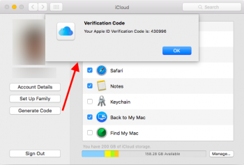
Introduced in Yosemite.not sure if this has been posted or was introduced in yosemite but here:

Got a tip for us?
Let us know
Become a MacRumors Supporter for $50/year with no ads, ability to filter front page stories, and private forums.
OS X 10.11 All The Little Things!
- Thread starter Galaxas0
- WikiPost WikiPost
- Start date
- Sort by reaction score
You are using an out of date browser. It may not display this or other websites correctly.
You should upgrade or use an alternative browser.
You should upgrade or use an alternative browser.
- Status
- The first post of this thread is a WikiPost and can be edited by anyone with the appropiate permissions. Your edits will be public.
That's not new, it's been there for a long time.
Do you mean this setting? If so, not new.
View attachment 563434
Mk, just hadn't payed much attention to it before then.
Doesn't feel any faster than the first beta.sorry if i am offending anyone,,.. i did see multiple comments but did not anywhere find about the system speed overall? is it more snappier system wide?
Doesn't feel any faster than the first beta.
Agreed. Although, it does feel a bit more polished. WindowServer is using less CPU, Safari is more stable, apps feels a bit quicker to launch, and so on.
New Color Profiles in System Preferences > Displays
Very exciting, some new professional color profiles including linear workflows; lets hope Apple's new GPU drivers enable 10bit output for these new profiles...
Yup. That was introduced in 10.6.Mk, just hadn't payed much attention to it before then.
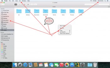
I have noticed one thing. I overall like the new San Fransisco but file and folder names in Finder is way too thin. I am have compared it with yosemite and it looks thin to me. I am using macbook retina and I can see that new font is thinner just in file and folder names but boldish on the rest of the system. I have attached some screenshots, have a look at them please. I personally want a little more bold text for file and folder names.



I think they made the height of safari tabs smaller in beta 2. Can anyone confirm?
I can confirm, they have
I have noticed one thing. I overall like the new San Fransisco but file and folder names in Finder is way too thin. I am have compared it with yosemite and it looks thin to me. I am using macbook retina and I can see that new font is thinner just in file and folder names but boldish on the rest of the system. I have attached some screenshots, have a look at them please. I personally want a little more bold text for file and folder names.
View attachment 563515 View attachment 563517 View attachment 563514
That's not thinner, that's smaller. It's a bit weird that is smaller, but maybe you can personalize the font size displayed for files and folders... or maybe not.
That's not thinner, that's smaller. It's a bit weird that is smaller, but maybe you can personalize the font size displayed for files and folders... or maybe not.
Nope, it is exactly same default size 12. I'd say it is thinner

I overlaid The "Document" label from the folder and the "Document" label from the sidebar in the screenshot you provided. The UI text is slightly larger in the menu bar and sidebar.
The good news is that going back multiple versions of OS X when you right click a folder theres a "Show View Options" item, in the resulting pop up you can set the text size for folder labels.

Hope that helps clear up the confusion.
Nope, it is exactly same default size 12. I'd say it is thinner
Feels more like a bug than a tweak to me.A couple of little things I noted in "Apple Seeds Second OS X 10.11 El Capitan Beta to Developers":
Brighter Terminal icon (left)


Quick Look tweaked. Ick, seriously.

Hope that helps clear up the confusion.
I see what you mean. But the text size and hasn't changed in the sidebar or in the menu bar in the OS. However the files and folder names text thinness have changed. Here I am comparing yosemite folders text, size 12 with El Capitan folder size 12. You can definitely see the difference between them!
Top: Yosemite, Bottom: EL Capitan
Last edited:
/bin/zsh was updated to the latest version (5.0.8) in beta 2. This was a pretty big update for zsh (textobjects in vi-mode + visual mode whoo!) so I'm pretty happy that it's updated and I don't have to get it from homebrew.
Now only if they add in python3 by default, I'll be delighted. Speaking of python, python2 is still at 2.7.6
Now only if they add in python3 by default, I'll be delighted. Speaking of python, python2 is still at 2.7.6
Nope...
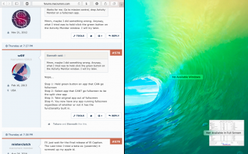
Step 1: Hold green button on app that CAN go fullscreen
Step 2: Select app that CANT go fullscreen to be the split view app
Step 3: Take original app out of fullscreen
Step 4: You now have any app running fullscreen regardless of whether or not it has the functionality built in.
Hm I'm not able to select the Activity Monitor window for split view. I can, however, put Safari into full screen and drag it into the full screen space.
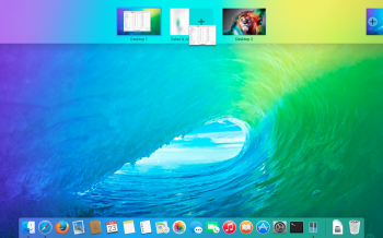
Sweet Firefox logo! Link?
Here you go: http://santiagorpan.deviantart.com/art/Yosemite-Firefox-493690981
I see what you mean. But the text size and hasn't changed in the sidebar or in the menu bar in the OS. However the files and folder names text thinness have changed. Here I am comparing yosemite folders text, size 12 with El Capitan folder size 12. You can definitely see the difference between them!
Top: Yosemite, Bottom: EL Capitan
View attachment 563546 View attachment 563547
I actually prefer the new, thinner look.
I am also not sure this is new, but feels new to me: Calendar's window now extends to it's left edge when I press the Calendars button to show the sidebar of my calendars, and animates back to my original window size if I press again. Looks very good!
Preview is the same (expands the edge of the window, does not shrink it's content).
Preview is the same (expands the edge of the window, does not shrink it's content).
Adobe Photoshop does not allow me to do so, on my 1366*768 MacBook AirHm I'm not able to select the Activity Monitor window for split view. I can, however, put Safari into full screen and drag it into the full screen space.
View attachment 563606 View attachment 563610
System Preferences > General > Use font smoothing when available ...is disabled in the El Capitan version.I see what you mean. But the text size and hasn't changed in the sidebar or in the menu bar in the OS. However the files and folder names text thinness have changed. Here I am comparing yosemite folders text, size 12 with El Capitan folder size 12. You can definitely see the difference between them!
Top: Yosemite, Bottom: EL Capitan
View attachment 563546 View attachment 563547
Register on MacRumors! This sidebar will go away, and you'll see fewer ads.


