Become a MacRumors Supporter for $50/year with no ads, ability to filter front page stories, and private forums.
Photo of the Day - August 2009
- Thread starter Phrasikleia
- Start date
- Sort by reaction score
You are using an out of date browser. It may not display this or other websites correctly.
You should upgrade or use an alternative browser.
You should upgrade or use an alternative browser.

Looking at the exif info for this shot (17mm, f5.6, 1/6s, ISO1600) the first suggestion would be to shoot at a much lower ISO than 1600. I'd use ISO 200 (which I think is the native base iso for this sensor), a tripod and adjust the shutter speed accordingly. If this is a location you can't go back to (seeing how the date the photo was taken is 10-03-2008), then look into the software noise reduction solutions like Noise Ninja.
Yes... if you use a tripod, you won't need to compromise: low ISO, most appropriate f-stop (f11, say), using the shutter speed as your one variable.
Grasmere...


This is a bit washed out in the highlights, but it reminds me of the type of work I shot in college using a 4x5 view camera. Why don't you go back to this scene and see if you can improve on the exposure and capture more of the highlights without loosing all of the shadows?
Dale
You know what, I might as well since I go for a bike ride around that lake every weekend so I'll try to improve on it. Thanks!. Here's one for today.
A bit too bright but I like it.


^^^
A couple of things are spoiling my enjoyment of your pix...
The horizontal format, in particular, makes the viewer scan the pic from left to right (or for some folk, right to left...), looking for the subject. Like the barn in the shot you posted yesterday. If the subject isn't immediately apparent, the eye keeps looking for it... with no place to 'rest'.
The other thing is the bits of fence-post, foliage, hedgerows in the foreground, which are distracting. Maybe take a bit more time to shoot, like walking into a field rather than shooting over a hedge.
Just my two-pennorth...")
A couple of things are spoiling my enjoyment of your pix...
The horizontal format, in particular, makes the viewer scan the pic from left to right (or for some folk, right to left...), looking for the subject. Like the barn in the shot you posted yesterday. If the subject isn't immediately apparent, the eye keeps looking for it... with no place to 'rest'.
The other thing is the bits of fence-post, foliage, hedgerows in the foreground, which are distracting. Maybe take a bit more time to shoot, like walking into a field rather than shooting over a hedge.
Just my two-pennorth...
mcavjame, is this an hdr or tonemapped image? still not sure what the difference between the two is.
No. The shot is as is from the camera. I maintain the sky with an ND grad. It helps to compensate for the two dramatic areas of light in the image. As for HDR, I think tonemapped is just one of the ways your HDR image can be achieved. There are several members who shoot HDR and they have a very specific look. Nuwomb is the user that comes to mind off the top of my head, but there are others. If you look at Nuwomb's images and then my field again, you will see the difference.
Thanks, Doylem, I always appreciate your comments. I understand what you are saying. As I cycle around looking for good light, subject and light do not always occur in the same place. I loved the way this field was lit up with the almost uniform grey in the background. I like to post as often as I can, even if I don't have a great shot to share.^^^
A couple of things are spoiling my enjoyment of your pix...
The horizontal format, in particular, makes the viewer scan the pic from left to right (or for some folk, right to left...), looking for the subject. Like the barn in the shot you posted yesterday. If the subject isn't immediately apparent, the eye keeps looking for it... with no place to 'rest'.
The other thing is the bits of fence-post, foliage, hedgerows in the foreground, which are distracting. Maybe take a bit more time to shoot, like walking into a field rather than shooting over a hedge.
Just my two-pennorth...
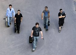
Band shoot from last week. C&C welcome

The idea is great, but the tire tracks ruin the symmetry for me, and the puddle at the back ruins the simplicity. I'd clone them out, and probably shift the yellow color of the concrete to blue a bit to match with the clothing, maybe with a contrast boost to go with the blacks too.
The idea is great, but the tire tracks ruin the symmetry for me, and the puddle at the back ruins the simplicity. I'd clone them out, and probably shift the yellow color of the concrete to blue a bit to match with the clothing, maybe with a contrast boost to go with the blacks too.
I'll definitely keep that in mind. I can see what you're saying with the color. Thanks
Band shoot from last week. C&C welcome
Cool idea! Personally, I would bring them all closer together. Being so spread out looks off to me. Also, the guitar player in grey is holding his case backwards (again, just my preference), and the drummer is the only one not looking towards the camera (viewer)...
As I cycle around looking for good light, subject and light do not always occur in the same place.
And I'm amazed just how often they do. If the light is promising, and the subject looks good, nine times out of ten it will work out if you have patience. Don't ask me how... it just does...
Actually, I think it's something to do with letting go, and not trying so hard...
I'll definitely keep that in mind. I can see what you're saying with the color. Thanks
Want to see a quick edit? Not the fine selection you'd need for usage, but just how I'd generally do it?
Want to see a quick edit? Not the fine selection you'd need for usage, but just how I'd generally do it?
Yeah that'd be great!
Image "Noise" >> Fixing it ...
 - click to big it ...
gnd: " ... If this is a location you can't go back to (seeing how the date the photo was taken is 10-03-2008), then look into the software noise reduction solutions like Noise Ninja. ..."
Doylem: " ... Yes... if you use a tripod, you won't need to compromise: low ISO, most appropriate f-stop (f11, say), using the shutter speed as your one variable. ..."
... its all good ... Thanks
 - click to big it ...
gnd: " ... If this is a location you can't go back to (seeing how the date the photo was taken is 10-03-2008), then look into the software noise reduction solutions like Noise Ninja. ..."
Doylem: " ... Yes... if you use a tripod, you won't need to compromise: low ISO, most appropriate f-stop (f11, say), using the shutter speed as your one variable. ..."
... its all good ... ThanksYeah that'd be great!
Here's my quick edit...
Basically healing brush the mess out of the tracks and puddles, Smart selection everything but the people/instruments then Image->Adjustments->Color Balance and go from yellow towards blue for each of shadow, midtone and highlight with preserve luminosity checked (should be the default.) I cropped a bit, but with the drummer still getting some space to look into. Attached as a thumb, so click for full effect- looks like the makings of a good cover shot to me...
Paul
Attachments
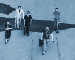
Band shoot from last week. C&C welcome
It's interesting how everyone throws out their personal preferences, so I might as well toss mine in. For others offering improvements, It's not just about making a good photo, but fulfilling what the band wants. If they are a gritty, hard rocking band, then this shot suits them. Aside from the lack of detail in the blacks, I think the setting has promise. Rather than clone out all the elements that compuwar does not like, I would take advantage of them. That greasy puddle could be an element used to string everyone together if it ran through the background from left to right. I happen to like the tire tracks. They lead the viewer's eye from bottom to top which seems to suit the angle. I like that the drummer is looking off. It would help more if he was on the left and looking across the group.
Here are a couple quick and dirty photoshop mods. The interesting this is that the original image has a nice rhythm to the position of the figures. I cannot recreate that rhythm without a lot of work. But imagine swapping the drummer and keyboardist positions (from the original image) and having the drummer looking to the right:
Attachments
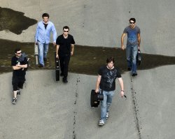

Yes, interesting edits, mcavjame. I think you've put your finger on the main problem: the band members need to be more cohesive. They're a bit too spread out, and there is too much dead space around them, so they don't have quite enough "presence" in the frame. The latter problem could be helped by cropping, but the band members still need to be "tighter," and yes, that drummer's gaze out of the frame is distracting.
That said, I think the original photo has a lot going for it. I especially like the lighting (nice, diffused light) and the loose V-formation. So I wouldn't just move the drummer in post because doing so breaks the "V".
That said, I think the original photo has a lot going for it. I especially like the lighting (nice, diffused light) and the loose V-formation. So I wouldn't just move the drummer in post because doing so breaks the "V".
Yes, interesting edits, mcavjame. I think you've put your finger on the main problem: the band members need to be more cohesive. They're a bit too spread out, and there is too much dead space around them, so they don't have quite enough "presence" in the frame. The latter problem could be helped by cropping, but the band members still need to be "tighter," and yes, that drummer's gaze out of the frame is distracting.
That said, I think the original photo has a lot going for it. I especially like the lighting (nice, diffused light) and the loose V-formation. So I wouldn't just move the drummer in post because doing so breaks the "V".
Yeah, that was the point I was making with the rhythm. Use the same formation as the original photo, but have the left most figure looking right. It doesn't have to be the drummer, I just moved him because he happened to be the one looking right. It was done for illustration purposes only. I would reshoot the shot.
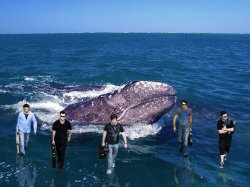
Description from my flickr:
I took this photo for my Dad to enter in a Cartier employee competition. He has already made it to the semi-finals (all of the challenges up to now were written tests), and the challenge for the semi-finals was to do your best to depict "Cartier: I love you too" via a photo. This is what we came up with!

Clickable!

Incredible lighting. Very beautiful shot.
It's interesting how everyone throws out their personal preferences, so I might as well toss mine in.
My personal preference...hard-rocking "green" band. Watch out Bono!
Attachments
Incredible lighting. Very beautiful shot.
Thank you! The whole setup consisted of: a desk lamp, a pillowcase, and a black cloth. I'm very proud of my resourcefulness!
Register on MacRumors! This sidebar will go away, and you'll see fewer ads.