Did some post processing on my original image and decided to upload this new one. This is the school I'm currently attending.

ya, thx. The only thing that bothers me is the tire image in the background that sticks out above the hood. I may try to blur the background. Don't know.
Did some post processing on my original image and decided to upload this new one. This is the school I'm currently attending.
Not sure that blur would work...have you thought about putting an entirely different background in via Photoshop/Gimp (or whatever else you may use)?
I really like the color effect on the banners, but the fuzzy tree really distracts me. Otherwise, this is an adventure.
Dale
/"\/oo\/"\;8536168 said:Camera: Canon
Model: XSi
ISO: 100
Exposure: 1/2000 sec
Aperture: 1.8
Focal Length: 50mm
Sorry I don't like this one. Though the composition might be ok, it's not sharp and lacks a subject or topic. Is it a test shot?
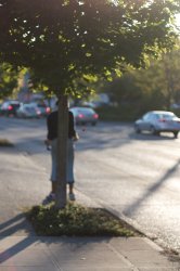
/"\/oo\/"\;8538948 said:S'ok, given my lack of talent/experience compared to the usual folks that post here, I was kind of expecting that. It was a rushed shot as I was about to cross the street walking home- I ended up liking the composition and lighting (despite shooting facing the sun). The subject, if I had taken more time to focus properly, would've been the rose the homeless person is selling on the side of the road.
not a good shot. you should have taken the guy with the rose he was selling.
")


Marking the 250th anniversary of the world's greatest drink:


Kelly Joe Phelps...in session...the man's a genius
Boston Public Library, Addition, designed by Phillip Johnson:
Shot with a Nikon D50 and 18-70mm kit lens.
Yes, I managed to get a car shot at the car show:
I posted this image from Antelope Canyon earlier this month:
That was pretty much straight out of the camera with minor white balance adjustments in Lightroom. I spent some more time with it last night but I'm mixed on whether or not I like the edited one better:
What do you think of new version? What would you have done differently?
Many thanks!When I looked at this larger, it really made me want to look at it for a while. It's unusual, and I like the light, and the stylistic muted colors and tone, with the almost oversaturated green of the plants as a cool contrast. Also, all the 90 degree line intersections contrast in a very interesting way with the curved arch and the converging lines of the ceiling. Overall, a really nice image...!