Become a MacRumors Supporter for $50/year with no ads, ability to filter front page stories, and private forums.
Status
Not open for further replies.

neut

macrumors 68000
Nov 27, 2001
1,843
0
here (for now)
stoid said:
that's nifty as hell! how did you do that? Photoshop? I still kinda like my original better though ;)

yeah, im a PS feind. :D

i wish i had done it on my PB though; cause it looks a bit bright now that i look at it from inside a mac :). The original seemed just a bit too dark on the PC monitor, but that what i get for remixing on the PC. :mad:

*****
m.r.m. said:
has a kind of jim morrison spreading his arms (middle top), "above there is heaven and below there is hell and in-between are the doors.", feel.

hell yeah, that kind of mood was in the air when i got the inspiration to mix that image. I think it was the brownies :).

peace.
 

neut

macrumors 68000
Nov 27, 2001
1,843
0
here (for now)
lame... i was the last one who posted. come on now, post your pics! :)

0103.jpg


peace.
 

Moxiemike

macrumors 68020
Jan 1, 2002
2,437
0
Pittsburgh, PA
i think i used my 70-200. Or my 50. And def. D100. Maybe an SB-800. For a magazine, I was shooting gardens. This is one of the shots. I'm sure it's like, f4-5.6 or something.

I like it. LOTS of DOF and subject isolation. ;)

m
dof.jpg
 

Moxiemike

macrumors 68020
Jan 1, 2002
2,437
0
Pittsburgh, PA
stoid said:
That's such a peaceful image there Mike, do you have a 1280x854 or something like that so I could make it a desktop?

edit: The windchime image.

I can try to make it 1280 by xxx for a desktop. Lemme resize it and i'll post.

thanks

m
 

Moxiemike

macrumors 68020
Jan 1, 2002
2,437
0
Pittsburgh, PA
neut said:
nice shot, i like photos of PBs. :)


*****
mike - as always... excellent work. :)


peace.

Thanks. Have been shooting so much for this magazine... it's ROUGH.

Apparently, some of the staff photogs (if we call 'em that) use DISPOSABLES! For a print mag! Ouch!

I finally figured out why I get called so much. :) BUT it's limited my time to post, and more importantly, to shoot for myself.

Here's another DOF for ya:

DSC_5809.jpg
 

orbital~debris

macrumors 68020
Mar 3, 2004
2,289
6,063
UK, Europe
Originally Posted by neut
nice shot, i like photos of PBs :)

Thanks for the compliment! I'm still experimenting with my IXUS, but I occasionally manage to pull off something vaguely similar to what I intended!
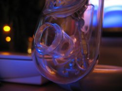
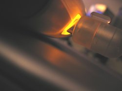
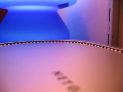
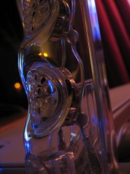
Here are a couple more such shots, hope people aren't getting too bored with my current theme! (I've got some beach shots coming soon - honest!) :D
 

Attachments

  • CrystalBlue.jpg
    CrystalBlue.jpg
    95.5 KB · Views: 121
  • OrangeGlow.jpg
    OrangeGlow.jpg
    99.2 KB · Views: 119
  • BlueGlow.jpg
    BlueGlow.jpg
    83.3 KB · Views: 132
  • CrystalBlue2.jpg
    CrystalBlue2.jpg
    92.3 KB · Views: 127

yahooz

macrumors member
Mar 11, 2004
46
0
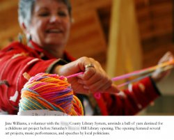
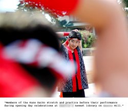
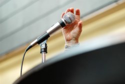
Some photojournalism work for a local weekly:

comments welcome
 

Attachments

  • 1.jpg
    1.jpg
    86.3 KB · Views: 135
  • 2.jpg
    2.jpg
    86.1 KB · Views: 144
  • 3.jpg
    3.jpg
    74 KB · Views: 146

orbital~debris

macrumors 68020
Mar 3, 2004
2,289
6,063
UK, Europe
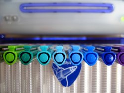
Two more (again slightly abstract - i just needed to shoot something and its pretty overcast outside right now) :rolleyes:

Yahooz - i like all three, but especially the shot of the woman & ball of wool: it looks very professional and 'real', i.e. not too staged.
The microphone shot is really good too - the focus really brings the eye in to the centre of the picture.
I think the shot of the performers is creative, but maybe there's a little too much of the person in the foreground and not a clear enough sight through to the performer in focus? - but i do like the idea very much!
 

Attachments

  • Blues.jpg
    Blues.jpg
    95.5 KB · Views: 125
  • Colours.jpg
    Colours.jpg
    91.9 KB · Views: 166

zync

macrumors 68000
Sep 8, 2003
1,805
24
Tampa, FL
I'm back, kind of...

orbital~debris said:
My first post to a photography thread, so I'm not sure if I've gone about it the right way... Anyway - it's just an experimental shot taken with my fairly new IXUS 400.

Wow, it's time someone else has even a similar camera to mine, much less the same one (well yours says IXUS 400 and mine says S400, though IXUS sounds cooler, they're the same). I have, or at least had, a picture somewhat similar to that. :)

So what's be going on people? I somehow lost communication with the boards here (probably another blackout with email from macrumors or something) when we switched to a new thread. I recently got my display issue fixed and didn't have a backup since there was no reason for them to even turn on my computer except to see that the display was working and the audio was fixed....instead they "restored" my computer and I lost pretty much all of my favorite recent pictures...oh, and they left me back in the stone age with 10.3.2....luckily I went to my friends house (they finally began putting up cable at my house so I should have broadband in a few weeks, finally) and was able to download like 300+ megs of updates! You know what's odd? 10.3.2 is slower on an empty hard drive than 10.3.4 was with my drive full of files!

My business has been coming along. We finally finished writing a lot of our code, and we finally have a client. A few more and I'm quitting Target for good. They keep working me too much to get to work on my business so I'm going to take a week or two of vacation before school starts again in the fall so I can get my crap together and get as far from that place as possible! Anyway, I'm off to code some website designs and what have you (luckily I still have some pictures I need on CD and they've finished copying to my drive now).

Oh guess what else they did at apple? They made my user's short name and name apple, so now I have to reformat again so that it doesn't say apple's computer on my start up...that's like the last straw! Anyway, hopefully I'll be around. See you guys later...
 

yahooz

macrumors member
Mar 11, 2004
46
0
orbital~debris said:
Yahooz - i like all three, but especially the shot of the woman & ball of wool: it looks very professional and 'real', i.e. not too staged.
The microphone shot is really good too - the focus really brings the eye in to the centre of the picture.
I think the shot of the performers is creative, but maybe there's a little too much of the person in the foreground and not a clear enough sight through to the performer in focus? - but i do like the idea very much!

Thanks for your kind words Orbital! The one of the woman was not staged at all :D She was setting up her 'table' for the kid activity later in the afternoon, and she continued as i took 20 different perspectives :cool:

the shot of the woman clutching the microphone was just an abstract shot, but I thought it was cool -- glad someone else likes it :D

as for the performer shot, well, i respectfully disagree ;) I feel there is a nice balance between foreground performer and the bemused look of the performer [in focus part of shot].

thanks for looking and commenting.

yahooz
 

Wardofsky

macrumors 65816
Aug 6, 2002
1,194
0
orbital~debris said:
Two more (again slightly abstract - i just needed to shoot something and its pretty overcast outside right now) :rolleyes:

Nice colour scheme :) You do much drawing?

Here's a streetie ;)

CRW_3958.jpg
 

Moxiemike

macrumors 68020
Jan 1, 2002
2,437
0
Pittsburgh, PA
virividox said:
i love that shot

Thanks. That's shot with a 35mm f2.0 lens. Which on my D100 is a 50mm and has a pretty close focus ability and WAFER THIN dof. So I love the ability to shoot and get nice blurry backgrounds, especially because the bokeh (out of focus area) is soooo smooth on it. ;)

m
 

zync

macrumors 68000
Sep 8, 2003
1,805
24
Tampa, FL
moxie,

I really love that flower shot, and I too love the way that lens blurs the background....it's completely different to the way my 50mm 1.8 blurs on my AE-1....I like the effect of yours there but on complicated backgrounds I prefer the way my 50mm blurs....it's hard to explain, I'll have to either scan a shot or take a picture of it with my S400 (which is more likely since I'd have to buy a new cable for my scanner since it isn't USB, oh and it's in a closet :)).

Anyway, that would be perfect for the site I'm designing to show a client (a florist) to hopefully get him to get a site to go along with the data system we're working on for him...he seemed interested when we told him we did sites too, and since none of his sites come up when you go to them, I think I have a pretty good chance, lol.
 

Moxiemike

macrumors 68020
Jan 1, 2002
2,437
0
Pittsburgh, PA
zync said:
moxie,

I really love that flower shot, and I too love the way that lens blurs the background....it's completely different to the way my 50mm 1.8 blurs on my AE-1....I like the effect of yours there but on complicated backgrounds I prefer the way my 50mm blurs....it's hard to explain, I'll have to either scan a shot or take a picture of it with my S400 (which is more likely since I'd have to buy a new cable for my scanner since it isn't USB, oh and it's in a closet :)).

Anyway, that would be perfect for the site I'm designing to show a client (a florist) to hopefully get him to get a site to go along with the data system we're working on for him...he seemed interested when we told him we did sites too, and since none of his sites come up when you go to them, I think I have a pretty good chance, lol.

Thanks. alot was due to my use of a 35mm f2.0 which gives the same FOV as a 35 but acts like a 50 due to the sensor crop on my DSLR.

If you need any floral shots for that website, lemme know. I'll hook you up with some at a good price.
 

superninjagoat

macrumors 6502
Apr 23, 2004
325
0
Apex, N.C
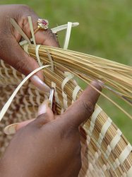
Brochure cover art

Sony Cybershot 717
Aperture: f2.4
ISO: 100
Focal length: 35 mm

A lady weaving sweetgrass baskets on St. Helena Island in Beaufort, S.C., for a brochure cover for the University of South Carolina Beaufort. Today is my last day at USCB! Woo Hoo!
 

Attachments

  • SweetGrassCover1.jpg
    SweetGrassCover1.jpg
    95.7 KB · Views: 125

superninjagoat

macrumors 6502
Apr 23, 2004
325
0
Apex, N.C
The almost finished cover. It'll be cropped from the top a bit, and the univeristy logo and name will be added to either the top of bottom (likely top) in 14 or 15 point reverse text over a rich black background.

Notice the shorter fingernails and absence of rings. I love PhotoShop!
 

Attachments

  • SweetGrassCover2.jpg
    SweetGrassCover2.jpg
    98.6 KB · Views: 141
Status
Not open for further replies.
Register on MacRumors! This sidebar will go away, and you'll see fewer ads.