Got a tip for us?
Let us know
Become a MacRumors Supporter for $50/year with no ads, ability to filter front page stories, and private forums.
Photography XIII - Anything Goes
- Thread starter Mudbug
- Start date
- Sort by reaction score
You are using an out of date browser. It may not display this or other websites correctly.
You should upgrade or use an alternative browser.
You should upgrade or use an alternative browser.
Here's some more of mine, they're all huge images so I'll just post a link:
http://community.webshots.com/photo/305085942/305119802bkhsPP
http://image24.webshots.com/25/1/99/59/305119959LjMGsu_fs.jpg
http://image28.webshots.com/29/8/76/72/281787672xOtaTi_fs.jpg
http://image32.webshots.com/32/7/89/56/237678956oJjMje_fs.jpg
http://community.webshots.com/photo/305085942/305119802bkhsPP
http://image24.webshots.com/25/1/99/59/305119959LjMGsu_fs.jpg
http://image28.webshots.com/29/8/76/72/281787672xOtaTi_fs.jpg
http://image32.webshots.com/32/7/89/56/237678956oJjMje_fs.jpg
A couple recent shots. Been experimenting with RAW stuff-- taking low-contrast images, with more dynamic range than usual, and process the photo twice-- once for the shadows and once for the highlights. Interesting look i think:


Moxiemike said:A couple recent shots. Been experimenting with RAW stuff-- taking low-contrast images, with more dynamic range than usual, and process the photo twice-- once for the shadows and once for the highlights. Interesting look i think:

awesome!
i really like that technique.
id like to get an DSLR , but i need to pay off my G5 and 12" PB first.
* ... is that a crow looking down at you?
i pushed your image:

... a bit too far.
peace.
neut said:awesome!
i really like that technique.the image really pops; the grain of the stone against the sky is nice. there is some green tinge (could be from the JPEG), but it seems to help the image be more dynamic and separate better) i like it!
id like to get an DSLR , but i need to pay off my G5 and 12" PB first.... maybe my work will let me buy there 10d they rarely use (gets more use at home from the employees than at work). i guess my 505v with bad batteries will work for now.
* ... is that a crow looking down at you?[SIZE]
peace.
YES INDEED the crow was looking down. What's extra cool about this technique is that I try and take an i mage with a histogram that peaks in the center. With low contrast, I get an image that's flat-ish out of the camera, but gives me *enough* color in the sky and more than enough detail in the subject.
I took the tomb as my first layer, contrasted it up in PS CS Raw, got the detail, color and balance correct (tried to expose a *bit* of the tomb door) and that was file one. Then i re-opened the same file is PS CS Raw, set it to camera default, and went about getting the sky correctly colored and made sure that the tomb was almost black. What that did was allow me to get some of those punchy edges you see on the top dormer of the tomb.
I then put both on different layers in the same PS file, and layer masked out the blown out sky from the first round of processing. Kinda cool technique, a little time consuming but I like the results, and it's easier and gives you more control than using filters.
I'm still hedging on that green and yellow area-- I mean, that's what was exposed, but i dunno if i like it.Might try and even the color out. But it basically gives the same effect as a graduated Neutral Density filter, except i'm not limited by a 50-50 split, which in this case wouldn't have worked right, or a regular ND or polarizer.
I was thinking about starting a site with a bunch of downloadable technique tips, all illustrated out and such. Mayeb charge $9.95 a lesson.
Whaddya think Neut? Is there a market??
m
* ... is that a crow looking down at you?
i pushed your image:

... a bit too far.
peace.[/QUOTE]
Hah. I like it though. Maybe dialed back a bit it would work nicely. You can even see in your remix where I *missed* layer masking out parts of the tomb. Haha.
Here's another layer spectacular:

and the original:

i pushed your image:

... a bit too far.
peace.[/QUOTE]
Hah. I like it though. Maybe dialed back a bit it would work nicely. You can even see in your remix where I *missed* layer masking out parts of the tomb. Haha.
Here's another layer spectacular:

and the original:

Moxiemike said:YES INDEED the crow was looking down. What's extra cool about this technique is that I try and take an i mage with ... <procedes to gives away trade secrets> ... Kinda cool technique, a little time consuming but I like the results, and it's easier and gives you more control than using filters.
I'm still hedging on that green and yellow area-- I mean, that's what was exposed, but i dunno if i like it.Might try and even the color out. But it basically gives the same effect as a graduated Neutral Density filter, except i'm not limited by a 50-50 split, which in this case wouldn't have worked right, or a regular ND or polarizer.
I was thinking about starting a site with a bunch of downloadable technique tips, all illustrated out and such. Mayeb charge $9.95 a lesson.
Whaddya think Neut? Is there a market??
m
there won't be if you give them away ...
i could see a market for them if packaged correctly. at least PDF or html walkthroughs ... perhaps Flash? It's what i do for a living if you need some help (WBT- web based training).
This is a killer technique. i could see pushing it further; even making another layer for the statue (fore - middle - back). If post processing is carried out anyways ... why not shoot that way. what a great idea.
not a practice for large shoots unless you have some time to burn.
* ... i like the green/yellow area; gives the tomb more life. sure dates the building though.
peace | neut
neut said:there won't be if you give them away ...
i could see a market for them if packaged correctly. at least PDF or html walkthroughs ... perhaps Flash? It's what i do for a living if you need some help (WBT- web based training).
This is a killer technique. i could see pushing it further; even making another layer for the statue (fore - middle - back). If post processing is carried out anyways ... why not shoot that way. what a great idea.... though this greatly increases PS time the result seems very worthwhile.
not a practice for large shoots unless you have some time to burn.
* ... i like the green/yellow area; gives the tomb more life. sure dates the building though.
peace | neut
Thanks. I was thinking the PDF route. Almost like Thom Hogan's ebook thing that he does on bythom.com except i'd want them to be short, maybe 5-10 pages, and downloadable. I'd love to chat with you a bit more about this stuff. I have about 15-20 techniques that I use, from general post-processing in CS for those large photo shoots (doing one now working through 1500 shots. damn) and others for simulating soft focus, noise removal, general sharpening techniques, etc.
Flash might be nice, but I'd want to have some PS actions available to the end-user, so for say, lesson 8, they'd need a PS action i wrote. How does flash do downloadable delivery? I'm wayyyyyy behind on my flash. Spend too much time figuring stuff like this out. Heh.
Thanks for the barn comment.
Then again, you just by my noise removal tutorial and action and bam! You have a noiseless file again. haha.
iGary said:Yeah, I didn't post process that Key West image. here ya go:


subtle but a HUGE improvement.
m
Having moved up to a real camera (Canon 20D) recently, I thought I'd share a few pics from yesterday on the Mall. It was a crappy day, with a little drizzle now and then, so details were the subject, not really a day for the monuments. Also, everything is being worked on and they all have scaffolding or bare earth, not really good for scenery. Also, these are all from the jpgs - I don't have CS right now, only at home, so it will have to do.
Bonus points if you can figure out where the *all* were shot


D
Bonus points if you can figure out where the *all* were shot


D
Wow, those pictures are really good!Elan0204 said:I've never checked out these photography threads before, so here's my first submission. If it looks familiar, that is because it was also my August desktop in the August wallpaper thread.
edit: Added a second picture.
What kind of camera are you using?
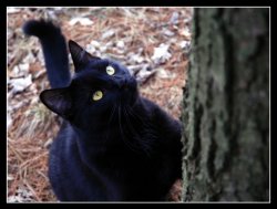
lol thanks! I'll relay the message to Amigo (the cat) loliGary said:Great looking cat!
Moxiemike said:Hah. I like it though. Maybe dialed back a bit it would work nicely. You can even see in your remix where I *missed* layer masking out parts of the tomb. Haha.
Here's another layer spectacular:

and the original:

You sir should be giving us some newbie lessons!
awesome stuff man, I really wish I knew that much so I could pump out quality photos like that!
Deefuzz said:You sir should be giving us some newbie lessons!
awesome stuff man, I really wish I knew that much so I could pump out quality photos like that!
It's all in the layers!
iGary said:It's all in the layers!
Not all of it!
When I saw the scene, I knew I couldn't photograph it as effectively with a "normal" exposure that the camera reads--the sky would be blown out! So I used that knowledge and went from there. It's all really based on experience and working with this stuff enough to know.
That said, I took a wee bit of artistic liberty in the color of the sky, but still. Haha
m,
Register on MacRumors! This sidebar will go away, and you'll see fewer ads.


