Become a MacRumors Supporter for $50/year with no ads, ability to filter front page stories, and private forums.

What do you think about OS X 10.10 Yosemite's GUI graphical changes?

  • Yosemite is UGLIER than ALL Prior versions of OS X

    Votes: 55 11.9%
  • Yosemite is UGLIER than SOME prior versions of OS X

    Votes: 40 8.6%
  • Aesthetically, I can't decide so it doesn't really matter to me.

    Votes: 36 7.8%
  • Yosemite is PRETTIER than ALL Prior versions of OS X

    Votes: 236 51.0%
  • Yosemite is PRETTIER than at least MAVERICKS. Full steam ahead!

    Votes: 83 17.9%
  • The GUI isn't really important to me

    Votes: 13 2.8%

  • Total voters
    463
  • Poll closed .

MagnusVonMagnum

macrumors 603
Original poster
Jun 18, 2007
5,196
1,452
OS X is like Doctor Who.

1. I don't like the new doctor I want _______ back.
2. Oh, that was pretty rad. I guess he's not so bad.
3. This guy is a great doctor.
4. Doctor dies, cycle repeat.

All the doctors have been good. It's the female companions I miss. ;)

I could deal with most of the changes in Yosemite, but making the traffic buttons and other UI things one color is a travesty. The video for OS X's original release claims (by Jobs) they spent months on the Aqua buttons alone. Now they're all gone and ALL traces of Aqua with it (some people keep saying Aqua is still there, but AQUA referred to the "gelcap/wet" look in OS X and I see NO TRACE of it anymore in Yosemite. The stoplight buttons and some busy metering things are about the only things left in Mavericks and now those are "flat colors" in Yosemite. AQUA IS DEAD.
 

B-Eugen

macrumors member
Jul 26, 2014
66
16
I think Apple's own "update or perish" practice will come home to bite them on this release. I like the hardware but I absolutely hate Yosemite. The fact is, this is Apple's future, like it or not, and I assume that in the future all hardware will be unable to run Mavericks or anything earlier. If you don't like Yosemite, you don't buy Apple products, period.

Every time I use it I find myself getting angry and saying to myself "wow, what idiot thought that crap up."

Translucency everywhere is a really, really stupid idea. What makes someone think that blurred random colors caused by translucency is a good idea? It doesn't even make sense. If I have a dark background, the menus can be hard to see. If I put a HUD window over a light window in some cases the controls wash out completely so you can read them.

I have never seen anything this idiotic or poorly thought out before in my life.
 

Traverse

macrumors 604
Mar 11, 2013
7,711
4,491
Here
Really, I've gotten used to it. However, I do think legibility has been inhibited in some areas.

The only app I have a real issue with is Safari. I never realized how much I used the title bar, but I miss it so bad. The tabs don't accomplish the same goal when you have tons of sites open. I wish you could have the title display in the Smart Search Filed instead of the long or short URL.
 

Lolito

macrumors 6502
Mar 20, 2013
397
34
here
Yosemite is just like 10.7; better not to use it and wait until 10.11
that should be a good release, just like mavericks and snow leopard.

Uglier? Mmmmm... Yes of course, those blue folders. For me, the worst part is the uber low overall quality of the new fonts in low resolution screens, of 2-3 or older macbooks and the ever-present 1080p screens of any typical budget LG or Samsung display...

Yes, this is the new apple, made even more for the rich, with more obsolescence, welded ram and glued batteries, no more ipod with phisical controls, etc...

And about iOS, stock android is far superior. Android is not like Microsoft. Windows was easy to beat, android is not that thing.

----------

People who hate it are definitely some of the louder people on these forums but it looks like most people think it looks awesome, and I would include myself in that category. I absolutely love the new look in Yosemite, even though I still fervently believe that they should have named it OS X Weed.

That is actually the problem; 90% of people like it, 10% hate it. 90% of people are wrong, but they drive the market. People prefers small and cute devices, even though they can't swap ram or hard disks. Apple will always do what makes more money, no matter what.

----------

[Emotion & Design: Attractive things work better]

Is Yosemite pretty? No doubt, it is.

Whether or not it's a better design than Mavericks is a whole other question...

you are totally right.
 

JoshMKB24

macrumors 6502a
Jan 5, 2013
520
44
Midwest
I actually really like it. I think I like the way iMessage shows up in the Messages app. I am not necessarily fan of iTunes in it, but I'm sure like all changes I'll get used to it.
 

Partron22

macrumors 68030
Apr 13, 2011
2,655
808
Yes
The Jelly beans at window topleft are gone. -That's an improvement.
The folders are electric-blue. - That's an aesthetic bummer.
 

Junosbetterhalf

macrumors member
Oct 16, 2014
48
0
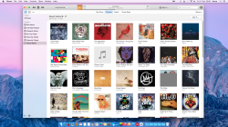
Is it pretty?

attachment.php


Definitely yes :p

[Appreciate my iTunes sorting needs some work]
 

Attachments

  • Screen Shot 2014-10-17 at 22.56.55.png
    Screen Shot 2014-10-17 at 22.56.55.png
    2.5 MB · Views: 710

melendezest

Suspended
Jan 28, 2010
1,693
1,579
I was willing to give it a fair shot. I did. But I cannot stand it. It is clear to me that I'm pretty much done with Apple after 15 years of absolute joy. What a shame.

I went from hardcore Apple evangelist to...hardcore dissenter. From the poll numbers I can tell that I'm in the minority here, but I tell you, no one in my household likes it. It's not an issue of "new". It's an issue of UGLY.

Damn you, Tim Cook. Damn you Jony Ive. Damn you to hell!!!! (in my best Planet of the Apes impression voice):D

Never in a million years would I have looked at Apple in derision and look at Windows and go "hmmm, that's NICE". I skipped through Apple's last keynote in 15 mins, if that. Alas, all good things come to an end.

Looking forward to installing Win X on my 2011 17" MBP.
 

colourfastt

macrumors 65816
Apr 7, 2009
1,047
964
Yosemite is just like 10.7; better not to use it and wait until 10.11
that should be a good release, just like mavericks and snow leopard.

Uglier? Mmmmm... Yes of course, those blue folders. For me, the worst part is the uber low overall quality of the new fonts in low resolution screens, of 2-3 or older macbooks and the ever-present 1080p screens of any typical budget LG or Samsung display...

Yes, this is the new apple, made even more for the rich, with more obsolescence, welded ram and glued batteries, no more ipod with phisical controls, etc...

And about iOS, stock android is far superior. Android is not like Microsoft. Windows was easy to beat, android is not that thing.

----------


That is actually the problem; 90% of people like it, 10% hate it. 90% of people are wrong, but they drive the market. People prefers small and cute devices, even though they can't swap ram or hard disks. Apple will always do what makes more money, no matter what.

----------


you are totally right.

I'd love to know what idiot thought that light blue folder icons with a SLIGHTLY darker blue identification overlay was a brilliant idea??? While it might work for 15 year olds, when you're over 50 it's just a complete pain in the **s to figure out which folders are which.
 

Mak47

macrumors 6502a
Mar 27, 2011
751
32
Harrisburg, PA
I really like the look/feel of the UI. It's oddly calming to look at. It took a little adjustment at first, mostly because of some of the changes. Once I adapted to those I could appreciate the design.

They didn't want it to feel like a computer and they achieved that. I dig it.
 

GerritV

macrumors 68020
May 11, 2012
2,264
2,729
Is it pretty?

Image

Definitely yes :p

[Appreciate my iTunes sorting needs some work]

If I were a 12 year old girl with nothing else to do but to stare at my iTunes cover art, perhaps.
As I am a grown up looking to get some serious work done, honestly I could do with less pointless distraction - a whole lot less. :mad:

----------

I was willing to give it a fair shot. I did. But I cannot stand it. It is clear to me that I'm pretty much done with Apple after 15 years of absolute joy. What a shame.

I went from hardcore Apple evangelist to...hardcore dissenter. From the poll numbers I can tell that I'm in the minority here, but I tell you, no one in my household likes it. It's not an issue of "new". It's an issue of UGLY.

Damn you, Tim Cook. Damn you Jony Ive. Damn you to hell!!!! (in my best Planet of the Apes impression voice):D

Never in a million years would I have looked at Apple in derision and look at Windows and go "hmmm, that's NICE". I skipped through Apple's last keynote in 15 mins, if that. Alas, all good things come to an end.

Looking forward to installing Win X on my 2011 17" MBP.

Totally with you, well almost.
If only my Win7 laptop would simply work like my MBP does, I'd probably switch without a doubt.

----------

I'd love to know what idiot thought that light blue folder icons with a SLIGHTLY darker blue identification overlay was a brilliant idea??? While it might work for 15 year olds, when you're over 50 it's just a complete pain in the **s to figure out which folders are which.

IMHO the Yosemite system folders are beyond personal taste. They crossed the line of common sense and basic aesthetic rules.
 

tkwolf

macrumors 6502
Apr 11, 2012
308
25
There you have it you people who keep whining that it is ugly. While I respect your opinion, you don't need to keep making threads and comments about how ugly it is. We get it, you don't like it. Now move on.
 

Eithanius

macrumors 68000
Nov 19, 2005
1,556
419
There you have it you people who keep whining that it is ugly. While I respect your opinion, you don't need to keep making threads and comments about how ugly it is. We get it, you don't like it. Now move on.

Then why bother whining on a thread about other people whining when you cherish other's opinion so much...? :rolleyes:
 

Michelasso

macrumors 6502
Feb 20, 2012
405
69
Treviso, Italy
It may not be ugly, but it sure is harder to the eyes. Too flat, I have issues finding what I need. Not to mention that Glims forSafari isn't compatible and so the Favicons are gone!!

The good news is that, being this a fashion thing, it might be soon revolutionized. 10.11 is just around the corner after all. :D
 

Rodster

macrumors 68040
May 15, 2007
3,177
6
I prefer the Yosemite look vs previous designs and my 1st experience with OS X was back in 2003.
 

ABC5S

Suspended
Sep 10, 2013
3,395
1,646
Florida
For me, its just fine, and folks, it doesn't matter one bit, since its not going to change. So what's the point for all these polls or threads anyway ? Unless we just want to vent our approval or disapproval to feel better. :confused:
 

GlenK

macrumors 65816
Aug 1, 2013
1,473
932
St. Augustine, FL
I'm liking it better now that I found how to control the Display contrast in Accessibility in preferences.

The looks aren't great but the functionality so far is a lot better than Mavericks.
 
Register on MacRumors! This sidebar will go away, and you'll see fewer ads.