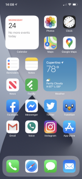
Yeah, I’ve been obsessing over mine for the last 30 minutes! I’m so psycho about this stuff!
View attachment 926292
How do you get the precipitation to show on the weather widget?
Yeah, I’ve been obsessing over mine for the last 30 minutes! I’m so psycho about this stuff!
View attachment 926292
Only appears if there’s rain forecast within the next hourHow do you get the precipitation to show on the weather widget?
👆🏼👆🏼 This, nailed it 😂👌🏼This thread is funny. A bunch of OCD geeks like myself who in reality, won't actually pay much attention to the friggin widgets, but getting them to look cool is important to us, lol.
You my friend can read the future lol 😂This thread is funny. A bunch of OCD geeks like myself who in reality, won't actually pay much attention to the friggin widgets, but getting them to look cool is important to us, lol.
I still cannot believe that we still can only put 4 apps in the dock---They should at least let the user put however many they want!!
It would be nice to have a scrollable dock like on the iPad.There's only so much room there... what happens when you have more icons than physical room on the dock?
I hope developers make more widgets for the home screen, so that I could have just a page with work related widgets/apps including email

You should be able to remove them and have them only in the App Library. That’s what I have on my iPhone now.
As a workaround you can move them to a separate page and then hide the entire page
I hope eventually they make them dynamic and/or resizable. Only have the phone and smart battery case, and the smallest with %s is 4 wide. The last 2 slots are useless.I really wish you could have a 1x2 widget. The 2x2 take up a lot of space. The weather widget takes up a lot of dead space.
As the title says...
Here's mine! Loving the Widgets so far, such a welcome addition.
Also to note, I have actually removed all app icons from my home screen apart from the dock. I have instead decided to use the Siri suggestions widget so it dynamically changes based on the apps I use.
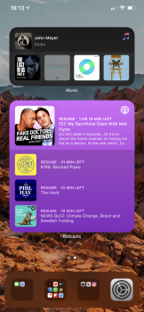
Primary and secondary.curious are you all on your primary phone or a backup device?
View attachment 927151
Simple yet satisfying. I had a Reminders widget but I don't like the fact that you can't check something off from the widget and are required to open the app. Hopefully this will change at some point.
Off topic, it's insane how many people around here have OCD.
Yep, I’ve done both now too. I did my backup phone first, but I couldn’t resist and have since done my primary phone and my iPad.Primary and secondary.
I never understand why people put the camera app on their home screen. You can access it from the lock screen or a swipe from the control center. To each their own I guess.
God that weather widget takes up so much space. It could easily fit in a 1x2. Which person at Apple said no to the 1x2 widget size and what the hell was the rationale?Since I have no use for App Library, I pretty much left it as it is and only removed apps I barely ever used from the home screen itself to make room for some widgets
organized folders on my own for the win
View attachment 926564
I’m really enjoying iOS 14. The beta is surprisingly stable.
But:
1) Why can’t we have just an Up Next widget? I have to have a huge Calendar widget to get that functionality.
2) Why is there so much wasted space in the huge Calendar app? Why wouldn’t it show me my other future events instead of just having that massive blank area at the bottom?
3) Widgets should be transparent like folders. That pure black is jarring.
The lock screen wouldn't really apply as easily when the device is already unlocked. And although Control Center is generally fairly easily accessible (and is mostly the way I access the Camera app too) it's not really the case for everyone as some don't really use Control Center at all while some have a harder time getting it to come up (either from sliding up or reaching up on top to slide it down).I never understand why people put the camera app on their home screen. You can access it from the lock screen or a swipe from the control center. To each their own I guess.
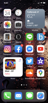
Here's mine:
Only one page with all the essential apps. I like my app order as default as possible.