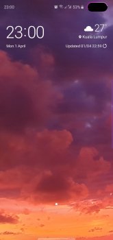
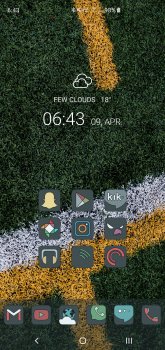
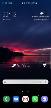
You don't need to use themes and icon packs to make it how you want itUnpopular opinion but what you guys laud as "customizability" I find garish and cluttered.
I mean its great that you have granular control over settings and notifications but Idk, using the homescreen customizability as a selling perk doesn't work for me (my opinion). The homescreen layouts that are posted here on this thread as well as reddit are definitely not my cup of tea. It looks as bad as when iOS used skeuomorphic design cues.
iOS I guess can be "boring" but its professional looking, uncluttered, and straight to the point, something a cellphone should be. On the contrary, I feel iOS became a bit bloated once they introduced the nonsense features such as animoji and message apps but on the Samsung/Android side I mean how many times a day can a person go into a theme store and look at fonts, icon packs, etc.?
I fail to see how seeing just apps and nothing else is somehow professional and not cluttered. If anything ios is more cluttered as you have no choice but to have apps on the home screen. They can't go anywhere else
Least with android you can have as bare of a homescreen as you want where with ios the most you can do is put them in folders which I think looks more cluttered than having a ton of widgets
With android you choose how you want your phone. With IOS you have no choice to have your phone how apple decides you have it.
Apple decides how your phone looks that's the issue. Every person's iPhone layout looks the same. On android? I bet all of us here with android phones have completely different looking home screens


