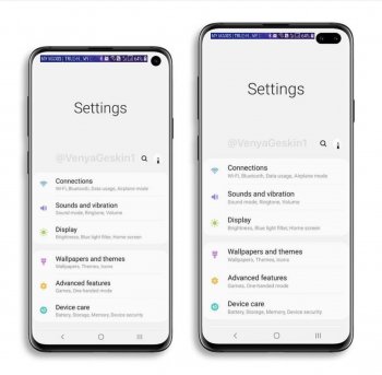
I was not commenting on your postI'm not saying it won't be unuseable, I'm saying that Android pie was design with the idea of a central notch, on my Pixel 3 there is no notch but there is nothing appearing where a notch would be, it's spread out, and even when I pull down the notification panel the top center is clear. You can even see it behaving like that on Samsung's one ui.
Sure, they will probably modify it so everything shifts over to make space for the top right hole, but now thing will probably look messy as the two areas get closer together. Will have to see how they handle it in the final product.
Also, regardless of where the hole is, the notification bar at the top will be thicker than normal and the icons will be larger, that's why we were discussing too about just going all the way to the edge to minimize that.
[doublepost=1544055979][/doublepost]
I'm not overly fussed if it's a notch or a hole, but I err on the side of holeWho’s suggesting a large central notch? My point is that hole is a less efficient design vs. moving it up a few mm against the top bezel border. Using a hole makes a larger area of the corner unusable, purely form over function, and in my opinion, a form more distracting than if they’d used a small corner notch.
I just do not want it in the middle
Last edited:


