Become a MacRumors Supporter for $50/year with no ads, ability to filter front page stories, and private forums.

jamezr

macrumors P6
Original poster
Aug 7, 2011
16,074
19,069
US

Lloydbm41

Suspended
Oct 17, 2013
4,019
1,456
Central California
I think the general thought is Android OEMs are needlessly copying Apple.
then if you look st the notch on the X and then the Android phones that are copying them...it is kinda blatant

Here is an article with about 10 notches that borrow from the X

https://www.theverge.com/2018/3/4/17077458/iphone-design-clones-mwc-2018
I agree that the cutout shape is identical to Apple’s, but the cutout itself did not originate with Apple.

It’s like saying Samsung copied the rectangular ‘candybar’ shape of the iPhone, even though other phones in the candybar shape existed before the iPhone.
 

Aneres11

macrumors 601
Oct 2, 2011
4,353
9,551
Well it's not. If they're copying the good stuff. But this notch thing isn't exactly the best design trend we've ever seen in mobile history.
Having said that, both my X and P20 Pros notches don't actually bother me, but I'd still rather have a screen that isn't compromised like the X and Androids with notches are with it eating into status bars.
But that's just my personal preference.
 
  • Like
Reactions: iSilas and 5105973

j800r

macrumors 6502
Jan 5, 2011
399
140
Coventry, West mids, England
People who complain about the “notch” haven’t spent any real time with the iPhone X or are the type to be bugged be the smallest things.

Seriously. I barely noticed it when my iPX was brand new. I don’t notice it at all now unless it’s brought to my attention. Your focus isn’t supposed to be there anyway.

The S9 doesn’t have one so chill and enjoy the phone that’s actually available.
 

TC_GoldRush

macrumors 6502
Dec 6, 2017
283
272
Nevada, USA
Seriously. I barely noticed it when my iPX was brand new. I don’t notice it at all now unless it’s brought to my attention. Your focus isn’t supposed to be there anyway.
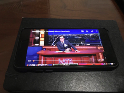
When in YouTube or Netflix the Notch is ugly and in the way, cutting off part of either side of the screen.
 
  • Like
Reactions: tonyr6

tbayrgs

macrumors 604
Jul 5, 2009
7,467
5,097
When in YouTube or Netflix the Notch is ugly and in the way, cutting off part of either side of the screen.

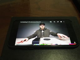
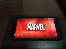
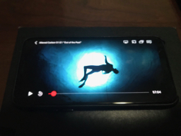
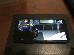
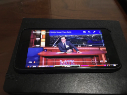
Except that very little content on either YouTube or Netflix is of an aspect ratio where the notch comes into play. Content would need to have a native ratio greater than 19:9 to bring the notch into play. Most content is less than that, resulting in black bars on either side. So in reality, it's the extra tall display ratios of the newest phones that are far more impactful on viewing video than any notches.


IMG_0024.jpg IMG_0027.jpg IMG_0026.jpg IMG_0025.jpg IMG_0023.jpg IMG_0029.jpg IMG_0030.jpg IMG_0028.jpg image.png
 

j800r

macrumors 6502
Jan 5, 2011
399
140
Coventry, West mids, England
Except that very little content on either YouTube or Netflix is of an aspect ratio where the notch comes into play. Content would need to have a native ratio greater than 19:9 to bring the notch into play. Most content is less than that, resulting in black bars on either side. So in reality, it's the extra tall display ratios of the newest phones that are far more impactful on viewing video than any notches.


View attachment 759363 View attachment 759364 View attachment 759365 View attachment 759366 View attachment 759367 View attachment 759368 View attachment 759369 View attachment 759370 View attachment 759371

Exactly! In fact, no video content brings the notch into play unless you let it. Even ultra wide aspect movies aren’t quite that wide unless you zoom and crop. Even then the action is closer to the Center of the screen.
 

jamezr

macrumors P6
Original poster
Aug 7, 2011
16,074
19,069
US
Whoa, good on 'em!

But what a day and age when someone makes the news for not aping Apple :D

Man I really hope Sammy too stay strong for the Note 9.

I really hope they go notchless too :)

I like this quote from The Verge.
Because the simple truth is that these notches don’t need to exist. They’re a stylistic choice, and the latest example of Apple design decisions being co-opted by much of the tech industry at large.

https://www.theverge.com/circuitbreaker/2018/2/28/17062030/iphone-x-clones-android-mwc-2018
 

5105973

Cancelled
Sep 11, 2014
12,132
19,733
I got my Product Red iPhone 8 Plus on Earth Day. I didn’t announce it then because I only just got it all set up last night. I’m switching my main sim between it and my silver 8 Plus. There are only very slight variations between the two phones and it’s impossible picking a favorite between the two, so switching between the two is painless and seamless.

Y’all know I’m also delighted with my S9+ and Snowball. So I’m just hunkered down with these lovely notchless beauties and weathering this storm of silliness until it passes.

Again, I have absolutely no quarrel with Apple or Essential for going with a notch and a uvula ;):p respectively. Apple especially was boxed into a bit of a corner where they didn’t want to come out with something that looked like what Androids, especially arch rival Samsung, were looking like. But they needed to accommodate all that Face ID gear somehow. So...notch. Essential was in something of the same corner, needing to come up with something to set their phone apart and generate some buzz so they came up with that thing that looks like the thing hanging down at the back of our throats. And they got the attention they needed.

But all these other clowns, well they’re stuffing themselves into the clown car. And the results aren’t horrible, for the most part. The P20 looks great and works well. If anyone has to upgrade or wants to upgrade their Android this year, these notched Androids are fine. It’s just all so irritating that they’re not taking the initiative to try to innovate an even better solution. I guess they just don’t have the budgets for that. I don’t know. Beats me. I’m just sitting it all out over here with some popcorn. o_O
 

tbayrgs

macrumors 604
Jul 5, 2009
7,467
5,097
Not really exactly on topic of this thread but I decided to put my sim back in my 7 Plus for a week or so to see how I truly felt about the changes involved in using the iPhone X, see if I really missed things like TouchID or the 16:9 display ratio and if I’d miss FaceID, the smaller sized phone, the OLED display.

I have to admit I’ve been suprised on my feelings after using the 7 Plus since last week. I think I do prefer TouchID over FaceID. I like not having to swipe up or being able to unlock my phone while it’s flat on the table/counter without having to make sure I’m looking down at it. Same goes for using it in the car dock. I also realize I type much better on the wide display—I’m going to have problems in the coming years when every phone had adopted the tall and skinny profile.

The OLED display on the X is great, no argument there but I never had complaints about the LCDs Apple used and am perfectly happy with the display on my 7 Plus. I also like having Conteol Center accessible from the bottom. I miss wireless charging a little bit but it’s slow charging speed makes me miss it a bit less. And finally, even with a battery that’s showing only 89% health, I think I’m still seeing better day to day battery performance on my 7 Plus.

So, wasn’t expecting to say this but I’m going to stick with my 7 Plus and sell the X while I can still recoup a good value for it. :eek: I’ll re-evaluate again if Apple comes out with a X Plus as I’d love a 6.3-6.5” display. Really want to see how FaceID evolves as well.

And notice, no where did I mention the notch as playing a part in my decision, because as I’ve mentioned, it’s really a non-factor in my daily use. I can take it either way.
 

Achillias

macrumors 6502a
Dec 1, 2011
720
996
Beauty is in he eye of the beholder. I don’t find it particularly attractive either. I can appreciate the attempt at a near bezel-less design but don’t like having the front camera at the bottom. The rear panel is pretty ugly though—reminds me of the fake wood trim on automobiles.
First of all it's not wood but glass, secondly the phone's comes with different colours, including a black rear. What kind of phone do you rock. Just for a reference.
 
Last edited:

tbayrgs

macrumors 604
Jul 5, 2009
7,467
5,097
First of all it's not wood but glass, secondly the phone's comes with different colours, including a black rear. What kind of phone do you rock. Just for a reference.

Right, fake wood, just like most automobiles. Even if it was real wood, I wouldn’t find it pleasing. The black version is better but I still don’t like the large band across it either.

And for reference, my last 3 phones were the iPhone 7 Plus Jet Black, Pixel 2 XL (black, but wanted the white/black version) and iPhone X in space gray. But aesthetics are just one element of my phone choices and admittedly a bit far down the list, considering in the past I also choose the iPhone 6 Plus and 6S Plus with their ugly antenna lines. ;)

FWIW, my favorite designs of the past year are probably the HTC U11+, Essential Phone, and iPhone X.
 

spinedoc77

macrumors G4
Jun 11, 2009
11,488
5,413
New Moto G6 and E5 Plus phones don't have a notch either. Notch is a failed experiment and will die in 2018.

https://www.motorola.com/us/products/moto-g-gen-6
moto-g6-pdp-fullbleedhalf-design-d-na.jpg


https://www.motorola.com/us/products/moto-e-plus-gen-5
moto-e5plus-pdp-fullbleedhalf-design-d-na.jpg


Oh man, let's hope not. I'd hate to go back to the days of having bulky top and bottom bezels like those monstrosities. I love my notch and the screen real estate it saves me by moving the status bar up into the notches.
[doublepost=1525452439][/doublepost]
My hat is off to Meizu! They haven't followed the notch herd....

Meizu's new phones don't have notches

https://www.theverge.com/circuitbreaker/2018/4/23/17269786/meizu-15-plus-series-specs-features-price

See, I don't get this? You prefer the huge top and bottom bezel look, made doubly more fugly by being the same color as the phone body? Don't you guys on Android have an app that lets you "hide" the notch anyhow? Which all it really does is move the status bar down and black out the left/right sides. I guess if I had to lose the notch I'd prefer a design that had no bottom bezel, and a blacked out top bezel as narrow as possible to fit in the hardware. I wouldn't mind a full top bezel at all, but would certainly lament the loss of screen real estate.
 

NT1440

macrumors Pentium
May 18, 2008
15,093
22,159
When in YouTube or Netflix the Notch is ugly and in the way, cutting off part of either side of the screen.
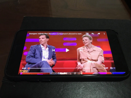
Why are you playing video in full-full screen mode? You're losing more content all around than just the notch. This is just a plain silly argument. The X is not 16:9, going in zoomed full screen ALREADY loses you more screen than the notch does.
 

1050792

Suspended
Oct 2, 2016
2,515
3,991
Why are you playing video in full-full screen mode? You're losing more content all around than just the notch. This is just a plain silly argument. The X is not 16:9, going in zoomed full screen ALREADY loses you more screen than the notch does.
Then what's the point of a big 5.8" screen if you are going to watch the content in a 4.7" space with two big black bars on the sides?
 
  • Like
Reactions: tonyr6
Register on MacRumors! This sidebar will go away, and you'll see fewer ads.