Good points, but maybe we'll be able to hide it when it comes out in the fall.Like it a lot! It's not a cluttered interface anymore (kinda reminds me of the iPod Classic). But what I don't like is that they push Apple Music on users. Apple Music is disabled in settings but I'm still seeing: 'For You', 'Discover' and 'Radio'. Give people the option to customize it just like you can change things up within iTunes (on iOS). Also the Downloaded Music tab should be the standard I don't care about music that I once bought. There is a reason why I didn't put it on my iPhone.
Got a tip for us?
Let us know
Become a MacRumors Supporter for $50/year with no ads, ability to filter front page stories, and private forums.
Thoughts on the new Music app
- Thread starter TigerMSTR
- Start date
- Sort by reaction score
You are using an out of date browser. It may not display this or other websites correctly.
You should upgrade or use an alternative browser.
You should upgrade or use an alternative browser.
Also the Downloaded Music tab should be the standard I don't care about music that I once bought. There is a reason why I didn't put it on my iPhone.
I'm missing the 'Show only music on this phone' option, as you said, there's music that I don't care about in my library that I once bought and if it's not made the cut anymore to be on my phone then I don't want to see it. I'm just deleting it all from the list which isn't a pain but something that's not needed.
Good points, but maybe we'll be able to hide it when it comes out in the fall.
Hopefully this is only the first beta after all!I'm missing the 'Show only music on this phone' option, as you said, there's music that I don't care about in my library that I once bought and if it's not made the cut anymore to be on my phone then I don't want to see it. I'm just deleting it all from the list which isn't a pain but something that's not needed.
I haven't had my hands on iOS 10 yet, so I'm not speaking from anything more than a few screenshots. But it's clear those of us who want a simple, clean music player that doesn't push a streaming service or other bloatware, will not be serviced by Apple unless they replace Ive the way he replaced Forstall.
Thankfully third party music app Cesium has come a long way and runs smoother than the native Music.app on my iPhone 6 at the moment. If only Cesium could create and edit its own playlists, I'd be set for life!
Thankfully third party music app Cesium has come a long way and runs smoother than the native Music.app on my iPhone 6 at the moment. If only Cesium could create and edit its own playlists, I'd be set for life!
Well, as stated before, I think most of the text is way to big.
Also there is way too much wasted space on my iPad Pro 12.9. When Searching something only 6 results are shown. That's only 1.5 results more than on my in comparison tiny iPhone 6s.
Also there is way too much wasted space on my iPad Pro 12.9. When Searching something only 6 results are shown. That's only 1.5 results more than on my in comparison tiny iPhone 6s.
Nope.No results searching this thread for "landscape" -- does the Music app support landscape mode on the 6s/6s+?
Thanks in advance.
Checked, but nope.
Um, Jony Ive isn't responsible for music at Apple, Eddy Cue is. Not all decisions at Apple come from one person. The decision to merge Music with the Music app certainly didn't come from Ive. And according to the rumors, the Music app redesign mostly came from Trent Reznor and the VP of iTunes.I haven't had my hands on iOS 10 yet, so I'm not speaking from anything more than a few screenshots. But it's clear those of us who want a simple, clean music player that doesn't push a streaming service or other bloatware, will not be serviced by Apple unless they replace Ive the way he replaced Forstall.
Thankfully third party music app Cesium has come a long way and runs smoother than the native Music.app on my iPhone 6 at the moment. If only Cesium could create and edit its own playlists, I'd be set for life!
I'm missing the 'Show only music on this phone' option, as you said, there's music that I don't care about in my library that I once bought and if it's not made the cut anymore to be on my phone then I don't want to see it. I'm just deleting it all from the list which isn't a pain but something that's not needed.
The "show only music on this phone" is not missing.
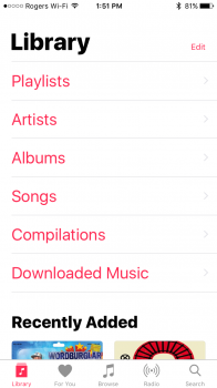
Screenshot 1 notice the "Downloaded Music" option.
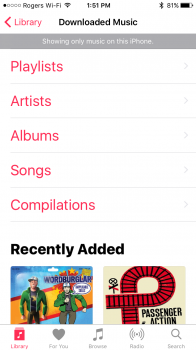
Screenshot 2 notice at the top it now says "Showing only music on this iPhone".
Attachments
Is it possible for someone to take a few screenshots of the For You section? I've been trying to see what it looks like, since apparently Apple has gotten rid of most of the recommendations, but I haven't been able to find any photos or videos going in depth about what has changed in For You. The For You tab is a fairly big part of how I discover music, and I'm not going to be happy if Apple crippled it 
Last edited:
Better than the previous one for sure. Everything is a lot simpler and more straightforward. And it's gonna get better with future betas.
I noticed when viewing the track list in albums, the app no longer shows the track number. I hope they add them back. I use the track numbers somewhat frequently to select tracks, and it helps me spot when things are out of order.
Also, the heart option needs to be added back to lock screen and Control Centre. I use that all the time to help organize music and get better recommendations. Apple seems to want to deemphasize the feature.
Also, the heart option needs to be added back to lock screen and Control Centre. I use that all the time to help organize music and get better recommendations. Apple seems to want to deemphasize the feature.
I've used Beats music way before it was bought by Apple. I really enjoyed their service and actually managed to discover a lot of new content by simply browsing playlists. Somehow, this got totally messed up once Apple came into the picture and all of my "for you" suggestions became the same 3 playlist I see everyday "gym flow, turnup, intro to lil wayne" even though my music taste isn't even that deeply rooted into hiphop. However, I continued to use Music just because of the integration and also all the music I've been collecting for a while was sitting there and I didnt want to start all over again with Spotify.
Anyways, fast forward to WWDC this year, seeing the new redesign was like a sigh of relief for me. I know many of you absolutely hate the new fonts and how big everything is. I freaking love it. I listen to music while working out, driving, or just being on the go. One of the most annoying things for me was how little and inaccessible all the buttons were. A prime example of this is the "recently added" button in iOS 9. Majority of the time I would miss it somehow because it was simply a small piece of text. Now, I know we shouldn't be on our phones while driving, etc etc, BUT, many of us still want to change a song every now and again without risking our lives. It's so much nicer to have large, clear buttons to work with that you can easily spot at a glance. I don't normally browse my music in an alphabetical or numerical order, so having all of my recently added songs front and center is actually really amazing. I also love that all I have to do is glance at my phone to see where I am and where I want to be as far as my music listening experience goes.
One of the biggest drawbacks is the fact that you still can't interact with other users. yes, sending songs via messages is nice but it would be even better if I could follow my friends, see what they love, check our their playlists, etc. You know, like simple things any other music streaming platform offers.
Considering the fact that this was only the second update ever, I am pretty happy with it. There is definitely a lot of room for improvement. I've managed all of my music via iTunes for ages so porting over to a new service doesn't really appeal to me that much. I'm gonna stick it out just a little while longer with Apple Music as I'm sure many changes and additions will be made before this fall release.
Honestly the design is growing on me. I don't even mind the ginormous text anymore.
The "show only music on this phone" is not missing.
Screenshot 1 notice the "Downloaded Music" option.
Screenshot 2 notice at the top it now says "Showing only music on this iPhone".
That's fine until you try and use search. Then it searches the whole library again, not just music on the phone/ipad.
That's fine until you try and use search. Then it searches the whole library again, not just music on the phone/ipad.
It's obvious that the Music app is not even close to finished in this version. It's barely out of Alpha. So I wouldn't huff and puff over missing things quite yet.
They really nerfed the "For You" section. I actually liked the variety of playlists in the old Music app.
I decided to sign up for the 3 month trial period last week before the WWDC.
Once I did this the Music app began to make perfect sense but before, not really.
The FOR YOU section was actually becoming very enjoyable to look at and use.
It was as close to a flea market record store browse as you might imagine on a small device or a sense of having a nice collection to wander through.
So I wondered if they planned to introduce coverflow at this level, the interface looked like it was using it by the way albums where partially stacked going right to left were you can see half of each album cover, but no.
This would have been the cherry on the Music cake for me. Now it's to be redesigned and I don't like the FOR YOU blocks. That's very Win 10 is it not?
I'm not beta user so rely on these reviews and user posting images.
One final point, personally I think the title of the Album/Sing title and song playing should be above the Album cover work and not above the controls and below the album artwork.
This is why in the current version the text is small/slim, it's trying to be discreet without interfering with the interface. So this to my eye looks like the response to complaints of it being too small was so some shouted at the designers make it BIGGER AND BOLDER! Yet sometimes repositioning an element clarifies something without having to make a size change. This to me seems like the kind of decision an non-design savvy Executive would DEMAND without question because they're sick of feeling the heat of complaints and they're right because they're the BOSS!
Placing it above would help differentiate and balance out the interface and clean it up.
Since the introductions of words as buttons, it's important not to have word-buttons and type that is informative close to each other. It's simply clutter to the eye, especially with all the white space everywhere and beyond. All that white space causes dimensional and perimeter problems as to what is what. It's disorientating to the eye. The eye needs places to rest and places to awe!
The iOS Design grammar seems once again inconsistent as appears to be the the reliable norm.
Last edited:
This is terrible, the titles are never readable. There's hardly any information displayed when scrolling through lists
I'm not beta user so rely on these reviews and user posting images.
If you want a sneak peak on iOS 9: Settings > Display & Brightness > Text Size > move slider to the right. Looks almost like it!


The iOS Design grammar seems once again inconsistent as appears to be the the reliable norm.
Grammar implies a rule set that you adhere to. This does not seem to have one.
View attachment 636197
This is terrible, the titles are never readable. There's hardly any information displayed when scrolling through lists
The only thing that's terrible are the people who keep taking this version of the Music app in the Developer Preview 1 as if it's a finished and final product over and over again. Then complaining about it.
The only thing that's terrible are the people who keep taking this version of the Music app in the Developer Preview 1 as if it's a finished and final product over and over again. Then complaining about it.
Doesn’t mean we can’t judge Apple for showing it. They were very proud of the design after all.
It's obvious that the Music app is not even close to finished in this version. It's barely out of Alpha. So I wouldn't huff and puff over missing things quite yet.
No huffing or puffing, just sharing information about what's working and what is not, which is interesting to many on these forums.
Question, if you delete the music app is it still possible to add music to your iPhone and say use an app like, Cesium instead?
Register on MacRumors! This sidebar will go away, and you'll see fewer ads.