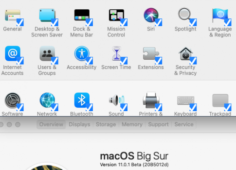
Couldn't agree more. What bothers me more is that all kids (i.e. Big Sur YT reviewers) that are so impressed by Big Sur design use Dark Mode by default. Why no one wants to use Light Mode anymore? Maybe because it is just pretty in the screenshots but practically useless?
My problem here is I prefer working Light Mode, and on Catalina the interface has still some amount of contrast. But on Big Sur everything is white on white. It is hard to tell which window is active or not, where the toolbar ends and content starts. Sure the window buttons (aka traffic lights) have no color in inactive window, but this is almost the last clue left to distinguish window state. Everything requires enormous amount of eyeballing to recognize what is what. The whole thing reminds me OSX 10.0 Cheetah Aqua style window and menu bar pin-striped backgrounds that were maybe looking nice at that time but their readability sucked.
It makes me sad that these days new appearance drives "OS innovation" and is an argument to call new release pompously a "macOS 11". If you are looking for technical and functional improvements or bug fixes you need to read between the lines, because this isn't something that Apple announces these days. Also because that aren't many, i.e. looking at
https://www.apple.com/macos/big-sur-preview/. At least I can hardly name any new great technical innovation Big Sur is bringing on the table.
I still miss all the Aperture features that were never ported to Photos. I miss CUDA and NVIDIA GPU support that was removed from macOS because of silly corporate animosity.


