Become a MacRumors Supporter for $50/year with no ads, ability to filter front page stories, and private forums.

CasualFanboy

macrumors 6502
Jun 26, 2020
382
679
No, my point is that when XP hit the market the outcry was immense - it as called cartoonish, loud, immature looking, brash etc.

Now people remember it fondly.

My point has nothing to do with customization and everything to do with the stock UI.

Why do you all want to put meaning in MY post that I did not mean?

Want to talk about customization? Fine - just do so in response to a different post in this thread.

My post was only EVER about stock.
XP was 20 years ago. The world was a lot different back then. People had far fewer options, expectations were different, and people at the time didn't use Windows 95/XP for the same reasons people now use Macs. Is this even a relevant or meaningful comparison?

In any case, I see more attempts to recreate the look of Windows 95 than XP with Linux themes. And I don't remember a lot of people ever admiring the look of XP in particular.

Personally, I've never liked using or looking at Windows. So I can't really offer much more than that as it relates to my extremely negative opinion of Big Sur.

I sure do miss the days when OS X was the anti-Windows, instead of the "but Windows does it too!" OS.
 
Last edited:
  • Like
Reactions: Tozovac

Jamalien

Suspended
Oct 29, 2014
161
404
XP was 20 years ago. The world was a lot different back then. People had far fewer options, expectations were different, and people at the time didn't use Windows 95/XP for the same reasons people now use Macs. Is this even a relevant or meaningful comparison?

In any case, I see more attempts to recreate the look of Windows 95 than XP with Linux themes. And I don't remember a lot of people ever admiring the look of XP in particular.

Personally, I've never liked using or looking at Windows. So I can't really offer much more than that as it relates to my extremely negative opinion of Big Sur.

I sure do miss the days when OS X was the anti-Windows, instead of the "but Windows does it too!" OS.
Windows XP certainly isn't remembered fondly because of its aesthetics. Its hideous
 

CasualFanboy

macrumors 6502
Jun 26, 2020
382
679
Windows XP certainly isn't remembered fondly because of its aesthetics. Its hideous
Considering that it came right after Windows 98, I guess people said it was better than the previous, but I don't recall a lot of XP fanboys.

If it's remembered so fondly today, then it's more an indictment of what came after than a positive reflection on XP.
 

TiggrToo

macrumors 601
Aug 24, 2017
4,205
8,838

CasualFanboy

macrumors 6502
Jun 26, 2020
382
679
Ok, even if I concede that Big Sur is somewhat preferable to an ugly UI from over 20 years ago, on an OS I never liked, is that supposed to make me happy about Big Sur?
 
  • Like
Reactions: qoop

Tozovac

macrumors 68040
Jun 12, 2014
3,034
3,233
sure do miss the days when OS X was the anti-Windows, instead of the "but Windows does it too!" OS.
This.

How ironic things have gotten, yes.

2005 Steve's Apple: Our interfaces are hands-down the best, the customers know it, we know it, the competition knows it. Our Apple interfaces look like an Apple product, even the fonts. Our interfaces are inviting, engaging. Let's keep refining a good (great) thing. We lead, they follow.

2005-2012 Samsung: Let's start blatantly copying iOS's class-leading interfaces (Samsung).

1990-2012 MS Windows: Let's reinvent the OS wildly every few years. Surely the customers won't realize it's our way of admitting "boy, we really blew it last time, but check out THIS spaghetti on the wall!" (only to then completely reinvent it in 5 years).

2005-2012 Google: Let's come up with competing interfaces to Apple's devices but make sure they're different enough from class-leading iOS/OSX. We have to make it different even though theirs is so good. Let's make things Flat and monochromatic, to be safely different from class-leading Apple and maybe look futuristic to the customers.

2012-2013+ Jony Ive's Apple: Hmmm the Windows phone's interface's font is pretty, the interface overall is nice and low-contrast flat-design white on light blue. I'll take some of that low-contrast monochromatic design even though every iPhone ever created is already nearly impossible to read easily outdoors in sunlight. Google's minimalist interfaces are so minimalist, way more minimalist than all the crap Scott got to put into the interfaces. I'm in control now, let's give something completely new by taking a lot away, and show we're keeping up with the times. Screw the decades of refining things that just worked. Let's follow and catch up to others and radically reinvent something that worked really well even if it no longer looks like an Apple product.
 

nickdalzell1

macrumors 68030
Dec 8, 2019
2,787
1,670
Tozovac, I kinda like the visuals of the weather because it sorta brings back some of the long-lost Nature UX cues from Samsung phones' older Weather widget, like from the Galaxy S3-S5. Just added some visual flair, and it could have been flat icons on blinding white or flat black.

The icons themselves aren't from Yahoo! (Yahoo!'s aesthetic today feels ripped from Microsoft to me) they're the official Weather Channel icons from 2014+, when they switched from the far-skeuo WeatherSCAN (which replaced WeatherSTAR in the early 2000s) to the current flat era of today.

WeatherSTAR:
iu-2.jpeg

WeatherScan XL (which iOS 6 got its Weather theme from):
iu-3.jpeg

Modern Weather Channel (which iOS 7+'s Weather app gets its theme from):
iu-4.jpeg

Come to think of it, in the 80s-early 90s the logo for The Weather Channel was skeuo:
iu-2.png

We all know what it looks like today:
iu-4.png
 
  • Like
Reactions: RandomDSdevel

qoop

macrumors 6502
Feb 4, 2021
440
424
THE UNITED KINGDOM
Just for fun, here's some clip of how relaxing the old Local on the 8's used to be, before short attention spans took over and ruined it all:

The Weather Channel Local Forecast: 11-29-1990
A friend of mine is restoring Quantel Paintboxes. The BBC used to create weather maps using a Lisa (then a Mac II) to control a VAX — in turn controlling a Paintbox. The system was introduced in 1985.

_72183838_helenyounginthe1990s.jpg
 

Tozovac

macrumors 68040
Jun 12, 2014
3,034
3,233
Tozovac, I kinda like the visuals of the weather because it sorta brings back some of the long-lost Nature UX cues from Samsung phones' older Weather widget, like from the Galaxy S3-S5. Just added some visual flair, and it could have been flat icons on blinding white or flat black.

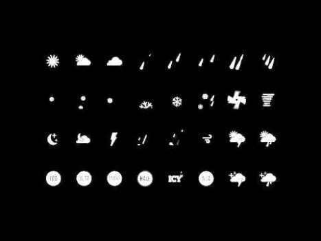
Oh, there would have been nothing wrong with the added visual background if only the “content” wasn’t so de-emphasized. The stick-diagram icons for sunny, clouds, rain, wind, overcast, snow, etc. looked too alike and increased the time it took to take in the forecast at quick glance, almost subconsciously.

This is a twisted example Apple’s “helping reduce (supposed) distraction by letting the background/interface blend in seamlessly” (like Big Sur’s blatant over-simplified monochromatic interface) because in this case the background was prioritized and overshadowed the content.
 
Last edited:

nickdalzell1

macrumors 68030
Dec 8, 2019
2,787
1,670
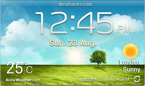
This is what I refer to:

iu-5.jpeg

Was always nice to look at :)

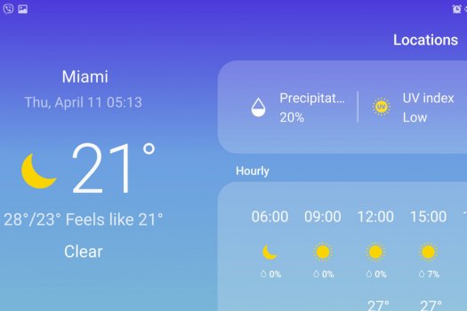
Since they went OneUI (their own take on iOS 7+) all the life was taken away. In fact, it's hardly recognizeable as a Samsung product anymore:

Where-is-the-Weather-app-shortcut-on-Samsung-Galaxy-S10.jpg

This ^^ could have been Apple, keep that in mind!
 

nickdalzell1

macrumors 68030
Dec 8, 2019
2,787
1,670
A friend of mine is restoring Quantel Paintboxes. The BBC used to create weather maps using a Lisa (then a Mac II) to control a VAX — in turn controlling a Paintbox. The system was introduced in 1985.

View attachment 1756812
Someone once did an emulator (for PC) of the classic WeatherSTAR system, which I had running myself (complete with the jazz music) on a PC attached to my TV's HDMI input, making a classic 1990s Local on the 8s screensaver
 

venom600

macrumors 65816
Mar 23, 2003
1,310
1,167
Los Angeles, CA
This is what I refer to:

View attachment 1757055

Was always nice to look at :)

Since they went OneUI (their own take on iOS 7+) all the life was taken away. In fact, it's hardly recognizeable as a Samsung product anymore:

View attachment 1757059

This ^^ could have been Apple, keep that in mind!

My perspective is don't blame Apple. Blame Microsoft. When they designed Windows Phone they literally couldn't copy the iPhone interface because of technical limitations in Windows. As a result they had to come up with a flat interface, and that's where the Metro interface that was in Windows Phone, WIndows 8 and is still in Windows 10 came from. Everyone else decided that flat meant modern and they all copied it. Once Apple let Jony Ive design the interface in iOS 7 and he went 2D everything, you end up where we are now with abstract, flat icons that are uniform in shape and size.
 

Tozovac

macrumors 68040
Jun 12, 2014
3,034
3,233
My perspective is don't blame Apple. Blame Microsoft. When they designed Windows Phone they literally couldn't copy the iPhone interface because of technical limitations in Windows. As a result they had to come up with a flat interface, and that's where the Metro interface that was in Windows Phone, WIndows 8 and is still in Windows 10 came from. Everyone else decided that flat meant modern and they all copied it. Once Apple let Jony Ive design the interface in iOS 7 and he went 2D everything, you end up where we are now with abstract, flat icons that are uniform in shape and size.

That’s an easy agree. I’ve been saying that for years. How ironic is it that Apple followed much of the simplistic/flat/monochromatic aspects of the Windows interface circa 2013, where windows has proven itself time and time again to be a company incapable of creating a truly intuitive, attractive, and desirable to use interface worthy of keeping around a while and just refining (like Apple pre-2012) since Microsoft would reinvent itself completely every five or so years. Jony (and his team and with Tim’s permission) led Apple away from very refined and successful (and engaging to use) interfaces around 2012-2013 by feeling the need to catch up to Microsoft’s then-current spaghetti on the wall.

And here’s Big Sur.
 
Last edited:

colourfastt

macrumors 65816
Apr 7, 2009
1,047
964
This is what I refer to:

View attachment 1757055

Was always nice to look at :)

Since they went OneUI (their own take on iOS 7+) all the life was taken away. In fact, it's hardly recognizeable as a Samsung product anymore:

View attachment 1757059

This ^^ could have been Apple, keep that in mind!

My god!! The second one is just god-awful. It's washed out with white on light blue, and the typefaces are so skinny as to be almost unreadable. The first example is fantastic though. Easy to read and its elements give you visual information—not just a flat blue background.
 

Tozovac

macrumors 68040
Jun 12, 2014
3,034
3,233
My god!! The second one is just god-awful. It's washed out with white on light blue, and the typefaces are so skinny as to be almost unreadable. The first example is fantastic though. Easy to read and its elements give you visual information—not just a flat blue background.

The 2nd one reflects the worst of the worst of Big Sur and much of the iOS/OSX operating systems and mobile apps, especially the Big Sur mail app. When everything is essentially the same white or light grey shade (the emails, the folder sidebar, the tools top bar, the header) it takes more work to focus in on what you are looking for.

Big Sur is ugly in many respects, but also inefficient and many steps backwards from intuitive, efficient, and engaging use. (For the 50th time heh heh heh)
 

qoop

macrumors 6502
Feb 4, 2021
440
424
THE UNITED KINGDOM
Someone once did an emulator (for PC) of the classic WeatherSTAR system, which I had running myself (complete with the jazz music) on a PC attached to my TV's HDMI input, making a classic 1990s Local on the 8s screensaver
I will look that one up - thanks Nick, I love anything to do with vintage broadcast graphics.
 

nickdalzell1

macrumors 68030
Dec 8, 2019
2,787
1,670
The 2nd one reflects the worst of the worst of Big Sur and much of the iOS/OSX operating systems and mobile apps, especially the Big Sur mail app. When everything is essentially the same white or light grey shade (the emails, the folder sidebar, the tools top bar, the header) it takes more work to focus in on what you are looking for.

Big Sur is ugly in many respects, but also inefficient and many steps backwards from intuitive, efficient, and engaging use. (For the 50th time heh heh heh)
It's not from Big Sur though. It's Samsung's new One UI skin (everyone thought TouchWiz Nature UX was ugly but the complete opposite existed for me. I adored Nature UX, and despise One UI). One UI replaces TouchWiz and the Samsung Experience Launcher on the Galaxy S8 and up. One UI 2.x is even worse, I assure you (tried out a Galaxy A01 for kicks). You can at least remove their garbage widget, and use XWidget to get the older one back, or at least a reasonable facsimile, and sideload a lot of old Android 2.3 apps to get it looking more skeuo as backward compatibility exists, as well as replace the launcher with Nova and get a Galaxy S4 icon pack, and you get a kinda half-done attempt at getting old TouchWiz back, but it's not quite the same. A lot is missing, the sounds, some wallpapers, the themes from Messages, etc.

Kinda like the result you get replacing icons from Big Sur with Mountain Lion icons. You get partly there but not ever 100%.

FYI, Windows 8, which started the flat bandwagon, released October of 2012. Apple followed suit in 2013 September.
 
  • Like
Reactions: RandomDSdevel

Tozovac

macrumors 68040
Jun 12, 2014
3,034
3,233
It's not from Big Sur though.

Yes, it’s not from Big Sur...its monochromatic simplified representation reflects the worst aspects of Big Sur.

Funny, for whatever it’s worth I take no issue with any app icons in Big Sur. They’re offscreen 99% of the time, and once the app is called, I’m done with the icon. I take much more issue with individual tool icons in a given app, like when they’re made to be devoid of any color or other obvious differentiation from each other, or are not as easy to differentiate from nearby text.
 
Last edited:
  • Like
Reactions: Jamalien

Tozovac

macrumors 68040
Jun 12, 2014
3,034
3,233
Stuff like this is cool. Meaning, it’s cool to have options (ahem, Apple, cough cough). A lot of the discussion in this thread about preferences is like interest in cars. Some love the aesthetics and tactile function of cars from the 1920’s. Some love the 40’s/50’s, some the 60’s, then 70’s. Some prefer more modern cars, and then there’s Tesla which to me represents the most minimalist and modern of the bunch. Outside ornate details are as few as they come (the front “grille” looks like a Hollywood space alien’s featureless face), the inside controls are largely touch-screen instead of buttons that look like buttons (I’ll contend for the rest of my days that non-tactile touchscreen controls in a moving, shaking, bumping car are more awful than good), and it is trending towards driving itself and taking away options from the user (like Apple’s dumbed-down disk utility and many other examples).

The Tesla like many aspects of Big Sur and Apple in general...the more you smooth over and simplify, the more you sand down into homogeneity, the more you take away from the user...at what point are you left with a featureless, white blob or rectangle without a single button or light or port/jack? Minimalism as a main driving force is impossibly limiting, unfortunately, as the more you add the more you take away. That’s what’s killed much of the efficiency and even joy of using an Apple product for the past 8 years.
 

headcode

macrumors newbie
Apr 15, 2008
4
11
This is all my option, but I've heard some hate on Big Sur here and there as well. My question is, why does Apple want to make Mac OS into IOS like seriously; I've always liked how good and "professional" OS X looked, but now it just looks so unprofessional...

And when Apple pushes this update, do you think it is safe for me to stay on Catalina?

Like I just got my new Mac, and I see this...
I want so badly to go back to Catalina. Big Sur has a terrible UI, where you can't even tell which is the active window. Not to mention the technical issues. ssh-agent is utterly broken. FTDI serial drivers are broken. If you do any microcontroller, arduino or raspberry pi work consider NOT upgrading.
 
Register on MacRumors! This sidebar will go away, and you'll see fewer ads.