Become a MacRumors Supporter for $50/year with no ads, ability to filter front page stories, and private forums.
Status
Not open for further replies.

leman

macrumors Core
Oct 14, 2008
19,526
19,693
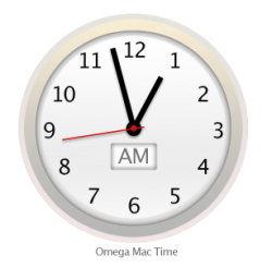
I'm not sure what his problem with the icon is but that clock definitely looks hilariously bad and amateurish. Go to Date & Time Preferences to see a larger version.

Whut? That clock icon is based on the SBB (Swiss State Railroad) clock, which is one of most iconic and critically acclaimed clock designs ever. I mean, I would understand if someone would criticise the Extensions or Safari icon, but that clock? :roll eyes:

P.S. I would still prefer them to adopt the SBB design unaltered. Hell, I'd pay 10 Swiss Franks extra for every Apple product for this. That clock is a piece of art.
 

Omega Mac

macrumors 6502a
Aug 16, 2013
582
346
I'm not sure what his problem with the icon is but that clock definitely looks hilariously bad and amateurish. Go to Date & Time Preferences to see a larger version.

Yet they didn't even use the design which they paid over 20 million to use.

http://www.idownloadblog.com/2012/11/10/ipad-clock-swiss-railways-20-million/

----------

Whut? That clock icon is based on the SBB (Swiss State Railroad) clock, which is one of most iconic and critically acclaimed clock designs ever. I mean, I would understand if someone would criticise the Extensions or Safari icon, but that clock? :roll eyes:

P.S. I would still prefer them to adopt the SBB design unaltered. Hell, I'd pay 10 Swiss Franks extra for every Apple product for this. That clock is a piece of art.

Nope doesn't look like it to me. Here from macrumors.com itself

swissrailwayclock.jpg


https://www.macrumors.com/2012/09/2...s-says-apple-copied-its-iconic-railway-clock/
 

leman

macrumors Core
Oct 14, 2008
19,526
19,693
Really, you don't see the connection? Hint: think beyond the tick marks and imagine looking at the clock from below while the sun is high up.

KWWPYHG.png


P.S. Again, I would prefer the original Swiss design every time. Actually, I should probably get out of bed and steal that clock from the nearest train station ;)
 

TheBSDGuy

macrumors 6502
Jan 24, 2012
319
29
I see his point about the clock. It looks, well, goofy. Like it was drawn to appeal to a 5 year old. It's not symmetrical. The hands look like they're raised above center about 10%. It just doesn't look right.

What was the rush, Apple?
 

pickaxe

macrumors 6502a
Nov 29, 2012
760
284
Whut? That clock icon is based on the SBB (Swiss State Railroad) clock, which is one of most iconic and critically acclaimed clock designs ever.

I'm pretty sure the Swiss State Railroad clock doesn't have a tacky early-90s cyan-gray gradient or awkwardly large digits in Helvetica Neue (a terrible typeface for digits) that give the illusion of uneven spacing. Also, there's that misplaced centre issue that was mentioned above.

I get that it's supposed to be a clock. It just looks really, really bad.
 

leman

macrumors Core
Oct 14, 2008
19,526
19,693
Our tastes have to differ then. I think that the clock looks good, the digits are look clear and I can't understand what you mean by misplaced center. Looks quite symmetric to me.

P.S. I just measured it with an on-screen ruler. The center is symmetric as far as I can tell.
 

Omega Mac

macrumors 6502a
Aug 16, 2013
582
346
I see his point about the clock. It looks, well, goofy. Like it was drawn to appeal to a 5 year old. It's not symmetrical. The hands look like they're raised above center about 10%. It just doesn't look right.

What was the rush, Apple?

It's a very poor icon and digital artwork.

The seconds hand is too long as is the mintues hand, they look the same lenght to my eye.

The black lines of the hour and minute hands (and the red seconds hand) look as if no anti-aliasing is applied. We know from history Steve Jobs would not have allowed that out the door. (google icon on the early iphone, made a sunday call to a designer story is on mac rumors somewhere).

I've been designing icons since my Amiga500 days and this is so poor compared to the artistry, craft and density that went into the leopard and snow leopard icon set that made them deeply rich on the eye.

In sum total it looks unfinished and an early exercise in pixel pushing for someone who might be learning btu I'd expect more! It really is about the details. Only Jobs got that. Ive has an eye for a different kind of detail, if you know how Industrial designs works you'll know what I mean. Jobs had the eye for details for the customer and that is the most important one in the end since the customer is your customer!

Following on from that I had a look at Yosemite on Retina machines in a Premium seller store. It doesn't look as bad on the Retina and the reason is they are trying to simulate frosted glass and frosted plastics (as you're now merging or blurring the line between the physical materials and the display).

Simply put the dock looks crap. The quality and artistry overall in the icons is very poor. I have an animation background and never made the connection as was mentioned with Jobs Pixar time influencing the OS X desktop look, but it makes perfect sense. Now I know why I liked it so much when I first saw it.

To update my tagline for the current theme for YOSX I'm calling it, Frosted & Flat Aqua.

You see this fetish all the time in design students reaction to materials and such like, frosted is quirky and cool in the material world. It resets a common material into some more dimensional and cool looking for a novel effect.

Yes it's cool for awhile but not for long and it's not something that ever seems to win wide spread appeal in the real world because it's not practical and it's also very cold.

I don't see how Apple might conquer this and the customer reactions only bares my own personal observations that they can not win on this one. It's already established. They're designing with hand bags in full flight. It's prissy and boring to look at in many ways. If you took out that beautiful picture from Yosemite it would look even more reductive or child like as many are calling it.
 
Last edited:

Etan1000

macrumors regular
May 18, 2008
174
34
It's a very poor icon and digital artwork.

The seconds hand is too long as is the mintues hand, they look the same lenght to my eye.

The black lines of the hour and minute hands look as if no anti-aliasing is applied. We know from history Steve Jobs would not have allowed that out the door. (google icon on the early iphone, made a sunday call to a designer story is on mac rumors somewhere).

I've been designing icons since my Amiga500 days and this is so poor compared to the artistry, craft and density that went into the leopard and snow leopard icon set that made them deeply rich on the eye.

In sum total it looks unfinished and an early exercise in pixel pushing. it really is about the details. Only jobs got that. Ive has an eye for a different kind of detail. Jobs had the eye for details for the customer and that is the most important one in the end.

Following on from that I had a look at Yosemite on Retina machines in a Premium seller store. It doesn't look as bad on the Retina and the reason is they are trying to simulate frosted glass and frosted plastics.

The dock looks crap. The quality and artistry overall in the icons is very poor. I have an animation background and never made the connection as was mentioned with Jobs Pixar time influencing the OS X desktop look but it makes perfect sense. Now I know why I liked it so much when I first saw it.

To update my tagline for the current theme for YOSX I'm calling it, Frosted & Flat Aqua.

You see this fetish all the time in design students reaction to materials and such like, frosted is quirky and cool in the material world. It reset a common material into some more dimensional and cool looking.

Yea and it's cool for awhile but not it's not something that ever seems to win wide spread appeal in the real world because it's not practical and it's also very cold.

I don't see how Apple might conquer this and the customer reactions only bares my own personal observations that they can not win on this one. It's already established. They're design with hand bags in full flight. It's prissy and boring to look at in many ways. If you took out that beautiful picture from Yosemite it would look even more reductive or child like as many are calling it.

Excellent and specific, detailed analysis from an obviously well-informed and well-qualified critic!
Thank you!

Best wishes, Etan :D
 

F1Mac

macrumors 65816
Feb 26, 2014
1,283
1,604
I see his point about the clock. It looks, well, goofy. Like it was drawn to appeal to a 5 year old. It's not symmetrical. The hands look like they're raised above center about 10%. It just doesn't look right.

What was the rush, Apple?

It's sunday and I guess I have time to waste...so out of curiosity I checked the icon in photoshop: the hands are perfectly centered.
 

Etan1000

macrumors regular
May 18, 2008
174
34
It's sunday and I guess I have time to waste...so out of curiosity I checked the icon in photoshop: the hands are perfectly centered.

If you have to check it by actual physical measurement in order to overcome the appearance to many that the hands are affixed off-center, then it's a very poor graphic.:rolleyes:

The whole point of a graphic is how the item illustrated universally appears to the naked eye. Not just to some, but to everyone.

Etan
 

F1Mac

macrumors 65816
Feb 26, 2014
1,283
1,604
If you have to check it by actual physical measurement in order to overcome the appearance to many that the hands are affixed off-center, then it's a very poor graphic.:rolleyes:

The whole point of a graphic is how the item illustrated universally appears to the naked eye. Not just to some, but to everyone.

Etan

No I didn't "have" to check it :rolleyes:, but I thought it would be better to give "proof" that they are perfectly centered. How they are perceived by the eyes of many is not a design flaw is it?
 

hamis92

macrumors 6502
Apr 4, 2007
475
87
Finland
If you have to check it by actual physical measurement in order to overcome the appearance to many that the hands are affixed off-center, then it's a very poor graphic.:rolleyes:

The whole point of a graphic is how the item illustrated universally appears to the naked eye. Not just to some, but to everyone.

Etan

That is an excellent point. Things can be mathematically centred and look wrong – they should be visually centred instead. This is something that bothers me about Apple's new design direction (with both Mac OS and iOS): it is so obsessed with grids and other mathematical constraints that the natural 'flow' of how things should align to look good and balanced is being sacrificed to satisfy the metrics (which are ultimately invisible to the end user). It's a bit like kerning in typography – you can use metrics to determine the distance between characters but usually doing it optically yields much better results.

I won't go into this clock icon, but is anyone else bothered by the Time Machine icon in the menu bar? To me that is what looks horribly inbalanced.
 

Omega Mac

macrumors 6502a
Aug 16, 2013
582
346
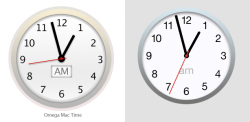
Ok so I took my lead from the new YOSX clock icon as was posted previously as my template and tweaked it. This is kind of what I would expect to see when it's sent back to be finished.

This took me about 2 hours between making dinner and family time this evening. I'm not claiming it's perfect but I hope it sums up what I wrote in my previous post.

... and no Tim you can't automatically have my artwork but I'm a very cheap consultant with a great ROI! :p
 

Attachments

  • omega_mac_clock_test.png
    omega_mac_clock_test.png
    35.6 KB · Views: 488
  • omega_clock_v_apple_clock.png
    omega_clock_v_apple_clock.png
    84.5 KB · Views: 82

tkermit

macrumors 68040
Feb 20, 2004
3,586
2,921
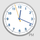
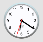
Would you guys be happy if Apple had kept it as it was?
 

Attachments

  • clock.png
    clock.png
    18.9 KB · Views: 458
  • clocknew.png
    clocknew.png
    17.9 KB · Views: 450

Etan1000

macrumors regular
May 18, 2008
174
34
No I didn't "have" to check it :rolleyes:, but I thought it would be better to give "proof" that they are perfectly centered. How they are perceived by the eyes of many is not a design flaw is it?

With all due respect, I believe you are mistaken, and yes "How they are perceived by the eyes of many" can be a design flaw.

It's all about cognition - "the mental action or process of acquiring knowledge and understanding through thought, experience, and the senses; a perception, sensation, notion, or intuition."

"…a large absolute gap between user and analyst cognitive styles often yields a higher rate of user dissatisfaction than a smaller gap…"

In other words, if you choose to use a ruler to support your point, you have lost the argument.

Computer user satisfaction
http://en.wikipedia.org/wiki/Comput...omputer_User_Satisfaction_and_Cognitive_Style

Respectfully,

Etan
 
Last edited:

leman

macrumors Core
Oct 14, 2008
19,526
19,693
Which on-screen ruler app do you use?

I used xScope.

If you have to check it by actual physical measurement in order to overcome the appearance to many that the hands are affixed off-center, then it's a very poor graphic.:rolleyes:

There must be some confusion here. The clock's center never looked misplayed to me (as I have written before), so I was confused why people were talking about this. I only did the measurement to see whether there is something wrong with my perception. Then again, optical illusions are not universal.

Ok so I took my lead from the new YOSX clock icon as was posted previously as my template and tweaked it. This is kind of what I would expect to see when it's sent back to be finished.

I would certainly never question your authority and expertise on these matters. At this level of discussion, the only thing I can do is express my subjective opinion. And I honestly believe that Yosemite's clock is miles better than yours. You version is less clear, I don't like the font you have used for numbers, the border is overdone IMO and the box around the AM/PM is unnecessary. Too much shadows. It simply lacks that elegant subtlety that seems to be main theme of Yosemite. I do like the shorter clock hands though, they look nice.
 

KALLT

macrumors 603
Sep 23, 2008
5,380
3,415
Don't see anything wrong with the clock icon either. If anything, it's one of the better icons in System Preferences.
 

F1Mac

macrumors 65816
Feb 26, 2014
1,283
1,604
In other words, if you choose to use a ruler to support your point, you have lost the argument.

You must be aware that internet forums usually ask for "facts" instead of mere opinions. I wanted it to be clear and somewhat irrebutable...So I thought "ok let's see EXACTLY how it's been made, let's see what actual pixels tell us". THAT'S ALL. It's not about "winning the argument". The clock has always looked fine to my eyes. And apparently I'm not the only one.
 

F1Mac

macrumors 65816
Feb 26, 2014
1,283
1,604
This took me about 2 hours between making dinner and family time this evening. I'm not claiming it's perfect but I hope it sums up what I wrote in my previous post.

hands size/axis considerations aside, it does look pretty cool! :)
 

MagnusVonMagnum

macrumors 603
Jun 18, 2007
5,196
1,452
Would you guys be happy if Apple had kept it as it was?

I think they're both HIDEOUS looking, but then it's just a stupid setting you see once in a blue moon. A better question is why Apple would pay them $20 million to NOT use their clock. That makes no sense (I can make them some clock faces to not use and I'll only charge $1 million! heh). I don't think that railroad clock is all that, but it's better than either of those two clocks. Honestly, are people really that upset about a clock inside a preference pane setting you never use? I'm going to guess that Johnny Ive didn't "approve" of a clock he had no part in and decided HIS clock looked better just like his other hideous GUI changes.
 
Status
Not open for further replies.
Register on MacRumors! This sidebar will go away, and you'll see fewer ads.