Become a MacRumors Supporter for $50/year with no ads, ability to filter front page stories, and private forums.
Status
Not open for further replies.

Etan1000

macrumors regular
May 18, 2008
174
34
You must be aware that internet forums usually ask for "facts" instead of mere opinions. I wanted it to be clear and somewhat irrebutable...So I thought "ok let's see EXACTLY how it's been made, let's see what actual pixels tell us". THAT'S ALL. It's not about "winning the argument". …

Morpheo, the word "argument" has two separate independent definitions:
1. an exchange of diverging or opposite views, typically a heated or angry one;
2. a reason or set of reasons given with the aim of persuading others that an action or idea is right or wrong.


I was using it in the second sense, not the first one. You were advancing a point of view for the purpose of persuasion, and my response was that if you use a measuring device to support your position as to how the clock "looks" then by definition you have failed to persuade. Do you follow me now?

Best wishes, Etan
 

Etan1000

macrumors regular
May 18, 2008
174
34
You must be aware that internet forums usually ask for "facts" instead of mere opinions. I wanted it to be clear and somewhat irrebutable...So I thought "ok let's see EXACTLY how it's been made, let's see what actual pixels tell us". THAT'S ALL. It's not about "winning the argument". The clock has always looked fine to my eyes. And apparently I'm not the only one.

Let me try to explain further. Take a look at this checkerboard. How does it look to your eyes?:


Do the lines look straight?
Now measure them and of course you will find that yes, the lines are all straight.
Does that measurement support an argument that the lines should "look" straight?
Would your measurement of the lines make it "clear and somewhat irrebutable" that the lines should "look" straight to everyone else too?

Regards, Etan
 
Last edited:

F1Mac

macrumors 65816
Feb 26, 2014
1,283
1,604
Do you follow me now?

Yes thanks.

...Another member (not you) did say that the center looks like it's been moved up by 10% or so. I simply replied that, in fact, the center was...at the center ;)

I do understand that for some reason it might look off to some, although to me it looks fine. But to be honest, I couldn't care less about this damn icon, as long as I see the correct time on my menubar :p
 

F1Mac

macrumors 65816
Feb 26, 2014
1,283
1,604
Would your measurement of the lines make it "clear and somewhat irrebutable" that the lines should "look" straight to everyone else too?

Ahhh but I never said that the clock hands should LOOK centered, I only said that they ARE centered. ;)


...and yes, I still follow you, and get your point :)
 

KALLT

macrumors 603
Sep 23, 2008
5,380
3,415
A better question is why Apple would pay them $20 million to NOT use their clock. That makes no sense (I can make them some clock faces to not use and I'll only charge $1 million! heh).

How do you know that Apple is even allowed to use that Swiss clock beyond iOS 6? Perhaps their settlement was confined to just the iPads that already shipped with it (without permission). $20 million sounds like a lot, but the Swiss rail company did have the upper hand in the negotiations once it became clear that Apple infringed their intellectual property.
 

MagnusVonMagnum

macrumors 603
Jun 18, 2007
5,196
1,452
How do you know that Apple is even allowed to use that Swiss clock beyond iOS 6? Perhaps their settlement was confined to just the iPads that already shipped with it (without permission). $20 million sounds like a lot, but the Swiss rail company did have the upper hand in the negotiations once it became clear that Apple infringed their intellectual property.

I still don't get how a few rectangular lines represents "intellectual property" (it's not exactly using building blocks we haven't seen before; in fact it's ONLY building blocks, but then I never thought it looked that great to begin with) or how there's even such a thing as "intellectual property" in the first place (e.g. patents are only supposed to be granted if it's something new and unique not based entirely upon block shapes we've seen before, but "copyrights" allow pretty much ANYTHING by comparison).

We would have never attained language if this idea of "intellectual property" existed back in the stone ages with people fighting over who owns what word. Until society moves beyond petty GREED driving everything we do, we will continue to languish in a world that hasn't progressed much since the middle of the 20th Century (save computers and HDTV, the latter of which got delayed almost two decades due to competing nonsense and HD video discs almost didn't go anywhere either for the same reason).

Perhaps that is why you don't see a future ANYTHING like Back To The Future 2 predicted for 2015 (frankly 2015 looks almost EXACTLY like 1985 except for those two things) because we don't do anything but sue anymore. It is perhaps no coincidence that lawyers were abolished in that future. I'm guessing if they made a sequel to explain WHY that future didn't happen (after the events of BTTF 3), it would have something to do with lawyers not being abolished due to something that got changed.

I weep for the future. We could have had a man on Mars by now if it weren't for humans fighting each other over everything (wars, litigation, it's all the same crap on different playing fields), causing over 50% of the budget to be put into defense instead of research. And what research is done is to make money, not to do things like CURE diseases (no money in that which is why there was no Ebola vaccine made 20 years ago, but the moment people get scared it could happen here, WHAM, we suddenly have a vaccine in less than a year). GREED is the root of all evil.

But we worry about Apple infringing "intellectual property" with a stupid simulated clock face buried in a preference pane. Yeah, that's what's important. :rolleyes:

Just wait and see how clock face litigation goes when the Apple Watch comes out. :eek: (that's where a clock face might actually matter to sales)
 

Ulenspiegel

macrumors 68040
Nov 8, 2014
3,212
2,491
Land of Flanders and Elsewhere
...That clock icon is based on the SBB (Swiss State Railroad) clock, which is one of most iconic and critically acclaimed clock designs ever. I mean, I would understand if someone would criticise the Extensions or Safari icon, but that clock? :roll eyes:

P.S. I would still prefer them to adopt the SBB design unaltered. Hell, I'd pay 10 Swiss Franks extra for every Apple product for this. That clock is a piece of art.

Agress 100%.
"...The Swiss railway clock was designed in 1944 by Hans Hilfiker, a Swiss engineer, together with Mobatime, a clock manufacturer, for use by the Swiss Federal Railways as a station clock. In 1953, Hilfiker added a red second hand in the shape of a railway guard's signaling disc.[1]
Since then it has become a Swiss national icon,[2][3][4] included among examples of outstanding 20th-century design by both the Design Museum in London and the Museum of Modern Art in New York City..."

Well, this clock - like all icons of the country - means a lot for those who live or lived in Switzerland. And as such it means a lot for me too.
 

TheBSDGuy

macrumors 6502
Jan 24, 2012
319
29
I suspect the optical illusion effect is what causes the Yosemite clock icon to look obscure, yet I don't notice it on earlier OS releases.

I heard that the icons, instead of being done by parts of the GUI team were, under Jonathan Ive, taken over and produced by the marketing team.

Is this correct?
 

technosix

macrumors 6502a
Jan 13, 2015
929
13
West Coast USA
To the topic, I don’t believe Yosemite is awful, just rather ugly by Apple's past efforts. Aesthetics aren't all that important as long as the OS has useful features.

It's in this area that Yosemite is weaker than I expected. Especially after more than one of its earlier predecessors were both good looking, plus fast and efficient. Based on past experience I thought that Apple would have Yosemite more well sorted by now, but perhaps they're in over their heads and just lost in the complexity.

I'm fairly certain that given several more months their bound to finally make it right. One things for sure they've got lots of resources to help them out.
 

pickaxe

macrumors 6502a
Nov 29, 2012
760
284
I heard that the icons, instead of being done by parts of the GUI team were, under Jonathan Ive, taken over and produced by the marketing team.

Is this correct?

It's even worse. I believe it was the Web and Print team. Which to mean sounds like the guys whose design ability can be summed up as "put a product shot over a white background then add a short slogan in Helvetica Neue"
 

FrtzPeter

macrumors member
Aug 11, 2014
77
3
It's even worse. I believe it was the Web and Print team. Which to mean sounds like the guys whose design ability can be summed up as "put a product shot over a white background then add a short slogan in Helvetica Neue"

A lot of Jonathon Ive's designs seem to be modeled after black print on a bright white sheet of paper done with a laser jet printer. The more I've used Yosemite the less impressed I am.
 

b0fh666

macrumors 6502a
Oct 12, 2012
957
786
south
when the yosemyted MBP goes into deep sleep, I need to type my password twice when it wakes up - one for filevault, and when it comes back another time because the screen is locked.

how stupid is that? heh
 

hamis92

macrumors 6502
Apr 4, 2007
475
87
Finland
It's even worse. I believe it was the Web and Print team. Which to mean sounds like the guys whose design ability can be summed up as "put a product shot over a white background then add a short slogan in Helvetica Neue"

I would just like to point out that Apple use Helvetica neither on their website nor marketing (or the product packaging for that matter).
 

typicaluser

macrumors regular
Sep 15, 2013
143
64
There is a Chinese smart phone company called Smartisan. I’ve just watched an interview with their CEO, Mr. Luo Yonghao. He is neither a total supporter for skeuomorphism or flat UI design. When asked about what made him decide that their smart phone should go with skeuomorphism his answer was that Skeuomorphism or flat was a pseudo problem in design because both of them have their places in different circumstances and that their Smartisan OS was classified as Skeuomorphism only due to a stupid fad in industrial design where almost every major smart phone maker was following Apple’s steps. He went ahead to reveal that there happened to be some designers at Smartisan who had connections with designers at Apple. And according to information inside Apple, the sharp turn to flat UI could only be attributed to Ive’s strong taste for flat.

I was not fully convinced that flat was Ive’s own will until now. Instead, I thought it was commonly agreed with by designers at Apple that flat was the right way into future and tried to convince myself that there was nothing wrong with going all flat. Now I have my own answer and I am deeply disappointed with it. I believe everyone could have his own taste in terms of design and rightfully fulfill it in his own blog or something. But for a neutral platform (a platform that should be compatible with any kind of content as well as maintaining a certain level of ease of use), such as an operating system, there should be no personal taste but right or wrong. And now I can only see personal taste in Yosemite and iOS 8.
 

Etan1000

macrumors regular
May 18, 2008
174
34
There is a Chinese smart phone company called Smartisan. I’ve just watched an interview with their CEO, Mr. Luo Yonghao. He is neither a total supporter for skeuomorphism or flat UI design. When asked about what made him decide that their smart phone should go with skeuomorphism his answer was that Skeuomorphism or flat was a pseudo problem in design because both of them have their places in different circumstances and that their Smartisan OS was classified as Skeuomorphism only due to a stupid fad in industrial design where almost every major smart phone maker was following Apple’s steps. He went ahead to reveal that there happened to be some designers at Smartisan who had connections with designers at Apple. And according to information inside Apple, the sharp turn to flat UI could only be attributed to Ive’s strong taste for flat.

I was not fully convinced that flat was Ive’s own will until now. Instead, I thought it was commonly agreed with by designers at Apple that flat was the right way into future and tried to convince myself that there was nothing wrong with going all flat. Now I have my own answer and I am deeply disappointed with it. I believe everyone could have his own taste in terms of design and rightfully fulfill it in his own blog or something. But for a neutral platform (a platform that should be compatible with any kind of content as well as maintaining a certain level of ease of use), such as an operating system, there should be no personal taste but right or wrong. And now I can only see personal taste in Yosemite and iOS 8.

I have always intuitively suspected that there was also another motivation for going to this flat look - that it was a deliberate attempt to taunt Samsung and other Android makers over their insistent denial that they had deliberately copied Apple's look on the iPhone. A childhood game which we used to call "Monkey See: Monkey Do" -

"We made something beautiful and you copied us, so now we are going to make it deliberately ugly (because our loyal customers will buy it anyway and drool over it as the latest thing) and the whole world will see that you will copy us again, won't you!?"

In my imagination, I can hear some cackling coming from the Apple boardroom or wherever this strategy was hatched, and it makes me furious because we loyal Apple buyers are perhaps being used in this way to prove a point.

Then again, maybe I am just being paranoid. Are those Apple users who claim they "love the new look" of Yosemite really enamored of it, or just subconsciously defending Apple design because of a learned Pavlovian response, of which they are unaware on a conscious level? I still remember raving over the introduction of the Mac laptop that looked distinctly like a brightly-colored toilet seat, and insisting it was a beautiful, brilliant design!:p

Etan
 

tkermit

macrumors 68040
Feb 20, 2004
3,586
2,921
I'm seeing more articles coming out on OS X quality declining

What does that have to do with this thread?

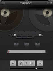
Nice music player, I'm envious.

I think I'd rather have large, nice, static album art instead of that rotating (I'm assuming :rolleyes: ) LP, never mind that ridiculous tone arm which has absolutely no functional purpose. That may be a fun design exercise, but is otherwise just completely frivolous, comparable to the stuff Apple released at the height of the skeuomorphism trend. It's pretty clear where they got their 'inspiration'.
 

Attachments

  • 8320805931_081beabf28_z.jpg
    8320805931_081beabf28_z.jpg
    107 KB · Views: 88

joedec

macrumors 6502
Jul 25, 2014
443
51
Cupertino
What does that have to do with this thread?


I think I'd rather have large, nice, static album art instead of that rotating (I'm assuming :rolleyes: ) LP, never mind that ridiculous tone arm which has absolutely no functional purpose. That may be a fun design exercise, but is otherwise just completely frivolous, comparable to the stuff Apple released at the height of the skeuomorphism trend. It's pretty clear where they got their 'inspiration'.

If you watch the demo, you move the tone arm to start, so it does function.

However for the time being I'd be happy if Apple would just fix the Mini-player, getting back to 10.10 terribleness, do we really need 14 objects in it. Talk about busy, including Album Art.
 

tkermit

macrumors 68040
Feb 20, 2004
3,586
2,921
I'd be happy if Apple would just fix the Mini-player, getting back to 10.10 terribleness, do we really need 14 objects in it. Talk about busy, including Album Art.

The iTunes mini player on OS X? These days, people usually complain about Apple's 'dumbing down' of apps. At the very least, the mini player has never been more functional and yet can be configured to look very minimalistic:
 

Attachments

  • mini.png
    mini.png
    29.5 KB · Views: 851

Omega Mac

macrumors 6502a
Aug 16, 2013
582
346
There is a Chinese smart phone company called Smartisan. I’ve just watched an interview with their CEO, Mr. Luo Yonghao. He is neither a total supporter for skeuomorphism or flat UI design. When asked about what made him decide that their smart phone should go with skeuomorphism his answer was that Skeuomorphism or flat was a pseudo problem in design because both of them have their places in different circumstances and that their Smartisan OS was classified as Skeuomorphism only due to a stupid fad in industrial design where almost every major smart phone maker was following Apple’s steps. He went ahead to reveal that there happened to be some designers at Smartisan who had connections with designers at Apple. And according to information inside Apple, the sharp turn to flat UI could only be attributed to Ive’s strong taste for flat.

I was not fully convinced that flat was Ive’s own will until now. Instead, I thought it was commonly agreed with by designers at Apple that flat was the right way into future and tried to convince myself that there was nothing wrong with going all flat. Now I have my own answer and I am deeply disappointed with it. I believe everyone could have his own taste in terms of design and rightfully fulfill it in his own blog or something. But for a neutral platform (a platform that should be compatible with any kind of content as well as maintaining a certain level of ease of use), such as an operating system, there should be no personal taste but right or wrong. And now I can only see personal taste in Yosemite and iOS 8.

The flat v skeumorph always seemed like a false dichotomy too me.

Ive is not the customer and to so ill consider the customer by placing your design ego bias ahead it is very serious thing indeed. Ive was a designer who aided the person who thought about the customer but that persons input is sadly gone.

Clearly Cook doesn't think about the customer. He thinks about the bottom line and the share price.

So is anyone at Apple thinking about the customer anymore and the end user end experience and not putting their specialist area of expert specialisation i.e. cart before the horse.

In other words they'll need to get their heads out of their own arses soon enough. I hope it's not too late.
 
Last edited:
Status
Not open for further replies.
Register on MacRumors! This sidebar will go away, and you'll see fewer ads.