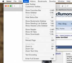
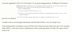
There you go

I have 2 1920x1080 monitors, not from Apple.
Well looking at the Mavericks menus, what stands out is that in Mavericks all the text is in
BOLD and in Yosemite it appears to not be in bold. That makes the fonts look thinner, but they aren't unreadable or not sharp in that snapshot here.
And it's not limited to the system font:
View attachment 542080
Etan
Now
that looks like a real problem. But is that TeXShop's fault (in the sense they need to fix something for Yosemite) or Apple's fault (as in a lot of 3rd party programs are broken looking)?
The example shown on this page (
https://discussions.apple.com/thread/6602718?start=105&tstart=0) looks BAD in my Firefox viewer in Mavericks and it's a PNG image being scaled by Firefox (i.e. if I click on the image, it's clear). So now I'm even less sure of the cause. Could it be that Yosemite is simply using poor choices of fonts in some areas? I've never seen any blurry fonts in everyday use on my Mac. When I switched to my first flat screen monitor several years ago, I did have to click on the LCD font smoothing to get all text to look good, but that was it. I'm half tempted to try out Yosemite just to see it for myself, but switching back even using Carbon Copy Cloner to simplify it all still would take hours to copy, etc. and gauging by comments overall and the snapshots I've seen, I don't really
want Yosemite for any good reason (i.e. no features to entice me to use it despite the ugly new interface).
Ok, I've gone back and looked at the first page of that discussion and there are much better examples there (e.g.
https://discussions.apple.com/servl...5542/Screen+Shot+2014-10-17+at+2.07.17+PM.png )of the menu bar system fonts looking blurry. What I don't get is how that looks better on a Retina monitor? Is it just a simple scaling issue (i.e. it looks bad when scaled to any other resolution but the Retina display ones)? Could it be they don't have enough font sizes available or it's not one of those scalable type fonts (truetype? I forget what they are called it's been such a non-issue for such a LONG time).
I guess I have to read the whole thread; the very next post the guy that posted that picture said rebooting eliminated the blurry font problem for him.... (sigh) It seems that the changes to LCD Font Smoothing only take effect after a reboot and turning it off helped many people. I had it off with my CRT, but it looked bad with it off on my LCD in Leopard on my PPC Mac when I first got an LCD so it sounds pretty strange to me that turning it off helps for flat-screens since that's just the opposite sounding. Others report it looks fine for many hours and then shows up (i.e. bug, not the font smoothing option). Basically, I'm getting a lot of different experiences in that thread that don't all add up together.
My second monitor is a cheap Insignia TV/Monitor (i.e. so I could watch TV on it sometimes while doing something else) and it was pretty horrific looking at first. I had to do several attempts with the color calibration to get colors to even come close to matching the primary monitor, but it wasn't just color that was off. It was contrast and that had a huge effect on things. I think it needed the LCD setting etc. set as well (didn't appear to be automatic). In the end, it was MUCH better looking, but still the fonts don't look as good on that monitor as the primary one. I wonder if any of these people did any calibrations and/or checked their resolution settings (I know in Mavericks it automatically picks the "best" resolution for you, but it may not be the "best" one as it appeared to look at my 2nd monitor's resolution when making the choice as well and the 2nd one is a different size and resolution). All I know is I would look in multiple areas. 3rd party monitors aren't always automatically awesome looking with a Mac. Color calibration made a 500% improvement on that monitor. But Apple's asinine method of calibration is hard to get it just right (took a half dozen attempts here). The Microsoft method is SOOO much easier and more reliable, IMO.


