Become a MacRumors Supporter for $50/year with no ads, ability to filter front page stories, and private forums.
Status
Not open for further replies.

grahamperrin

macrumors 601
Jun 8, 2007
4,942
648

Etan1000

macrumors regular
May 18, 2008
174
34

Etan1000

macrumors regular
May 18, 2008
174
34
Not exactly good news …

Jony Ive becomes Apple's first Chief Design Officer
…by Jon Fingas | @jonfingas | 17 mins ago


There's no question that Jony Ive is more important than ever to Apple's design process given his heavy influence on everything from the look of iOS to the philosophy behind the Apple Watch, and the Cupertino crew just gave him a promotion to reflect that fact. The Telegraph has revealed that Ive was recently promoted from Senior VP to become Apple's first-ever Chief Design Officer. He'll still oversee the company's broader design efforts, but there will be leaders dedicated to user interfaces (Alan Dye) and industrial design (Richard Howarth) as of July 1st.

This won't necessarily lead to a big shift in how Apple crafts its products. Dye helped Ive build the interface team that came after Scott Forstall's forced exit from the company…

http://www.engadget.com/2015/05/25/apple-names-jony-ive-chief-design-officer/

Etan
 

Etan1000

macrumors regular
May 18, 2008
174
34
See also a much broader article on Apple, but which includes the above report, in The Telegraph:
When Stephen Fry met Jony Ive: the self-confessed tech geek talks to Apple's newly promoted chief design officer
In an exclusive interview - in which Ive's promotion is revealed for the first time - Stephen Fry meets Jony Ive, and his boss, Apple chief executive Tim Cook, to talk spaceships, design and Steve Jobs

http://www.telegraph.co.uk/technolo...ples-newly-promoted-chief-design-officer.html

Etan
 

joedec

macrumors 6502
Jul 25, 2014
443
51
Cupertino
Last edited:

grahamperrin

macrumors 601
Jun 8, 2007
4,942
648
Alan Dye, Richard Howarth; Flavours

Alan Dye

Thanks; and please see the related post under Apple’s Software Quality Decline.

Flavours 2

I am unable to find any forums for Flavours 2 on that website. …

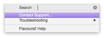
For feedback on build 182: at the download page, click 'Feedback'.

Also for contact with the developers, see top right of http://www.flavours.interacto.net

For public discussion: if you can treat the Sneak Peak versions as beta (does the About box show a 'b'?) then maybe aim for https://interacto.zendesk.com/forums/21622916-KB-Beta-Releases
 

grahamperrin

macrumors 601
Jun 8, 2007
4,942
648
Apple Human Interface Guidelines for OS X, past and present

http://web.archive.org/web/20140501...conceptual/applehiguidelines/Intro/Intro.html

… when or how …

2014-10-16: release of OS X 10.10 and if I recall correctly, the original guidelines disappeared within hours of release. Guidelines for Yosemite appeared.

From the 2014-10-22 copy of guidelines for Yosemite, step back in time; copies of that Apple URL in the three years preceding release of Yosemite found nothing.

No human interface guidelines in Apple's Retired Documents Library, but I shouldn't read too much into the disappearance of the traditional HIG from the apple.com domain. TN1150 is an example of something that disappeared, maybe more than once, for an extended period.

Reading between the lines of something else: the timeline in the Internet Archive Wayback Machine is curious. If HIG for a 'completely new' OS X originated privately more than three years before release, then that only adds to the disappointment with the end result.

I imagine alarm bells ringing, privately, for three years or more whilst leading UI designers (or their representatives) simply shut doors, at strategic points in time, to keep the noise to a minimum during meetings with other leaders; others who might have been more mindful of alarm within the company.

Well, hello.

Less pessimistically

I remind myself that the negativity:positivity ratio appeared not too bad during the public beta period that preceded 10.10. Maybe that early ratio led Apple to believe that post-release reactions would be better than they were/are.

Postscript – Yosemite "refines the impression of plausible, physical dimensionality"

Really?

Really, Apple? Was someone from the marketing department – a wearer of Burberry, maybe – totally blotto on cheap vodka when they wrote that sort of BS into the first page of something that's intended for software developers?

Phrases such as "refines the impression of plausible, physical dimensionality" might be good for selling anti-****ing-wrinkle cream but what the **** is that sort of language doing in a previously highly respected Apple document for developers? Novice developers might absorb the nouveau pomme BS like sponges but I'm old enough to have (and be happy with) all seven signs of ageing, without senility; I can see/smell/hear BS from a distance. No wonder the guidelines were not properly previewed during the prerelease period. Sigh.
 
Last edited:

Etan1000

macrumors regular
May 18, 2008
174
34
http://web.archive.org/web/20140501...conceptual/applehiguidelines/Intro/Intro.html


2014-10-16: release of OS X 10.10 and if I recall correctly, the original guidelines disappeared within hours of release. Guidelines for Yosemite appeared.

From the 2014-10-22 copy of guidelines for Yosemite, step back in time; copies of that Apple URL in the three years preceding release of Yosemite found nothing.

No human interface guidelines in Apple's Retired Documents Library, but I shouldn't read too much into the disappearance of the traditional HIG from the apple.com domain. TN1150 is an example of something that disappeared, maybe more than once, for an extended period.

Reading between the lines of something else: the timeline in the Internet Archive Wayback Machine is curious. If HIG for a 'completely new' OS X originated privately more than three years before release, then that only adds to the disappointment with the end result.

I imagine alarm bells ringing, privately, for three years or more whilst leading UI designers (or their representatives) simply shut doors, at strategic points in time, to keep the noise to a minimum during meetings with other leaders; others who might have been more mindful of alarm within the company.

Well, hello.

Less pessimistically

I remind myself that the negativity:positivity ratio appeared not too bad during the public beta period that preceded 10.10. Maybe that early ratio led Apple to believe that post-release reactions would be better than they were/are.

Thanks very much for that!

The irony of this statement in the HIG for Yosemite really glaringly stands out like a bad joke:

The system font is a specially optimized version of Helvetica Neue, which displays textual content with beauty, clarity, and sharpness.
:eek:

Who do they think they are kidding?

And what a bunch of doohickey this is:

Yosemite refines the impression of plausible, physical dimensionality in the UI. In particular, Yosemite uses translucency and vibrancy to help users focus on what’s important to them. (Vibrancy is a sophisticated blending mode that lets UI elements absorb color from content that’s underneath them.)

Etan
 
Last edited:

Etan1000

macrumors regular
May 18, 2008
174
34
Looks like Windows 10 users are going to get the same "stuff" generating the same "debate":

Windows (10) still looks and feels like a bunch of 6 year olds designed it in a nursery.

I'll stick with Win7.

I am glad MS is giving Win 10 a fully new coat of paint. That is what I admired about Yosemite: its look was all new. Windows 8 should have had a new icon set, but hey, at least MS is taking initiative now.

New Windows 10 build leaks with updated set of icons
http://www.techspot.com/news/60773-windows-10-build-10125-leak.html?google_editors_picks=true

What a circus!
Looks like Apple and Microsoft are going to be driving the same clown cars, driven by the same or similar clowns. How unique! How new! How refreshing!
I guess we are just not smart and chic enough to be impressed!

Etan
 

Agent-J

macrumors regular
Sep 20, 2014
148
38
What a circus!
Looks like Apple and Microsoft are going to be driving the same clown cars, driven by the same or similar clowns. How unique! How new! How refreshing!
I guess we are just not smart and chic enough to be impressed!

My goodness, it's like somebody ported the ugliest bits of Yosemite into Windows. The clown car bit is right, all the Chief Designers are drunk with the Kool aid, and they're all, lemming-like, driving over the cliff. :(
 

F1Mac

macrumors 65816
Feb 26, 2014
1,283
1,604
What a circus!
Looks like Apple and Microsoft are going to be driving the same clown cars, driven by the same or similar clowns. How unique! How new! How refreshing!
I guess we are just not smart and chic enough to be impressed!

Etan

My goodness, it's like somebody ported the ugliest bits of Yosemite into Windows. The clown car bit is right, all the Chief Designers are drunk with the Kool aid, and they're all, lemming-like, driving over the cliff. :(

Like I said a million posts ago in this thread, nowadays what's "cool" and trendy is "flat", free from any form of fantasy. OSes are products of their time, someday it will change again to something else, maybe not as flat. Computers have become fashion products, maybe because they are so integrated in our lives I don't know. So, as fashion products, in a way I understand why they're following the current trend, although I don't know why flat has become so popular.
 

Etan1000

macrumors regular
May 18, 2008
174
34
Possible New Take on Ive's Promotion?

Fortune
The weirdest Apple scoop of the week
by Philip Elmer-DeWitt
May 26, 2015, 9:07 AM EDT


The news, when we finally get it, is that the world’s most famous industrial designer — the man behind the iMac, iPhone, iPad and Apple Watch, not to mention all the software re-design since Scott Forstall was fired — has handed off day-to-day managerial duties to two of his lieutenants:

Richard Howarth, the new vice president of industrial design,
Alan Dye, the new vice president of user interface design.

That neither of Ive’s successors is a household name is unsurprising. Apple keeps a tight lid on the number of key people it makes famous. But the fact that both names surfaced earlier this year in published articles — Howarth in the New Yorker, Dye in Wired — suggests that there’s more here than meets the eye.

“The level of orchestration around this announcement,” writes Stratechery’s Ben Thompson, “augurs something far more significant than a changed title.”

Ive told Fry that handing off managerial duties would free him up to travel more, a statement widely interpreted to mean he will finally get to move back to England where his children won’t be forced, as 9to5Mac’s Seth Weintraub puts it, “to grow up talking like Americans and pronouncing ‘aluminum‘ like animals.”

What it means for Ive’s future at Apple was a matter of fierce debate overnight in the Twittersphere.

Daring Fireball’s John Gruber takes Apple’s statement — that Ive will “focus entirely on current design projects, new ideas and future initiatives” — at face value. “I do not believe,” he writes, “that [Ive is] taking a figurehead position or a ceremonial role — I think he truly is taking a serious C-level role as CDO.”

Others were less sanguine. Weintraub points out that Ive’s news broke in the middle of a big holiday weekend, when stories are usually released to blunt their impact. He thinks Ive may have one foot out the door.

Thompson came to the same conclusion. “In my estimation,” he writes, “this is the beginning of the end of his time at Apple.”

http://fortune.com/2015/05/26/the-weirdest-apple-scoop-of-the-week/

Etan
 
Last edited:
  • Like
Reactions: orbital~debris

Etan1000

macrumors regular
May 18, 2008
174
34
Could this announcement be reminiscent of the announcement made when Scully and the original Apple board "promoted" Steve Jobs to "Apple Visionary"?

Just wondering out loud.

Etan
 

Etan1000

macrumors regular
May 18, 2008
174
34
We can hope!

If that happens I will find myself with mixed emotions. Ive has been a huge asset for Apple on hardware designs over the years. IMO, he just should never have been turned loose on software design, and he seems to have misunderstood the underlying purpose of the Human Interface Guidelines.

Etan
 

applelover4u

macrumors 6502
Nov 6, 2012
336
179
"However, some Apple engineers have told us that they are not fans of the new font, which may look particularly rough on non-Retina screens."

I guess we just have to wait and see... I truly, truly hope they're not forgetting how many of us DON'T use retina screens.


...I completely agree with you about the font color, make it black again and a pretty large chunk of the problem is gone.

so what engineers, your not the main consumers buying the products, We don t like the font it is not about what you like
 

grahamperrin

macrumors 601
Jun 8, 2007
4,942
648
Flavours 2 (182) support and feedback

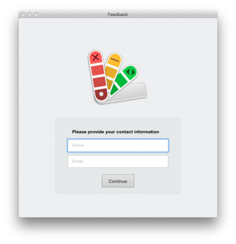
For feedback on build 182: at the download page, click 'Feedback'. …

More importantly, the app includes a feedback routine. Screenshots attached show the first step.
 

Attachments

  • Screen Shot 2015-05-27 at 05.54.10.png
    Screen Shot 2015-05-27 at 05.54.10.png
    22.9 KB · Views: 102
  • Screen Shot 2015-05-27 at 05.54.19.png
    Screen Shot 2015-05-27 at 05.54.19.png
    84.2 KB · Views: 120

zxy

macrumors newbie
Oct 24, 2014
18
4
New Zealand
I'm confused - do you mean there are variations within the Lion Theme? If so, how do I access those options? I can't find them.
Etan

The lion theme should look like my picture, not Grahams, which seems to be buggy. If yours doesn't look like that, try turning off:

dark mode

reduce transparency (you can turn that back on if turning it off doesn't work)
 

applelover4u

macrumors 6502
Nov 6, 2012
336
179
Its worth noting that for all the griping that's been done about Yosemite, Apple is changing the system font in 10.11. Seems these complaints don't fall on deaf ears after all.

https://www.macrumors.com/2015/05/20/apple-san-francisco-font-ios-9-osx-1011/

I just hope they'll also take notice of the contrast, namely eliminating the use grey type on bright white background, that would go a long way in making the OS easy on the eye (again).


i change my font already to San Francisco system wide. I'm happy!
 

Attachments

  • Screen Shot 2015-05-27 at 4.02.48 AM.png
    Screen Shot 2015-05-27 at 4.02.48 AM.png
    406.7 KB · Views: 192

Partron22

macrumors 68030
Apr 13, 2011
2,655
808
Yes
Please, do not blame engineering.
For certain. They've given us some great products.
Some of them can make the jump into good user interface design for the rest of us, some are not so flexible.
Things work out best when they know their limits, and stay within them.
 
Status
Not open for further replies.
Register on MacRumors! This sidebar will go away, and you'll see fewer ads.