Become a MacRumors Supporter for $50/year with no ads, ability to filter front page stories, and private forums.
Status
Not open for further replies.

w0lf

macrumors 65816
Feb 16, 2013
1,268
109
USA
What is that picture? Surely you are not trying to say that this awful mockup has anything to do with Yosemite?

But senpai... that is Yosemite.

> Increased contrast
> cDock > 3D dock
> Colorfulsidebar
> Custom folder icons
 

leman

macrumors Core
Oct 14, 2008
19,529
19,700
But senpai... that is Yosemite.

> Increased contrast
> cDock > 3D dock
> Colorfulsidebar
> Custom folder icons

Ah, I see. So someone has modded the normal looks of Yosemite, which resulted in ugly icons and ugly colors and now people are discussing how awful Yosemite looks :D Entertaining ;)

BTW, the screenshot does show at least one bug with the accessibility settings in combination with the dark mode — the menu icons should not be black when the 'Increase contrast' is activated.
 

agaskew

macrumors 6502
Dec 3, 2009
416
253
The final Yosemite had better be a vast improvement over the current build, because its basically a dog's dinner at the moment :confused:
 

grahamperrin

macrumors 601
Jun 8, 2007
4,942
648
…
dark mode still crappy …

Yosemite_improved.png

Yes I see what you mean. Are those the default iCloud folders?

I've changed all the yosemite folder icons …

… the overlay makes for a nice touch. I use folders from Orion …

Orion is indeed a great set …

That looks hideous.

Daenerys, please: what, specifically, looks hideous?

… Dark Mode devolved … to a Menu Bar+Dock+Spotlight recoloring …

– no mention of folder icons

Looking at the Finder toolbar buttons, the tabs, the checkboxes. …

– no mention of folder icons

Ah, I see. So someone has modded the normal looks … now people are discussing how awful Yosemite looks …

Concerning the third party folder icons: I suspect that Mr Todhunter and joedec viewed the folder icons (at least, the related overlay) as a nice touch. Not awful.

… with the accessibility settings in combination with the dark mode — the menu icons should not be black when the 'Increase contrast' is activated.

Yes, that's probably what was meant by crappy.

Yosemite dark mode should be no less accessible, no less pleasing in appearance, than its alternative.

I'm really quite disappointed at Apple's development pace …

That pace is debatably crappy.

Considering feedback from six developer previews, over three months, plus the time that Apple must have taken before the first, it is disappointing to find a menu of Finder only half-baked in appearance. This is Finder, the Apple app that is almost omnipresent, which gained a 'Go' menu years ago.

I should be not too harsh on Apple. If a half-baked appearance is a side-effect of very recently scrapping what was originally imagined for a release of Yosemite, then I welcome the company's readiness to scrap what's not right.
 

j800r

macrumors 6502
Jan 5, 2011
399
140
Coventry, West mids, England
I've honestly no idea how I feel about this myself. I neither love or hate it.

See, it was the gorgeous, incredible, way ahead of it's time look which Leopard had that attracted me to OSX. I came in at Snow Leopard. To this day I think it was the visual pinnacle of OSX. Aqua was so very far ahead of it's time when it launched that I quite honestly felt they didn't NEED to get rid of it. To me it still stands up today!

Well, with Yosemite that's all out the window. Everything that attracted me to OSX visually is gone and I could easily make Linux look far better. However...

I don't hate it! I should, but I don't. For the new type of UI it is it's still the best of it's kind and it's still the best looking OS out there (not including themed Linux of course)! Also the way certain UI elements react to your wallpaper/content is amazing! I hate when people compare the transparency to aero though as it's nothing alike. The transparency is so subtle you barely notice it. Really, I wouldn't call it transparency, more like adaptation. The title bar adapts to scrolling content and the doc/sidebar adapt to your active wallpaper or whatever's behind it. The most transparent element is the dock and even that's not transparent.

I won't lie, I do miss the 3D dock (the original Leopard style one) but being a Mac user for 4 years now I know all the benefits to OSX/owning a Mac besides a fancy UI. I don't love the UI changes but I don't hate them either. Some parts are kinda cool and refreshing. I just can't wait till my next phone upgrade so I can grab an iPhone and have an even better OSX experience.
 

grahamperrin

macrumors 601
Jun 8, 2007
4,942
648
Questions for anyone:

… I wouldn't call it transparency, more like adaptation. The title bar adapts to scrolling content

– to let you know there’s more to see than what’s visible in the window as you scroll.

What more is there to Apple's logic for that appearance?

and the doc/sidebar adapt to your active wallpaper or whatever's behind it.

What's Apple's logic, and is it demonstrably consistent?

For consistency, with what's done to the toolbar, the following would be more Yosemite-like:
  • a sidebar that adapts to let me know that there's more to see than what's visible
– and where content is wide, that adaptation should convey the content (not the wallpaper or anything else that may be behind the content).

The most transparent element is the dock and even that's not transparent. …

Through experimentation in and around Yosemite, I decided to make major changes to the appearances of my Docks. Early changes included abandonment of indicators below running apps. I'm now happy with no background. In chronological order, some of my recent choices:

attachment.php


attachment.php


attachment.php
 

Attachments

  • 2014-08-22 15-30-21 screenshot.png
    2014-08-22 15-30-21 screenshot.png
    935.7 KB · Views: 828
  • 2014-08-22 15-30-30 screenshot.png
    2014-08-22 15-30-30 screenshot.png
    1.9 MB · Views: 98
  • 2014-08-30 22-27-30 screenshot.png
    2014-08-30 22-27-30 screenshot.png
    28.5 KB · Views: 807
  • 2014-09-03 20-46-32 screenshot.png
    2014-09-03 20-46-32 screenshot.png
    127.9 KB · Views: 807

shanson27

macrumors 68020
Nov 27, 2011
2,228
21,201
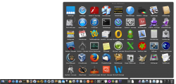
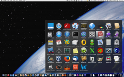
Can Apple change the background of the stacks ? it's sometimes really difficult to see something ! Most of the web sites use a white background

altarnative-2.jpg
 
Last edited:

joedec

macrumors 6502
Jul 25, 2014
443
51
Cupertino
Can Apple change the background of the stacks, is really difficult to see something ! Most of the web sites use a white background

Image

Of course they can, also they fade the font in this case, which I cannot understand why they can't seem to resolve "unreadable" without feedback.

For now I guess we just send feedback.
 

j800r

macrumors 6502
Jan 5, 2011
399
140
Coventry, West mids, England
Well that's the whole point. It's not even released yet. Things are subject to change. Stacks may not even be complete. Just leave feedback, sit tight and if it doesn't change come release you can always go back to Mavericks and hope the next OSX iteration is different enough.
 

joedec

macrumors 6502
Jul 25, 2014
443
51
Cupertino
Well that's the whole point. It's not even released yet. Things are subject to change. Stacks may not even be complete. Just leave feedback, sit tight and if it doesn't change come release you can always go back to Mavericks and hope the next OSX iteration is different enough.

Generally you don't wait till you release your software before fixing the simple stuff. This is not rocket science here, this is fonts and icons. I've shown prototypes that never got these kind of complaints.

Releasing the 2nd Public Beta in this shape, that's just embarrassing.
 

j800r

macrumors 6502
Jan 5, 2011
399
140
Coventry, West mids, England
Oh come on!

Their priority is, and should be, fixing REAL bugs. A slight UI feature you take issue with?? It may or may not change but it's not the end of the world!! The OS isn't finished, give them a bloody break!!

As I said, the LOOK is completely and utterly relative and a matter of opinion.

FTR, grid stacks lack just fine to me and perfectly legible. Therefore it's just people nitpicking where there's nothing to pick or unique to a DP and NOT in the public beta!

There's nothing to even fix and if there was as said the OS is not finished till released.
 

joedec

macrumors 6502
Jul 25, 2014
443
51
Cupertino
Oh come on!

Their priority is, and should be, fixing REAL bugs. A slight UI feature you take issue with?? It may or may not change but it's not the end of the world!! The OS isn't finished, give them a bloody break!!

As I said, the LOOK is completely and utterly relative and a matter of opinion.

FTR, grid stacks lack just fine to me and perfectly legible. Therefore it's just people nitpicking where there's nothing to pick or unique to a DP and NOT in the public beta!

There's nothing to even fix and if there was as said the OS is not finished till released.

Your right, REAL bugs, those aren't being fixed, and there are a ton of regressions. How about REAL opportunity, like why doesn't Apple finish Time Machine, or make an Airport Utility that shows "wired" DHCP clients... I could go on and on. There's lots of room for improvement.

The point is, it seems this release is all about fonts and icons, very few REAL problems are being addressed. Handoff and Continuity could have been in a Mavericks patch release.

PS Legibility is a regression not an opinion.
 

j800r

macrumors 6502
Jan 5, 2011
399
140
Coventry, West mids, England
and as I said I personally tested and there is zero legibility issue. At least not on the public beta.

I don't follow you. Time Machine is a finished product and is the best backup solution I've used (for free at least) and certainly far better than Microsoft can spew out.

Bugs will get fixed. The OS isn't finished yet. As for features you want to see, well that's just something you want but aren't getting. Sorry. No OS is perfect. Not a single one and someone will ALWAYS have some issue or other but quite honestly if you're so unhappy with the way Apple are handling things and can only complain about the state of OSX I don't know why you're even using a Mac/OSX at all!! How about listing all the things you love about Apple/OSX now after that complaint-fest? :p

Seriously though, there is zero legibility issue in stacks. I've tested and could read fine. Maybe for poor eyesight but surely there'd be something in accessibility options for that.
 

joedec

macrumors 6502
Jul 25, 2014
443
51
Cupertino
and as I said I personally tested and there is zero legibility issue. At least not on the public beta.

I don't follow you. Time Machine is a finished product and is the best backup solution I've used (for free at least) and certainly far better than Microsoft can spew out.

Bugs will get fixed. The OS isn't finished yet. As for features you want to see, well that's just something you want but aren't getting. Sorry. No OS is perfect. Not a single one and someone will ALWAYS have some issue or other but quite honestly if you're so unhappy with the way Apple are handling things and can only complain about the state of OSX I don't know why you're even using a Mac/OSX at all!! How about listing all the things you love about Apple/OSX now after that complaint-fest? :p

Seriously though, there is zero legibility issue in stacks. I've tested and could read fine. Maybe for poor eyesight but surely there'd be something in accessibility options for that.

Time Machine is great, I agree, but its never been finished, open Time Machine with Calendar, then Contacts, you'll see what I mean. Incremental restores are not fully implemented.

Legibility is more fact than opinion, I believe it looks OK for some but that doesn't mean its sharp or in focus. Sharpness is measurable, and its reasonably simple to magnify and compare pixels. Now people's tolerance is what I think is being expressed more than opinion. Some people never clean their glasses and it doesn't bother them, some people see every speck, (like me). Make sure when you look at Stacks you vary the background, you'll see the issue.

Complaint fest, probably, I'll admit I am starting to sound like a broken record to myself. To be honest I used lots of beta software, but never participated in these "public" forums. Lets just say its been an experience.

A list of why I am on Mac would be long, but to make a long story short, when Apple moved to Mach and the BSD stack I was all over it. A UNIX machine that runs PC software, nothing can top that. So now the Mac that was relegated to the corner was front and center. Yes I've owned 68K and PPC, that dates me.

So don't be too hard on the public discourse. Apple is fishing with this Beta, they distributed to a million people after all.

Apple can take criticism, its part of the culture. Personally I've filed 24 bugs, seems I'm working for Apple for free. Now that's something to gripe about!
 
Last edited:

OldGuyTom

macrumors regular
Original poster
Sep 6, 2013
156
33
US
When I started this post almost 2 months ago I thought it would be buried in the mud with maybe 5 or 10 responses. Instead it's got one of the highest thread viewing counts in the Yosemite section. Apparently I'm no where near alone in my sentiments regarding these "improvement."

One of the things I find annoying, and this has been going on for some time at Apple, is that they seem to be on a march to not only uglify the UI, but make it more annoying to work with as well.

Aside from title bars, another annoyance, or should I say "improvement" with Safari is the elimination of icons in the reader sidebar, all to be replaced by the outlines of open books (simple.....clean.....flat.....stupid!!!). What I used to do was get links for some weather radar links and move them to the top of my bookmarks list with a group of other related icons. With the icons all now being replaced by the "beautiful, flat, simple" open-book icon it's now irritating and often difficult to put them in order. The bookmarks are, after all, hyperlinks, and when you slide one icon up over another you literally need to start re-reading hyperlinks to try and order them. This was easy with icons but with the new simple....clean.....flat.....stupid looking appearance it's annoying, difficult, and error prone. It's like Apple is going out of its way to deliberately irritate its own customers.

Someone else also mentioned stuff like the removal of Expose, which I thought was a great feature as well as other removals like the display icon in the menu bar. Were things like these REALLY confusing people. Were they REALLY that difficult to maintain in source code?

This is a classic example how NOT to do things. You don't take away features that improve things and replace them with bad ideas that don't.

...but now the entire user interface is being replaced in what can only be called the grandest of grand experiments in Apple's history.

The number of views and responses this thread is getting speaks for itself!
 

shanson27

macrumors 68020
Nov 27, 2011
2,228
21,201
and as I said I personally tested and there is zero legibility issue. At least not on the public beta.

I don't follow you. Time Machine is a finished product and is the best backup solution I've used (for free at least) and certainly far better than Microsoft can spew out.

Bugs will get fixed. The OS isn't finished yet. As for features you want to see, well that's just something you want but aren't getting. Sorry. No OS is perfect. Not a single one and someone will ALWAYS have some issue or other but quite honestly if you're so unhappy with the way Apple are handling things and can only complain about the state of OSX I don't know why you're even using a Mac/OSX at all!! How about listing all the things you love about Apple/OSX now after that complaint-fest? :p

Seriously though, there is zero legibility issue in stacks. I've tested and could read fine. Maybe for poor eyesight but surely there'd be something in accessibility options for that.

Time Machine is a finished product ? No! LOL The Time machine is full of bugs

see the image

Bildschirmfoto%202014-09-04%20um%2021.23.34.png
 
Last edited:

j800r

macrumors 6502
Jan 5, 2011
399
140
Coventry, West mids, England
*facepalm*

You're making your point using beta software. I wasn't talking about the beta at that point. Yes, I'm sure the Time Machine redesign has holes to pick and that's the point in a bloody beta!


Also @op I think you'll find a lot of it is people arguing your point as well.

Aesthetic changes aren't gonna impress everyone. Don't like it? Stick to an older version or move away from OSX. In my 4 years as a Mac user I've learned it's Apple's way or the highway. That's what you bought into. Personally I loved Aqua and never wanted to see it go. I still believe Snow Leopard was the best looking OSX version. However, I've learned to deal and get used to the changes as I'd still rather have the Apple experience in general.

I don't like their changes that much, but aesthetically Apple still do it best imho.
 

grahamperrin

macrumors 601
Jun 8, 2007
4,942
648
Thanks, OldGuyTom

… Apparently I'm no where near alone in my sentiments … it's annoying, difficult … like Apple is going out of its way to deliberately irritate its own customers. …

Dislikes for the look (and more) of Yosemite are fairly widespread.

OS X Yosemite | Hacker News (2014-06)

Safari 8.0 gripe - comp.sys.mac.system (Google Groups, 2014-07-30)

Had a chance to try Yosemite today. - JLA FORUMS (2014-08-02)

"… tolerable. Frankly the overall look and feel is a big step backwards …"​

Yosemite is ugly as hell has to be the worst look and feel of all the OS - The Something Awful Forums (2014-08-05)

Back to Mavericks!! - comp.sys.mac.system (Google Groups, 2014-08-06)

Another step towards Windows - JLA FORUMS (2014-08-27)

Postscript – a few words from paid-up Mac Developer Program members (not representative of majority opinion, but it's unusual to find such things):
  • … change for the sake of change … (2014-06-05)
  • … Yosemite is butt-ugly … (2014-07-14)
  • … mature and stable … I agree Yosemite is pig-ugly … (2014-07-16)
  • … style and the elegance. That went out … with Yosemite. … (2014-07-25)
  • … it hurts my eyes to look at the screen … (2014-08-27)
– I see those things in context with a (free) Safari Developer Program membership.
… elimination of icons in the reader sidebar

That's disappointing.

all to be replaced by the outlines of open books …

For me, the appearance differs. Most items are completely without an icon. Mavericks is better.

… how NOT to do things. You don't take away features that improve things and replace them with bad ideas that don't.

... the grandest of grand experiments in Apple's history. …

Highly experimental …

My bet is they are measuring the boiling point, so to speak, with this beta …

People get burnt by the software, and by discussion of the pain.

People really need to file Bug Reports and/or Feedback, that's what this is really all about.

+1

Preview: A closer look at OS X Yosemite, just in time for the public beta | Ars Technica (2014-07-23)

"… don't think that complaining will get you your old interface back—spamming Apple with "I HATE YOSEMITE" messages isn't going to help anybody. …"​

+1 to not spamming, but "I HATE YOSEMITE" is a reasonable comment.

I encourage people who dislike (or hate) the appearance of Yosemite to make clear their emotions in feedback to Apple. If that feedback can include a detailed explanation of why there's a negative reaction to the design, even better – if a problem (or perception of a problem) is reproducible, that's ideal.
 
Last edited:

MagnusVonMagnum

macrumors 603
Jun 18, 2007
5,196
1,452
and as I said I personally tested and there is zero legibility issue. At least not on the public beta.

I don't follow you. Time Machine is a finished product and is the best backup solution I've used (for free at least) and certainly far better than Microsoft can spew out.

Bugs will get fixed. The OS isn't finished yet. As for features you want to see, well that's just something you want but aren't getting. Sorry. No OS is perfect. Not a single one and someone will ALWAYS have some issue or other but quite honestly if you're so unhappy with the way Apple are handling things and can only complain about the state of OSX I don't know why you're even using a Mac/OSX at all!! How about listing all the things you love about Apple/OSX now after that complaint-fest? :p

Instead of being able to put my computer to sleep (because NFS isn't a recognized sleep token and it would take Apple maybe 5 minutes to FIX this and despite several bug reports, they obviously find fracking with the GUI graphics to be their top priority). Frankly, your apologetic list of excuses for Apple doesn't help that issue any.
 
Status
Not open for further replies.
Register on MacRumors! This sidebar will go away, and you'll see fewer ads.