Become a MacRumors Supporter for $50/year with no ads, ability to filter front page stories, and private forums.
Status
Not open for further replies.

j800r

macrumors 6502
Jan 5, 2011
399
140
Coventry, West mids, England
"… don't think that complaining will get you your old interface back—spamming Apple with "I HATE YOSEMITE" messages isn't going to help anybody. …"
+1 to not spamming, but "I HATE YOSEMITE" is a reasonable comment.

I encourage people who dislike (or hate) the appearance of Yosemite to make clear their emotions in feedback to Apple. If that feedback can include a detailed explanation of why there's a negative reaction to the design, even better – if a problem (or perception of a problem) is reproducible, that's ideal.

As I said earlier, it's always been Apple's way or the highway. That's how it's always been done. The people who hate Yosemite that much are gonna have better luck moving away from OSX than getting Apple to rapidly change things again.

A lot of it is the whole change thing. People are massively resistant to change. I've learned to embrace it as I have any design decisions Apple have made as that's what I signed up for when I bought a Mac. That's Apple's way. I HATED when they changed the 3D dock from the Leopard style but I learned to deal as there was no changing it. Same with the visual changes of Yosemite. They may tweak things but the big UI change is here to stay I'm afraid until it becomes dated and Apple decides to redo again.

As I've said before also, I feel the Snow Leopard look was the best. I loved Aqua! However no matter how much I whine and moan it ain't coming back so I have to learn to be happy with the UI I've got now and it's honestly NOT all that bad! It just takes getting used to.
 

grahamperrin

macrumors 601
Jun 8, 2007
4,942
648
… It just takes getting used to.

No. That argument was made, not accepted, earlier in this topic.

… I personally tested and there is zero legibility issue. At least not on the public beta. … Seriously though, there is zero legibility issue in stacks. I've tested and could read fine. …

I'll look at the most recently seeded build.

… Sorry. No OS is perfect. …

At a glance, in this topic I see no pleas for operating system-wide perfection.

Most complaints concern the appearance of Yosemite.

It's fair to occasionally complain about the relative lack of attention by Apple to older and more serious problems, such as bugs that may prevent the Mac from waking …

… How about listing all the things you love about Apple/OSX now after that complaint-fest? :p

There are a few love-fests and more varied topics. A selection, in chronological order:

… Complaint fest, probably, I'll admit I am starting to sound like a broken record to myself. …

I can't speak for you but for myself, most of the repetition is in response to repetition from other people.

… Apple is fishing with this Beta, they distributed to a million people after all. …

My guess: Apple will make the beta more easily available on, or soon after, next week's event.

… In my 4 years as a Mac user I've learned it's Apple's way or the highway. …

It's not so simple, please see below.

… NFS isn't a recognized sleep token … several bug reports …

OS X Yosemite (10.10) Bug Thread … I could add a long list, including at least one old bug that may be critical from a security perspective, but I'll not.

… it's always been Apple's way or the highway. That's how it's always been done. …

For a while, Apple's way was to not show the address when required in Safari. Apple changed its way.

For a while, Apple's way was to not show the title bar in Safari. Apple changed its way.

I hope that Apple can, again, improve its ways in response to thoughtful feedback.
 

grahamperrin

macrumors 601
Jun 8, 2007
4,942
648
and as I said I personally tested and there is zero legibility issue. At least not on the public beta. … Seriously though, there is zero legibility issue in stacks. I've tested and could read fine. Maybe for poor eyesight but surely there'd be something in accessibility options for that.

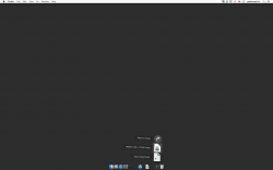
Downloads stack, my view


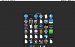
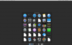
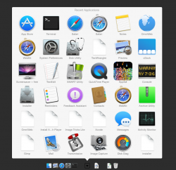
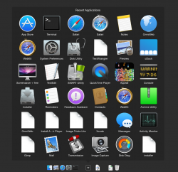
Recent applications stack, my views


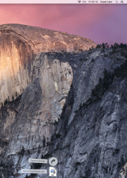
Downloads stack, Guest user, before


Downloads stack, Guest user, after


I don't expect everyone to realise – from those screenshots alone – but there are some legibility problems.

Environment
  • MacBookPro5,2
  • NVIDIA GeForce 9600M GT preferred (discrete)
  • 17" glossy display
  • 1920 x 1200 resolution (best for display)
  • Build 14A343f of OS X 10.10
 

Attachments

  • 2014-09-05 00-02-21 screenshot.png
    2014-09-05 00-02-21 screenshot.png
    105.5 KB · Views: 1,129
  • 2014-09-05 00-03-47 screenshot.png
    2014-09-05 00-03-47 screenshot.png
    542.1 KB · Views: 2,936
  • 2014-09-05 00-20-02 screenshot.png
    2014-09-05 00-20-02 screenshot.png
    540.8 KB · Views: 1,147
  • 2014-09-05 00-06-03 screenshot cropped.png
    2014-09-05 00-06-03 screenshot cropped.png
    1.7 MB · Views: 1,163
  • 2014-09-05 00-18-20 screenshot cropped.png
    2014-09-05 00-18-20 screenshot cropped.png
    1.7 MB · Views: 1,143

j800r

macrumors 6502
Jan 5, 2011
399
140
Coventry, West mids, England
Downloads stack, my view

[url=https://forums.macrumors.com/attachment.php?attachmentid=488779]Image[/URL]

Recent applications stack, my views

[url=https://forums.macrumors.com/attachment.php?attachmentid=488780]Image[/URL]

[url=https://forums.macrumors.com/attachment.php?attachmentid=488781]Image[/URL]

Downloads stack, Guest user, before

[url=https://forums.macrumors.com/attachment.php?attachmentid=488782]Image[/URL]

Downloads stack, Guest user, after

[url=https://forums.macrumors.com/attachment.php?attachmentid=488783]Image[/URL]

I don't expect everyone to realise – from those screenshots alone – but there are some legibility problems.

Environment
  • MacBookPro5,2
  • NVIDIA GeForce 9600M GT preferred (discrete)
  • 17" glossy display
  • 1920 x 1200 resolution (best for display)
  • Build 14A343f of OS X 10.10

You need your eyes checked mate. Every last screenshot was clear as a bell to me.
 

grahamperrin

macrumors 601
Jun 8, 2007
4,942
648

colourfastt

macrumors 65816
Apr 7, 2009
1,047
964
From a software engineer, a user interface designer:


No, I don't. My spectacles are good enough, and clean.

The trouble that occurs with Yosemite does not occur with Mavericks.

As I said, I don't expect everyone to realise – from those screenshots alone.

I've said it before: the UI is acceptable if you're in your teens or 20s, but when you hit your 40s, 50s, etc. the slight gradients of the colors, lack of contrast, etc. make it difficult to see the UI elements clearly and quickly.
 

j800r

macrumors 6502
Jan 5, 2011
399
140
Coventry, West mids, England
and I've said before, there are accessibility features if you have poor eyesight. I'm sorry, it IS poor eyesight. There is NOTHING hard to see there. Not at all. Not in the slightest. I'm done arguing though as this topic is getting nowhere now.

If you don't like Yosemite don't use it. Simple as. It looks and behaves fine for me. That is all. I'm done.
 

frgough

macrumors newbie
Jun 28, 2007
15
0
and I've said before, there are accessibility features if you have poor eyesight. I'm sorry, it IS poor eyesight. There is NOTHING hard to see there. Not at all. Not in the slightest. I'm done arguing though as this topic is getting nowhere now.

If you don't like Yosemite don't use it. Simple as. It looks and behaves fine for me. That is all. I'm done.

So, what you're saying is that Yosemite damages your eyesight and Mavericks restores your eyesight. Because apparently, his eyesight degrades / improves depending on which OS he is using. Apple should definitely market Mavericks then as a cure for poor eyesight.

After having read through 40 pages of this thread, two points become clear.

1 - Yosemite is a poorer interface than Mavericks in objective, scientific, measurable terms.

2 - A very loud group of Yosemite users and Apple itself appear to be in willful denial of that fact. In Apple's case, the reason is easy to understand: Ego investment. Not sure what the motivation is in the forum posters.
 

colourfastt

macrumors 65816
Apr 7, 2009
1,047
964
So, what you're saying is that Yosemite damages your eyesight and Mavericks restores your eyesight. Because apparently, his eyesight degrades / improves depending on which OS he is using. Apple should definitely market Mavericks then as a cure for poor eyesight.

After having read through 40 pages of this thread, two points become clear.

1 - Yosemite is a poorer interface than Mavericks in objective, scientific, measurable terms.

2 - A very loud group of Yosemite users and Apple itself appear to be in willful denial of that fact. In Apple's case, the reason is easy to understand: Ego investment. Not sure what the motivation is in the forum posters.

The koolaid is stronger than ever.
 

grahamperrin

macrumors 601
Jun 8, 2007
4,942
648
Can Apple change the background of the stacks ? it's sometimes really difficult to see something …


At the time of that screenshot, was the difficulty caused by insufficient contrast – between the light grey text and off-white background of the stack?

If so, I can understand the difficulty.

I don't know whether the off-white background below is an Apple default, but it's what appears here whilst things are 'settling in' (before my preferences become effective).


Attachments

  • 2014-09-05 00-19-36 screenshot.png
    2014-09-05 00-19-36 screenshot.png
    496.2 KB · Views: 1,033
  • 2014-09-05 00-20-02 screenshot.png
    2014-09-05 00-20-02 screenshot.png
    487.5 KB · Views: 934

grahamperrin

macrumors 601
Jun 8, 2007
4,942
648
Doing what's best for the user; being classy and confident …

"… Resist the urge to indulge or show off. Do what's best for the user.

"I guess it boils down, when designing interfaces, to being classy and confident enough to be boring. By all means have a masturbatory design session when you talk about how cool your awesome UI would be; something applicable might emerge."​
Christopher Phin, Editor-in-Chief of MacFormat, MacLife,
iPad User Magazine and special edition magazines.
Uses language suitable for miners, not minors.
https://alpha.app.net/chrisphin/post/294177
 
Last edited:

crashoverride77

macrumors 65816
Jan 27, 2014
1,234
213
I skipped Lion and didn't miss it one bit. Unless there's some overwhelming awesome feature in this I missed, I see no reason to upgrade either so far.

So basically you don't care about a more modern look, better security, new safari, mail with mark up, new notification centre with widgets, new messages, much better spotlight, icloud drive, icloud photo library with new photos app and ffing CONTINUITY.
:mad:
 
Last edited:

grahamperrin

macrumors 601
Jun 8, 2007
4,942
648
Caring about the human interface

So basically you don't care about a more modern look, better security, new safari, mail with mark up, new notification centre with widgets, new messages, much better spotlight, icloud drive, icloud photo library with new photos app and ffing CONTINUITY.
:mad:

If we did not care, we would not be here.

From an earlier post:

Apple decided – before WWDC – to jettison best practice for the sake of novelty and some 'wow' factor.

Apple must have known that reducing functionality and ease of use would have a polarising effect. And here I am, strategically planning my next Apple purchase to occur before Yosemite becomes a requirement. And no longer planning to get a more modern iPhone.

I love what Apple is planning around continuity (and if my suspicions are correct, some of what's secret will be extraordinarily good) but if the Yosemite UI as we see it now is the only foundation: I'll take my time and look elsewhere.​
 
Last edited:

grahamperrin

macrumors 601
Jun 8, 2007
4,942
648
… stuck with a skeumorisphm os for another 10 years to keep the close minded people happy.

The purpose of a skeumorph is unrelated to a person being closed-minded.

It's the same people that probably still have an iPhone 4 and complain about speed

I have an original iPhone (MB213B) that was refurbished and gifted to me in April 2012. Good battery life, more than fast enough. No complaints about any aspect.

or have a mac book pro from the stone ages and complain that continuty will not work on their ancient devices. …

2009 MacBookPro5,2 here, I don't recall any complaint about hardware compatibility.

… Skeumorisphm …not fresh

https://forums.macrumors.com/showthread.php?p=19536631#post19536631

… Yosemite is the same osx we all know and love just a lot more sexy and usable. …

Wherever OS X causes a headache, the customer may defer sexual intercourse with the Mac.

… a lot more sexy, while not dumbing it down at all. …

http://hardforum.com/showpost.php?p=1040984052&postcount=23

https://www.youtube.com/watch?v=SPDZyjYY2Ec&google_comment_id=z12mx3nhnoettd2cb23dyzkbsp2ivhtqo04
 

oVerboost

macrumors 68000
Sep 17, 2013
1,565
1,039
United Kingdom
I know a fair few don't like the new look, but I am loving Yosemite! Nice layout, a much nicer font used even in Beta stage it seems to run better than Mavericks ever did on my iMac. Although it's never been quite right since I downloaded Mountain Lion, but now it works as well as it did on Snow Leopard.

Plus it refreshed things, and makes the whole experience feel "new" on a machine I've had for 4 years. :)
 

grahamperrin

macrumors 601
Jun 8, 2007
4,942
648
Transparent menus in 2000, 2001 and 2014

… I hope they tone down the transparency for the final release. It reminds me of 10.0 and not in a good way, context menus in particular look like they are a lot less legible. The transparency isn't bad per se, but it doesn't serve any useful purpose and just makes things harder to read. I know you can disable it completely, but I found the transparency in SL and above to be just right. …

… those pinstripes and transparencies were very visually impressive for their time and set standards for UI for the next decade. Without them, we would have never arrived to the tasteful "frosted glass" blur effect in iOS and now OS X. And who knows; in a couple of years people may be blasting the frosted glass effect for being over-the-top and distasteful. …

If you really want to see the fonts get messed up, put a dark wallpaper up and drop down one of the menu bar menus. It is the transparency that is messing things up. …

… Transparent menus were the first thing that I wanted to change. …

… OS X.0 was a horrible OS with overly transparent menus and pinstripes everywhere. … there are still some fancy visual effects, but …

… I want some transparency but not for the menus. …

… menus in dark mode are a bit too transparent and distracting making them more difficult to read than their standard white counterparts …

For readers who never experienced Macs around the turn of the century: http://youtu.be/BkQxvSX9MOs?t=2m2s there's an example of transparent menus from Christmas 2000. It's not a good quality representation – that particular video suffers badly from moiré – but hopefully enough can be seen to get a rough idea of how some effects were used by Apple in that era.

Better quality representations might be found in videos of the introduction by Steve Jobs.
 

crashoverride77

macrumors 65816
Jan 27, 2014
1,234
213
If we did not care, we would not be here.

From an earlier post:

Apple decided – before WWDC – to jettison best practice for the sake of novelty and some 'wow' factor.

Apple must have known that reducing functionality and ease of use would have a polarising effect. And here I am, strategically planning my next Apple purchase to occur before Yosemite becomes a requirement. And no longer planning to get a more modern iPhone.

I love what Apple is planning around continuity (and if my suspicions are correct, some of what's secret will be extraordinarily good) but if the Yosemite UI as we see it now is the only foundation: I'll take my time and look elsewhere.​

What is this nonsense, yosemite improved functionality a lot and it's as easy to use as ever. You seem very old fashioned with wanting to not get modern iphone, operating system etc. Guess what the only option is windows so try to enjoy that if you think yosemite is bad UI design.
 
Last edited:

shanson27

macrumors 68020
Nov 27, 2011
2,229
21,205
the graphic dots in Photo Booth are pixelated :confused: not really clean

see the image

Bildschirmfoto%202014-09-06%20um%2014.51.35.png
 

grahamperrin

macrumors 601
Jun 8, 2007
4,942
648
What is this nonsense, yosemite improved functionality a lot and it's as easy to use as ever.

That's exemplary of the repetition that was discussed in this topic less than two days ago. Please read the posts, and at least some of the materials linked from those posts, that go towards explaining exactly how pre-release Yosemite makes some aspects of using a Mac more difficult.

You seem very old fashioned with wanting to not get modern iphone, operating system etc.

I am old-fashioned in some ways, but not in the ways you imagine. The misunderstanding may be a result of reading only a fraction of this topic.

Guess what the only option is windows …

No guesswork is required. That last word alone guarantees that you have not properly read this topic.

If that's harsh, it's because in a topic as long, thoughtful and contentious as this, it's appropriate to take time to read – without prejudice – a reasonable amount before accusing individuals (or groups of people) of nonsense.
 

crashoverride77

macrumors 65816
Jan 27, 2014
1,234
213
That's exemplary of the repetition that was discussed in this topic less than two days ago. Please read the posts, and at least some of the materials linked from those posts, that go towards explaining exactly how pre-release Yosemite makes some aspects of using a Mac more difficult.


I am old-fashioned in some ways, but not in the ways you imagine. The misunderstanding may be a result of reading only a fraction of this topic.


No guesswork is required. That last word alone guarantees that you have not properly read this topic.

If that's harsh, it's because in a topic as long, thoughtful and contentious as this, it's appropriate to take time to read – without prejudice – a reasonable amount before accusing individuals (or groups of people) of nonsense.

Points taken. I did read this thread but most people complain about the UI, how it looks flat, glass effect etc. There is actually not much difference in terms of UI so I'm still not sure why people think it lost productivity and functionality. It's the same osx as always just so much more sexy.
I mean most complains I have seen so far, ignoring all the moaners about design, is readability on non retina macs.
 

leman

macrumors Core
Oct 14, 2008
19,530
19,701
After having read through 40 pages of this thread, two points become clear.

1 - Yosemite is a poorer interface than Mavericks in objective, scientific, measurable terms.

2 - A very loud group of Yosemite users and Apple itself appear to be in willful denial of that fact. In Apple's case, the reason is easy to understand: Ego investment. Not sure what the motivation is in the forum posters.

This is such a hilarious post that I can't resist to comment on it. Point by point:

1. I think you misunderstood what 'objective, scientific, measurable terms' are. They are not the same as 'wishful thinking'. I love it when people try to add authority to their statements by saying they are 'scientific'.

2. I can argue that its exactly the other way around. In fact, the poll in a parallel thread shows that only 17% of voted users dislike the new interface. While its a fairly large number, it should be clear that Yosemite critics are in a clear minority.


P.S. I do agree that there is a readability issue with the Dock folders in certain scenarios. This should be tweaked.
 
Status
Not open for further replies.
Register on MacRumors! This sidebar will go away, and you'll see fewer ads.