Become a MacRumors Supporter for $50/year with no ads, ability to filter front page stories, and private forums.
Status
Not open for further replies.

ZVH

macrumors 6502
Apr 14, 2012
381
51
I thought that this thread was about visuals and not other features, but ok. First of all, Yosemite does fix a number of bugs and also introduces substantial optimisations over Mavericks, at least in my experience. Overall UI responsiveness, Mail, Safari, Calendar are quicker. I had some issues with WiFi and Mail on Mavericks, which have been fixed with Yosemite.

However, as you are asking about progress — here are just few things that quickly come to my mind. Yosemite's very substantial innovation is its introduction of a generalised plugin API. With it, developers can ship plugins that integrate in different kinds of other apps seamlessly. Another feature is OS-wide scriptability with JavaScript, which has also been introduced in Yosemite. Not to mention the whole iOS integration features. There are tons of new APIs and little improvements that makes it easier for developer to create good software faster.

But obviously, these things do not have anything to do with looks. So the discussion these kinds of improvements is orthogonal to the discussion of the OS design.

I wasn't talking about new features or bug fixes I was talking explicitly about the UI. There are many posts in this thread that refer to those who dislike Yosemite as unwilling to accept progress. It has nothing to do with the changes you've listed, which could have been done using Mavericks. Might i add that if they didn't decide to beat the UI to pulp, and Yosemite had the Mavericks UI with the new modifications/enhancements, the OS would probably already be released by now.

I suppose the marketing and sales geniuses behind this move are sitting back trying to calculate just exactly how many users they'll lose by making this move as opposed to how many they think they'll convert from Windows to Yosemite.
 

MagnusVonMagnum

macrumors 603
Jun 18, 2007
5,196
1,452
I wasn't talking about new features or bug fixes I was talking explicitly about the UI. There are many posts in this thread that refer to those who dislike Yosemite as unwilling to accept progress.

I cannot even COMPREHEND how changing three-dimensional stoplight buttons that look like gems/jewels into FLAT MONO-TONE computer colors is "PROGRESS". Flat mono-tone is what we had in 1985! The Amiga's window buttons were two color. What's so great about two colors? Everyone was thrilled when VGA gave people 256 colors! The Amiga people loved to brag they had 4096 colors in HAM (hold and modify) mode. Then one day we had over 16 MILLION colors. And now we're back to ONE color for each button with no shading. RED. YELLOW. GREEN. It's SOOOO CREATIVE. Johnny MUST BE BLIND is all I can figure and the masses must be even more blind. More than likely, they just look at the background photos. I can tell this is true because that is what they post when they try to "prove" that Yosemite is "beautiful". They never show the GUI. They show background pictures. I don't think the "masses" even understand the question in my poll. I really don't because you'd have to be color blind to think one flat color looks better than a shaded jewel look. Progress my arse.
 

leman

macrumors Core
Oct 14, 2008
19,530
19,703
I wasn't talking about new features or bug fixes I was talking explicitly about the UI.

O, this makes more sense. I kind of agree that I would not use the word 'progress' to describe Yosemite's UI. Its just a next step in the evolution of Aqua. I happen to like it, because I think that it gets rid of unnecessary visual ballast and returns to the roots of the Aqua interface, while keeping things simple, elegant and concise. But then again, I was always a big fan of functional minimalism. Your preferences might vary.

P.S. I still don't fully understand your previous post. For example, what kind of bugs in Maverick's UI that need fixing you are talking about?

----------

I cannot even COMPREHEND how changing three-dimensional stoplight buttons that look like gems/jewels into FLAT MONO-TONE computer colors is "PROGRESS" .. I really don't because you'd have to be color blind to think one flat color looks better than a shaded jewel look

It does not look better. It does not look worse. It looks different. Don't really see what you re so upset about. Its not like you photos or movies are suddenly being converted to 8-bit color.
 

Apple Knowledge Navigator

macrumors 68040
Mar 28, 2010
3,695
12,930
I cannot even COMPREHEND how changing three-dimensional stoplight buttons that look like gems/jewels into FLAT MONO-TONE computer colors is "PROGRESS". Flat mono-tone is what we had in 1985!

...due to the limitations of the hardware. Are we to assume that, if the technology was available, the designers wouldn't exploit 3D graphics?
 

Eithanius

macrumors 68000
Nov 19, 2005
1,556
419
It does not look better. It does not look worse. It looks different. Don't really see what you re so upset about. Its not like you photos or movies are suddenly being converted to 8-bit color.

It does give the impression that out of a sudden OS UI is being relegated back to 32-bit, worse still 16-bit... Was it because Apple's hardware (esp Retina Displays) cannot handle the Lion - Mavericks graphical bloat...? :rolleyes::rolleyes:

SNOW LEOPARD FTW...!!! :eek::eek:
 

AxoNeuron

macrumors 65816
Apr 22, 2012
1,251
855
The Left Coast
Wow, with some of you on here, you'd think Apple personally killed your children going by your comments.

It's a new look. A lot of people absolutely love it. Some people don't. It is almost 100% a matter of opinion. If you don't like it, that is your opinion.

Furthermore, it's a developer preview. It's not perfect yet and they are still working on a lot of it.
 

leman

macrumors Core
Oct 14, 2008
19,530
19,703
It does give the impression that out of a sudden OS UI is being relegated back to 32-bit, worse still 16-bit... Was it because Apple's hardware (esp Retina Displays) cannot handle the Lion - Mavericks graphical bloat...? :rolleyes::rolleyes:

I am not sure if you are being serious or ironic. I sure hope its ironic. Because otherwise, :eek:

At any rate boys and girls, I am going on holiday and I am banning all the internet usage. So sadly, I won't be able to continue bickering with all of you the next two weeks. Enjoy! :D
 

grahamperrin

macrumors 601
Jun 8, 2007
4,942
648
A mid-September summary of personal opinion of pre-release Yosemite

… they are still working on a lot of it.

True, but based on past experience I doubt that Apple will U-turn or loosen up so late in the product development process.

On one hand:

I should be more optimistic because Apple is more open now than in the past; I shouldn't pre-judge its future approach based on its past approaches. To Apple's credit: after a while, it was realised that hiding addresses was not an acceptable starting point for everyone; and so on.​

On the other hand:

there's the extended and profound W…T…F…? that began with the frankly appalling appearance of 14A238x. Never, before Yosemite, have I seen so much drastically wrong with a pre-release. Safari could not show addresses in the normal way until the fifth developer preview, 14A314h, two months after testing began. Maybe after two more months there'll be a fix for titles, but that would probably mean less than four weeks to test (if a golden master is to be seeded before autumn ends).​

… don't you think that its a bit harsh to condemn an entire OS simply because the standard browser does not happen to appeal to you?

To clarify: it's not condemnation of Yosemite in its entirety. It's an observation that the affected operating system looks terrible. Safari is not the only example, but for me it's the showstopper. The combined/cumulative effect of appearance bugs made, still makes, Yosemite truly repellent to me; that's terrible. I'll be equally critical of any other developer who follows Apple's example(s) without giving due consideration to the negative consequences. Those things are, generally, terrible to observe (very few readers will understand where I'm coming from, I can't change that).

Is terrible too harsh a word for Safari? I could say, less harshly, critically bugged. But the title bug could/should have been fixed long before 14A238x – with both GNOME Web and Safari using WebKit, it's reasonable to assume that at least one developer/designer of Yosemite observed the Web bug (November 2013), or the fix (February 2014), some time before WWDC.

There are multiple browsers on the market, and some of those might be more suitable for you.

This topic is, inescapably, about pre-release Yosemite.

It's good to be aware of alternatives to the Apple product, but that awareness must not detract from the problems that some customers find with the appearance of the Apple product.

Then again, no modern browser has proper title bars anymore — everyone is moving to having titles on tabs.

At https://forums.macrumors.com/showthread.php?p=19592487#post19592487 there's a modern example that shows the title bar, and more …
 

kyussmondo

macrumors regular
Apr 7, 2010
105
40
UK
Overall I like Yosemite. The menu bar is improved and a lot of the icons have been redesigned, I prefer the 2D dock and the traffic lights are now more consistent.

For me there are a few things I do not like:

1. The Finder icon looks a bit too cartoonish.
2. Translucency
3. Folder icons (I liked the texturing of the folder icons in Mavericks, not keen on the brighter blue either) - only seen on non-retina so may look better on my retina Mac.
4. Back/Forward buttons are inconsistent across apps

I really like Mavericks as is though to be honest so I am not impatient for an upgrade like I was from iOS 6 to iOS 7.
 

smokesletsgo

macrumors regular
Oct 23, 2013
166
140
Still goes on and on and on about those title bars. Nobody cares man, they won't bring them back. Get over it.

It's good to be aware of alternatives to the Apple product, but that awareness must not detract from the problems that some customers find with the appearance of the Apple product.

Some people will always find problems due to their lack of ability to adapt to something new/different. As long as that group of people are insignificant, there are no problems.
 

cgc

macrumors 6502a
May 30, 2003
718
23
Utah
I'd be happy if they allowed:

1. Yosemite's new GUI
2. Yosemite's dark mode GUI
3. Snow Leopard GUI
4. Lion's GUI

How hard could that be? Or, roll the past iterations and call them "Aqua" and call Yosemite's GUI something other than Aqua as it's quite a bit different. Why can't we have options?
 

grahamperrin

macrumors 601
Jun 8, 2007
4,942
648
Doubting people's willingness to adapt to difference and to novelty

… Remember, it's not your OS, it's Apple's, and they shouldn't listen to anyone but themselves.

That suggestion appears to devalue all input from customers.

Should the company cease to allow use of Feedback Assistant?

Or is there a broader wish, for all customers to be removed from the OS X Beta Program?​

… make your own stuff, your own vision of OS, instead of creating topics of predicting doomsday for Apple. …

More accurately: I said that OS X will surely succeed.

Did I predict success for the product?

Or did I predict a domesday for the producer?

Readers may decide who's making up stuff.​

… You're so limited you ain't even know it. Try to think different, rethink how you can take advantage of something new, you're … too stubborn to think different. …

Still goes on and on and on … lack of ability to adapt to something new/different. As long as that group of people are insignificant, there are no problems.

… and again and again and again, on and on, there goes yet another one of those comments where a person fails to understand; he or she rushes to dismiss opinion and misrepresent things – without bothering to read what's relevant.

Still, I thank smokesletsgo for successfully raising the numbers of views and replies for this topic, so the first up-vote for post #1035 was from me.

Perception: a question

smokesletsgo, which of the following three statements support your perceptions of people as 'limited' or 'lacking ability to adapt to something new/different'?

A)
I'm not averse to drastic change or complete novelty.​

B)
… frequently, and very happily. Typically with keystrokes for Mission Control. Plus Command-F12 for Launchpad then find-as-you-type, and Spotlight to launch or switch to an app, and more than anything: application switching with Command-Tab and other key combinations. The application switcher is a particularly useful complement when I switch to single application mode for the Dock. Plus fullscreen without hesitation, whenever that's beneficial. The ways in which those features of the operating system work together – coherently and predictably – exemplify Apple at, or close to, its best.

Add to those things: hopping between Windows, Linux and OS X in both physical machines and VirtualBoxVM apps, knowing to add (or refrain from) certain keystrokes to work with the peculiarities of the latter. Plus Outlook 2007 in CrossOver, knowing to not accidentally use MS Windows keystrokes despite the Windows appearance of things. I try to be very good at adapting to change – when that change is good.​

C)
See the first of my posts about OmniWeb and imagine the frustration when you have umpteen topics on the go and all pages have the same marked-up title.

In the complete absence of words to properly identify long topics, I relied much more than usual upon the learnt shape of each topic that I frequented. In each shapely tab of OmniWeb I saw, in miniature, the shape of the head of each page. No miniature word was legible, but most page shapes were recognisable.

(If that's not proof of willingness to adapt, I don't know what is.)​

Hint: you can keep your reply brief, bump up the statistics for this topic, and minimise the risk of further error by using just the letters A, B and C.
 

MagnusVonMagnum

macrumors 603
Jun 18, 2007
5,196
1,452
...due to the limitations of the hardware. Are we to assume that, if the technology was available, the designers wouldn't exploit 3D graphics?

It's not really 3D dude. It's called PERSPECTIVE and yes, they could have had "gem" effects in the '90s if they had thought of it. It's one thing to move onto something "new". It's quite another to go back to 16-color mode just for the hell of it.
 

grahamperrin

macrumors 601
Jun 8, 2007
4,942
648
… PERSPECTIVE and yes, they could have had "gem" effects in the '90s …

I don't have notes from the 1990s, but certainly in 2002 and 2003 there were interfaces with perspective and so on.

2002–2003, for Mac OS X: 3DOSX

cinemabig.jpg
[/URL]

2003–2005, from Sun Microsystems, for Sun Java Desktop System: Project Looking Glass
– demo – screenshots

ss6.jpg
 

Paradoxally

macrumors 68000
Feb 4, 2011
1,987
2,898
Wow, that Sun Java Desktop looks like Windows Vista/7 tab switching.

128637-flip3D_b.jpg


I have yet to see someone use such a clunky interface.
 

KALLT

macrumors 603
Sep 23, 2008
5,380
3,415
Public Beta 3 is out and I have to admit that I’ve started to become indifferent to Yosemite’s UI. Not because there hasn’t been enough progress, but because the difference between Mavericks and Yosemite is so much less obvious on a daily basis.

The overall look and feel of OS X is still the same. Many elements still have a grey tone (even with translucent tool bars, the overall tone is still grey) and the translucency is something you’ll overlook very soon, because you won’t look at it specifically anymore. There can be a little shock in the beginning because everything seems so bright, but that settles quickly. Today I looked at System Preferences again and I found the sight of the window very appealing. The toolbar looks very simple, yet harmonious and with attention to detail, and still is so distinctly OS X. If you ever used Ubuntu or Linux Mint, which have very flat UIs too, you’ll notice that Yosemite is of a much higher quality. You can’t say that no attention has been put into it.

I frequently switch between Mavericks and Yosemite and sometimes I even forget which version I’m currently on. So safe to say, despite some minor UI annoyances, overall I think this update will be pleasing. And Safari is insanely fast and responsive, that alone is a reason to upgrade.
 

Attachments

  • Screen Shot 2014-09-16 at 03.13.29.png
    Screen Shot 2014-09-16 at 03.13.29.png
    141.6 KB · Views: 152

grahamperrin

macrumors 601
Jun 8, 2007
4,942
648
Fonts

… Things are not washed out anymore even without having to rely on accessibility settings like Increase contrast or Reduce transparency. Now it is just a matter of taste and pure font readability wether someone wants to install Lucida Grande or not and activate some Accessibility settings. …

Please, which build of the OS? What hardware? Etc..

It really needs to be configurable. I have a hard time seeing it. I also have a friend with an 27"iMac that is hard at seeing and I had to reduce his screen res all the way down to something like 800x600 just so the menu fonts would be larger. Why can't they ever get anything just right. How hard is it to at least set the size or bold.

Got a screenshot of the most up to the date version?

Here it is:


That looks OK to me √

Which build of the OS? What hardware? Etc..

I have to say, I wasn’t very fond of the idea to replace Lucida Grande with Helvetica Neue on every UI element, but I have to admit, in Public Beta 3, the font swap doesn’t look as bad anymore. The menu bar in particular uses a thicker version on my non-Retina MacBook. It’s not as fuzzy or pixellated as it was, it looks fine now.

Sadly, the text does look rather small in many places. I don’t think Apple consistently adjusted the text sizes yet to accommodate for the differences between Helvetica Neue and Lucida Grande (the latter is bulkier and spacier).

Yes, too small for me with my hardware, and I guess that the underlying problem is Apple's use of a font that's known to be not the most user-friendly for on-screen reading.

Environment:
  • MacBookPro5,2
  • discrete GPU, NVIDIA GeForce 9600M GT
  • 17" glossy display
  • mid-evening, pleasant ambient light in the room
  • f.lux enabled.
Pain

I used Yosemite for less than an hour. A headache began.

Doubting people's willingness to adapt to difference and to novelty

Some people just can't move on, I suppose. …

I'm glad that rdlink's post began with 'Some' :)

Related: https://forums.macrumors.com/threads/1766410/ and long post 1037 above.

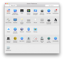
Screenshots

Chronological order.

14A343f, with changes to accessibility for legibility, also patched with third party Lucida Grande Yosemite.app for legibility


14A361c, after applying the delta update from Apple


14A361c, no longer using the Accessibility pane of System Preferences, still with the third party patch


14A361c, after removing the patch


14A361c, after re-using the Accessibility pane of System Preferences


Attachments

  • 2014-09-15 20-42-09 14A343f, patched.png
    2014-09-15 20-42-09 14A343f, patched.png
    116.3 KB · Views: 1,217
  • 2014-09-15 21-57-20 14A361c, patched.png
    2014-09-15 21-57-20 14A361c, patched.png
    269.2 KB · Views: 1,150
  • 2014-09-15 21-57-56 14A361c, patched.png
    2014-09-15 21-57-56 14A361c, patched.png
    269 KB · Views: 1,221
  • 2014-09-15 22-06-33 14A361c, after removing the third party patch.png
    2014-09-15 22-06-33 14A361c, after removing the third party patch.png
    238.1 KB · Views: 1,122
  • 2014-09-15 22-06-49 14A361c.png
    2014-09-15 22-06-49 14A361c.png
    232.9 KB · Views: 1,119

Paradoxally

macrumors 68000
Feb 4, 2011
1,987
2,898
Public Beta 3 is out and I have to admit that I’ve started to become indifferent to Yosemite’s UI. Not because there hasn’t been enough progress, but because the difference between Mavericks and Yosemite is so much less obvious on a daily basis.

For me it's very obvious. I hate that horrible font they've used for the menu bar and practically the entire OS. Helvetica Neue is terrible for legibility. The first thing I do on iOS is change the font using BytaFont as I cannot stand the default one. Fortunately, you can change this in OS X back to (much more legible) Lucida Grande using TinkerTool.

That being said, however, it's kinda sad how Apple abandoned one of the best typefaces that had become a staple of OS X in favor of something less legible. I'm not a Helvetica fan, and Neue is my least favorite variation due it being a very bad pick at lower sizes (don't even get me started on the Light and UltraLight crap).

You should not need a retina display for text to be sharp (I have one, and LG is still better imho). Honestly, it's a strange pick by Apple.
 
Last edited:

tkermit

macrumors 68040
Feb 20, 2004
3,586
2,921
You should not need a retina display for text to be sharp

I'm seriously pondering whether I should maybe keep my current non-retina machine on Mavericks and only upgrade to Yosemite once I get a retina display, whenever that might be... I'm getting the impression that Mavericks is the last Apple OS truly designed with "low-DPI" displays in mind.
 

mabaker

macrumors 65816
Jan 19, 2008
1,215
580
You guys have to keep submitting COMPACT and continuous feedback to the beta. The release is still far out - I'm sure it'll be early winter so Apple still has plenty of time to tweak it.
 

Paradoxally

macrumors 68000
Feb 4, 2011
1,987
2,898
I'm seriously pondering whether I should maybe keep my current non-retina machine on Mavericks and only upgrade to Yosemite once I get a retina display, whenever that might be... I'm getting the impression that Mavericks is the last Apple OS truly designed with "low-DPI" displays in mind.

Well, you can use TinkerTool to change back the font to Lucida Grande and that solves most of the issues. But yeah, Yosemite was clearly designed with Retina Macs in mind.
 

Cloudane

macrumors 68000
Aug 6, 2007
1,627
217
Sweet Apple Acres
I don't know if it's various tweaks that have been made but after going back to Mavericks and feeling "comfortably at home" with the look and then installing the latest beta of Yosemite again... it's really grown on me!

I like it this time. It's flat yes, that's the design trend at the moment but it seems to have enough subtle shading, antialiasing, curves etc to not look like something from the 1980s. Flat design is very utilitarian though. I suppose it's a bit like web design - when it was a fairly new thing, everyone was making things flashy and spinning and crazy and 3D because "whee, look at the fancy stuff we can play with"... but eventually things shifted to function over form when Usability became a big thing (Jakob Neilsen et al), and then came together to have function WITH form, like Apple does so well.

I think it also helps that most of the slowness and transparency glitches have gone. Beta 1 kept having blocks of opaqueness appearing (which still happens here and there but far less frequently) and was quite sluggish. Something about the font in the menubar as well, I don't know if it's been tweaked or again if it's me getting used to it.. but it looks more natural than I remember in beta 1, where to me it seemed like someone had erased the nice text from Mavericks and hastily typed over it in Photoshop. I don't know why.
 

rmercier

macrumors member
Aug 18, 2014
90
4
I like the UI of Yosemite. When I go back to Mavericks, it is just too busy and distracting.

My only gripe is that it is harder to distinguish between active and inactive windows..they just blend together too much, maybe it's not as apparent on retina displays.

An example would be (and really the only time it really bothers me) if you had 2 Finder windows open. I think it would help if the icons in the sidebar would go back to color, but be monochrome in inactive windows.
 

grahamperrin

macrumors 601
Jun 8, 2007
4,942
648
… feedback to the beta. …

+1

If I become quiet in MacRumors, the reason will probably be feedback to Apple with reference to relevant points in discussion here.

… you can use TinkerTool to change back the font to Lucida Grande …

Thanks, I'll try that. Wonder whether it'll be more effective than the other third party approach to avoiding Apple's choice.

… the latest beta of Yosemite …

Which build?

… harder to distinguish between active and inactive windows..they just blend together too much …

That type of appearance bug is not limited to inactive windows.

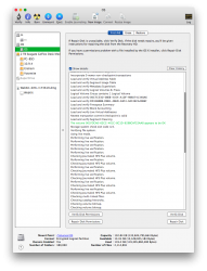
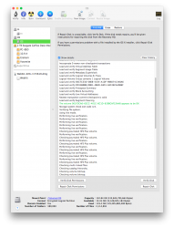
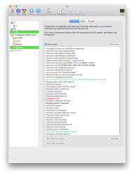
A naturally occurring 14A361c appearance of a sheet, dropped down from within an advanced preference pane for a web browser:


More
 
Status
Not open for further replies.
Register on MacRumors! This sidebar will go away, and you'll see fewer ads.