I haven't read the whole thread (yet).
First impressions:
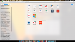
1) Doesn't look finished. But I know that it is (sad face). Example: the white buttons (are we still allowed to call them buttons?) at the top of Safari. Just sad looking.
2) Fonts are harder to read. Example: the tab names in Safari. Medium gray fine text on a slightly lighter gray background. Brilliant.
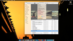
3) Not happy that they blurred my background image when signing onto my laptop (e.g., resuming from sleep). That's about the only time that I get to enjoy that background image in all its glory. Once I'm signed in, my screen is filled with application windows that cover it.
4) Apparently, Jony Ive hates color (see: Finder app, bookmarks in Safari, etc.) except when they're obnoxious colors (see: iTunes icon).
5) I thought there was a 'Dark mode'. It sure needs it. Just as with iOS7, having all of this white/light beaming at my eyes is going to fatigue them quickly. I see a 'Use dark menu bar and Dock' option in Settings which improves the launch bar, but I prefer the regular mode for the top menu bar, so I guess I can't win. Is there another 'Dark mode' setting somewhere else, because I need to darken up everything else in this UI.
6) The UI has lots of "smudges" all over the place. I thought this only happened with the new translucency effects, but I just noticed that the Messages app has a big blue smudge in the upper right portion of the window, there's nothing blue behind it, and the smudge doesn't move when I move the window. Speaking of the translucency effects, I think I'd prefer to turn that off. I don't think it's possible, is it?
7) OK, I found a way to reduce transparency and improve contrast. It's in the 'Accessibility' settings. Apparently, Ive only lets us improve his UI a bit by groveling before him and claiming that we have a disability.


