Become a MacRumors Supporter for $50/year with no ads, ability to filter front page stories, and private forums.
Status
Not open for further replies.

grahamperrin

macrumors 601
Jun 8, 2007
4,942
648
Misleading, again; Apple appears to not know the meaning of <title>

Apple appears to not know – or refuses to acknowledge – the meaning of <title> in markup for the web.

A domain is not a title.


… Apple had not just months, it had years to prepare human interface guidelines (HIG) for itself before seeding the first developer preview.

I would not say zero consistency, or amateurish, but to me the inconsistencies suggest:
  • lack of due care and attention in the years that preceded the first developer preview of Yosemite; and/or
  • wilful ignorance of logic, and of previously superior guidelines, in a misguided drive to present novelties that are somewhat inferior.
… If you were to attempt to rewrite the current human interface guidelines – to reflect Yosemite in its current state – it would be impossible to do so in a coherent way. …

Maybe I'm wrong; maybe Apple's draft HIG for Yosemite were unmistakably clear and consistent long before the first developer preview was seen. If that's true …

If that was true for an earlier private edition of the HIG, it's no longer true.

Months. I no longer suspect innocent mistake, I now believe that Apple is actively attempting to mislead some people.
 

Zxxv

macrumors 68040
Nov 13, 2011
3,558
1,104
UK
Finally caved in and turned on - accessibility/ reduce transparency

to prevent me having a nice pretty pink computer when wallpaper changes randomly to a red one.

/s
 

n-evo

macrumors 68000
Aug 9, 2013
1,910
1,731
Amsterdam
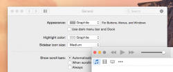
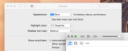
This kinda ****** me off, only a problem with iTunes:
 

Attachments

  • Screen Shot 2014-10-18 at 11.24.46.png
    Screen Shot 2014-10-18 at 11.24.46.png
    111.5 KB · Views: 199
  • Screen Shot 2014-10-18 at 11.25.28.png
    Screen Shot 2014-10-18 at 11.25.28.png
    97.2 KB · Views: 161

Eithanius

macrumors 68000
Nov 19, 2005
1,557
419
Apple appears to not know – or refuses to acknowledge – the meaning of <title> in markup for the web.

A domain is not a title.

[url=https://files.app.net/1/2032326/a1XqxmR8TftN7nq4Vv9s51fzSt0Xm6J81Vlu-1m70mIYyL5y1P9qG2RITzCL7Mav5MhW6L0yFG9LLD7L3OvqaIPJgZpT8RXJsUQJ80ZklfZmT7HwJK3jwlIfQBwuqdp65zPvcr8VHipV7Jky2ly72fK9T7aJnUpAWrUat7sAMu7fsYTPJumih5H6vOjHTdvF5]Image[/URL]


If that was true for an earlier private edition of the HIG, it's no longer true.

Months. I no longer suspect innocent mistake, I now believe that Apple is actively attempting to mislead some people.

You know, somehow I felt like compiling all of your posts here and spam them over to Tim Cook just to show them how terrible a job they did on Yosemite... :D
 

n-evo

macrumors 68000
Aug 9, 2013
1,910
1,731
Amsterdam
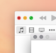
After a restart the mixed blue / graphite stoplight buttons were corrected. But I'm still getting graphite stoplight buttons when the rest of the system is set to blue and vice versa. Using iTunes v12.0.1.

Is anyone else getting this too?
 

Attachments

  • Screen Shot 2014-10-18 at 11.37.10.png
    Screen Shot 2014-10-18 at 11.37.10.png
    32.3 KB · Views: 1,080

BenjaminJohnson

macrumors newbie
Oct 18, 2014
3
0
Fixing Yosemite

I too don't like much about the new design. Unfortunately the new features are pretty good. I have started modifying Yosemite to look more like Mavericks.

Screen_Shot_2014_10_18_at_9_42_43_pm.png


I've just changed some of the icons back to what they were in Mavericks. The folder icons look so much better. I would really like to get back some of the original aqua controls such as the buttons and progress bar but probably a long stretch. Is anyone else modifying Yosemite?
 

seble

macrumors 6502a
Sep 6, 2010
972
163
I too don't like much about the new design. Unfortunately the new features are pretty good. I have started modifying Yosemite to look more like Mavericks.

Image

I've just changed some of the icons back to what they were in Mavericks. The folder icons look so much better. I would really like to get back some of the original aqua controls such as the buttons and progress bar but probably a long stretch. Is anyone else modifying Yosemite?

Where did you get all of the icon sets, and how did you change the default icons back? I'm running Yosemite on a partition currently, but if I can make changes to icons, then I'll install Yosemite on the main partition in a heartbeat.
 

grahamperrin

macrumors 601
Jun 8, 2007
4,942
648
Apple awareness of feedback and discussion

You know, somehow I felt like compiling all of your posts here and spam them over to Tim Cook just to show them how terrible a job they did on Yosemite... :D

A lighthearted thanks …but I should not encourage targeting any individual. Not Jonathan Ive, not Tim Cook, not anyone. I do remain puzzled about the 'WTF?' effects of pre-release Yosemite, but I'm prepared to accept that Cook was neither primarily nor ultimately responsible for those problems.

For what it's worth: in a recent response to someone senior at Apple, I expressed my some of disappointments in the strongest possible terms. It was not an entirely appropriate response, because (for starters) Apple people are – with me – always faultlessly polite and I was scathing about some of what has been done with Yosemite. Also because a fraction of my posts to MacRumors have been contrary to agreements with Apple, and so on.

----

Feedback to Apple aside, for a moment, I'll offer a couple of paragraphs from August:

… If the people at Apple who promoted the design, whilst it was not yet known to the public, are offended by the paragraph below, I can only apologise. I do still believe that the company aims to act upon the real-world customer feedback that it so encourages. So yeah, here's more real ridicule.

Yeah. It is ridiculous that Apple's redesigns of Yosemite led to redefinitionnot true maintainence – of at least one essential element of the Mac user experience (UX). Ridiculous because the end result is, for some experienced users, too far removed from what the company set out to create. It's new, but it is not sufficiently easier to use. It is no longer "Completely Mac", and the Apple people who chose to ignore (for example) one of the two things that all windows should have, those people have caused some lasting fallout. "Don’t be tempted to ignore the guidelines that govern the use of these UI elements, because users tend to notice even subtle differences in appearance and behaviour", Apple said to itself. It was entirely predictable that the result of partial ignorance – the unsubtle mash that is Yosemite – would prove divisive, somewhat ridiculous, and might appear somewhat amateurish. …​

(To the recipient of the e-mail that I sent on 15th October, if you're reading: apologies for putting you in a possibly difficult position, possibly more than once. You have much better things to do.)
 

Pow!

macrumors regular
Oct 17, 2014
103
73
Toronto
Not impressed with the folders, at small size they look like OS X 10.1 or 10.2. Glad LiteIcon works.

Where did you get all of the icon sets, and how did you change the default icons back? I'm running Yosemite on a partition currently, but if I can make changes to icons, then I'll install Yosemite on the main partition in a heartbeat.

LiteIcon works for me.
 

hamis92

macrumors 6502
Apr 4, 2007
475
87
Finland
After a restart the mixed blue / graphite stoplight buttons were corrected. But I'm still getting graphite stoplight buttons when the rest of the system is set to blue and vice versa. Using iTunes v12.0.1.

Is anyone else getting this too?

I am and it's annoying. Not that iTunes has really respected that colour scheme choice before (apart from the traffic lights)...
 

almirramic

macrumors member
Oct 9, 2011
57
29
Yosemite does look terrible

Apple has projected its fear of Google onto Yosemite, that's what's clear to me. I've always held that Apple cared deeply about the looks of its apps and OS and that Google only cared about functionality while looking horrible.

Now you essentially have Googlefied Apple on IOS and OS X. Safari's toolbar looks like one of those simplified web interfaces. Icons in all Apple app toolbars look unfinished or belonging to a different skin.

So yes, Apple (John Ive that is) has gone absolutely mad. This can't hold and my prediction is that OS X 10.11 and iOS 9 will have flashbacks to OS X 10.9 and iOS 7.
 

the8thark

macrumors 601
Apr 18, 2011
4,628
1,735
For me the looks I can get over. I guess in time I'll get used to it. The OS should fit into my lifestyle and not make me get used to it. But that's another issue. Here are some of the looks I don't like:

- Transparency everywhere. In menus, in finder windows, on app menu bars etc etc. I think an option to turn off all this transparency would be great. I would turn off all the transparency if I could.

- The colour was removed from iTunes (and other Apple apps) again. The last Mavericks iTunes had brought back a little of the colour. But now it's pretty much black and white icons. The Mac App Store has the same issue. I like colour in apps. If I wanted black and white applications I'd get my old Mac SE back and use that.
 

Partron22

macrumors 68030
Apr 13, 2011
2,655
808
Yes
- Transparency everywhere. In menus, in finder windows, on app menu bars etc etc. I think an option to turn off all this transparency would be great. I would turn off all the transparency if I could
System Prefs: Accessibility: Display: "Reduce transparency" checkbox
 

the8thark

macrumors 601
Apr 18, 2011
4,628
1,735
I too don't like much about the new design. Unfortunately the new features are pretty good. I have started modifying Yosemite to look more like Mavericks.

Image

I've just changed some of the icons back to what they were in Mavericks. The folder icons look so much better. I would really like to get back some of the original aqua controls such as the buttons and progress bar but probably a long stretch. Is anyone else modifying Yosemite?

I felt the same way when 10.5 hit. Day 1 I hated the look of it. So much so I seriously looked into making the OS look more like 10.3. But I decided I'd leave and see if the looks would grow on me. And they did. Within a few weeks I was ok with it all.

So my suggestion to you would be to give 10.10 a fair go and if you hate the looks still with in a few weeks after it's had a good shot of growing on you, then mod it. In saying that, I think the transparency in 10.10 is an acquired taste. Either you love it or you turn it off. I do not love it so I turned it off.

----------

System Prefs: Accessibility: Display: "Reduce transparency" checkbox

Thank you also.
 

Gallion

macrumors member
Aug 18, 2011
42
0
Anyway, you say that Yosemite looks bad, but, that's just like, your opinion, man.

There is a whole science dedicated to making user interfaces that are easy to interact with. Depth greatly helps improve UI element recognition in humans. That isn't an opinion, it's a fact. Flattening everything out is bad for a UI. That is a fact.
 

Gallion

macrumors member
Aug 18, 2011
42
0
You need your eyes checked mate. Every last screenshot was clear as a bell to me.

You probably don't even realize that you have a harder time reading.

My sight is 20/20 and I have a noticable harder time identifying things on Yosemite. Looking at Yosemite, it looks like my eyesight is clouded. The split second more it takes to locate and identify things on my screen are a major annoyance.
 

Mikey86uk

macrumors 6502a
Jul 3, 2010
700
192
England
i can honestly say i prefer the new look that Yosemite brings.

Also seems to be running a lot smoother than Mavericks did on my 2011 27" iMac.

I did do a clean install, but it feels so snappy.

:D
 

grahamperrin

macrumors 601
Jun 8, 2007
4,942
648
Recalling the subject here: Yosemite looks terrible (not beautiful)

Mikey86uk: with respect, that's all quite off-topic from the perceptions of terrible looks. Your praise for the looks may be more suited to Yosemite is beautiful – more than thirty-one thousand views, that's a very prominent topic.
 

j800r

macrumors 6502
Jan 5, 2011
399
140
Coventry, West mids, England
I must say my own views on the topic have changed since I discovered my iMac is one year out of supporting Handoff. Even with my awesome new iPhone 6. Guessing that means I don't get some of the other features too and if the UI is the only real change for me I'd maybe take Mavericks. There's gotta be more to it for me. Big disappointment, that one.
 
Status
Not open for further replies.
Register on MacRumors! This sidebar will go away, and you'll see fewer ads.