Become a MacRumors Supporter for $50/year with no ads, ability to filter front page stories, and private forums.
Status
Not open for further replies.
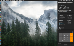
Cinema Display Quality is OK / Laptop NOT

I am starting to think a large part of the issues with Yosemite is they can't get the auto brightness figured out.

The Macbook Pro, HD Matte (1650x1050) gives me eye strain consistently, I'm always adjusting the brightness trying to settle down those bright whites Apple seems to love these days.

For kicks I installed on a Mini with a 23 Cinema Display (1920x1200), also Matte, and I am pleasantly surprised how good it looks, of course there is no auto adjust for brightness. The bright whites are still a little irritating, time will tell, of course I dual boot back to my production Mavericks easy enough.

BTW I didn't upgrade, this 10.10 is a perfectly clean install.
 
Is it wrong to be still using Snow Leopard 10.6.8? It doesn't feel wrong reading this thread.

I never used Leopard or previous incarnations but was there this much upset in the initial phase?

From a few recent comments from Johnny Ive I get the feelings the hand bags are in control.

No, in fact I'm actually considering moving back to it myself. With the release of Yosemite I find myself exploring old OS options - I think what I'm trying to do is find a "home" if you will, i.e. something I feel I like and can stay on without problems.

Everything "just works" under Snow Leopard. It seems that since Lion there's been a gradual decline in the quality of the OS's. My current irritation with Mavericks is with drives ejecting after sleep and the fact the OS is such a disk pig. Yosemite is as bad or worse, and of course it looks like something you'd expect on a kiddie computer.
 
Yosemite, at a glance (split-seconds etc.): not as user-friendly as it should be

Weekend reading. Mainly for the benefit of newcomers, another review from a personal perspective.

The essence of why I rejected OS X 10.10:
  • repeated, frequent failures of Yosemite to provide what was required at a glance.
From a post-release complaint about on-screen messiness with Yosemite, compared to the previous user interface:


post 145 under POLL: Is Yosemite UGLY or NOT?

Hint: that screenshot is a relatively rare example of how Yosemite might appear when things begin to get busy. Realistic. (An overwhelming majority of screenshots of pre-release Yosemite were relatively completely unrealistic.)

Rewind to July:
… The at-a-glance difficulty, which grew over time, was one of the things that pushed me over the edge with Yosemite.

… in Mavericks I could glance at a buttons location. …

Yosemite is very refined and beautiful, but Apple needs to give users more options with a more controversial UI. … home folder symbols (like for Documents or Downloads) … much harder to see at a glance than on Mavericks. … I wish Apple would give more options if they are going to design against ergonomic. …

… I try to be very good at adapting to change – when that change is good.

… lose sight of what was, to me, genuinely and frequently troublesome:
  • the state of windows in their natural state, when I simply observed the screen.

Those observations were often after spending time away from my desk with tasks that are diverse and/or fragmented. First impressions of what I returned to with Yosemite: too disorienting, too often.

The operating system should help me to recognise and interpret – immediately, at a glance – the screen, as it was when I left it.

A natural approach to immediate recognition: titles, predictably and consistently positioned at the heads of windows.

Instead, I found myself battling with Yosemite, with no way of restoring lost functionality. For me to find that degree of worsening at an Apple operating system level is unprecedented.

… seriously, I found Yosemite to be initially disorienting – not always, but often enough and troublesome enough for me to know that something was wrong and giving it time was not proving to be a workaround. The difficulties became harder to bear. To the point where I rebelled.

… It's impossible to convey a holistic user experience within the constraints of a forum such as this. (I would not attempt to convey the whole thing; most of the whole must remain confidential.)

… I rebelled because multiple consecutive pre-releases of Yosemite proved to be less practical, less productive, more disorienting than Mavericks when applied to my real-world situations.

YMMV of course :)


5. A different question is about identifiability of a window area. This is a more complicated topic. Some (you included) have argued that windows in Yosemite are difficult to distinguish because they lack contrast. Personally, I do not have any difficulties with that, but I understand that this is a valid concern. …

… I think what we have here is a combination of a genuine issue (window identifiability) and the old good inertia of habit …

… (The title within a title bar) identifies the window's function and thus is a function of the GUI itself. I've seen plenty of programs override the GUI and do their own thing over the years It rarely works as well. Imagine twenty windows open of similar "looking" content (all the more likely in a "conformity" atmosphere) and trying to figure out which one is the one you're looking for. You'd have to start looking through the content of the item instead of just looking at its name. … plenty of applications … aren't instantly recognizable, particularly when new to the user.

For example, the top of this window right now says "MacRumors Forums - Reply to Topic" and so if I had multiple browser windows open for some reason, I could quickly identify it at a glance. Windows task bars identify things quickly if you don't have too many open. You have to click and hold on the browser icon to get a list of window names in OS X, though. There's a simple solution to window title bars. Make it an OPTION. …

I actually agree with you regarding the scanning for opened windows. I was on Yosemite DP2 and it was such a pain to look for opened apps at a glance. I had to move windows so that they overlap each other, with status bars at different height level, sticking out just enough so i know that they're there. It's a massive waste of space and make any interface clunky to look at.

In the words of Apple:

When you refine every detail,
the entire experience is enhanced.


Thoughtfully redesigning OS X … changes to big things … streamlined toolbars …​

Good intentions, and if you look at a Yosemite toolbar – in isolation – that bar might be indisputably streamlined compared to Mavericks. No argument there.

I prefer a holistic approach to testing. A thing is rarely viewed, rarely used in isolation. A dictionary definition:

– characterised by comprehension of the parts of something as intimately interconnected and explicable only by reference to the whole.​

As a whole, the effect of Yosemite on my workflows was the opposite of streamlining …

(Apologies for the length of this post. I don't expect frequent reviews of this depth.)
 
After spending the last week not being happy with the no glossy, 3d look of Yosemite i have finally got it to a point where i actually like it. Seems the difference is the default out the box feel just looks horrible, after lots of playing I'm now very happy. So Dark mode on, move dock to the left, and change the wallpaper.

and attached is the finished result.
 

Attachments

  • desktop.png
    desktop.png
    1.8 MB · Views: 243
… From a post-release complaint about on-screen messiness with Yosemite, compared to the previous user interface: …

I would blame Firefox and Totalfinder in that particular case. …

I had no trouble with those two windows. I genuinely struggled to realise the third. Around fifteen viewings before things became distinguishable. For me, that type of problem with Yosemite was much more about … and I use this buzzword reluctantly … flatness. Specifically, Apple failed to make best use of shadows. There's a lack of depth; a lack of distinction between windows.

In reality – if that had been my screen (not a screenshot) – I would have quickly used the keyboard shortcut for the Mission Control view of applications; that's less wasteful than trying more than a dozen times to understand what's presented by Yosemite. However, use of Mission Control ignores the essence of why I rejected the operating system: Yosemite fails to deliver at a glance.

Also in reality – screenshots may be used in group environments (face-to-face, faces-to-screen and so on), or for online learning.

Yosemite Safari versus teaching and learning: no title bar, and other problems

- Non existent Title Bars (Makes teaching new users more difficult)

Problems with Yosemite in educational environments in general – not classrooms alone – were predictable months ago. I should never choose to use Safari 8.0 in a demonstration, and so on.

It's not only the removal of the title bar; the initial response to Command-L is undesirable in a shared environment, and so on. Making your Mac experience different from anyone else’s by default can be a frustration in a group environment where there's a shared desire for consistency, focus, predictability and order. …
 
I use this buzzword reluctantly … flatness. Specifically, Apple failed to make best use of shadows. There's a lack of depth; a lack of distinction between windows.

Am I missing something? As far as I'm aware and can tell, Yosemite utilizes shadows in exactly the same way as Mavericks did? :confused:
 
OS X 10.10: less effective use of shadows for windowing?

Am I missing something?

Possibly; and/or if I'm mistaken, I should apologise.

As far as I'm aware and can tell, Yosemite utilizes shadows in exactly the same way as Mavericks did? :confused:

I'm using Mavericks, and as I use it to view, concurrrently:
  • that screenshot of Yosemite
  • a variety of non-Yosemite windows
– I see, in Mavericks, use of shadows that's much more user-friendly.

Attention, please, to the shadows above and to the left of the front window …
 
The Macbook Pro, HD Matte (1650x1050) gives me eye strain consistently, I'm always adjusting the brightness trying to settle down those bright whites Apple seems to love these days.

For kicks I installed on a Mini with a 23 Cinema Display (1920x1200), also Matte, and I am pleasantly surprised how good it looks

It might just be me, but I generally get less eyestrain from ccfl-backlit displays (in my case a 20" Cinema Display or even my old Macbook) than from LED backlighting...
 
It might just be me, but I generally get less eyestrain from ccfl-backlit displays (in my case a 20" Cinema Display or even my old Macbook) than from LED backlighting...

I need to get down to the Apple store and look at this thing on a few different displays. Personally I can live with the colors and icons (childish as they are) as long I can look at the screen for 8 hours.

A long while back I was comparing iMacs at the Apple store, the smaller looked awful, side by side with the new 27. I ran the color tool on the 21 and it looked as good as its neighbor. Just a case in point.

Is your 20 Cinema Display Matte?
 
Shadows: uncertainty

Yes it does …

I may be mistaken about shadow above the window (sorry), but is there not a difference to the side?

TIA
 

Attachments

  • 2014-10-25 22-22-11 screenshot.png
    2014-10-25 22-22-11 screenshot.png
    543.4 KB · Views: 128
  • 2014-10-25 22-24-41 screenshot.png
    2014-10-25 22-24-41 screenshot.png
    582.1 KB · Views: 130
Thankfully, yes. – as (to my knowledge) all Apple displays back in 2004 were. :)

I really like my matte displays too, I really don't what I'll do when either breaks. I wish Apple would sell them again, I've had this one for a long time, it was expensive, but its been outstanding.

Still I need to see how "terrible" Yosemite looks on a glossy 27. A friend of mine installed 10.10 and says it looks good, but he's two states away, I need to see it for myself.

----------

I may be mistaken about shadow above the window (sorry), but is there not a difference to the side?

TIA

Its hard to see in your example. What I did was a simple light background and compare two non overlapping windows. Looked pretty similar.

EDIT - I looked again with two machines side by side and it appears to me Mavericks is darker. Yes?
 
Last edited:
Shadowing …

… EDIT - I looked again with two machines side by side and it appears to me Mavericks is darker. Yes?

Yes, I think so, and from what I recall of Yosemite it often appeared to lack depth through lack of shadow. Maybe it was something else, or some combination of things, that failed to offer acceptable distinction between windows.

In the Accessibility pane of System Preferences in Mavericks, I prefer normal contrast (slider to the far left).

My f.lux preference is classic, and the sun has set, but I don't know whether f.lux would affect perception of shadows for what's discussed above.

Thanks … for additional opinion, I'll ping someone someone else with an extraordinarily good eye for details. I'm not that good ;-)
 
Last edited:
For me, that type of problem with Yosemite was much more about … and I use this buzzword reluctantly … flatness.

Actually, I didn't like the look of the 3-D icons; I changed them back to 2-D.

Specifically, Apple failed to make best use of shadows.

They have yet to master mirrors as well. ;)

----------

Yes, Yosemite is just not ready for prime time. :(

Isn't that a rule about software? "Never buy version x.0 of any software", for any x?
 
Personal experience with 10.n releases and pre-releases

… Isn't that a rule about software? "Never buy version x.0 of any software", for any x?

That's frequently recommended, but never a rule.

For every OS from System 7 to OS X 10.9, I was 'all-in' at the earliest opportunity, and I never regretted it. That's not a recommendation; it's a reflection on my experience over the decades.

For OS X 10.10 I was 'all-out' before it was released. Partly because Apple broke its own rules guidelines.
 
Yosemite: apparently much brighter, with less depth through shadow

… that type of problem with Yosemite was much more about … and I use this buzzword reluctantly … flatness. Specifically, Apple failed to make best use of shadows. There's a lack of depth; a lack of distinction between windows. … Yosemite fails to deliver at a glance. …

Am I missing something? As far as I'm aware and can tell, Yosemite utilizes shadows in exactly the same way as Mavericks did? :confused:

… EDIT - I looked again with two machines side by side and it appears to me Mavericks is darker. Yes?

Yes, I think so, and from what I recall of Yosemite it often appeared to lack depth through lack of shadow. … failed to offer acceptable distinction between windows.

… I'll ping someone else with an extraordinarily good eye for details. I'm not that good ;-)

OK, this example (not my own) is entirely consistent with my recollections of pre-release look-and-feel:

 
Reconsidering reactions to customer reports of glare and the like in Yosemite

… Looks like we're basically returning to what we had with Snow Leopard …

From what I see in the most recent visual comparisons: the similarity to Snow Leopard may be true for the shadowing around windows, but the Yosemite presentation of each window is remarkably different.

Snow Leopard and other operating systems before Yosemite were, to my eyes, suitably restrained. Readers, please don't misinterpret that as boring or old-fashioned. There's something inarguably good about an appearance that is suitable.

… lack of shadow. Maybe it was something else, or some combination of things, that failed to offer acceptable distinction between windows. …

Timely

It's understandably easy for lovers/likers of the looks of Yosemite to doubt, or openly disagree with, the (minority of) customers who use words such a brightness, glare or pain in complaints about those same looks.

Now … consider the relative brightness of just one Yosemite window (above), and recall the 'one or two hours at most' post from a few days ago. Neither words nor screenshots can convey true pain. The pains may be only slight but – frankly – a supposed improvement to an operating system from Apple should not cause pain. That's somewhat disgraceful …
 
After spending the last week not being happy with the no glossy, 3d look of Yosemite i have finally got it to a point where i actually like it. Seems the difference is the default out the box feel just looks horrible, after lots of playing I'm now very happy. So Dark mode on, move dock to the left, and change the wallpaper.

and attached is the finished result.

With all due respect, but a picture and a menubar hardly qualify as a way to discuss Yosemite's ugliness.
The Desktop is the one part I hardly ever get to see because I use my computer to work. Launch a few apps, mimic a real life setup, or just look at some of grahamperrin's screenshots. You might get a different view on Yosemite.
I know I did after I installed it on my MBP. Immediately thereafter, I spent a whole day on a Mavericks clean install. I call it one of my best spent workdays of 2014.
 
Looking at GoSquared:

https://www.gosquared.com/global/mac/yosemite/#beta

it looks like the usage is already starting to level off in the vicinity of 20%. It's probably too early to take those stats seriously, but what will Apple do if this thing is rejected by users? It's not like an iPhone or iPad where the user has no choice but to accept what they offer.
 
Long time lurker and first post :).

About a month ago popped into my local Media Markt and was toying with the iMacs/Mac book pros deciding on what will be my Mac Mini replacement. Nice experience, laptops were fluid and as usual the OS was polished compared to the numerous windows laptops.

Fast forward to this week, went into my local Apple store. Lots of very young "geniuses" strutting their stuff. However looking at the 5K iMac I had high hopes. My initial reaction - WTF have they done to the task bar, why do the collapse /expand buttons look like flat garrish skittles and where has all the panache gone? Impressions have not improved with use, i find it very, very difficult to look at.

Apple have taken a step backwards...in time, even Windows 7 looks better.....AGHHHH ... and I was all set to buy that IMAC too.
Keeping my mini but definitely not upgrading Mavericks, no way. Want to get the 5K iMac but wont unless there is a way of installing Mavericks on it, no way I could live with yucky Yosemite.
 
Was "pound it down" originally written, originally spoken, or later implied?

… Ive said he was going to "pound it down" (the user interface, that is) …

For anyone, a question: was the phrase "pound it down" originally written, or was it originally spoken, recorded then transcribed somewhere by a listener?

A link will be ideal. Thanks.

Please note, this is not straying from the previously given plea to avoid targeting individuals. I'm simply curious about this one context.


While not a fan of Yosemite's interface, I'd swallowed it like bitter medicine and got used to for the most part. I had no idea this is what Coverflow looks like now (never use Coverflow), that grey background is absolutely hideous. I wasn't fond of the previous reflective black background but that's just ghastly.

As for the 'flat', 'simple' interface in general, if it's flat and simple they were going for I would've preferred something more like Platinum. A modernised version of that would be pretty sexy.
 
Status
Not open for further replies.
Register on MacRumors! This sidebar will go away, and you'll see fewer ads.