There's absolutely normal for me. I don't know why you have disabled sub-pixel anti-aliasing.The sidebar in Safari has some of the most blurry, jagged text this side of Windows XP. I feel like I've rolled back to the mid-90s. The menu fonts look smudged and blurry. Throughout the fonts are either jagged and too dark, or way too light too even read. I've only been using the OS for two days, and I'm suffering eye strain.
Got a tip for us?
Let us know
Become a MacRumors Supporter for $50/year with no ads, ability to filter front page stories, and private forums.
Yosemite looks terrible!
- Thread starter OldGuyTom
- Start date
- Sort by reaction score
You are using an out of date browser. It may not display this or other websites correctly.
You should upgrade or use an alternative browser.
You should upgrade or use an alternative browser.
- Status
- Not open for further replies.
Yosemite: harder to look at
In the 'hard to look at' topic:
Under 'looks terrible':
Broadly: is seems that a few people are trying, without success, to regain the quality of appearance that was present before Yosemite.
In the 'hard to look at' topic:
My first sensation of Yosemite was eyestrain, and if I can be bothered in the future i plan to downgrade to mavericks.
In the mean time unticking "use LCD font smoothing when available" in general settings helped, marginally.
Under 'looks terrible':
… I don't know why you have disabled sub-pixel anti-aliasing. …
Broadly: is seems that a few people are trying, without success, to regain the quality of appearance that was present before Yosemite.
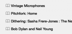
No. Because the toolbar and other window elements ARE ALSO CONTENT. This is what Apple and others are not getting.
BTW, this is also why it was stupid UI design to remove coloring from the sidebar. The Sidebar is content. This is why it was stupid UI design to remove coloring from the Mail sidebar. The sidebar is content. This is why it's stupid to flatten the traffic light buttons. They are content. This is why it is stupid to overly simplify icons. Icons are content (they communicate information to the user).
Everything on your screen is content. Good UI understands this and understands the concept of tiered content and contextual content. This is why translucency is bad UI. It makes the least important content (your wallpaper) primary content by drawing the eye and focus of your attention to it.
Good UI uses shape, color, and depth to let the user easily move between his different tiers of content.
Oh, and to all you people dissing skeumorphism, you are out of touch. Skeumorphism isn't about making computers easier to use for neophytes, it's about accommodating the hard wiring of our brains programmed through the fact that our entire lives are spent in a three-dimensional world of physical objects. You make a button look like a button because in the physical world people see and press buttons. Thus, when they see something that looks like a button, they immediately and instinctively know what it's purpose is; they don't have to waste effort identifying and processing the image. Throw a flat white rectangle up and now users have to spend conscious effort to parse the information. Forstall went a bit far with skeumorphism, to where it became a negative impact on usability, but Ive, with his wholesale abandonment of it is worse.
----------
You mean until a security issue comes up and the patch is to upgrade to Yosemite.
This is the only post I've come across that understands the real issue many can not articualte and conveys my own feelings which I've posted in this thread or elsehwere.
People need to understand in the world of 2D you have to use all the visual tricks you can to compensate the lack of third dimension which is the equivalent but opposite of what ID designers do (Ive) in the real three dimensional physical world where they try to make something look like it's 2D, thinner for example, something that looks physically impossible but is somehow a real object.
Human perception is also very varied thing thankfully. We're being asked to accept a very narrow and I would say one dimensional approach to UI design.
May I also add the gross irony in the age of the Retina screen they've gone for such inept UI approach.
Never have so many pixels been asked to do so little.
It looks like we have the Industrial designer working on the UI and marketing designer the computers. APPLE is eating itself.
Also this term "skeumorphism", I never heard of it until things started to get a bit hand baggy at Apple HQ and people began to get fired.
I remember back in the 90's a new generation of Commodore AMIGA graphics chips where being developed and TRANSLUCENCY was being demoed as part of a new GUI. So for those who think it's a cool new modern feature.... ha!
Yes well Commodore went bust for various other reasons, the chips never made it to market and the rest is history as they say.
My point is it's a HUGE visual gimmick. It's the candy floss of GUI. It's was a milestone technically back in the 90's but it's not much use in truth.
Do we write our notes or print our pages on semi transparent sheets? No we don't as a rule. Just because you can do something doesn't mean you can.
My point is it's a HUGE visual gimmick. It's the candy floss of GUI. It's was a milestone technically back in the 90's but it's not much use in truth.
Do we write our notes or print our pages on semi transparent sheets? No we don't as a rule. Just because you can do something doesn't mean you can.
And it takes more cpu apparently, according to my iStat Menus at least. "playing" with a scrollbar with transparency "on" takes more power than when it's off.
I don't mind the minimalist approach tbh, but I like "efficiency" - so I've "reduced transparency". I don't need to keep my CPUs busy just because there's an effect to render each time I move my mouse.
Oh my sack
Last week I discovered the expression "Oh my sack …".
A January 2014 example
Oh my sack! … from someone who was agape at the sight of outstanding natural beauty –
– and for that outstanding beauty there is, by coincidence, a beautiful word:
An October 2014 example
Oh my sack. OS X Yosemite is fugly. So fugly.
Last week I discovered the expression "Oh my sack …".
A January 2014 example
Oh my sack! … from someone who was agape at the sight of outstanding natural beauty –
Sometimes nature just gives us a precious, awe inspiring gift.
This is one of those times. If you can watch this with your mouth closed you get a gold star...
– and for that outstanding beauty there is, by coincidence, a beautiful word:
An October 2014 example
Oh my sack. OS X Yosemite is fugly. So fugly.
There's absolutely normal for me. I don't know why you have disabled sub-pixel anti-aliasing.
I just realized it's when you enable the option to reduce transparency is when the font gets all bold and blurry. Looks like Apple still has a bit of work to do to get rid of UI bugs concerning the accessibility options.
Attachments
Looks like Apple still has a bit of work to do to get rid of UI bugs concerning the accessibility options.
Yes, Yosemite is just not ready for prime time.

Bringing back some of the older icons
Hi,
I have used cdoc to restore the 3-D dock and now have found another utility that will allow you to change a lot of the system and app icons. You can get it here: http://www.freemacsoft.net/liteicon/
I found older version icons on Devient Art: http://www.deviantart.com/morelikethis/417708749
If anyone finds a utility to get back the 3-D buttons, please post the link.
Truly,
Emad
I agree. They have taken all that was beautiful about Mac OS X and ripped it out. Now it looks like a toy. I especially hate what they have done to the traffic lights and the Finder icon. The latter just looks silly - no class or refinement. It's like they've taken the Mona Lisa and painted over her subtle smile with a massive cheesy one. Urgh, can't bare to look at it!
Hi,
I have used cdoc to restore the 3-D dock and now have found another utility that will allow you to change a lot of the system and app icons. You can get it here: http://www.freemacsoft.net/liteicon/
I found older version icons on Devient Art: http://www.deviantart.com/morelikethis/417708749
If anyone finds a utility to get back the 3-D buttons, please post the link.
Truly,
Emad
Some things look great, but the white buttons and other controls look amateurish at best. The craftsman ship has been lost. What was once clean and nice looking now looks like they forgot to remove the temporary placeholders.
I also hate the blurry translucent panels. Turning it off just breaks antialiasing among other things.
Give it a chance.
I did, for months.
If you don't like Yosemite why not just go back to Mavericks?
No going back, because I was never tempted to begin using Yosemite for real work.
Simple: I continued with Mavericks.
I'm almost certain that the troublesome appearance of Yosemite the nature of customer complaints is without precedent. No Apple operating system before Yosemite has upset people to this degree.
Apple seems in intent on putting on the yearly OS Fashion Show so a lot of the changes just look like stuff moved around for the sake of change.
That's true, and it's somewhat shameful. Adding to that shame: Apple's movement of some things has a logic that's either flimsy or ridiculous.
I switched to a Mac because I was sick of Windows BS. I'm beginning to question the wisdom of that decision.
Someone needs to explain to me why there are so few options offered by the OS-X platform. Specifically, what was wrong with the nice looking "Shelf" look of the Mavericks dock? Why not give me the freedom to choose what my desktop looks like. Seriously, what's it to you "people at Apple"? It's my money buying your product. What gives you the right to decide what I see on my computer? Once the product is bought you have your money. Tell me why you think you need to control what I see on my screen. Please
A few months ago I was prepared to spend my own money on an iPhone and an iPad. Then, Apple's JUne 2014 announcements of things such as handoff interesting, and clever, but I was simultaneously appalled at what the company threatened to do to the user interface.
No more. My money will be spent elsewhere, not on Apple.
A fughoff of Applestuff is not the ecosystem for me.
I did, for months. [...] I was never tempted to begin using Yosemite for real work. [...] I continued with Mavericks. [...] No more. My money will be spent elsewhere, not on Apple. [...] not the ecosystem for me.
You may want to consider that the suggestions offered here may not always be addressing you specifically. For some people it very well might actually be as simple as "giving it a chance". Just a thought.
Most if not all of the quotes were from a duplicate topic.
My post was partly an attempt to summarise, for those few people, some points from amongst the more than 1,500 posts that were already in this topic.
Some of the past complaints about users' styles of writing, in this topic, revolved around things being presented as if those things were/are facts. To avoid such complaints, I was fairly careful to use words that implied opinion. That's why you see (your emphasis) "I", "me" and "My". It seems that my care backfired …
… but I get the general point. Thanks. And the repetition might not have happened if the stickiness had been more noticeable.
Maybe it's hidden? If you right click on a purchase it gives you an option to "hide" it. It then says you can see your hidden purchases from your account screen. Which you can see on the main page on the app store, under the "quick links" section.
Hope this helps
I called Apple Support and they got ahold of iTunes support. Apparently it was hidden. I now see it and all the other apps in my Purchases. Thanks for your help.
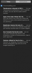
My push notifications are so difficult to read! It strains my eyes. I had no problems with Mavericks. I'm still debating on whether to downgrade because I do like the new features in OS X Yosemite and Safari is faster. This really sucks.
Btw, I just got my Push Notifications to work. You need to go into Safari Preferences and tick off "Allow" and then "Deny" and then "Allow" again. Finally works.
Btw, I just got my Push Notifications to work. You need to go into Safari Preferences and tick off "Allow" and then "Deny" and then "Allow" again. Finally works.
Attachments
Here's another comparison of the menu bar font with first default settings, then reduced transparency, and finally increased contrast. It seems only in the second case, reduced transparency without also enabling the option of increased contrast, something is going horribly wrong:


Which button?
Apologies for the near-endless noise from me, but this is timely
First impressions

Which one is pressed?
If you had not previously used Yosemite, would your single-word answer be the same?
(Reply under https://alpha.app.net/grahamperrin/post/41947436 if you like I shouldn't encourage one-word answers in this already noisy topic.)
I'm often verbose but please understand that only a fraction of the problems that I find are posted publicly.
so difficult to read! It strains my eyes. I had no problems with Mavericks. I'm still debating on whether to downgrade because I do like the new features in OS X Yosemite and Safari is faster. This really sucks.
Apologies for the near-endless noise from me, but this is timely
First impressions
Which one is pressed?
If you had not previously used Yosemite, would your single-word answer be the same?
(Reply under https://alpha.app.net/grahamperrin/post/41947436 if you like I shouldn't encourage one-word answers in this already noisy topic.)
Mine looks like this - how come your "today" looks almost bold?
Attachments
how come your looks almost bold?
The shot was not from my Mac (I use Mavericks), I simply pasted a block of grey over part someone else's shot.
If the image that I posted has a button that appears bolder than yours, it's probably because the person who took the shot was attempting to make Yosemite more usable.
Increase Interface Contrast in OS X Yosemite to Improve Usability a few interesting comments there.
Ah ok...
But still, I have no idea what that person did to have the text so bold (which is indeed confusing), because I have tried these so-called tips including LCD font smoothing and none of them made the text bolder on my notification panel.
On my mac I've only turned off transparency not because it made things hard to read, but because it takes a bit more cpu and I prefer efficiency over a cosmetic enhancement. I thought I would like dark mode but I prefer the "normal" one.
… indeed confusing …
In fairness to Apple: the confusion was immediately obvious to me, months ago, but I have no recollection of giving feedback on the problem.
Other things were so ghastly – I found so much wrong with Apple's direction – that I assumed no point in giving feedback.
(If respectable feedback is what's desired, then please begin by giving the tester a relatively respectable product. What I received was too far from respectable … I suspected wilful ignorance, by Apple, of past mistakes.)
Less personally (and less fair to Apple)
With up to a million public beta testers – plus developers and other testers (no doubt including thorough tests within Apple) – I assumed that a few people would make the problem known to Apple.
The more I read of public reactions to the released software, the more I believe that the '****-you theme bulldozer' was effective – contrary to the better judgement of the more respectable people within Apple.
… to have the text so bold …
With emphasis added by me –
… system wide and the use of a lighter and thinner font is awful … barely read the Safari favourites bar and the Mail app "To" section is so tiny! Can I increase the size....NO.
… Apple pushing … is maddening, but why should they care what the average consumer thinks … We just have to eat it up.
… tiny, not crisp … blob. So I tried different setting tips: ticked off LCD font (didn't work), turned off translucency, ticked increase contrast, but the latter two settings … didn't help that much in readability. …
It's funny/sad … a joke and Apple doesn't give a crap …
I'm not a fan of all the whiteness in Yosemite. … to not allow a user to pick a different system font or make a few changes that doesn't affect the rest of system is so frustrating.
… threads from June 2014 where beta testers complained about the legibility of Helvettica Neue and Apple's choice of that font system wide. …
… considering … Mavericks until this is fixed because legibility issues is affecting my work … I really don't trust Apple with updates anymore.
– I assume that the confusing appearance is a result of Yosemite's approach to improved accessibility.
With emphasis added by me
I assume that the confusing appearance is a result of Yosemite's approach to improved accessibility.
Except "increase contrast" doesn't have that effect on text. Like I told you I have tried all these "tips", none of them makes the text as bold as the previous screengrab.
Like I told you I have tried all these "tips", none of them makes the text as bold as the previous screengrab.
Understood thanks I don't doubt you. Real-world quality and usability feedback involves very many different environments, and this long topic might be not the best place to plunge into the detailed differences between your environment and the environments of customers who are affected by the problem. That said, my pre-release installations were fairly clean; I can't think of anything exotic that might have caused the OS to present, so often, the problem that's observable at the head of dmj102's screenshot.
My last post was a bit of a hint that Apple might have not received the necessary feedback from users in affected environments. But I think it more likely that Apple deferred such problems, to focus on first impressions for users who do not think of themselves as having accessibility issues.
Is it wrong to be still using Snow Leopard 10.6.8? It doesn't feel wrong reading this thread.
I never used Leopard or previous incarnations but was there this much upset in the initial phase?
From a few recent comments from Johnny Ive I get the feelings the hand bags are in control.
I never used Leopard or previous incarnations but was there this much upset in the initial phase?
From a few recent comments from Johnny Ive I get the feelings the hand bags are in control.
If you want to be in a state of sin, you need to be running 10.4.11 or earlier. That'll still let you do System 9.2 in emulation mode.Is it wrong to be still using Snow Leopard 10.6.8?
Off-topic: use of Snow Leopard is neither wrong nor right
Neither wrong nor right.
Users of Snow Leopard and less should be prepared to find sources other than Apple if they require protection against vulnerabilities such as CVE-2014-6271 and CVE-2014-7169, and so on.
General use of Mac OS X 10.6.8 is quite off-topic from the appearance of Yosemite, so for a more detailed answer, please ask under OS X (there's not, or no longer, a sub-forum for Snow Leopard).
Is it wrong to be still using Snow Leopard 10.6.8?
Neither wrong nor right.
Users of Snow Leopard and less should be prepared to find sources other than Apple if they require protection against vulnerabilities such as CVE-2014-6271 and CVE-2014-7169, and so on.
General use of Mac OS X 10.6.8 is quite off-topic from the appearance of Yosemite, so for a more detailed answer, please ask under OS X (there's not, or no longer, a sub-forum for Snow Leopard).
- Status
- Not open for further replies.
Register on MacRumors! This sidebar will go away, and you'll see fewer ads.