Become a MacRumors Supporter for $50/year with no ads, ability to filter front page stories, and private forums.
Status
Not open for further replies.
Don't Like the Look of Yosemite

I realize this is strictly subjective, but the new look of Yosemite just does not work for me. Apple has really gone too far with this "clean and flat” look in Yosemite. Images are dull, washed out and boring, system text is fuzzy, pale and hard to read. There is no personality and no character to the visual UI any more. They have ruined what was once an appealing crisp looking computer experience. Just stop it, Apple!

I have tried all the tips & tricks about changing contrast, transparency, etc., and it still looks ugly. Why have a Mac if I can't have beautiful images and easy-to-read text? Oh wait, maybe I'll just toss out my MBP and buy a new Retina version. Right.

MBP 13, 2.3Ghz i5, 8GB, OS X 10.10
 
if it's flat and simple they were going for I would've preferred something more like Platinum. A modernised version of that would be pretty sexy.

Platinum wasn't flat though. So what would a modernized, simple and flat version of that look like?

macos90-2-1.png
 
Platinum wasn't flat though. So what would a modernized, simple and flat version of that look like?

Image

First: Change the system font (and have it user customisable as it was in Platinum). Then remove the pin-stripe from the title bar, replace the grey of window backgrounds with a much lighter grey or plain white, significantly reduce the drop shadow from around the UI controls as well as the border from around buttons, add some colour (a slightly lighter blue than used in Yosemite, or darker grey than Yosemite's Graphite) and you're done.

And I don't know, it looks pretty flat to me.
 
First: Change the system font (and have it user customisable as it was in Platinum). Then remove the pin-stripe from the title bar, replace the grey of window backgrounds with a much lighter grey or plain white, significantly reduce the drop shadow from around the UI controls as well as the border from around buttons, add some colour (a slightly lighter blue than used in Yosemite, or darker grey than Yosemite's Graphite) and you're done.
I guess to me that sounds like what they've actually done in Yosemite... (with the exception of a customizable system font and the possibly slightly darker shade of blue for UI elements than you would have liked).
 
For anyone, a question: was the phrase "pound it down" originally written, or was it originally spoken, recorded then transcribed somewhere by a listener?

I got that from a blog (somewhere) where the author was enthusiastically praising the complete removal of skeuomorphism and 3D effects from the user interface. He was also touting how everyone loved iOS 7 because iPhone sales went up, completely neglecting the fact that the phones are tied to contracts and, at least with Verizon in my area, you can trade your current iPhone in for free if you get a new contract. The phone is a disposable entity, the money is made on the contract.

I'm surprise this thread is still active, much less a sticky. After all, according to the Yosemite cheer leaders, Apple marketing reps., or whatever they are in this thread, Yosemite should be running on about 99.999% of the users systems with people like me feeling embarrassed, humiliated, and out in the cold for having not accepted it.
 
Thought-provoking … keywords dyslexia and saccades

OldGuyTom (opening poster): again, thank you.

It's timely for me to whittle things down, to what may be the two most important keywords for people who share some of my complaints about the user interface to Yosemite: dyslexia and saccades.

For the first – dyslexia:
  1. Dyslexia, learning and unlearning (2014-08-21)
  2. Adjustment to Yosemite: not always as easy as people imagine (2014-08-27)
  3. Yosemite has a terrible UI for dyslexics (2014-10-24, highlights)
  4. Ask Different Chat - 2014-10-26 (highlights).
For the second – saccades – I encourage people to use this forum's search capabilities.
 
First: Change the system font (and have it user customisable as it was in Platinum). Then remove the pin-stripe from the title bar, replace the grey of window backgrounds with a much lighter grey or plain white, significantly reduce the drop shadow from around the UI controls as well as the border from around buttons, add some colour (a slightly lighter blue than used in Yosemite, or darker grey than Yosemite's Graphite) and you're done.

And I don't know, it looks pretty flat to me.

Customizable system font would be awesome. Is there any way to do that now??
 
I guess to me that sounds like what they've actually done in Yosemite... (with the exception of a customizable system font and the possibly slightly darker shade of blue for UI elements than you would have liked).

Definitely not. The unnecessary translucency (while I'm not opposed to the light transparency/translucency from Leopard onwards, Yosemite's translucency is too distracting), bright and gaudy colours next to pastels, and the unsettling mixture of flat squares with gradient round shapes would not be in my design (the icons are one of the worst things about 10.10). What I have in mind is a whiter, flatter version of the old ShapeShifter themes (something like Rhapsodized/Gershwix/Sosumi, if anyone remembers them), but obviously something different enough to make it look like Apple isn't regressing and is still the 'leader of innovation'.

Customizable system font would be awesome. Is there any way to do that now??
At the moment I'm only aware of this: YosemiteSystemFontPatcher. I haven't used it myself though. But seeing as the font in Yosemite is one of the biggest complaints, I'm sure there will be a lot of font patchers released in the coming weeks/months. There's also a script to revert the font to Lucida Grande if that's what you're after: lucidagrandeyosemite
 
Last edited:
Livin' on jacks and queens, Maverick(s) is a legend of the West.

I've followed this conversation since the first post. It's spirited, informative, and engaging. What a wonderful experience it has been to follow this thread which is filled knowledge and insight. Props to all of you who have contributed. Personally, I made my decision today regarding which side of the fence I am on. Since the first public beta, I've had Yosemite installed on my secondary computer (mid-2011 iMac 21.5") and kept Mavericks on my main machine (mid-2012 MBP, 15" non-glare screen). I'm going back to Mavericks and will ride its wave for the remaining life of my two beloved Macs. It works best for me. I suppose that should be the final consideration. I'm somewhat "tepid" in my overall response to Yosemite feature/performance-wise; rather less so regarding visual aesthetics. My main reason for posting is in appreciation of this community which provided me many opportunities to weigh all the pros and cons of Yosemite. (The title of my post references an old western TV show that I loved when younger, and was the first thought that entered my mind when I first read of Mavericks being the chosen name for OS X 10.9 summer before last).
 
I've followed this conversation since the first post. It's spirited, informative, and engaging. What a wonderful experience it has been to follow this thread which is filled knowledge and insight. Props to all of you who have contributed. Personally, I made my decision today regarding which side of the fence I am on. Since the first public beta, I've had Yosemite installed on my secondary computer (mid-2011 iMac 21.5") and kept Mavericks on my main machine (mid-2012 MBP, 15" non-glare screen). I'm going back to Mavericks and will ride its wave for the remaining life of my two beloved Macs. It works best for me. I suppose that should be the final consideration. I'm somewhat "tepid" in my overall response to Yosemite feature/performance-wise; rather less so regarding visual aesthetics. My main reason for posting is in appreciation of this community which provided me many opportunities to weigh all the pros and cons of Yosemite. (The title of my post references an old western TV show that I loved when younger, and was the first thought that entered my mind when I first read of Mavericks being the chosen name for OS X 10.9 summer before last).

I think this is also my case. At first i give it a chance. But after hour of usage i felt strong rejection in my gut. When realized that spotlight shares every ****ing thing that i search with apple, google, microsoft i asked my self why i am so stupid. This is privacy reduced by default. Then i looked in my second mac (Maverick) and began to see how ****ing ugly is new os.
I know that nobody in apple will give second chance to redesign seriously, they are marketing and profit first, users second. For me this are my last macs, i will switch on linux desktop and use vm to run specific apps for graphic design. Its downhill for mac desktop from here.
 
Transparency and 'vibrancy'

… Transparency is "cool" but the newness wears off very quickly. It doesn't really add usability to the UI/Finder.
If there was a way I could stick with Mavs UI forever, I would.

Review: With OS X Yosemite, Aqua's all grown up — 512 Pixels (2014-10-16)

With transparency enabled:

… can and does cause legibility and clarity issues under the right circumstances. In this screenshot, I have Mail open in front of a Safari window …

Out of the corner of my eye, the red looks like some sort of alert or flag. The fact that it’s hard to read is secondary only to the mind-bending question as to why the empty message list[3] isn’t translucent.

iOS 7 introduced this sort of transparency, but as iOS apps don’t ever have overlapping windows, it’s not as big of an issue there. However, as OS X still has a windowed UI, transparency just has too many edge cases to deal with.

To help combat this — and give Core Animation a break — only the front-most window will allow what is below to shine through. This helps make it clear which Finder window is the foremost when a lot are open at once, as the others will retain the pre-Yosemite opaque sidebars.

However, in practice, I haven’t fallen in love with Vibrancy. It looks good most of the time (when it looks bad, it looks really bad), but it can cause odd usability issues and even be distracting in certain circumstances. …
 
1. I think the people that predicted the fairly high, meaning anywhere from 20% to 50% dissatisfaction rate had it right. Right now I'm guessing it's going to be 30% or more dislikers and a very low adoption rate in the long term.

2. My #1 personal dislike is the translucency running through the top of the window frame, especially on Safari. ... Seriously, this thing is constantly reminding me of the pictures of victims of spousal and child abuse. All I need to do is scroll a site opened in Safari up where a small colored item was and voila - a bruise appears. The bruises can appear to look like the drunken husband/father/whatever merely slapped the victim around a little to one where he had the victim pinned down on the floor and was severely beating them.

1. It's purely a guess based on this thread which is a minuscule amount of OSX users. At least you wrote "I think" and "I guess". And Yosemite adoption is faster than Mavericks at this point. SO I guess we will see if your prediction comes true. I'd be very surprised if you are correct unless you are talking certain professional areas which are often slow to update no matter the OS version.

2. Is there something you'd like to tell us all? Maybe Yosemite can double as a Rorschach like test?

yosemite is running fast & smooth here; i hear my fans less. less beachballs. 'feels' lighter to me. all i know is, it works well, looks good, and let's me use my needed apps without issue. just what i'd want in a modern OS.

There has been nothing wrong with many of the criticisms on this thread. Some of them I even agree with, but when it boils down to it, I think you've got it spot on. But hey, that's just my person opinion (and yours!)... And I Love that movie! Jeff Bridges and Robin Williams were fantastic together.

Thanks. I'm a usability know-it-all. Was close to making a career switch to focusing on that, but I would have had to take a big salary hit. So now it's just a hobby of mine to pick apart things in everything I use.

haha. this is one of the funniest things I've read on Macrumours in ages! thanks for the morning giggles.

For what it's worth: in a recent response to someone senior at Apple, I expressed my some of disappointments in the strongest possible terms.

I'd like to know what some of those "strongest possible terms" were...
 
I am a tab hoarder. My Safari windows usually have dozens of tabs in them.

So you can imagine my dismay when I installed Yosemite and found they removed the button in Safari that gives a list of your tabs. Do I really have to click left and right (effectively an unheard-of horizontal menu) and try to find the tab I want?

:confused:

I'm fine with minimalism, but my workflow may be different from Jony Ive's.
 
I don't see why a fake 3D shelf is considered more advanced than the new Dock to begin with. I always thought it stuck out like a sore thumb and didn't relate to anything else in Aqua. The way I see it Apple only did it for the sake of refreshing the desktop without changing too much else.

I'm extremely glad the 3D Dock is gone again to be honest.
 
Extremes of good and bad; thanks and apologies

I've followed this conversation since the first post. It's spirited, informative, and engaging. What a wonderful experience it has been to follow this thread which is filled knowledge and insight. Props to all of you who have contributed. … Since the first public beta, I've had Yosemite … My main reason for posting is in appreciation of this community which provided me many opportunities to weigh all the pros and cons of Yosemite. …

I think this is also my case. At first i give it a chance. But after hour of usage i felt strong rejection in my gut. …Then i looked in my second mac (Maverick) and began to see how ****ing ugly is new os.

… I know that nobody in apple will give second chance to redesign seriously … Its downhill for mac desktop from here.

To nubizus: if you have not already done so, please give feedback to Apple. I'm not entirely pessimistic. Much of what Apple does is extremely good.

To 3rdGradeTchr and every other person who chose self-restraint in public whilst privately testing for Apple: I have ENORMOUS respect for that restraint.

Some of the more restrained people may be aghast at some of what I have posted in public. Partly by way of apology: concerning agreements with Apple, a couple of months ago I drew attention to three phrases within a relevant paragraph with two words given double emphasis. I suspect that I have repeatedly stretched, to its limit, the boundary of what's acceptable. I have total respect for Apple's response to the one observed breach – the response was (as always) faultlessly polite … concise but unmistakably emphatic in its message to me.

… I'd like to know what some of those "strongest possible terms" were …

I sometimes quote my own words, but I will never disclose any part of that correspondence. My reasons for nondisclosure in that area go beyond the usual agreements with Apple; first and foremost I have enormous respect for the person who wrote to me and (again) if that person is reading, you have my apology – and given what's emerging from other customers, post-release, I feel less of a need to rampage.

Instead, I'll share something from one of my items of feedback. To put the style of writing below in context: I can't quantify the amount of written feedback that I gave before testing of Yosemite began, but I can estimate the number of hours spent on testing: hundreds, possibly thousands. In all that time, I never shouted in this way – this was a first:

WITH NO APOLOGY FOR SHOUTING, BECAUSE THIS REGRESSION (NOT LIMITED TO SAFARI) REPEATEDLY CAUSES GREAT ANNOYANCE SOON AFTER TRYING TO USE THE OPERATING SYSTEM IN A PRODUCTIVE WAY …

TOO OFTEN, IN THE ABSENCE OF TITLES, I HAVE NO IDEA WHAT I'M WORKING ON!

I'M MULTITASKING. WHAT'S IN FRONT? I HAVE NO IDEA? DO YOU?

TITLES ARE _ESSENTIAL_ TO SOME PEOPLE'S WORK!

IS SOMEONE ON THE DESIGN TEAM AT APPLE STARK, RAVING BONKERS?

AMONGST THE LIST OF THINGS THAT IS SLOWLY BUT SURELY DRIVING ME AWAY FROM APPLE SOFTWARE, THIS IS WITHOUT A DOUBT #2 :-(

I must emphasise, that approach to feedback is the polar opposite of what's useful to software engineers. An extremely bad style of writing. I was, simply, at the end of my tether with the frequency of annoyance of a combination of problems. I don't expect to boil over in that way again.

On a much more positive note

User experience: some links – a post from August. I found other people's writings – particularly in Stack Exchange – wonderfully enlightening.

Something else from August:

It has taken weeks for me to begin describing a problem in a way is more understandable. A majority of people will continue to disagree with my perceptions – disagreement is natural – but I feel that there's less of a brick wall.

So, it's possible that Apple did not foresee people having such difficulties with the first five pre-releases. Maybe reactions such as mine did not surface – or were inexplicable – during internal testing by Apple.

Last but not least, from the MacRumors advice on respect:

Expect and accept that other users may have strongly held opinions that differ from yours. In other words, basic human courtesy.
 
I am a tab hoarder. My Safari windows usually have dozens of tabs in them.

So you can imagine my dismay when I installed Yosemite and found they removed the button in Safari that gives a list of your tabs. Do I really have to click left and right (effectively an unheard-of horizontal menu) and try to find the tab I want?

Check out the the new Tabs View. It's pretty great – hugely improved over the old one (the old one was in fact rather useless). You can even type to filter/search.
 
Check out the the new Tabs View. It's pretty great – hugely improved over the old one (the old one was in fact rather useless). You can even type to filter/search.

Thanks. I didn't make the visual connection between those buttons up in the corner and the tabs. I wonder if there's a more clear way to position the button. But I'm glad to know about the Tabs View.
 
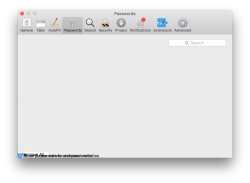
Is anyone else getting this in Safari (see pic)?

>Broken Password tab contents
>That resolution on the General and Advanced icons

Also, they removed the puff of smoke animation for removing dock items, but notifications still have it.
 

Attachments

  • Screen Shot 2014-10-27 at 9.41.50 AM.png
    Screen Shot 2014-10-27 at 9.41.50 AM.png
    160 KB · Views: 109
Back to MAVERICKS

I wanted to let you all know that I am now back running Mavericks as of yesterday so I hope the OS X Yosemite Adoption Rate is adjusted LOL. My eyes no longer need to strain and it's nice to not have all that "whiteness" in my face. I did a clean install with a Mavericks USB Boot Installer I made and got all my data back on with the Super Duper app.

For anyone interested, here is a great link to make a USB Boot Installer:
http://osxdaily.com/2014/10/16/make-os-x-yosemite-boot-install-drive/

In the code part, I changed "Yosemite" to "Mavericks".

I tried out Yosemite for one week and the legibility issues was the reason I decided to revert back to Mavericks. I do like Helvetica Neue, but not the way it's presented as a system wide font on Yosemite.

Sometimes I wish that Apple would do a two tier OS X release. One that is paid with access to more system settings and the other could be the way it is now.

I'm going to wait it out and see if Apple offers at least Lucinda Grande as an option for system wide fonts in Yosemite for non-retina displays and allows for reducing the "whiteness" without screwing up the dock, but I'm not holding my breath. I did send Feedback to Apple. I'm no longer going to be an early adopter ever again even though it is quite exciting when new OS X's come out.
 
Why i don't believe that apple will listen.
I am trained professional painter, designer and UI/UX developer. I know how the process of creating a strong visual language must be done. Here we have non-consistent approach to big problem. How to effectively mix ios7 visual language and osX tradition. Its possible but you have to change things not from ground up ( you serve old paradigm and UX must be Desktop first ) but using for start only slight UI changes. Then repeat the process in iteration until you break old paradigm. Then go several steps back to find a sweet spot between two. Yosemite looks like cheap theme job. Fundamental ergonomic principles are broken, like font readability, scaling, proportion of rounding corners (its to much), color usage (Itunes icon, Folder etc.) Overall this thing must be made again with more attention to detail and strong visual loop (parts that create UI rhythm). This os looks like its done by non educated designers, without professional supervision, people that believe that design is made with Photoshop, and have not heard about pen and paper or Gestalt Principles of perception. There is no way, designer like Ive, who has ultra deep knowledge to be connected to this ****. Its not possible man who is done such iconic designs not to see how immature and confusing this thing is. And if someone give adoption rate like argument is clearly blind. I am part of this adoption rate, the counter is recorded that i have upgraded but now i am using Mavericks. Who is counting this? Nobody. In the past lots of my Windows/Linux friends told us that apple is a cult. This was a lie. Nowadays that is true. Blind followers without critical thinking. This is the deep reason for going Linux, at least there i have some privacy by default. Not sharing with Mother-ship and friends.
 
… some sense in this fiasco.

To clarify – to encourage reading of that sense by people on both sides of the 'fence' – I should emphasise that at the time of its announcement, before any developer preview of Yosemite, Humanist Interface had already been a "long time in the making". In other words:

it was neither primarily about Yosemite, nor (as far as I can tell) primarily about Apple.​

https://diigo.com/06f4wl for highlights from
Thoughts on Yosemite’s Look and Feel + Subtraction.com (2014-10-21)

https://diigo.com/06f53o for highlights from
ignore the code: Yosemite's Visual Design (2014-10-25) – that's from Lukas Mathis, author of Designed for Use: Create Usable Interfaces for Applications and the Web (2011); and in 2009 he recognised that title bars were both both a waste of space and a fundamental user interface element. Both observations are true. Accepting that some things are fundamental to some people is, I believe, key to getting the user experience right when a fundamental user interface element is removed

– and in areas such as that, OS X 10.10 is fundamentally flawed – one size did not, DOES NOT fit all. It's too far removed from the Mac experience.

… The sad part is that this really hurts usability. …

It's that – that pain – making me wish for more passion in those two October 2014 articles.
 
Status
Not open for further replies.
Register on MacRumors! This sidebar will go away, and you'll see fewer ads.