Become a MacRumors Supporter for $50/year with no ads, ability to filter front page stories, and private forums.
Status
Not open for further replies.

leman

macrumors Core
Oct 14, 2008
19,530
19,703
1. In spite of terrible user reviews in the App Store, growth continues, as does regret.

Yeah, because people actually like the OS :rolleyes: BTW, I can't find App store rating for Mavericks (which were around 2.5 stars I believe), but here are user reviews for it on cnet: http://www.cnet.com/products/mac-os-x-10-9-mavericks/user-reviews/

Reminds you of something?

2. Unlike other OS versions, major press outlets seem to have shied away from talking about Yosemite.
3. Now that it's out, I don't see the high praise continuing from many of those that touted it's great new flat look.

Thats just total b***t. Makes it clear that you never even looked. Either that, or you are a shameless liar. Every major and minor reviewer had a Yosemite review out. In fact, googling "apple yosemite review" gives you around 2 million results, while googling "apple mavericks review" gives you around 1 million.

Major press outlets? What about these?


PCMag rating 4.5
Engaget rating 4
Techtimes: "Apple's OS X 10.10 Yosemite is a great improvement over Mavericks. The design changes make Yosemite look ahead of its time and the functional changes are great."
Arstechnica: an in-depth analysis (worth a read)
TheVerge: rating 8.9
TechRadar: rating 4
MacObserver: "A quantum jump to a beautiful, low-key GUI. Not heavy on agenda and annoyances."
...
 

MagnusVonMagnum

macrumors 603
Jun 18, 2007
5,196
1,452
Food for thought:

How Bad UX Killed Jenny

"Being a designer who is very passionate about what I do, this hurt. In all honesty, I don't think I've ever felt this emotional about any bad design I’ve encountered. I feel angry and sick when I look at that interface above. I start to think about the other stories that have been shared: like an ebola patient being sent home accidently, a pilot accidently plotting the wrong course killing crew and passengers, and so many other stories like them. I even think about my poor in-laws who are 60+ trying to navigate the government sites to pay for their ticket, or find information about government services for their son.

We can’t stand by while people’s lives, health, & rights suffer because of bad design.

There are some real, very serious UX problems out there for us to tackle. For now I don't know exactly how to change it, but here are some practical steps …"​

Think

Not to nitpick, but I personally find constant changes in font size to be very hard to look at. I'm sure you think it's better organized by header or something, but my brain just wants to skip right over all of it instead.
 

grahamperrin

macrumors 601
Jun 8, 2007
4,942
648
OT: adapting to forum software

… I personally find constant changes in font size to be very hard to look at. I'm sure you think it's better organized by header or something, but my brain just wants to skip right over all of it instead.

Sorry – yes, I used font sizes in the absence of heading levels. There'll be a change to the forums so until then, I'll try to moderate my styling of text. The use of size 5 was exceptional, I have been saving that link up for weeks. Aim for Site and Forum Feedback if you'd like to continue the writing/formatting style discussion – thanks.
 

TekGuy

macrumors member
Nov 30, 2014
59
7
Well even though I do not like the Yosemite UI I still think I'm going to buy the Macbook Pro Retina 15" £1999 model as don't think I can cope with another poor quality Windows machine even though I always did pay around £1000 for a windows laptop. I am being given a full refund from a windows laptop I bought 8 months ago, 3 replacements and 2 repairs later, just waiting for it to be picked up.

My head is throbbing not knowing whether to buy MBPr or another Windows laptop :confused:
 

grahamperrin

macrumors 601
Jun 8, 2007
4,942
648
Yosemite reviewed, not reviewed, in the press and behind the scenes

… Every major and minor reviewer had a Yosemite review out. …

No, not every.

At least: the reviews section of one prominent Apple/Mac-oriented site is without a review for Yosemite. And for at least one individual who writes for that organisation, what's said beyond the organisation's domain is far less complimentary than what's within the domain.

… Major press outlets? What about these? ...

Concerning the Ars Technica review:
– in my opinion it's not a bad review, but it's somewhat omissive, cautiously worded and debatably cliquey (from what I saw, not enough prominence to problems that the vast majority of users – with at least one non-Retina display – may encounter).
 

geefourfivesix

macrumors newbie
Jan 29, 2008
16
1
The quality of Yosemite on non-retina displays is unacceptable. Its clear that, in the same way as iOS devices, they are favouring retina graphics at the expense of non-retina.

I'm using Yosemite with a Thunderbolt display and its blurry / pixelated and hard to read. Open the App Store for example - the 'Categories' icon blurs into a single mess on a standard display. On retina its neat and crisp, it should look fantastic on both but it doesn't!

What stands out the most is that Mavericks looked beautiful on both retina and non-retina displays. It is possible to do. Yosemite lacks the quality and attention to detail to achieve the same.
 

TekGuy

macrumors member
Nov 30, 2014
59
7
Well I gotta admit it I bought a brand new Macbook Pro Retina 15" today from local Apple store and Yosemite was preinstalled and must admit I am starting to like it :eek:

Starting to love :apple: time to learn a new os now.

Caps Lock key seems like it not always working though as sometimes when i press it, it doesn't register. Phoned Apple store he said there is meant to be a delay but will replace/refund. I don't want to replace tbh but worried in case it maybe faulty as everything else as diagnostic test shows all as ok no problems found. However the power adaptor the thin cable coming out of it has some odd twists/kinks in it so that definately needs replacing.
 

Etan1000

macrumors regular
May 18, 2008
174
34
The quality of Yosemite on non-retina displays is unacceptable. Its clear that, in the same way as iOS devices, they are favouring retina graphics at the expense of non-retina.

I'm using Yosemite with a Thunderbolt display and its blurry / pixelated and hard to read. Open the App Store for example - the 'Categories' icon blurs into a single mess on a standard display. On retina its neat and crisp, it should look fantastic on both but it doesn't!

What stands out the most is that Mavericks looked beautiful on both retina and non-retina displays. It is possible to do. Yosemite lacks the quality and attention to detail to achieve the same.

You hit the nail on the head!

Etan:mad:
 

hamis92

macrumors 6502
Apr 4, 2007
475
87
Finland
Caps Lock key seems like it not always working though as sometimes when i press it, it doesn't register. Phoned Apple store he said there is meant to be a delay but will replace/refund.

Do you mean it doesn't light up when you quickly hit the key? You actually need to hold it down for about 0,2 seconds before Caps Lock actually engages (there is no delay when disabling it). This prevents triggering it accidentally when typing quickly.
 

joedec

macrumors 6502
Jul 25, 2014
443
51
Cupertino
You hit the nail on the head!

Etan:mad:

The real question in my mind, is this a maneuver to force hardware updates? If it is, that would be a huge disappointment from a company like Apple.

I keep telling myself since over 1/2 the current product line is not Retina, its laziness or incompetence, neither of which bode well for them either.

We'll see if they fix it, then redemption.
 

TekGuy

macrumors member
Nov 30, 2014
59
7
Do you mean it doesn't light up when you quickly hit the key? You actually need to hold it down for about 0,2 seconds before Caps Lock actually engages (there is no delay when disabling it). This prevents triggering it accidentally when typing quickly.

Hi,

I'm just taking it now to be replaced as I pressed it 6 times and it didn't light up, the one I tried last week was not like that so gonna replace to be on safe side.

Thanks.
 

ZVH

macrumors 6502
Apr 14, 2012
381
51
Yeah, because people actually like the OS :rolleyes:

That makes sense. Whenever people like something a lot the first thing they do is publish complaints about.

Thats just total b***t. Makes it clear that you never even looked. Either that, or you are a shameless liar. Every major and minor reviewer had a Yosemite review out. In fact, googling "apple yosemite review" gives you around 2 million results, while googling "apple mavericks review" gives you around 1 million.

Major press outlets? What about these?


PCMag rating 4.5
Engaget rating 4
Techtimes: "Apple's OS X 10.10 Yosemite is a great improvement over Mavericks. The design changes make Yosemite look ahead of its time and the functional changes are great."
Arstechnica: an in-depth analysis (worth a read)
TheVerge: rating 8.9
TechRadar: rating 4
MacObserver: "A quantum jump to a beautiful, low-key GUI. Not heavy on agenda and annoyances."
...

He said MAJOR, not every little nickel and dimestore site you could find on the web.
 

hamis92

macrumors 6502
Apr 4, 2007
475
87
Finland
Hi,

I'm just taking it now to be replaced as I pressed it 6 times and it didn't light up, the one I tried last week was not like that so gonna replace to be on safe side.

Thanks.

Definitely sounds defective then. Best of luck to you!

–––

More on topic, I recently switched to a Late 2013 MacBook Pro with Retina display and I have to say Yosemite is much better on that than on my old Early 2008. I've chosen to stay on Mavericks for the time being, though.

I think a part of the reason why 'flat' looks so different on regular and Retina displays is not necessarily just the number of pixels, but rather the gap between them. That's a big difference I notice when I compare my new and old notebooks.

The pixel gaps on Retina displays are so small that areas of (nearly) uniform colour appear silky smooth, like in print, whereas on a regular display you actually perceive a grid of black and the actual colour. I feel texture has traditionally been used as a way to draw our attention away from that.

That obviously doesn't fix many of the issues with Yosemite we've discussed in this topic, but just trying to take a bit of a different view to it all rather than just 'flat = bad'.
 

Egk

macrumors member
May 7, 2014
61
49
Hi, I haven't exactly read the entire thread, but hopefully that does not matter. I'm astounded to a degree of how people react to this new version. I'm astounded by two things:

  1. That veterans don't take precautions before upgrading (I know, some do)
  2. Threatening to leave to Windows, or something else

I've been burnt by iOS upgrades and OS X upgrades myself. I really enjoyed the nature of Snow Leopard, and Lion didn't really make me that happy. The same with iOS 7 on older devices. Still, I now never upgrade when something new comes out, I don't trust them at all like that anymore (which is sad). Instead I wait and see concerning iOS devices.

For Mac OS X, I always do a full backup with CCC and have a USB-install ready to go if anything goes haywire. I understand the frustrations, but by now veterans shouldn't blindly go for "oh, new!".

Now, threatening to go to Windows? This is completely baffling to me. I have used OS X and Windows together for a few years now (since, 2014, but mainly Windows, since 1994). I have quite a lot of muscle memory tied up into shortcuts for my old system and finally it is changing.

Changing entire ecosystems based on a preference that "it doesn't look good" is a frankly stupid. The difference in both platforms, ranging from shortcut muscle memory habits, to the platform-specific applications (well, it depends I guess), can severely reduce your productivity for a long time. It takes some time to get to know a system well, and although I have spent four years already on OS X, I'm by far much more acquainted with Windows. Yes, this if my personal opinion, but the cost of changing (from machines to licenses, old habits, knowledge about programs, workflows), are rarely worth it. And how in the world is Windows 8, 8.1, 10 even close to 10.9 compared to 10.10?

The knee-jerk reactions I see from people "Imma gonna change to Windows!" is childish. Yes, I'm sorry that you feel this way and that Apple made a dump on your screen, but that should not come as a surprise for anyone these days. I do still believe sending feedback to Apple is a good thing, so have at it.
 

joedec

macrumors 6502
Jul 25, 2014
443
51
Cupertino
High Performance Graphics looks worse than bad.

On my MBP with automatic graphics switching enabled, every time, only under Yosemite, the High Performance graphics gets switched on the display changes color to very cool, with way too much blue tint.

If I could create another color map that also gets automatically loaded it may be usable but that's not an option.

Of course I can create a color map and turn off switching (the default) and run HP graphics all the time but, battery life goes to down badly.

Chipset Model: NVIDIA GeForce GT 330M
Type: GPU
Bus: PCIe
PCIe Lane Width: x16
VRAM (Total): 512 MB

Makes me wish for the old days when one could get a driver from the 3rd party vendor, but as long as Apple says they support this machine I'll continue to file it as their bug. I guess that's the price they pay for a monopoly, they own all the problems too.
 

grahamperrin

macrumors 601
Jun 8, 2007
4,942
648
December. Getting chilly, looking forward.

Retrospective

… Apple made a dump on your screen, but that should not come as a surprise for anyone these days.

Before Yosemite, I never imagined that Apple would develop an operating system in that way for Mac users.

Early encounters were more than surprising. I was quietly puzzled and appalled.

Months later, the apparent design direction continued to puzzle and astound me; I found no reasonable explanation from Apple. I must prefix the following screenshot (menu bar removed) with an important point:
  • publication at the time was inappropriate …
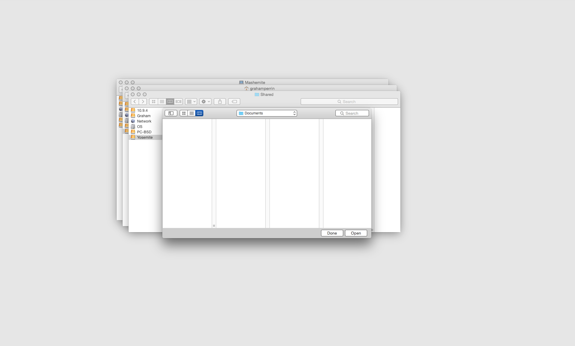

Logical approaches to alternatives to Apple operating systems

… Changing entire ecosystems based on a preference that "it doesn't look good" is a frankly stupid. … personal opinion, but the cost of changing (from machines to licenses, old habits, knowledge about programs, workflows), are rarely worth it. …

Egk, you're right to draw people's attention to those costs. Thanks.

Preference-based decision-making would be stupid only if the costs are underestimated.

… astounded by two things:
  1. That veterans don't take precautions before upgrading (I know, some do)
  2. Threatening to leave to Windows, or something else

For me it's not a threat. Not a weapon.

It's simply a plan, and there's an orderly, logical approach. Soon – before Yosemite becomes a requirement for this class of hardware – I'll get, from the budget at work, a new MacBook Pro. Then:
  1. refrain from starting Yosemite
  2. install a third party (non-Apple) operating system that will allow me to try a variety of desktop environments with the Retina display
  3. try a handful of other non-Apple operating systems with the new Apple hardware with the Retina display
  4. install OS X Yosemite to the internal drive, test it for as long as is tolerable
  5. erase Yosemite
  6. install Mavericks
  7. gradually move away from OS X
  8. complete that move before Apple ceases to provide security fixes for Mavericks
– Apple has the power to dissuade me from steps 7 and 8.

Specifically: at or before WWDC 2015, I'd like to see an unmistakable change of direction. Not a reversal from Yosemite, just a more flexible approach/direction, with software that can satisfy a broader range of users. Related:

Flavours is of great interest, future version 2 should make Yosemite more attractive. But if that's followed by nonsense at WWDC, I'll be a step closer to my steps 7 and 8.

Feedback

I do still believe sending feedback to Apple is a good thing, so have at it.

+1make some noise – to Apple.

I'll probably blog some things clearly, early, in 2015. Some of those things may become points of reference in my feedback.

I encourage everyone else to send feedback without delay. One item of feedback per problem with the looks, so if – for example – you're troubled by a lack of contrast and by excessive brightness, aim for two submissions (not two types of trouble within the same item of feedback). The separation should make it easier for Apple to classify and prioritise whatever is submitted through its public feedback form.

… is this a maneuver to force hardware updates? …

I doubt that was Apple's intention.

Why it's not OK to show/discuss pre-release software in public: an example

As things turned out, what's in the screenshot above was probably simply a bug. Only probable; I can never be certain because I did not bother to send feedback. My loss. I made some noise, in public, that was almost entirely unjustifiable. When I realised the probability of it being a bug I was quietly embarrassed (lessons learnt – better respect for agreements with Apple, and so on) but I didn't draw attention at the time. Now, I don't mind people knowing about the embarrassment.
 

Badagri

macrumors 6502a
Aug 9, 2012
500
78
UK
attachment.php


It nearly reminds me of the 80s.
 

GerritV

macrumors 68020
May 11, 2012
2,266
2,742
It nearly reminds me of the 80s.

Glad you say "nearly" - because anything design from the 80s must have looked way better than this crap.
I still can't believe that Apple released something without any quality or style or taste. And I mean that on a level of general aesthetics, not of personal taste.

Reminds me of what Jobs once said about Microsoft: "they have no taste".
Hello Pot, my name is Kettle.
 

Masada31

macrumors newbie
Dec 6, 2014
14
0
When iOS7 first came out there was a period of time when you could still uninstall it and put iOS 6 back on. Once the window closed, that was it.

Unfortunately, I "bit" on the Jonathan Ive video on Apple telling me how wonderful iOS 7 was and I installed it without seeing any reviews, but I did it after the window closed allowing me to revert back to iOS 6. I now use my iPhone for about 10% of what I used if for when it had iOS 6 on it. I used to use it for all sorts of stuff. Now I play Solitaire on it, and that's about it. I CANNOT STAND the glaring white everywhere.

I could not agree more . Jonathan Ive has taken all the fun out of using OS on iPad and iPhone and now with OSX Yosemite which I used for 30 minutes and went back to Mavericks . I'm so tired of white, Flat and 2D and boring .
 

Masada31

macrumors newbie
Dec 6, 2014
14
0
When iOS7 first came out there was a period of time when you could still uninstall it and put iOS 6 back on. Once the window closed, that was it.

Unfortunately, I "bit" on the Jonathan Ive video on Apple telling me how wonderful iOS 7 was and I installed it without seeing any reviews, but I did it after the window closed allowing me to revert back to iOS 6. I now use my iPhone for about 10% of what I used if for when it had iOS 6 on it. I used to use it for all sorts of stuff. Now I play Solitaire on it, and that's about it. I CANNOT STAND the glaring white everywhere.
https://www.youtube.com/watch?v=R41NNPBqRCk&app=desktop

Remember when iPad use to be fun to use
 

ZVH

macrumors 6502
Apr 14, 2012
381
51
I was seriously considering getting an iPad, until iOS 7 came out. When I saw how cartoonish it looked, I totally dropped the idea.

Well, there's one more lost sale in the name of "progress."
 
Status
Not open for further replies.
Register on MacRumors! This sidebar will go away, and you'll see fewer ads.