Got a tip for us?
Let us know
Become a MacRumors Supporter for $50/year with no ads, ability to filter front page stories, and private forums.
iOS 18: All the little things
- Thread starter Ansath
- WikiPost WikiPost
- Start date
- Sort by reaction score
You are using an out of date browser. It may not display this or other websites correctly.
You should upgrade or use an alternative browser.
You should upgrade or use an alternative browser.
Aw man, I absolutely hate this feature - this is one of the reasons I hate the Android dialer. I like that you simply tap the entry to call the person ... hope this gets reversed.My favorite new thing in the phone app…recent calls…no more accidentally hitting one of the recent numbers and having it call that person!!
It’s coming later this year, a price increase.Wondering if there's much new for Music.... it is not mentioned anywhere on the preview webpages for neither of the platforms. 🙁
Oh my god, this is really an odd timing, because right this morning I was hating the recent list because you can accidentally call that person.Aw man, I absolutely hate this feature - this is one of the reasons I hate the Android dialer. I like that you simply tap the entry to call the person ... hope this gets reversed.
“Wheel of undo / redo” when using the pencil in iPad notes:
Pretty awesome! Now I need a Pencil Pro! (and a new iPad).
Now you can make ‘cluck’ sound to open the control centre or ‘click’ to open the camera…

I know this is an iOS post. But the feature shown in the screenshot is available on iOS and iPadOS.
I know this is an iOS post. But the feature shown in the screenshot is available on iOS and iPadOS.
It's probably a bit technical, but if developers are in here as well, I have written down my thoughts on the iPad's new tabs design and why it's bad. If you're feeling the same way, this is the time to get feedback to Apple to change things before launch.

 gamery.app

Let's talk about the new tabs and sidebar in iPadOS 18
With iPadOS 18 Apple is making the app experience confusing and unnecessarily complex.
Last edited:
I don’t think you have to worry. According to earlier posts you can still tap to call, you just have to be a bit more accurate:Aw man, I absolutely hate this feature - this is one of the reasons I hate the Android dialer. I like that you simply tap the entry to call the person ... hope this gets reversed.
“Before you could touch anywhere on a phone call ‘card’ in the Recents tab and it would immediately place a call to that person. Now, tapping in most places on the card will just get you info about the caller. To return a call, you have to tap on the round blue phone icon at the far right.”
Effectively, they have swapped the blue “i” button with a “call” button. I think it’s a good compromise, but might take a bit of getting used to
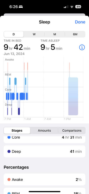
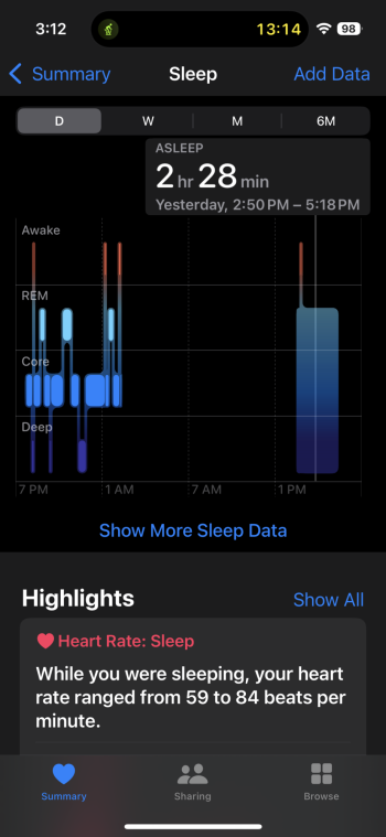
Apologies if I missed this somewhere in this thread. Looks like we can track naps now. I didn’t have the sleep focus on. My Apple Watch is also on the developer beta. View attachment 2388691
I thought something had changed, just noticed yesterday my watch seemed to have tracked a nap I took! This is huge to me because having a little kid my sleep schedule is all over the place, I’ve always been frustrated how if I would wake up for even a minute to go to the bathroom it wouldn’t track my sleep for the rest of the night.
I believe those are all new, but they were introduced several weeks ago with Apple’s other accessibility announcements. In addition to those sound-based actions, there are also Vocal Shortcuts, which I’ve activated. Allows you to just say a single word and a shortcut will run. I have the word “cam” opening the camera. Very quick and can be done even from a locked phone. Opens the camera in about 1.5 seconds. Great for hands free situation when you can‘t fumble to tap the lockscreen camera icon (or if you remove it altogether). This is a glimpse of what may be ahead if Apple’s plans for Apple Intelligence pan out.Are those sounds (Click, Cluck, Eh, La, Mug…) new on iOS 18?
Nicely put! 😁I don’t think you have to worry. According to earlier posts you can still tap to call, you just have to be a bit more accurate:
“Before you could touch anywhere on a phone call ‘card’ in the Recents tab and it would immediately place a call to that person. Now, tapping in most places on the card will just get you info about the caller. To return a call, you have to tap on the round blue phone icon at the far right.”
Effectively, they have swapped the blue “i” button with a “call” button. I think it’s a good compromise, but might take a bit of getting used to
Very nice write up. Captures a lot that non-developers (and operating system giants) don’t necessarily think about but should.It's probably a bit technical, but if developers are in here as well, I have written down my thoughts on the iPad's new tabs design and why it's bad. If you're feeling the same way, this is the time to get feedback to Apple to change things before launch.

Let's talk about the new tabs and sidebar in iPadOS 18
With iPadOS 18 Apple is making the app experience confusing and unnecessarily complex.gamery.app
could someone post the new recent call interface?
Attachments
Omg I’ve hoped they would add this for years! Thanks for sharingApologies if I missed this somewhere in this thread. Looks like we can track naps now. I didn’t have the sleep focus on. My Apple Watch is also on the developer beta. View attachment 2388691
Can't you just hit the phone icon next to the entry? This feature should satisfy everyone, Tap name , get info. Tap icon make callback. I like it and has been needed for EVER!Aw man, I absolutely hate this feature - this is one of the reasons I hate the Android dialer. I like that you simply tap the entry to call the person ... hope this gets reversed.
I agree, this is a fantastic and much-needed change! With the previous design it was far too easy to accidentally dial one of the numbers when you intended to look at their information. Now you can still directly return the call if you want to, but it's far less likely that you'll accidentally do so. And now it displays the contact photos. 2 x finally!Can't you just hit the phone icon next to the entry? This feature should satisfy everyone, Tap name , get info. Tap icon make callback. I like it and has been needed for EVER!
Of course! I highlighted the info from my nap yesterday (from the above screenshot). Unfortunately doesn't give me the data for REM, Core and Deep sleep. But, I'm glad it finally shows the times and automatically adds it to the 'time asleep' for the day.Omg I’ve hoped they would add this for years! Thanks for sharing
Register on MacRumors! This sidebar will go away, and you'll see fewer ads.


