Become a MacRumors Supporter for $50/year with no ads, ability to filter front page stories, and private forums.
Status
The first post of this thread is a WikiPost and can be edited by anyone with the appropiate permissions. Your edits will be public.

bigjnyc

macrumors G3
Apr 10, 2008
8,281
7,611
Probably not new but still only took me 18 iOS versions to realize that one can long press on the App Store updates list to get further info. I assume this has always been there? 😅

Apple and its „secret“ long press functionality

I used to do this on my iPhone 6S with 3D touch lol.
 
  • Like
Reactions: asv56kx3088

Dj64Mk7

macrumors 65816
Sep 15, 2013
1,388
734
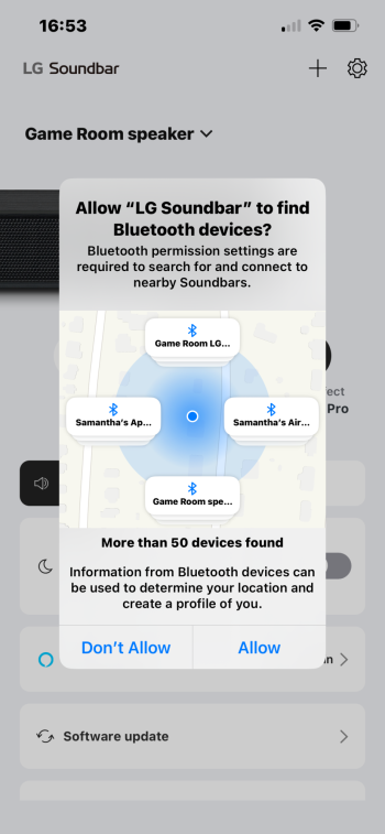
I opened the app for the soundbar hooked up to my TV, and I saw this dialog that I’ve never seen before.
 

Attachments

  • IMG_3952.png
    IMG_3952.png
    555.9 KB · Views: 217

NT1440

macrumors Pentium
May 18, 2008
15,088
22,154
I opened the app for the soundbar hooked up to my TV, and I saw this dialog that I’ve never seen before.
They’ve got much more granular with Bluetooth and Network sharing permissions. The idea is they want to make users recognize that some hardware makers are being overly aggressive (or lazy in scoping) with their implementations.

Craig actually talked about it for a bit during the Daring Fireball post-WWDC keynote interview.
 

gwhizkids

macrumors G5
Jun 21, 2013
13,252
21,399
I’m going to post this again without the quoted posts as those may get moderated out.

Just use the “Report” button to handle obvious harassment like what we see (saw) just above. Much faster and doesn’t clutter the timeline and give people like this more of a platform.
 

gwhizkids

macrumors G5
Jun 21, 2013
13,252
21,399
Here’s a new one for me: auto selection of an image in the photos app. This one is a photo I took of the USS Constitution (“Old Ironsides”) in Boston Harbor in 2018.

I was scrolling through and noticed that selection was occurring without any intervention from me as soon as I dragged to get the photo’s metadata. I suspect it’s because it’s marked as a “Landmark” in Photos.


gwhizkids

macrumors G5
Jun 21, 2013
13,252
21,399
I’ve noticed that as well and wasn’t sure what was happening as I haven’t used that selection feature much since it came out.
I’ve done a bit more “research”. It seems to be a means to feature a particular landmark. I’ve gotten it to work on the US Capitol and the Washington Monument. But it seems limited to the US, as it does not work on my photos of Notre Dame Cathedral in Paris or the Shard in London.
 

Lotsacaffine

macrumors newbie
Jun 10, 2024
8
12
I’ve done a bit more “research”. It seems to be a means to feature a particular landmark. I’ve gotten it to work on the US Capitol and the Washington Monument. But it seems limited to the US, as it does not work on my photos of Notre Dame Cathedral in Paris or the Shard in London.
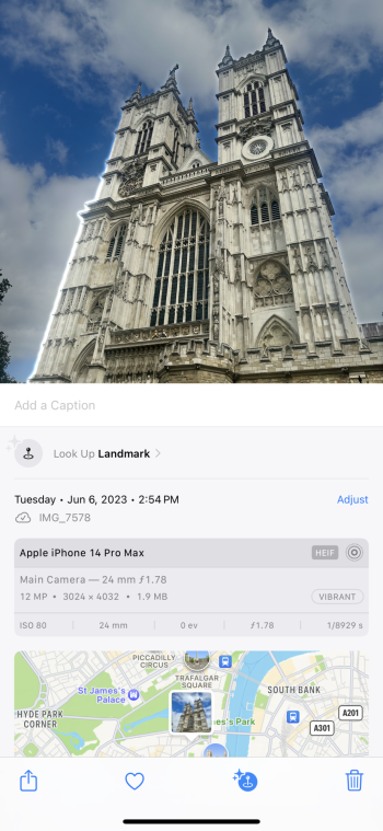
This is working in iOS 17. Demonstrated using Westminster Abbey in London.
I think they started the auto selection/highlighting thing with iOS 17 when they added the new system stickers and remove subject from background features.
 

Attachments

  • IMG_9932.png
    IMG_9932.png
    1.7 MB · Views: 86
Last edited:

gwhizkids

macrumors G5
Jun 21, 2013
13,252
21,399
This is working in iOS 17. Demonstrated using Westminster Abbey in London.
I think they started the auto selection/highlighting thing with iOS 17 when they added the new system stickers and remove subject from background features.
I was wondering if that might have been the case. Another of Apple’s many not really announced or promoted features. Thanks for clearing that up.
 

Akinom

macrumors newbie
Dec 26, 2023
26
27
I'm noticing some third party apps have their own dark mode icons now on Beta 3.

Third party apps that don't have dark mode icons do appear slightly darker, though.
 

tomtad

macrumors 68020
Jun 7, 2015
2,072
5,477
I'm noticing some third party apps have their own dark mode icons now on Beta 3.

Third party apps that don't have dark mode icons do appear slightly darker, though.

I think the OS is doing it automatically for third parties, ie a white (or coloured) background is being swapped out for a black background. I guess icons where they are too complex for this to work are just being dimmed.
 

nutmac

macrumors 603
Mar 30, 2004
6,167
7,670
I think the OS is doing it automatically for third parties, ie a white (or coloured) background is being swapped out for a black background. I guess icons where they are too complex for this to work are just being dimmed.
Doesn't work for Microsoft Teams and apps with white color used for other parts of the graphics.
 

Paddle1

macrumors 603
May 1, 2013
5,140
3,572
I think the OS is doing it automatically for third parties, ie a white (or coloured) background is being swapped out for a black background. I guess icons where they are too complex for this to work are just being dimmed.
Strangely it doesn't work for the Apple Store app icon for me which has a pretty simple white background.
 

gank41

macrumors 601
Mar 25, 2008
4,345
5,017
Strangely it doesn't work for the Apple Store app icon for me which has a pretty simple white background.
Even more strangely is that the Apple Store app icon IS dark for me. There’s a few others that are now dark but apps like Teams or Spark are not. Yet. Soon!
 
  • Like
Reactions: Paddle1

addamas

macrumors 65816
Apr 20, 2016
1,313
1,341
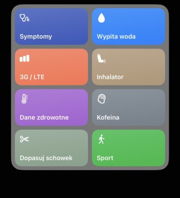
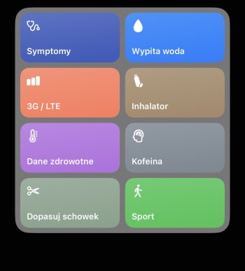
In Beta3 they changed Inhaler icon for Shortcuts. Personally I preferred previous (first picture)
 

Attachments

  • IMG_4621.jpeg
    IMG_4621.jpeg
    115.8 KB · Views: 118
  • IMG_4625.jpeg
    IMG_4625.jpeg
    114.9 KB · Views: 114

gank41

macrumors 601
Mar 25, 2008
4,345
5,017
Still no Select All / Delete All button or at least a swipe gesture like in the Photos app to mass select photo / video attachments in Messages 😭 am I the only one that deletes attachments? It’s a true pain in the ass having to tap on each photo one by one in an endless list of photos
It’s still an option but you have to tap on Select first.
 

MrWeenus

macrumors regular
Jul 26, 2017
192
335
Romania
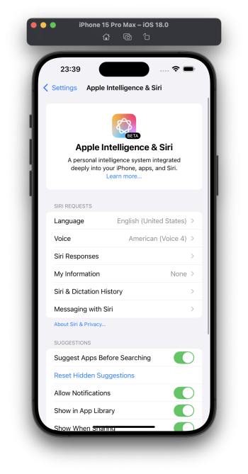
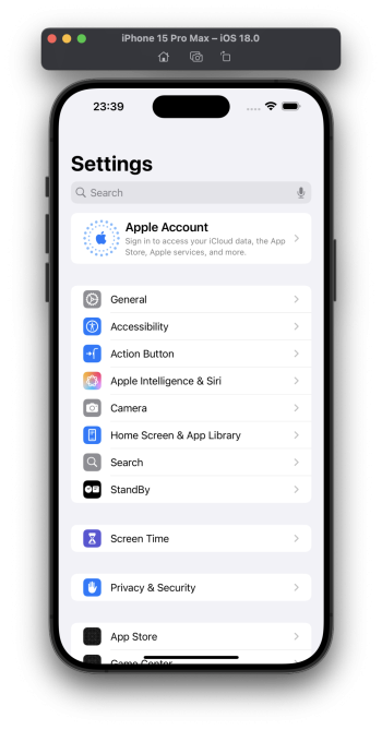
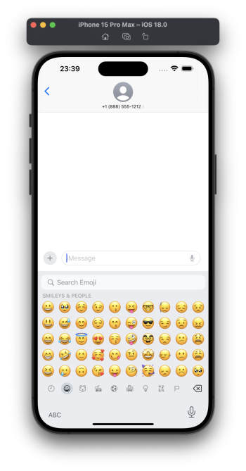
I'm not sure if anyone has seen the same build in the Xcode simulator. The emoji thing in the keyboard looks like iOS 17. And an actual mention of AI in the settings.

sorry if I have skipped any posts that posted this. :(
 

Attachments

  • Screenshot 2024-07-09 at 23.39.59.png
    Screenshot 2024-07-09 at 23.39.59.png
    862.6 KB · Views: 119
  • Screenshot 2024-07-09 at 23.39.56.png
    Screenshot 2024-07-09 at 23.39.56.png
    805.4 KB · Views: 116
  • Screenshot 2024-07-09 at 23.39.44.png
    Screenshot 2024-07-09 at 23.39.44.png
    993 KB · Views: 111

gwhizkids

macrumors G5
Jun 21, 2013
13,252
21,399
I'm not sure if anyone has seen the same build in the Xcode simulator. The emoji thing in the keyboard looks like iOS 17. And an actual mention of AI in the settings.

sorry if I have skipped any posts that posted this. :(
Good find! Was the Apple Intelligence thing in the previous beta version of Xcode?
 

adamlbiscuit

macrumors 6502a
Sep 22, 2008
602
1,402
South Yorkshire, UK
The colour of the Dock and folder backgrounds is now determined based on the app icon appearance you've selected (light / dark), rather than whether the system as a whole is in Dark / Light mode.

This means that it is possible to have a dark Dock & folder backgrounds whilst the system is in Light Mode, as long as you have dark app icons enabled (and vice versa).

Doesn't look too bad in Light Mode but I imagine If you want the 'classic' Dark Mode appearance (i.e. light app icons with dark UI elements) it looks a bit off.
 

redbeard331

macrumors 68040
Jul 21, 2009
3,099
5,788
The colour of the Dock and folder backgrounds is now determined based on the app icon appearance you've selected (light / dark), rather than whether the system as a whole is in Dark / Light mode.

This means that it is possible to have a dark Dock & folder backgrounds whilst the system is in Light Mode, as long as you have dark app icons enabled (and vice versa).

Doesn't look too bad in Light Mode but I imagine If you want the 'classic' Dark Mode appearance (i.e. light app icons with dark UI elements) it looks a bit off.

Yea not a fan, also they added a terrible looking dark filter to all your apps which which makes them all look like they have had a poop filter applied to them. I really hope that’s a bug that they fix in the next beta as it’s one of the most terrible things Apple has ever done.
 
Last edited:
  • Haha
Reactions: JFLECHUGA

gwhizkids

macrumors G5
Jun 21, 2013
13,252
21,399
When creating a reminder in the Reminders app via Siri on CarPlay, you now get a different dialog showing the reminder created. I think this has more detail than in iOS 17. But Siri is still Siri (and messed up "forum" to "for him"). 😂

IMG_1297.png
 
Register on MacRumors! This sidebar will go away, and you'll see fewer ads.