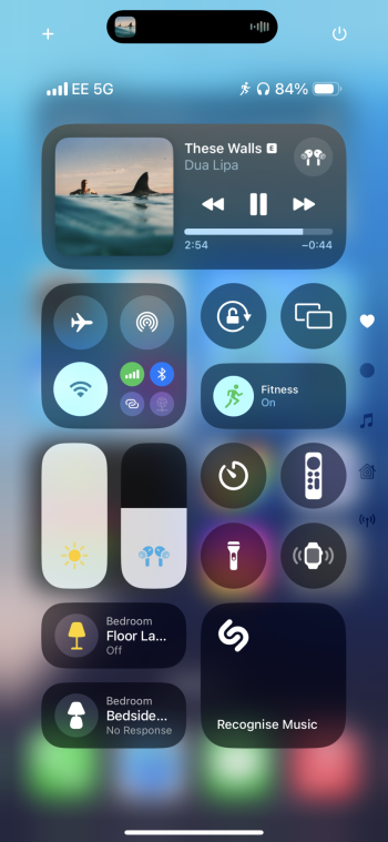
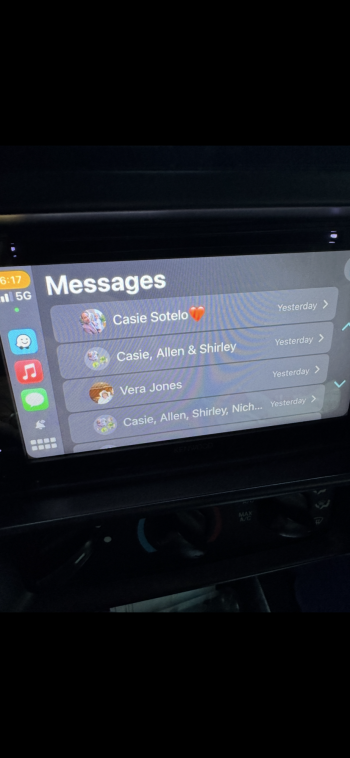
Yeah. I’m not sure how I feel about it how this looks. Seems a bit messy.Hopefully they remove the circle buttons on Control Center and leave the current square ones, they look out of place.
Got a tip for us?
Let us know
Become a MacRumors Supporter for $50/year with no ads, ability to filter front page stories, and private forums.
iOS 18: All the little things
- Thread starter Ansath
- WikiPost WikiPost
- Start date
- Sort by reaction score
You are using an out of date browser. It may not display this or other websites correctly.
You should upgrade or use an alternative browser.
You should upgrade or use an alternative browser.
- Status
- The first post of this thread is a WikiPost and can be edited by anyone with the appropiate permissions. Your edits will be public.
The new icons "theming" option is a bit messy, at least for now. Dark mode only applies to the default Apple apps which is horrible. 3rd party apps still have default icons. Hope they 'll fix this.
Working for me on EE in the UK.I’m also with 3.
Any information about the feature online says it’s US, Canada only. Not seen anything saying it’s expanded to UK.
its carrier specific , not all support them currently .Working for me on EE in the UK.
If you go to each individual's website and look at the features it will say if it is or not, I know that Vodafone and voxi support it here in the uk un sure about others
I'm just happy that they've FINALLY added colours to the Calendar app appointments (rather than just everything being grey) and also given us the option to narrow those chunky margins in the Books.
Yes, just without legacy widgets.Hey all, a question please: does the Today View page (swipe right) still exist?
Nope, sadly it doesn’t look like you can drag your finger to select a bunch at once. I wish they would change this, too.Can you finally select all iMessage attachments (photos) without tapping each photo one by one? This has been driving me nuts probably since iOS 13 or whatever.
Nope, sadly it doesn’t look like you can drag your finger to select a bunch at once. I wish they would change this, too.
Ugh in this case I just give up and will go back to WhatsApp. I don’t understand why they did not implement like in the photo app to begin with
Agreed - it was an immediate red flag in the demo when she said "everything's in one place, with all your photos at the top and every other piece of functionality underneath" (or words to that effect), and having used it it is indeed bad.I very much dislike the new Photos app. Unlike apps with a tab bar, it’s not possible to switch between completely different views without returning to the main view.
Yeah you're right, there's slightly more padding on the icon, and the dots are smaller.The only photo I have is my iPad for the old logo… I swear it’s very slightly different…
When someone sends you a photo in messages, the phone will describe the photo if you don’t have the phone unlocked.
What do you mean? It's applied to every icon I've looked at including many without black backgrounds.Are tinted icons only available with black background?
Edit: okay, only those with black background. Less customizable that I thought
I mean that the “select tint” customization option appears to be only applicable to the icon version that replaces background color for a black color. Which is understandable because ting those without a white background would be difficult. But damn, Apple should allow users to change apps icons manually.What do you mean? It's applied to every icon I've looked at including many without black backgrounds.
Not sure I get what you mean. When I went to tint, every single app icon I have has tinted.I mean that the “select tint” customization option appears to be only applicable to the icon version that replaces background color for a black color. Which is understandable because ting those without a white background would be difficult. But damn, Apple should allow users to change apps icons manually.
Yeah, and each and every App tinted (all of them) are a combination of black and the tint color, right?Not sure I get what you mean. When I went to tint, every single app icon I have has tinted.
If you hold an application to edit you can require FaceID to use any application now. That’s pretty sweet.
The new icons "theming" option is a bit messy, at least for now. Dark mode only applies to the default Apple apps which is horrible. 3rd party apps still have default icons. Hope they 'll fix this.
And yet it themes 3rd party widgets
I don't like them either. Icons are square everywhere, on the Home Screen, in settings app and then you open the Control Center and some of the buttons are circle and the square ones have such a dramatic corner radius that it looks messy and dense because of the added icons on the right of the screen for different Control Center pages. The current (ios17) Control Center looks way cleaner.Hopefully they remove the circle buttons on Control Center and leave the current square ones, they look out of place.
Also speaking of icons - why are the dark mode icons so vibrant? Like camera and calculator icons are tottaly fine but then you have phone, FaceTime, messages and photos icons that are so colourful and vibrant. They look tacky for me. And at the same time there's maps icon with dull/darken colours (which is obvious for a DARK mode) but are these new icons supposed to be for a DARK mode or VIBRANT mode? The light mode icons are not so colourful and vibrant.
I *think* I see what you mean - you mean for the apps that have a dark and an light icon, ie Apple's own apps, it switches to the dark mode icon when you apply a tiny? If so yeah, that's true. It still tints 3rd party icons that don't have a dark background.I mean that the “select tint” customization option appears to be only applicable to the icon version that replaces background color for a black color. Which is understandable because ting those without a white background would be difficult. But damn, Apple should allow users to change apps icons manually.
Last edited:
Register on MacRumors! This sidebar will go away, and you'll see fewer ads.


