Become a MacRumors Supporter for $50/year with no ads, ability to filter front page stories, and private forums.

Lloydbm41

Suspended
Oct 17, 2013
4,019
1,456
Central California
1 - Personal Preference on this
2 - That just goes to show you that the iPhone 6 is behind the competition. Many Android phones had 1080p screens 2 years ago. Apple still catching up here.
3 - iPhone "widgets" are nothing like Android widgets.

Well aware that Android has had 1080p screens for a while (i own some of them), but it doesn't detract the fact that the iphone 6's screen is really good. I own the original Moto X and that 720p screen did have noticeable pixelation, whereas the iPhone does not. Would I have preferred a 1080p screen like my Nexus 5 has? Absolutely! But the iPhone 6's screen is quality.

And ios widgets and Android widgets do the exact same thing. The only difference is Apple sandboxes the info into the Notification center. Otherwise, a widget is a widget. It provides quick glance info. Trying to argue against that is getting into minutiae simantics.
 

Nick A

macrumors 6502
Original poster
May 10, 2009
293
928
You must have bionic eye to be able to tell 720p from 1080p on the 5" screen. I call bs on that..typical argument from Android camp. Spec blah blah specs specs.

There is a difference. As I'm typing this I'm looking at an iPhone 6 next to the HTC One M8, the M8's screen is clearly sharper when side to side. The display on the M8 also appears to look more pure white on a white background while the IP6 looks more "yellowish."
 

Lloydbm41

Suspended
Oct 17, 2013
4,019
1,456
Central California
You must have bionic eye to be able to tell 720p from 1080p on the 5" screen. I call bs on that..typical argument from Android camp. Spec blah blah specs specs.

Next time you visit a carrier store, hold the iphone 6 up to any flagship Android device like the Moto X, S5, Note 4, LG G3, or even a Lumia 930 or 1520. There is a noticeable difference. If you can't admit it, then you are in denial.
 

OceanView

macrumors 65816
Sep 16, 2005
1,094
39
You must have bionic eye to be able to tell 720p from 1080p on the 5" screen. I call bs on that..typical argument from Android camp. Spec blah blah specs specs.

No need to BS.
You can test it yourself by zooming in on any text on a website or an e-book.
Compare it to a 1080p screen and you will see the difference.
 

LIVEFRMNYC

macrumors G3
Oct 27, 2009
8,878
10,987
Well, from one perspective, iOS's solution is actually more useful. The notification panel is accessible from any part of the OS--home screen, while in any app, even from the lock screen, meaning I have immediate access to my widgets without having to leave the app I'm using. IIRC, the Galaxy S5 doesn't even allow lock screen widgets.

Apple's solution may not be your preferred implementation but it's certainly far from useless.

I feel the opposite. Two widgets that serve me very well are the Falcon Twitter widget and the TW calendar widget. On my Nexus 7 I use Jorte calendar widget. Both the calendar and twitter widgets take up an entire home screen(other sizes available though).

From the main home screen, I can easily flip left and see my monthly calendar with appointments, birthdays, holidays, and etc. I can flip left or right twice from my main home screen and see my twitter feed as well as scrolling the feed. This has become priceless for me and can't be done in the notification center.

Power Toggles is also priceless for me as I can put very small app icons on my main home screen. The weather widget from Beautiful Widgets is also a must for me on my main home screen. The weather widgets on iOS suck in comparison.
 

jeffe

macrumors 6502a
Feb 17, 2008
601
50
Google Now is a bit too much i would think. Since it is card based, it would take up a ton of real estate.


On Android Google now will display information in the notification shade using a notification. I think it works best - simple and clean. I never used google now on iOS so maybe it is similar? I don't know.
 

LIVEFRMNYC

macrumors G3
Oct 27, 2009
8,878
10,987
The one thing that I thought was a dead cert for improvement was the third party keyboards. They are buggy as hell. They revert back to the stock keyboard randomly and some badic functions just don't work on some of them like copy and paste. In the end I just went back to the stock keyboard as it wasn't worth the hassle.

I had the same problem. Going to Keyboard, then edit and push the prefered keyboard to the top helps somewhat, but that problem seems to still exist.

Another thing I don't like is, when you completely power off the iPhone, you have to allow the third party keyboards full access again when you power back on.
 

Oohara

macrumors 68040
Jun 28, 2012
3,050
2,423
The one thing that I thought was a dead cert for improvement was the third party keyboards. They are buggy as hell. They revert back to the stock keyboard randomly and some badic functions just don't work on some of them like copy and paste. In the end I just went back to the stock keyboard as it wasn't worth the hassle.

I was hoping that Swype on iOS would have all the functions from the Android version, but it is missing the swipe commands for Cut/Copy/Paste and for lowering the keyboard. These are so useful to me that the lack of them on iOS currently tip the scale in favour of Android for me.

Really though, it is early days for these new functions and possibilities on iOS. Maybe next year they will have come further, and then I might consider the iPhone an alternative again. I'd like to see some more dedicated large screen-functionality too, though.
 

kevinof

macrumors 6502a
Jul 30, 2008
744
161
Dublin/London
Oh please. I have both iOS and android and there is simply no comparison between the widget implementation. IOS are very basic glancible panels. You can't action much of anything using them. They are simply a quick way to view information but that's it.

How about adding a text message widget, or a settings widget or a maybe a quick dial. I could go on and on.

Like I said in another post it will take another version or two before iOS widgets are really useful being just a series of quickview panels.

...

And ios widgets and Android widgets do the exact same thing. The only difference is Apple sandboxes the info into the Notification center. Otherwise, a widget is a widget. It provides quick glance info. Trying to argue against that is getting into minutiae simantics.
 

Technarchy

macrumors 604
May 21, 2012
6,753
4,927
Google Now is a bit too much i would think. Since it is card based, it would take up a ton of real estate.

The app is card based. The widget is just tiles and resizable on android.

No reason those tiles, say 3 or 4, can't be made into an iOS widget. Most of the news widgets are sporting 4 to 5 snippets as is.
 

spinedoc77

macrumors G4
Jun 11, 2009
11,488
5,413
Lloydbm41 said:
And ios widgets and Android widgets do the exact same thing. The only difference is Apple sandboxes the info into the Notification center. Otherwise, a widget is a widget. It provides quick glance info. Trying to argue against that is getting into minutiae simantics.

Android widgets provide more information in many if not most cases. They are live, I can scroll through a list such as calendar entries, email messages, text messages, etc. Also you can have very specialized widgets, like I can have a live video feed of my daughters day care inside a resizable widget, let's see iOS do that.
 

Lloydbm41

Suspended
Oct 17, 2013
4,019
1,456
Central California
Oh please. I have both iOS and android and there is simply no comparison between the widget implementation. IOS are very basic glancible panels. You can't action much of anything using them. They are simply a quick way to view information but that's it.

How about adding a text message widget, or a settings widget or a maybe a quick dial. I could go on and on.

Like I said in another post it will take another version or two before iOS widgets are really useful being just a series of quickview panels.
Why would you need a settings widget when you already have a built in one? Swipe up from bottom.
Text message widget? Why do i need a widget when I can a) see and answer any text that comes in, even on the lockscreen or b) open the app to send a text? These are redundant examples you are giving.
Now i do have a banking widget on my Nexus 5 that displays my current account info, but it still requires me to enter my pin to access it. Why not just open the app? Saves me a microsecond i suppose?

By the way, i do have a widget that quick dials any contact, launches any app, blah blah. It is called Launcher, but Appke pulled it from the app store. I point this widget out because even though it was pulled, it shows that the caoabilities are there and that devs are able to do these things, just like on Android.

----------

Android widgets provide more information in many if not most cases. They are live, I can scroll through a list such as calendar entries, email messages, text messages, etc. Also you can have very specialized widgets, like I can have a live video feed of my daughters day care inside a resizable widget, let's see iOS do that.
Specialized widgets will likely never happen. Apple will favor opening an app rather than a widget like you described.

----------

The app is card based. The widget is just tiles and resizable on android.

No reason those tiles, say 3 or 4, can't be made into an iOS widget. Most of the news widgets are sporting 4 to 5 snippets as is.
Which cards would be displayed? Weather and news? Package deliveries? Time to work or home? Traffic data? Sports scores? TV data?
Right now i have on average 10 cards that get displayed. I don't want to pick and choose what gets displayed and what doesn't. I might as well just open my Google Search app and look at all my cards.

Not saying it can't be done, i just hate neutering an app to turn it into a widget.
 

jeffe

macrumors 6502a
Feb 17, 2008
601
50
Which cards would be displayed? Weather and news? Package deliveries? Time to work or home? Traffic data? Sports scores? TV data?
Right now i have on average 10 cards that get displayed. I don't want to pick and choose what gets displayed and what doesn't. I might as well just open my Google Search app and look at all my cards.

On Android it's resizable so the number of cards it displays depends on the size. It will only show you all of your cards if it has enough room otherwise it will pick which cards to show you automatically w/o you doing anything. Some things are different - it might just show you the current weather instead of the forecast, or one stock price instead of a list...

Lots of pictures on google images to give you a better idea of what it looks like.
 
Last edited:

tbayrgs

macrumors 604
Jul 5, 2009
7,467
5,097
I feel the opposite. Two widgets that serve me very well are the Falcon Twitter widget and the TW calendar widget. On my Nexus 7 I use Jorte calendar widget. Both the calendar and twitter widgets take up an entire home screen(other sizes available though).

From the main home screen, I can easily flip left and see my monthly calendar with appointments, birthdays, holidays, and etc. I can flip left or right twice from my main home screen and see my twitter feed as well as scrolling the feed. This has become priceless for me and can't be done in the notification center.

Power Toggles is also priceless for me as I can put very small app icons on my main home screen. The weather widget from Beautiful Widgets is also a must for me on my main home screen. The weather widgets on iOS suck in comparison.


Understood--like I said, Apple's implementation certainly isn't for everyone. But it doesn't change the fact that you have to go to your home screens to view them. So you're looking at 1 to 5 touches (depending on number of home screens and widget locations) to access the info if you're in an application or on a different home screen. In those same amount of touches I can either, use one touch to pull down and see any of my widgets at a glance, without having to even leave an app or access a full app which will provide far more information than a widget. IMO, if you need more info than is available at a quick glance, accessing an app is a far better solution.

And lets be a little realistic---iOS 8 has been out for a week and a half. You cannot honestly expect developer to have a widget library that matches Android in such a short time.
 

Lloydbm41

Suspended
Oct 17, 2013
4,019
1,456
Central California
On Android it's resizable so the number of cards it displays depends on the size. It will only show you all of your cards if it has enough room otherwise it will pick which cards to show you automatically w/o you doing anything. Some things are different - it might just show you the current weather instead of the forecast, or one stock price instead of a list...

Lots of pictures on google images to give you a better idea of what it looks like.

heres one: http://cdn-static.zdnet.com/i/story/70/00/013966/06-google-now.jpg

and another: http://www.blogcdn.com/www.engadget.com/media/2013/02/google-now-widget-update.jpg

I know what it looks like on Android dude, i own more Android phones than most people. I use Google Launcher and swipe right from my home screen to get Google Now, so a widget is pointless to me on Android.

Im trying to envision how it could be enabled within the sandboxed environment of iOS's notification center.
 

Lloydbm41

Suspended
Oct 17, 2013
4,019
1,456
Central California
Power Toggles is also priceless for me as I can put very small app icons on my main home screen. The weather widget from Beautiful Widgets is also a must for me on my main home screen. The weather widgets on iOS suck in comparison.

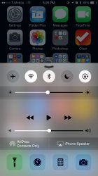
Do i need power toggles?
 

Attachments

  • image.jpg
    image.jpg
    126.6 KB · Views: 86

Oohara

macrumors 68040
Jun 28, 2012
3,050
2,423
And lets be a little realistic---iOS 8 has been out for a week and a half. You cannot honestly expect developer to have a widget library that matches Android in such a short time.

This. We need to hold on with all the griping until these new features have had a chance to settle in.
 

tbayrgs

macrumors 604
Jul 5, 2009
7,467
5,097
Why would you need a settings widget when you already have a built in one? Swipe up from bottom.
Text message widget? Why do i need a widget when I can a) see and answer any text that comes in, even on the lockscreen or b) open the app to send a text? These are redundant examples you are giving.
Now i do have a banking widget on my Nexus 5 that displays my current account info, but it still requires me to enter my pin to access it. Why not just open the app? Saves me a microsecond i suppose?

Exactly. I always chuckle at the 'actionable widget' argument because, no matter what actions are available, a widget that doesn't use the entire display will never be as useful as an entire application, something that is only one or two touches away--same as you rotating to a 2nd or 3rd home screen to see your widget. Trying to use most widgets for anything more than at-a-glance info is counterproductive, IMO. Spinedoc's example of a live feed on the home screen is advantageous but again, at best one touch quicker than accessing a far more functional application. And I'm not trying to make excuses--spend plenty of time on numerous Android devices to know that I found widgets far less functional than just using the app.

By the way, i do have a widget that quick dials any contact, launches any app, blah blah. It is called Launcher, but Appke pulled it from the app store. I point this widget out because even though it was pulled, it shows that the caoabilities are there and that devs are able to do these things, just like on Android.

I thankfully installed it as well before Apple pulled it--great app, very 'Android-esque' (hey, I can give credit where credit is due ;)). On the surface, seems like a pretty crappy move by Apple.
 
Last edited:

Technarchy

macrumors 604
May 21, 2012
6,753
4,927
On Android it's resizable so the number of cards it displays depends on the size. It will only show you all of your cards if it has enough room otherwise it will pick which cards to show you automatically w/o you doing anything. Some things are different - it might just show you the current weather instead of the forecast, or one stock price instead of a list...

Lots of pictures on google images to give you a better idea of what it looks like.

heres one: http://cdn-static.zdnet.com/i/story/70/00/013966/06-google-now.jpg

and another: http://www.blogcdn.com/www.engadget.com/media/2013/02/google-now-widget-update.jpg

Right now on my S5 there are 8 tiles displayed in the Google Now widget. Sometimes it's 6. Google Now does a good job of figuring what I want to see most.

Either way, right now Google now on the iPhone isn't all that valuable because you basically have to check the app, which really, I'm never going to do. Between Safari's integrated search and Siri, there is no need.

If Google wants to encourage use of their services, a widget makes a lot of sense, and the iOS demographic is pretty significant.
 

Oohara

macrumors 68040
Jun 28, 2012
3,050
2,423
Do i need power toggles?

One thing I miss particularly in Control Center, which I love having as a Power Toggle: a direct on/off toggle for the WiFi hotspot (I use this a ton so it really gets to be annoying after a while on iOS).

Another thing I use Power Toggles for is to turn on Wifi File Transfer Pro so I can juggle files between Android and PC without cable or internet, but I realise this is a Windows feature that Apple isn't really expected to cater to. (And with Mac/iOS obviously one has AirDrop, which is represented in Control Center.)
 

tbayrgs

macrumors 604
Jul 5, 2009
7,467
5,097
One thing I miss particularly in Control Center, which I love having as a Power Toggle: a direct on/off toggle for the WiFi hotspot (I use this a ton so it really gets to be annoying after a while on iOS).

Another thing I use Power Toggles for is to turn on Wifi File Transfer Pro so I can juggle files between Android and PC without cable or internet, but I realise this is a Windows feature that Apple isn't really expected to cater to.

Agreed--Control Center is great, use it all the time, especially the music control but it really should be customizable, at least to change the toggles to a few other set functions. Wifi Hotspot would be my first change as well.
 

Oohara

macrumors 68040
Jun 28, 2012
3,050
2,423
Agreed--Control Center is great, use it all the time, especially the music control but it really should be customizable, at least to change the toggles to a few other set functions. Wifi Hotspot would be my first change as well.

Yeah, add just a bit of user choice there and the thing would go from good to superb.

But in general I love Control Center and do miss it heavily on Android. Especially because you can call it up from the locked lock screen - this may be silly but the fast access to the flashlight has pretty much saved my life (or at least my chins) when I get up in the middle of the night to go to the loo lol.
 

LIVEFRMNYC

macrumors G3
Oct 27, 2009
8,878
10,987
Understood--like I said, Apple's implementation certainly isn't for everyone. But it doesn't change the fact that you have to go to your home screens to view them. So you're looking at 1 to 5 touches (depending on number of home screens and widget locations) to access the info if you're in an application or on a different home screen. In those same amount of touches I can either, use one touch to pull down and see any of my widgets at a glance, without having to even leave an app or access a full app which will provide far more information than a widget. IMO, if you need more info than is available at a quick glance, accessing an app is a far better solution.

And lets be a little realistic---iOS 8 has been out for a week and a half. You cannot honestly expect developer to have a widget library that matches Android in such a short time.

From the main home screen, one swipe to the left for the calendar widget. It's two swipes in either direction for the twitter widget. I only have 4 home screens.

Most of the widgets I tried on iOS seems slightly more or less equivalent to the notifications I already receive from those apps. Yes, notification widgets can be slightly more convenient at times, but lack of info or function is the trade off.

----------

Do i need power toggles?

That has nothing on Power Toggles. And I'm not just saying that to be argumentative.
 

Lloydbm41

Suspended
Oct 17, 2013
4,019
1,456
Central California
Agreed--Control Center is great, use it all the time, especially the music control but it really should be customizable, at least to change the toggles to a few other set functions. Wifi Hotspot would be my first change as well.

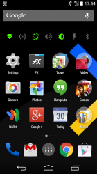
WiFi hotspot would also be on my list for Control Center, but as it is, here is Power Toggles on my Nexus 5, which to me is just as good, just more limited to what I can do on the iPhone.

But I also have to be on my home screen to do simple things like auto-rotate, which means closing out of an app, clicking the toggle and then going back into the app. (YouTube gets me every time!)
 

Attachments

  • Screenshot_2014-09-28-17-44-52.png
    Screenshot_2014-09-28-17-44-52.png
    527.9 KB · Views: 72
Register on MacRumors! This sidebar will go away, and you'll see fewer ads.