While there's certainly some validity to the article, it also strikes me as sort of 'click-baity'. I think the ability to recharge the Pencil directly from an iDevice without the need for another cable/cradle/dock is actually a great design--it's the equivalent of having prongs pop out of your smartphone that allow you to directly plug it into a wall outlet, then disappear from view entirely when not needed. If it took longer than 15 seconds to get a few more hours of use, I could see more concern but come on--15 secs is what we're talking about. Lie your iPad down if it's that concerning. The mouse--yeah, agree not a great design in regards to recharging but again, it's designed to last much longer than a single day on a charge so just plug it in when you're done for the day. The design in fact seems very much like Apple because including a charging port on the end that would allow it to be charged ruin the sleek, flowing contours. Form over function--not a foreign concept to Apple. The keyboard case also seems quite nit picky. Yes, Microsoft's type case lie's flat but it also isn't responsible for holding the SP4 upright. Apple chose to reduce the device size by not including an integrated kickstand--allowing the smart keyboard to lie perfectly flat would require an entire redesign of the iPP--so they should redesign the core product from the ground up to accommodate an accessory.And the hump in the keyboard is quite subtle.
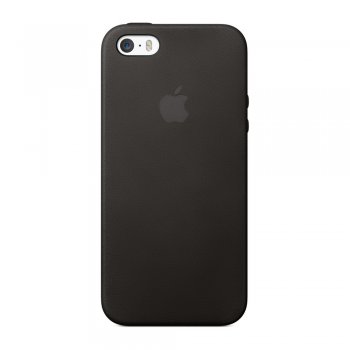
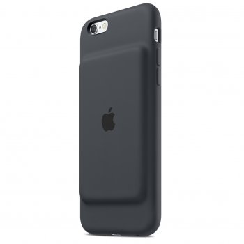
Now the battery case--there are no excuses for that abomination. There is no functional advantage that can explain away the hideous design. There is no 'beauty in they eye of the beholder' here. Other's have already done the battery case and have done it far better, with nicer aesthetics, and of course at a better price. This product truly is a bit confounding and I'm quite surprised Apple released it.
Apparently the case was designed around patents that mophie holds.


