Become a MacRumors Supporter for $50/year with no ads, ability to filter front page stories, and private forums.

tbayrgs

macrumors 604
Jul 5, 2009
7,467
5,097
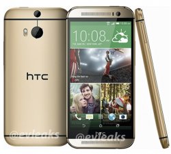
Evleaks has confirmed they are keeping the power button on the top. This phone looks nearly identical to the M7.

Image

Ugh, this is one time I hope EVleaks is wrong. Leaving that much bottom bezel just to leave room fo the HTC logo and keeping the top mounted power button (which I actually prefer) but moving it to the top right, which makes it even harder to reach if holding right-handed--makes absolutely no sense. A phone with that much bezel and a 5" display is going to be really tall.

Pulling boneheaded moves like this gives me zero confidence that HTC has any common sense and will be dumping the Ultrapixel camera. :(
 

blairh

macrumors 603
Dec 11, 2007
5,972
4,472
Ugh, this is one time I hope EVleaks is wrong. Leaving that much bottom bezel just to leave room fo the HTC logo and keeping the top mounted power button (which I actually prefer) but moving it to the top right, which makes it even harder to reach if holding right-handed--makes absolutely no sense. A phone with that much bezel and a 5" display is going to be really tall.

Pulling boneheaded moves like this gives me zero confidence that HTC has any common sense and will be dumping the Ultrapixel camera. :(

Why do you feel putting the power button on the top right is worse than the top left?
 

tbayrgs

macrumors 604
Jul 5, 2009
7,467
5,097
Why do you feel putting the power button on the top right is worse than the top left?

Hold your phone in your right hand. You should see that your right index finger is already in the general vicinity of the top left corner. Now try to reach the top right corner with that same finger holding the phone in the same manner.

It's manageable on a phone as small as the iPhone but really a stretch on something as large as the HTC One or Galaxy S4.

Also just noticed that since the power button is actually covered by the case that it likely means HTC is also abandoning the IR sensor. Another bummer as I used mine more than expected on my HTC One.
 
Last edited:

blairh

macrumors 603
Dec 11, 2007
5,972
4,472
Hold your phone in your right hand. You should see that your right index finger is already in the general vicinity of the top left corner. Now try to reach the top right corner with that same finger holding the phone in the same manner.

It's manageable on a phone as small as the iPhone but really a stretch on something as large as the HTC One or Galaxy S4.

Also just noticed that since the power button is actually covered by the case that it likely means HTC is also abandoning the IR sensor. Another bummer as I used mine more than expected on my HTC One.

I can't reach the power button on the One and then be in a position to use the phone without shifting my hand. Hence why I feel a power button on the top, right or left, is pretty terrible ergonomically once you hit 4.7". It wouldn't matter to me if it were on the left or right at that point. I would say it's only very slightly less awkward to hit the top left versus the top right. In both instances it feels terrible IMO. Plus, like I said before, I would then have to shift my hand down to use the actual device.

There is a common sense reason why just about every other OEM uses the right edge as the location for the power/wake button once the screen hits roughly 4.7". The only exception is the G2/Pro.

Anyways, I personally think it's a shame. Unless I could tap to wake without rooting.
 

tbayrgs

macrumors 604
Jul 5, 2009
7,467
5,097
I can't reach the power button on the One and then be in a position to use the phone without shifting my hand. Hence why I feel a power button on the top, right or left, is pretty terrible ergonomically once you hit 4.7". It wouldn't matter to me if it were on the left or right at that point. I would say it's only very slightly less awkward to hit the top left versus the top right. In both instances it feels terrible IMO. Plus, like I said before, I would then have to shift my hand down to use the actual device.

There is a common sense reason why just about every other OEM uses the right edge as the location for the power/wake button once the screen hits roughly 4.7". The only exception is the G2/Pro.

Anyways, I personally think it's a shame. Unless I could tap to wake without rooting.

I understand why many people prefer the wake/power button on the upper right hand side--very convenient to access with your thumb (right-handed) or index finder (left-handed). I just found that on the few devices I used with that configuration that I often accidentally would press it when I didn't intend to. Just a personal preference for how I generally handle my phones.

Regardless of whether a top mounted button is less ideal, moving it to the right side of the top on a large device make even less sense and I don't understand their motivation for doing so. In fact, very little of the changes that appear to be coming on the M8 make much sense, IMO.
 

blairh

macrumors 603
Dec 11, 2007
5,972
4,472
Regardless of whether a top mounted button is less ideal, moving it to the right side of the top on a large device make even less sense and I don't understand their motivation for doing so. In fact, very little of the changes that appear to be coming on the M8 make much sense, IMO.

SD card slot and on-screen buttons (both confirmed) are improvements IMO.
 

Oohara

macrumors 68040
Jun 28, 2012
3,050
2,423
SD card slot and on-screen buttons (both confirmed) are improvements IMO.

I can't believe they'd go for onscreen buttons while keeping that extra bezel with the logo on it. Just doesn't make sense at all.
 

blairh

macrumors 603
Dec 11, 2007
5,972
4,472
I can't believe they'd go for onscreen buttons while keeping that extra bezel with the logo on it. Just doesn't make sense at all.

Well they decided they wanted the logo in the same location. I don't know. Doesn't really bother me. People on other sites are freaking out. Doubt most consumers will care.
 

Sensamic

macrumors 68040
Mar 26, 2010
3,072
689
I can't believe they'd go for onscreen buttons while keeping that extra bezel with the logo on it. Just doesn't make sense at all.

Well believe it.

It doesn't make sense for us consumers, but it does for HTC. Like I previously said EVERY company (except Apple) puts their logo on the front: Nokia, Sony, LG, Samsung, etc.

I don't like it either but people need to be more realistic in how these companies think and act.
 

MRU

macrumors Penryn
Aug 23, 2005
25,370
8,952
a better place
TouchWiz is getting a redesign. I expect to look wildly different this time out. You'll need to see how it has changed before knowing what you'll prefer.

Evleaks is basically the word of God. If he says the M8 Mini is getting a 13 MP camera then I can't imagine how the M8 isn't too. It's a given at this point.

From what in have seen of Magazine UX on the new Note Pros - I highly doubt Touchwiz is getting a major overhaul, rather a Google Now Magazine UX and a few new icons - sitting on top of everything that went before.

But that's by the by, I wouldn't buy another samsung phone as long they are voiding your warranty with KNOX counter ...
 

tbayrgs

macrumors 604
Jul 5, 2009
7,467
5,097
I can't believe they'd go for onscreen buttons while keeping that extra bezel with the logo on it. Just doesn't make sense at all.

Agreed, on screen buttons are not an improvement if it means a huge chin on the bottom of the device. It's the equivalent of taking the current HTC One and addition on screen buttons above the existing capacitive buttons.

It's also going to be hugely asymmetrical when using the device in landscape.

Expandable storage is certainly a plus, as long as they offer at least one version with more than 16GB on board for apps.
 

Dav1boy

macrumors member
Mar 12, 2011
50
0
I dont hate the logo being there, I hate the size of the bezel needed to house it. At least make the logo a notification light, some kinda gesture based area, something! Look at the evo LTE and one x logo. Placed at the top on a marginally thin bezel. Regardless, Im still getting "the all new one" even if this is the final product. It will look better in person. Aesthically it doesn't get much better then HTC phones. Yes I am a shameless htc fanboy.
 

Oohara

macrumors 68040
Jun 28, 2012
3,050
2,423
Well believe it.

It doesn't make sense for us consumers, but it does for HTC. Like I previously said EVERY company (except Apple) puts their logo on the front: Nokia, Sony, LG, Samsung, etc.

I don't like it either but people need to be more realistic in how these companies think and act.

Ok ok lol, I didn't meant to go after the logo placement (for once :D) in that comment, just using it to describe the extra bezel section in question.

Still hoping that those other "leaked" pictures are of the real M8, it just looks so incredibly much better:

htc-one-2-m8-display-leak-2.jpg
 

blairh

macrumors 603
Dec 11, 2007
5,972
4,472
Essentially the One with some tweaks. Sadly I see no reason why HTC won't continue their fall in 2014.
 

Oohara

macrumors 68040
Jun 28, 2012
3,050
2,423
I've uploaded the screenshot for anyone browsing at work where Twitter might be blocked.

So they dropped the ball on the design. The lower area with logo + onscreen buttons taken together looks a total mess, and the logo bezel serves no purpose. I'm out.
 

Rogifan

macrumors Penryn
Nov 14, 2011
24,735
32,201
Is evleaks normally accurate? Because that seriously looks like a step down from the 2013 model. Gold shade is ugly and corners are too rounded. Almost looks like a Samsung phone trying to copy the One! And why is a logo necessary on both the front and back of the device?
 

joshwithachance

macrumors 68020
Dec 11, 2009
2,106
1,320
Those rounded corners just make the device look HIDEOUS. What the ******* is wrong with HTC? The One and One Max are gorgeous devices, and now they're going to bring this out...?
 

tbayrgs

macrumors 604
Jul 5, 2009
7,467
5,097
So they dropped the ball on the design. The lower area with logo + onscreen buttons taken together looks a total mess, and the logo bezel serves no purpose. I'm out.

I likely wasn't in, as I'm sticking with smaller phones going forward, however I completely agree. I really liked the HTC One and this is just a big step in the wrong direction.

If HTC puts out another One Mini, I'd likely be passing on that as well if it sticks to the design elements of this phone.
 

Oohara

macrumors 68040
Jun 28, 2012
3,050
2,423
Those rounded corners just make the device look HIDEOUS. What the ******* is wrong with HTC? The One and One Max are gorgeous devices, and now they're going to bring this out...?

Yeah. The first thing I thought when I saw that picture was that it looked old somehow. Then I realized - those rounded edges remind me a bit of.....my old iPhone 3G. :(

And to think they had such a unique and unmistakeable design statement with the original One, it makes me sad tbh.
 
Register on MacRumors! This sidebar will go away, and you'll see fewer ads.