Become a MacRumors Supporter for $50/year with no ads, ability to filter front page stories, and private forums.
Status
Not open for further replies.

soulreaver99

macrumors 68040
Aug 15, 2010
3,710
6,441
Southern California
I installed it on my 27-inch iMac and I actually like how it looks. As others have said, this thing is just begging to be installed on a Retina display.

I installed it on my wife's 2012 MacBook Air 13" and it's not as terrible as some people say it is but it definitely is a step backwards on low-res displays.
 

timshundo

macrumors regular
Jun 17, 2009
225
200
San Francisco, CA
Sorry, but "C" looks like CRAP. "B" looks 10x better. I'm sorry some of you are apparently blind to nice aesthetics and prefer the "cartoon" look than actual beautiful art. Clearly, some people on Earth have no taste.


No, it takes an 8-year old child. It looks like Crayola world and I'm utterly amazed that ANYONE likes it at all. It's pure GARBAGE. And no, I don't call having "gem-like" effect on the traffic signal lights "flashy". I call it pretty. I call having flat cartoonish versions a travesty. They took the one thing I like the most about OS X's look compared to Windows (i.e. the best window buttons in the world) and RUINED them. Johnny Ive should be fired. PERIOD. Bring Scott back!

Wow.

I rest my case.

Just... wow. I'm not even being trolled.
 

grahamperrin

macrumors 601
Jun 8, 2007
4,942
648
It looks like some ugly ass Linux unfinished theme.

Some lack of finish is to be expected during beta testing.

Without focusing on Linux …

… since Apple is openly experimenting with controversial themes that appear to represent some departure from the Mac experience, I should welcome a proper Apple-provided method of allowing third party themes.

I recently tested a variety of desktop environments with PC-BSD. Not for long, but long enough to observe some things that were far more appealing and practical than the constraints of the Yosemite environment.
 

citizenzen

macrumors 68000
Mar 22, 2010
1,543
11,786
Honestly, which one looks better? clearly the one on the right.

It's not so clear cut.

The one on the left is easier to read. The one on the right sacrifices clarity for a lot of 3D bells and whistles. Now you may like those bells and whistles and I understand why you might.

But I've actually done a 180 on the look.

At first, I wasn't into it. Now I really like it.

It took just a few hours to win me over.
 

PsykX

macrumors 68030
Sep 16, 2006
2,754
3,929
Honestly, which one looks better? clearly the one on the right.

Clearly the one on the right, I have to agree. It was a leap forward when this was introduced in Leopard and got a bunch of applauses.

I managed to have the 3D Dock back, thanks to CDock made by one of Macrumors' members. The reflection of the icons isn't there yet, I think he needs someone to help in Objective-C for that, but another member said it was possible and threw a code snippet that could be used for that.

See here : https://forums.macrumors.com/threads/1748589/
 

munakib

macrumors 6502a
May 22, 2011
564
129
After using Yosemite for a few hours I also had to move back to Mavericks. Ive's direction is not what I wish to be a part of. Yes he designed the macs/ipods/iphones but OS design is all over the place (both iOS and OSX). Hopefully someone will develop some skinning app to bring back the mavericks like look ontop of yosemite so that I can take advantage of its features.
 

0000111

macrumors member
Jul 24, 2014
97
18
While the OP does have some points, I think he completely devaluates his opinion by mentioning Steve Jobs and making assumptions about Apple in general. Stop doing that.

This. I find it so closed-minded that people keep invoking his death into their arguments over a design change; that's a whole 'nother conversation, which only distracts from and weakens your argument. Without actually working at Apple and seeing it for ourselves, how do we know which exact feature 'Steve would never have done'? The guy would often go back on his own 'ultimatums' anyway.

I like to have a bit more of layering without adding translucency to every piece. If there is an option to turn it off, I will be happier.

There is! You'll find it in System Preferences >Accessibility.
 
Last edited:

azentropy

macrumors 601
Jul 19, 2002
4,138
5,665
Surprise
Found something interesting about the issue I'm seeing with the Menu fonts, especially with the User name displayed (and all the entries in it) in the upper right being "crappy". I turned off transparency and it looked MUCH better. But then as soon as I selected the menu it went back to looking jaggy. I then turned transparency back on and again it looked MUCH better. But again as soon as I selected the menu it went back to looking jaggy. So definitely a bug they should be able to fix, just surprised they haven't fixed it this far along.

Initial:
M1.png


Turn off Transparency:

M3.png


After selecting:

M4.png


Turn on Transparency:

M5.png


After selecting:

M6.png
 

kerrikins

macrumors 65816
Sep 22, 2012
1,243
530
This. I find it so closed-minded that people keep invoking his death into their arguments over a design change; that's a whole 'nother conversation, which only distracts from and weakens your argument. Without actually working at Apple and seeing it for ourselves, how do we know which exact feature 'Steve would never have done'. The guy would often go back on his own 'ultimatums' anyway.

I really despise it when people bring up Steve Jobs in that sort of context. Firstly it's disrespectful to assume that someone commenting on Macrumors somehow has insight into the man's mind. Secondly it's looking back all the time! He passed away almost four years ago, now. He is missed and will never be replaced but we can't keep looking back in time and guessing what he would have said, done or thought today.

I rather like Yosemite - it's fresh and has a crisp feel to it.
 

lparsons21

macrumors 6502
Jun 3, 2014
451
208
Southern Illinois
I'm not impressed with the look and feel of Yosemite at all. Too much like looking at a bigger iPad screen with iOS7.


The two issues for me are lack of contrast and the overall paleness of the screen. Same issue exist for me with the iPad.


And iTunes 12 just looks horrid!!


I see me running Mountain Lion for quite awhile longer.
 

0000111

macrumors member
Jul 24, 2014
97
18
I'm not impressed with the look and feel of Yosemite at all. Too much like looking at a bigger iPad screen with iOS7. [...] The two issues for me are lack of contrast and the overall paleness of the screen. Same issue exist for me with the iPad.

I too feel that iOS 7 can be very jarring, though I find Yosemite to be much more palatable and rich in its use of color (as opposed to excessive white in the blank space).

Re: contrast, try increasing the contrast from System Preferences > Accessibility... for both Yosemite and iOS 7 actually ;). Re: paleness, as another forum member suggested earlier, try using Flux to change the white point.. maybe that'll help ease your pain.

And iTunes 12 just looks horrid!!

Yeah, I'm not over the moon with it either. Though my biggest bone to pick with iTunes is its layout and functionalities, not just its visual style. Though its default behavior in iTunes 11 was to have all the different windows (Music, Podcasts, Devices, Playlists) in a bar near the top, I really liked being able to turn the sidebar back on and browse from there. Now, the sidebar doesn't quite work for me, and the bar has a lot of icons cluttered at the left. I've been quite disenchanted with iTunes ever since being able to see albums as tiles went away :(
_____

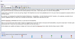
All this debate over usability and beauty in design and now I can't stand the Macrumors forum editor. God this thing is stuck in 2000. Talk about a case where flatness =/= beauty. Yes, it may be easier to implement than glossy artwork, but it still takes taste and effort to make it appealing.

Anyone know of other forum interfaces that can work with Macrumors?
 

Attachments

  • Screen Shot 2014-07-26 at 11.51.33 AM.png
    Screen Shot 2014-07-26 at 11.51.33 AM.png
    273.5 KB · Views: 168
Last edited:

0970373

Suspended
Mar 15, 2008
2,727
1,412
And iTunes 12 just looks horrid!!

I like Yosemite's new look for the most part, actually but I agree that iTunes is gross. I really dislike the new layout. But I've been on Team Burn iTunes to the Ground for a long time. lol.
 

B-Eugen

macrumors member
Jul 26, 2014
66
16
Do you know how one thing may remind you of another. For example, a mint may remind you of a cool, breezy winter day?

In much the same way, when I look at Yosemite, what comes to mind is a bunch of screaming tots in the 4-7 year old age bracket running around a Chuck E Cheese Romper Room Region filled with brightly colored balloons. This is just silly looking.

I think what may impress people initially isn't really the OS interface but the image used as the background - The incredibly good looking picture from Yosemiite National Park. Take that away and then you get to see and experience the real Yosemite.

Generally, the product to me looks totally unprofessional - I think the best word to describe it would be childish. The translucency is a stupid idea. For one thing, depending on the desktop background, what renders can end up being strange, if not just plain ugly looking. As you move a window around the translucency totally draws attention away from what you're trying to work on and instead draws attention to itself - and it's dumb. This feature will entertain kiddies in the 3 - 7 year old bracket for days on end likely, but I think the novelty of it will wear off on most adults after about 10 minutes, probably followed by disdain for the new "feature" after working with it for a while. The simple minded icons are also stupid looking. The colors are obnoxious.

Work with Yosemite for a while and then boot back into an earlier OS X version. What will strike you is how professional the old OS X version looks compared to Yosemite.

If someone asked me to rate every version of OS X on a scale of 1 to 5, every version from Puma to Mavericks would be in the 4.5 to 5.0 range. I'd give Yosemite a 1.

...what's that I'm hearing....the sound of the Mickey Mouse Club theme song....oh....Yosemite must be booting up.
 

lparsons21

macrumors 6502
Jun 3, 2014
451
208
Southern Illinois
Yeah, I could live with the new iTunes if I could turn the blasted sidebar on. But if there is a way, I sure haven't found it.


And what is Flux?? I'm not familiar with it.


One thing I didn't say was I had forgotten just how slow a USB hard drive can be. I had to repatriation one to give me a blank spot and then I used SuperDuper! To copy my Mavericks installation over and then do the upgrade.


Took a long time and even booting to it takes a very long time.
 

0970373

Suspended
Mar 15, 2008
2,727
1,412
Yeah, I could live with the new iTunes if I could turn the blasted sidebar on. But if there is a way, I sure haven't found it.

And what is Flux?? I'm not familiar with it.

Choose playlists and a sidebar will show.

F.Lux basically dims your screen/color temp depending on the time of day and it helps with eye strain. I enjoy it. https://justgetflux.com
 

MagnusVonMagnum

macrumors 603
Jun 18, 2007
5,196
1,452
The best thing they can do is make dark mode the option for those who prefer a simple clean look, and leave the bright colourful normal mode for those who prefer it.

But it's Apple so they won't. You're stuck with it, and if you don't update and stay on the older OS, they'll cripple that OS to the point where it forces you to upgrade.

That is the absolute truth. It's a shame that form and functionality have to be so closely tied together when it comes to Apple. If only they would offer older versions of OS X as optional themes, this wouldn't be an issue. It's just a shame you have to compromise the look of your desktop in order to keep running up-to-date software.

I personally like the original "Aqua" look of OS X it had up through Tiger and I didn't get my first Mac until 2006 (a used PPC Digital Audio I upgraded to be a whole house audio/video server with ATVs and an Internet terminal; it also played OS9 games well seeing as it could boot into OS9). Most of the changes visually since then haven't really bothered me too much, but I always loved OS X's traffic light buttons (even before I got a Mac, I had Aqua-like themes in Linux). I really don't want to see a pastel cartoonish version of OS X like iOS has become. You can change some colors in OS X, perhaps, but you can't really change the window buttons, etc. Thus, I say it's time to bring THEMES back (i.e. even OS9 had better theme options than OS X). Steve Jobs is dead (whether some on here find that relevant or not; Steve RAN the company). So I say let his iron fisted policy of "Everyone's desktop should look like my desktop" die with him. Tim Cook is made it clear he doesn't really like Macs these days anyway. He uses the iPad and iPhone almost exclusively. Keep Johnny Ive away from Macs and let him frack up iPads instead. Better yet, send him over to work for Google Android instead. He can single-handedly ruin the company. ;)
 

timshundo

macrumors regular
Jun 17, 2009
225
200
San Francisco, CA
People that purposely avoid upgrading their OS for superficial reasons are so backwards. It makes absolutely no sense to me. It's not a form of protest, it's just delaying the inevitable. The OS is free! Apple's not losing anything! They're not gonna make the OS theme-able so you guys can make it look like Snow Leopard, they're gonna stop supporting whatever OS you're on aside from important security patches, and you're only causing developers pain. Apple has always had a take-it-or-leave-it attitude; I don't get why you think that'll change now. People that don't like the design are a tiny, tiny minority.

Other than Safari's new search/url bar or the strange functionality of the sidebar in iTunes 12, nothing in Yosemite is a step backward. You're just being stubborn.
 

Cloudane

macrumors 68000
Aug 6, 2007
1,627
217
Sweet Apple Acres
Looks like the best place to chime in ---

but over all, I like the changes. I think the windows and menubar /window heads look great.

HOWEVER!

I was really looking foreword to Dark Mode ---- WHICH IS NOT DARK.

The only UI elements affected are the menu and dock --- something titled dark mode ought to affect the window surrounds, the spotlight search, all the primary user elements which make the screen bright.

Am I alone in thinking this? Maybe a few changes to come before the final GM?

You are not alone.

Unfortunately, love Apple as I do (when it comes to Macs), I know what they're like - dark windows will be a "BIG WHOOP WHOOP CHEER!" new feature announced for 10.11 or 10.12 during its keynote. I very much doubt it'll make it to 10.10.
 

lparsons21

macrumors 6502
Jun 3, 2014
451
208
Southern Illinois
Thanks for the info on f.lux!


Got it and made some tweaks and coupled with dark mode, it looks a bit better overall.


But Safari and iTunes just don't look good to me since the dark mode isn't a system wide effect and those pasty looking colors in Safari and iTunes just don't cut it for me.


I'm hoping that Dark Mode gets improved before the shipping OS comes out but I'm not holding my breath! :)
 

munakib

macrumors 6502a
May 22, 2011
564
129
Thanks for the info on f.lux!
But Safari and iTunes just don't look good to me since the dark mode isn't a system wide effect and those pasty looking colors in Safari and iTunes just don't cut it for me.

I'm hoping that Dark Mode gets improved before the shipping OS comes out but I'm not holding my breath! :)

Those will be the killer feature of 10.10.4 :S
 

grahamperrin

macrumors 601
Jun 8, 2007
4,942
648
… Apple has always had a take-it-or-leave-it attitude;

Not quite. One example comes to mind.

On one hand, there was a response to logical complaints from a minority of customers about the removal of the sidebar from iCal.

On the other hand, that response was too slow. Way too slow, and worse than than: it was the second time that the same mistake had been forced. Apple then was too stubborn.

… I don't get why you think that'll change now.

Apple now is more open.

People that don't like the design are a tiny, tiny minority. …

Tim Cook reportedly said, in 2012: "The only thing we'll never do is make a crappy product …".

If any minority can demonstrably prove that aspects of a product are significantly crappy, at release time, then such demonstrations will undermine Apple's claims of producing the best.

A slow, gradual undermining should be no more acceptable than a sudden undermining (such as the public response to the introduction of Maps).

If the one million beta testers are gained soon enough, then from amongst that number, I hope that there will be just enough logical feedback, to Apple, for the company to realise that some things must not be forced upon all users of an OS.

Aim for good quality feedback, people. And reproducibility.

If your feedback is highly emotive: include concise screen recordings – or movies – of you trying, failing to achieve a task. Whether or not you put yourself in the frame: speak as you perform each action with the Mac; make clear to the viewer/listener why your emotions are naturally high …
 

grahamperrin

macrumors 601
Jun 8, 2007
4,942
648
Off-topic: alternatives to Apple operating systems

… when my current generation of Apple hardware starts going south, the replacements will be non-Apple.

Any ideas for non-Windows alternates? I'm thinking Linux, FreeBSD, etc.

PC-BSD is a very smart idea but for me, there's a showstopper. https://alpha.app.net/grahamperrin/post/35418268 if you'd like to continue this conversation with me.

Linux, I could use quite happily – with both ZFS and encryption of my home directory, if those things are easily combined. I'm familiar with Ubuntu but the overall range of distributions is mind-numbing. Next week I'll plan to attend a local LUG meeting; hands-on demonstrations should help me to choose. Any follow-up from me is likely to be in a Linux forum, not in MacRumors.
 
Last edited:
Status
Not open for further replies.
Register on MacRumors! This sidebar will go away, and you'll see fewer ads.